Tableau 비주얼리제이션 확장 프로그램 가이드


Tableau Visionaries 회원인 Tristan Guillevin과 DataDev 홍보대사인 Jessica Bautista는 데이터 시각화 스튜디오이자 Tableau 개발자 파트너인 LaDataViz를 공동 운영하고 있습니다.
2004년 Tableau가 처음 출시된 이후 워크시트 내에 생성되는 모든 비주얼리제이션은 간단한 끌어 놓기로 차트를 만들 수 있는 획기적인 기술인 VizQL을 사용하여 렌더링되었습니다. Tableau에서 처음으로 비주얼리제이션을 만들면서 "와, 이렇게 쉽다고?"라고 생각했던 것을 아직도 기억합니다.
그리고 대부분의 경우 실제로 그렇게 쉬웠습니다! 하지만 Tableau를 어느 정도 사용하고 나서는 결국 도넛 차트를 만들고 싶거나 생키 차트를 생성해야 하거나 네트워크 다이어그램이 필요하게 되는데, 그런 경우에는 일이 조금 더 복잡해질 수 있습니다.
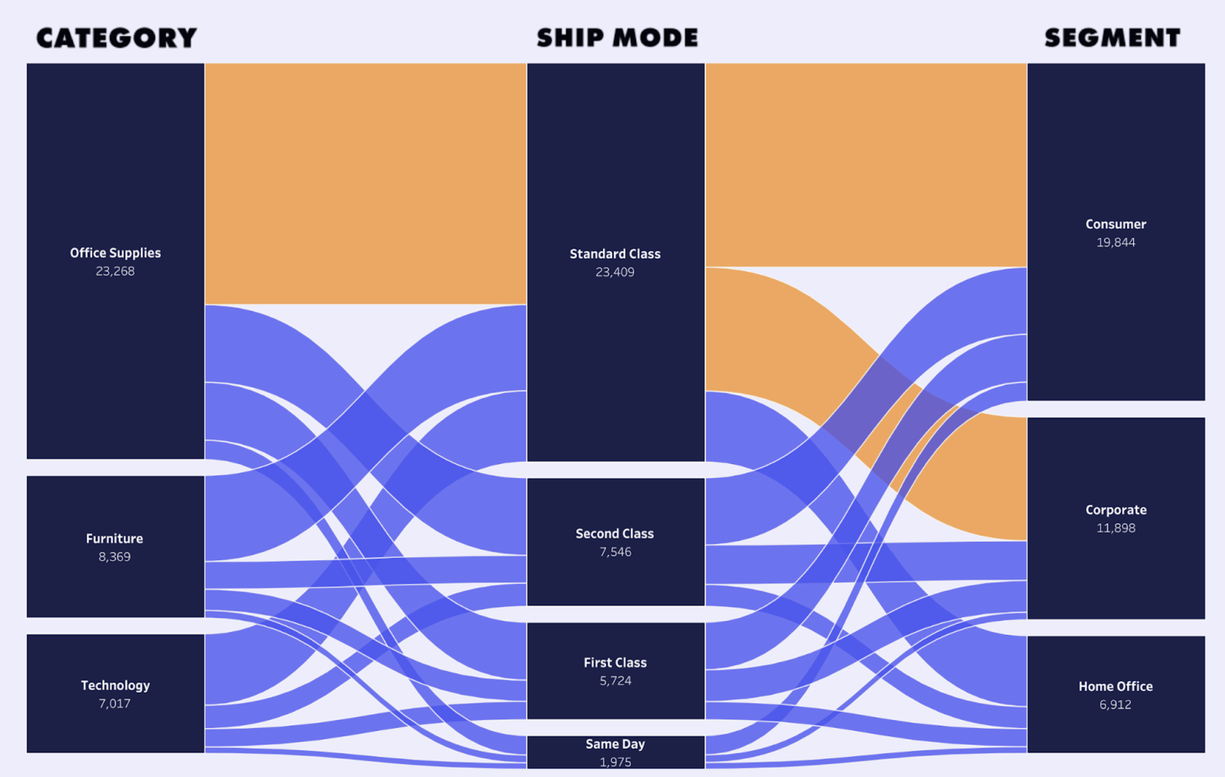
Tristan Guillevin의 배송 생키 차트.
Tableau 커뮤니티, 블로그, YouTube 동영상 덕분에 항상 방법을 찾기는 합니다. 그래도 여전히 복잡한 조작이나 데이터 치밀화, 또는 기타 복잡한 기법을 사용해야 하는 경우가 많은데, 간단한 차트는 손쉽게 만들 수 있는 것에 비하면 뭔가 이상하다는 느낌이 듭니다.
적어도 지금까지는 그런 느낌이었습니다.
Tableau 1.0과 VizQL이 나온 지 20년이 지난 지금, 차세대 혁신 기술인 비주얼리제이션 확장 프로그램이 이제 Tableau 2024.2에서 제공됩니다. 복잡한 차트도 간단하게 끌어 놓기로 만들 수 있게 된 것입니다.
비주얼리제이션 확장 프로그램이란 무엇일까요?
비주얼리제이션 확장 프로그램은 Tableau의 비주얼리제이션 옵션이 확장된 것으로, 누구나 새 비주얼리제이션 유형을 계산이나 템플릿 없이 더 쉽게 만들 수 있게 해줍니다.
비주얼리제이션 확장 프로그램은 Tableau의 워크시트에서 바로 사용할 수 있습니다. 만들려는 차트를 선택하고 데이터 필드를 마크 카드로 끌어 놓기만 하면 사용자 지정 비주얼리제이션을 생성하고, 데이터를 필터링하거나 동작을 실행할 데이터 요소를 선택할 수 있습니다. 이것이 바로 우리가 기대하는, 상상하는 모든 차트를 만들 수 있는 Tableau입니다.
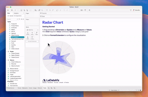
LaDataViz 레이더 차트를 만드는 단계별 과정.
각 비주얼리제이션 확장 프로그램은 개발자가 만든 새로운 사용자 지정 차트입니다. 축구 선수의 통계를 비교해야 하나요? 레이더 비주얼리제이션 확장 프로그램을 사용하면 됩니다. 여러 데이터 요소 간의 연결 관계를 시각화해야 하나요? 네트워크 비주얼리제이션 확장 프로그램을 사용하십시오. 정말로 이렇게 쉽습니다.
결론적으로, 비주얼리제이션 확장 프로그램이야말로 LaDataViz에서 바랐던 Tableau의 진화 결과입니다. 저희는 이미 Tableau에서 고급 차트를 생성할 수 있는 도구를 커뮤니티를 위해 만들었지만, 비주얼리제이션 확장 프로그램 덕분에 기대했던 바를 훨씬 넘어 더 크게 발전할 수 있었습니다.
현재 제공되는 비주얼리제이션 확장 프로그램
Tableau와 개발 파트너인 LaDataViz, AppsForTableau, Actinivision, DataMa가 협력하여 비주얼리제이션 확장 프로그램을 개발했으며, 현재 Tableau Exchange에서 모두 다운로드할 수 있습니다. 차트 유형별로 분류하여 모아놓은 비주얼리제이션 확장 프로그램을 자세히 살펴보십시오.
- Beeswarm 차트
- 범프 차트
- 코드 다이어그램
- 깔때기 차트
- 네트워크 다이어그램
- 극좌표 차트
- 프로세스 차트
- 레이더 차트
- 방사형 차트
- 생키 차트
- 스트림그래프 차트
- 선버스트 차트
- 테이블 비주얼리제이션
- 트리 다이어그램
- 벤 다이어그램
- 대시보드 최적화를 위한 비주얼리제이션 확장 프로그램
- 폭포형 차트 및 KPI 차트
비주얼리제이션 확장 프로그램 시작하기
이 모든 것은 Tableau 워크시트에서 시작됩니다. Tableau 2024.2 버전부터 마크를 선택할 때 새로운 확장 프로그램 추가 버튼이 표시됩니다. 그러면 다음 중에서 선택할 수 있습니다.
- 비주얼리제이션 확장 프로그램 찾아보기: Tableau Exchange 에서 제공하는 비주얼리제이션 확장 프로그램(저희와 같은 Tableau 파트너가 개발)입니다. 무료로 사용하실 수 있습니다.
- 로컬 비주얼리제이션 확장 프로그램 액세스: 비주얼리제이션 확장 프로그램을 구매하거나 직접 개발할 경우 여기에서 로컬 .trex 파일을 사용할 수 있습니다.

마크를 선택하면 "확장 프로그램 추가" 버튼이 표시되는 Tableau 워크시트.
각 비주얼리제이션 확장 프로그램마다 고유한 마크 유형과 작동 방식이 있습니다. 한번 사용해 보십시오!
Tableau Exchange에서 제공되는 모든 확장 프로그램을 https://exchange.tableau.com/ko-kr/viz-extensions에서 찾을 수 있습니다.
비주얼리제이션 확장 프로그램에 대해 자세히 알아보려면 LaDataViz의 FAQ를 확인해 보십시오. 여기에는 TableauTim이 진행하는 40분 분량의 심층 분석 동영상도 있습니다.
Beeswarm 차트
LaDataViz의 Beeswarm: 데이터 요소의 분포가 겹치지 않도록 시각화합니다.
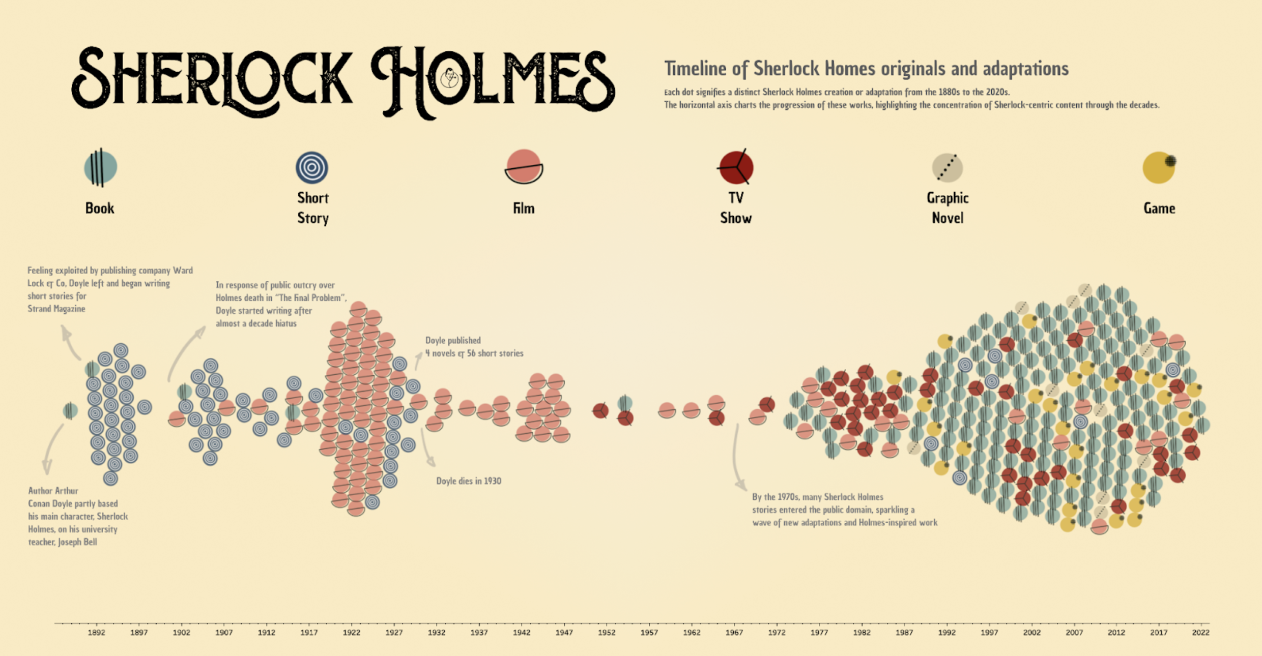
Jessica Bautista Gauna가 셜록 홈즈 원작과 각색본을 주제로 작성한 Beeswarm 차트.
비즈웜 차트는 공간을 최대한 활용하고 데이터 요소가 겹치지 않도록 하는 방식으로 여러 범주에 걸쳐 데이터 분포를 표시하는 데 매우 효과적인 차트입니다. 이 유형의 차트를 통해 데이터의 클러스터, 간극, 이상값, 전체적인 분포를 쉽게 파악할 수 있습니다. 비즈웜 차트는 각 데이터 요소를 명확하게 보여줌으로써 개별 데이터 값이 흥미로운 시사섬을 주는 자세한 탐색적 데이터 분석에 유용합니다.
범프 차트
LaDataViz의 범프 차트: 여러 범주 사이에서 시간의 흐름에 따라 순위 변화를 시각화합니다.
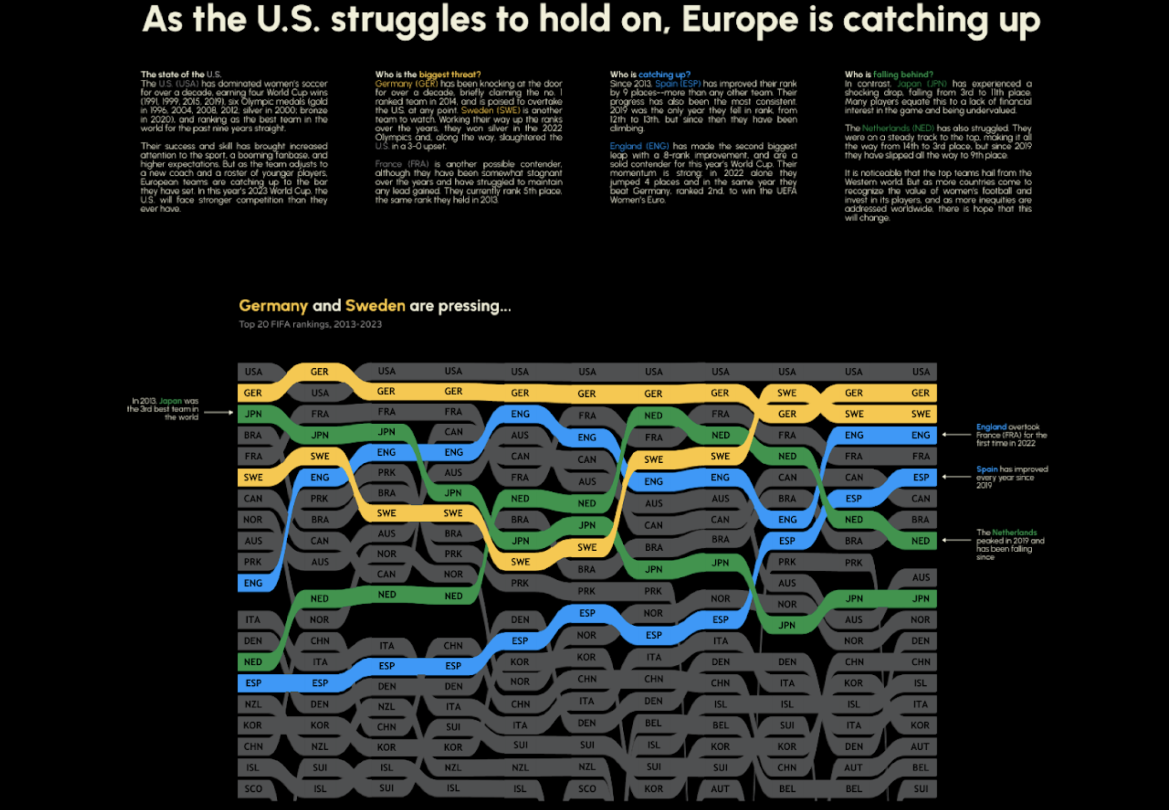
Becca B.가 작성한 여자 FIFA 랭킹을 보여주는 범프 차트
범프 차트는 시장 포지셔닝, 판매 순위 또는 스포츠 순위와 같은 경쟁 구도를 명확하고 설득력 있는 방식으로 보여주는 데 적합합니다. 시간 경과에 따른 순위 변동 상황을 표시하는 데 매우 유용하며, 차트를 보는 사람들이 데이터 집합 내 다양한 항목의 상승과 하락을 수월하게 추적할 수 있습니다. 범프 차트는 추세 파악, 승자와 패자 강조 표시, 포지션 변화의 시각화에 특히 효과적입니다.
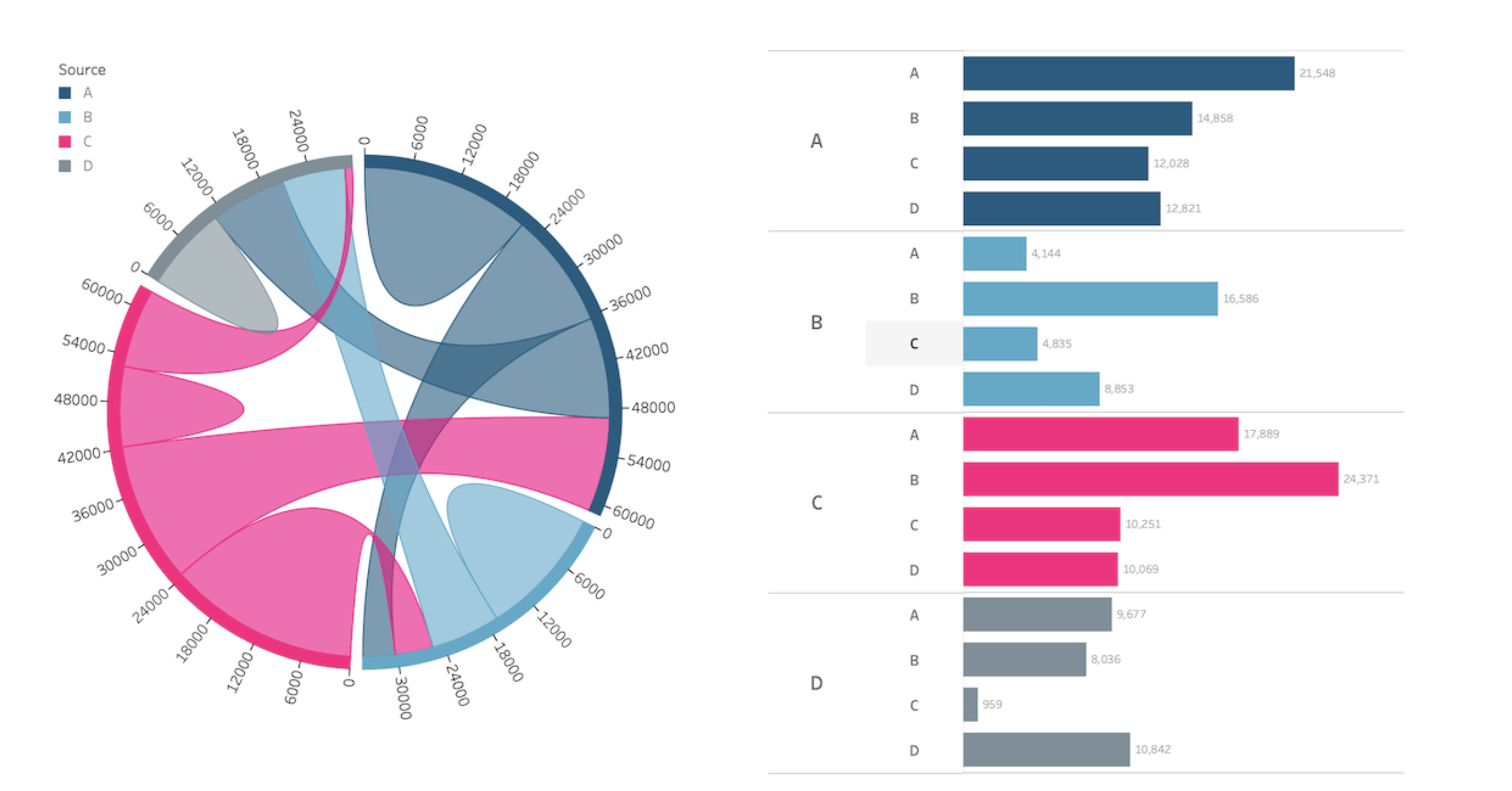
코드 다이어그램
LaDataViz의 코드 다이어그램: 다양한 개체 간의 상호 관계를 설득력 있는 원형 레이아웃으로 시각화합니다.
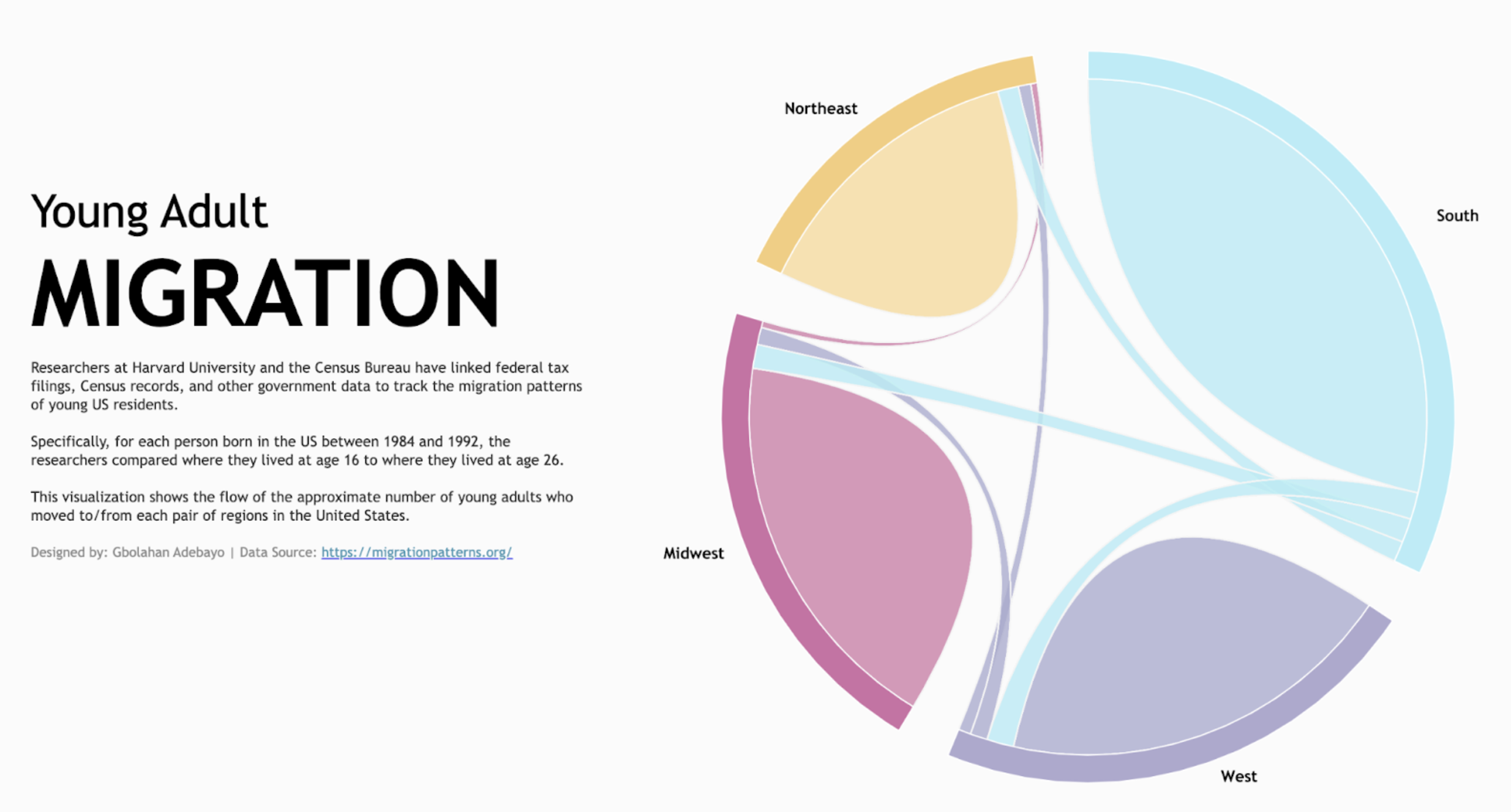
청년층 이주 상황을 주제로 하는 Gbolahan Adebayo의 코드 다이어그램.
코드 다이어그램은 소셜 네트워크에서의 관계, 이주 패턴 또는 국가 간 무역 흐름과 같이, 다양한 개체 간의 흐름이나 연결을 표시하는 데 편리합니다. 이런 다이어그램에서는 호와 리본을 사용하여 원 주위로 데이터 요소를 시각적으로 연결함으로써 손쉽게 구성 요소 간의 상호 작용 수준을 살펴보고 데이터 집합에서 지배적 관계와 부차적 관계를 파악할 수 있도록 합니다.
Infotopics의 코드 다이어그램 | Apps for Tableau: 네트워크 또는 시스템 내 개체 간의 관계와 연결을 그림으로 설명합니다.
청년층 이주 상황을 주제로 하는 Gbolahan Adebayo의 코드 다이어그램.
코드 다이어그램은 네트워크 또는 시스템 내 개체 간의 관계와 연결을 보여주는 시각적 표현입니다. 전형적으로 여러 세그먼트로 나뉜 원으로 구성되는데, 각 세그먼트는 어떤 범주나 개체를 나타냅니다. 세그먼트 간의 연결은 곡선 또는 '현'(코드)으로 표현되는데, 이러한 코드가 범주 간의 상호 작용 또는 관계를 나타냅니다. 코드 다이어그램은 소셜 네트워크, 유전학 연구, 공급망 분석 등에서 다양한 요소 간의 상호 작용 패턴, 정보 흐름 또는 관계를 보여주기 위해 데이터 시각화에 흔히 사용됩니다. 이를 통해 명확하고 직관적으로 복잡한 관계를 이해하고 시스템 내의 핵심 연결 고리를 파악할 수 있습니다.
깔때기 차트
Actinvision의 깔때기 차트: 단계별 데이터 진행.
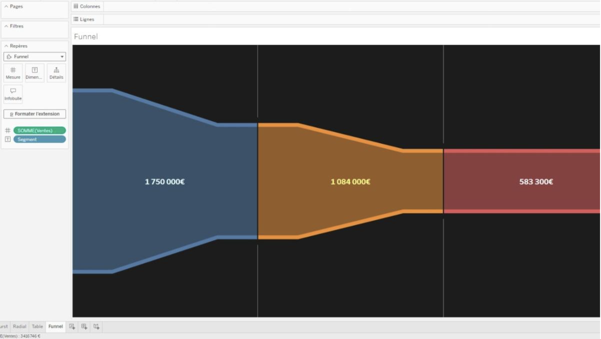
Actinvision이 Tableau에서 개발한 깔때기 차트 비주얼리제이션 확장 프로그램.
깔때기의 모양 매개 변수를 정밀 조정할 수 있는 고급 스타일 구성 기능을 갖춘 깔때기 차트 비주얼리제이션 확장 프로그램으로 데이터를 단계별로 시각화합니다. 색상 사용자 지정 및 레이블 구성 기능도 제공됩니다.
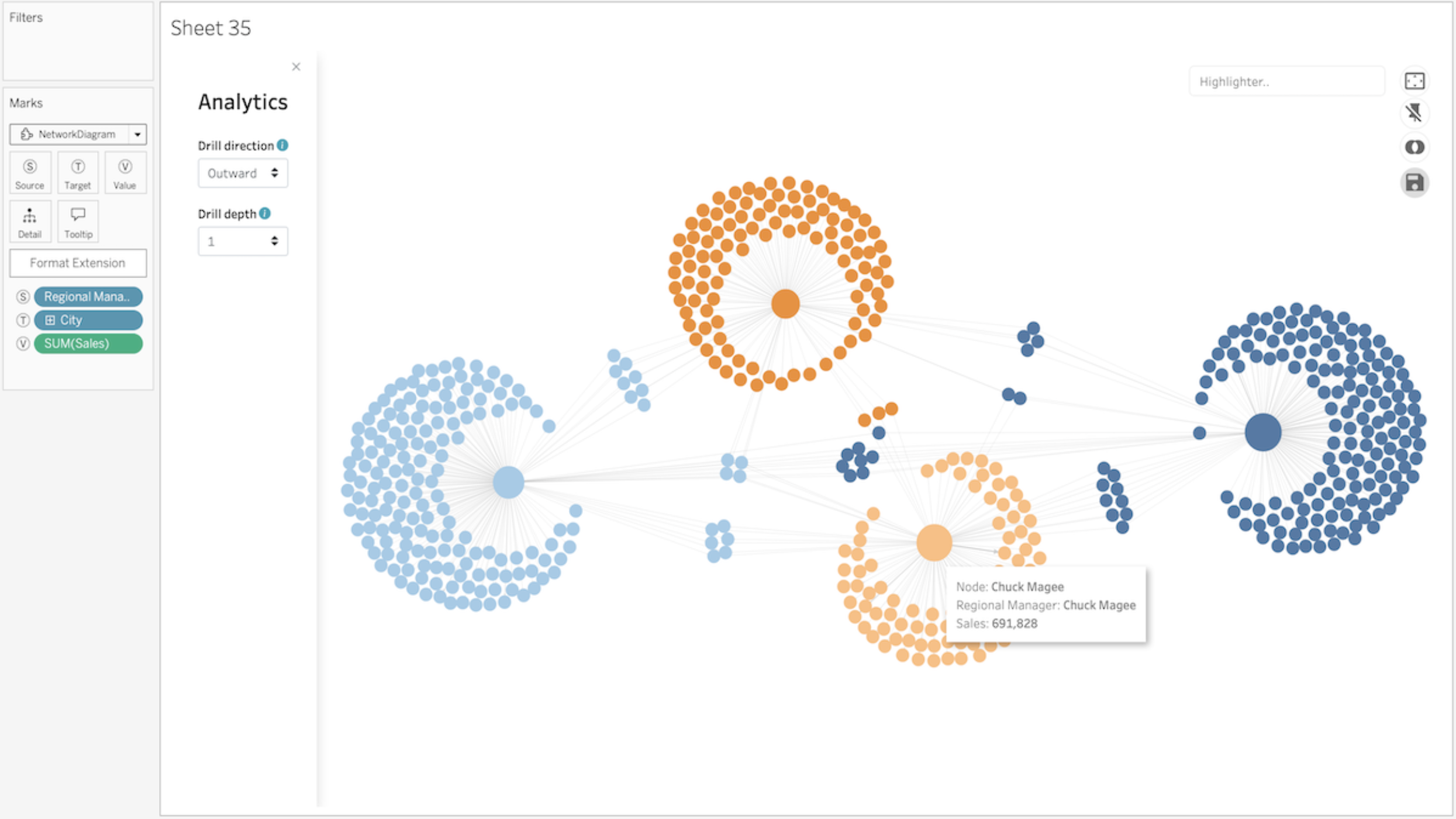
네트워크 다이어그램
LaDataViz의 네트워크 다이어그램: 데이터 내 연결과 관계를 시각화합니다.
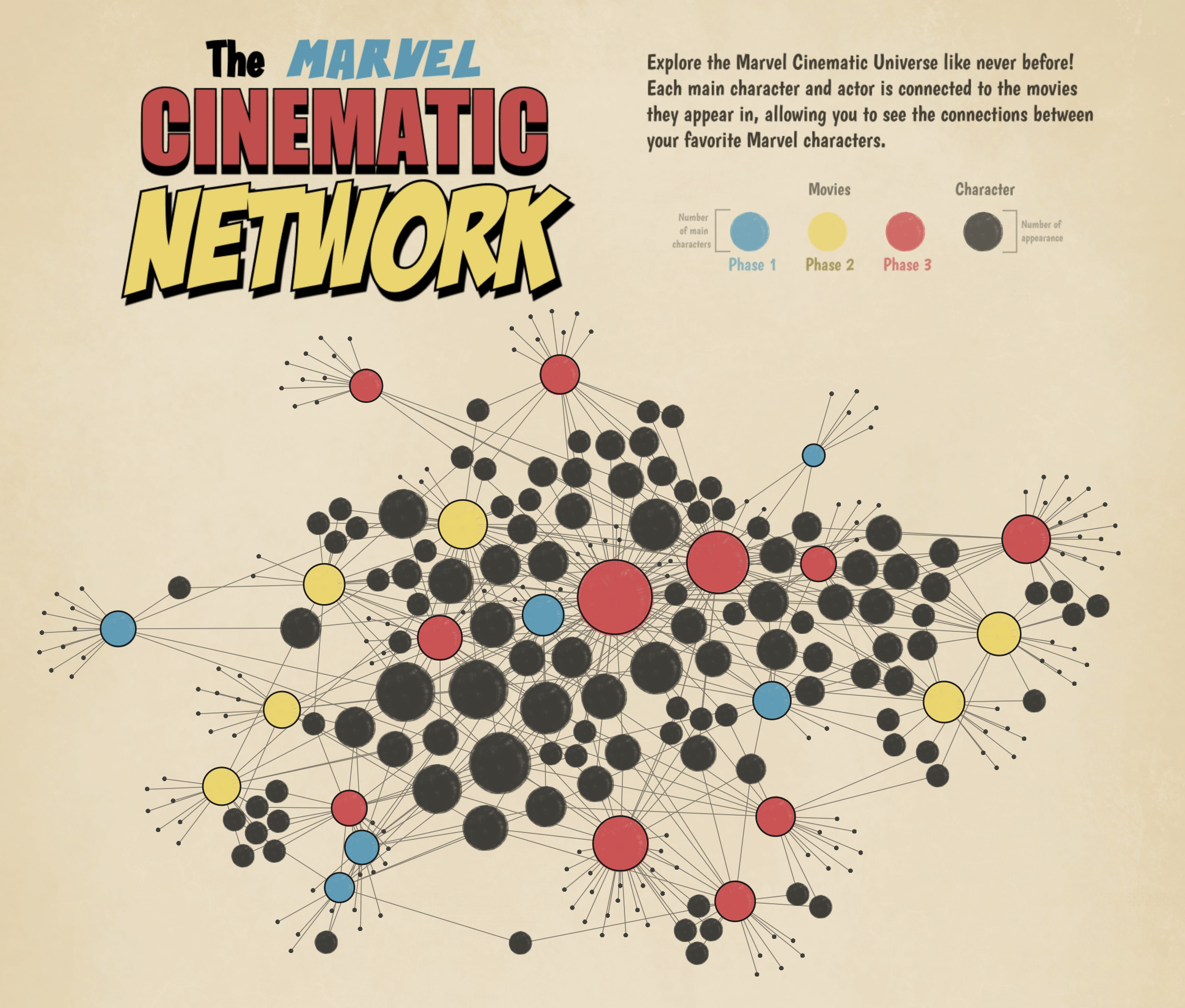
Marvel Cinematic 네트워크를 주제로 하는 Tristan Guillevin의 네트워크 차트
네트워크 차트는 소셜 네트워크 내 개인, 인프라 구성 요소, 데이터 구조 항목 등 무엇이든 개체 간의 관계를 탐색하고 제시하는 데 매우 유용합니다. 이러한 다이어그램은 상호 연결에 대한 시각적 지도를 제공하여 사용자가 데이터 요소의 상호 작용 방식과 상호 간의 영향을 이해하는 데 도움이 됩니다.
Infotopics의 네트워크 다이어그램 | Apps for Tableau: 데이터 내의 관계를 이해합니다.
Infotopics가 Tableau에서 개발한 네트워크 다이어그램 비주얼리제이션 확장 프로그램.
네트워크 다이어그램은 사용자가 데이터 간의 관계를 쉽게 이해할 수 있도록 하는 데이터 시각화 방법입니다. 네트워크 다이어그램은 노드와 경로로 구성됩니다. 노드는 경로를 통해 다른 노드에 연결된 개개의 데이터 요소입니다. 경로는 2개 이상의 노드 간 관계를 보여줍니다.
극좌표 차트
LaDataViz의 극좌표형 영역 차트: 다변량 데이터 집합을 원형 형식으로 분석하고 제시합니다.
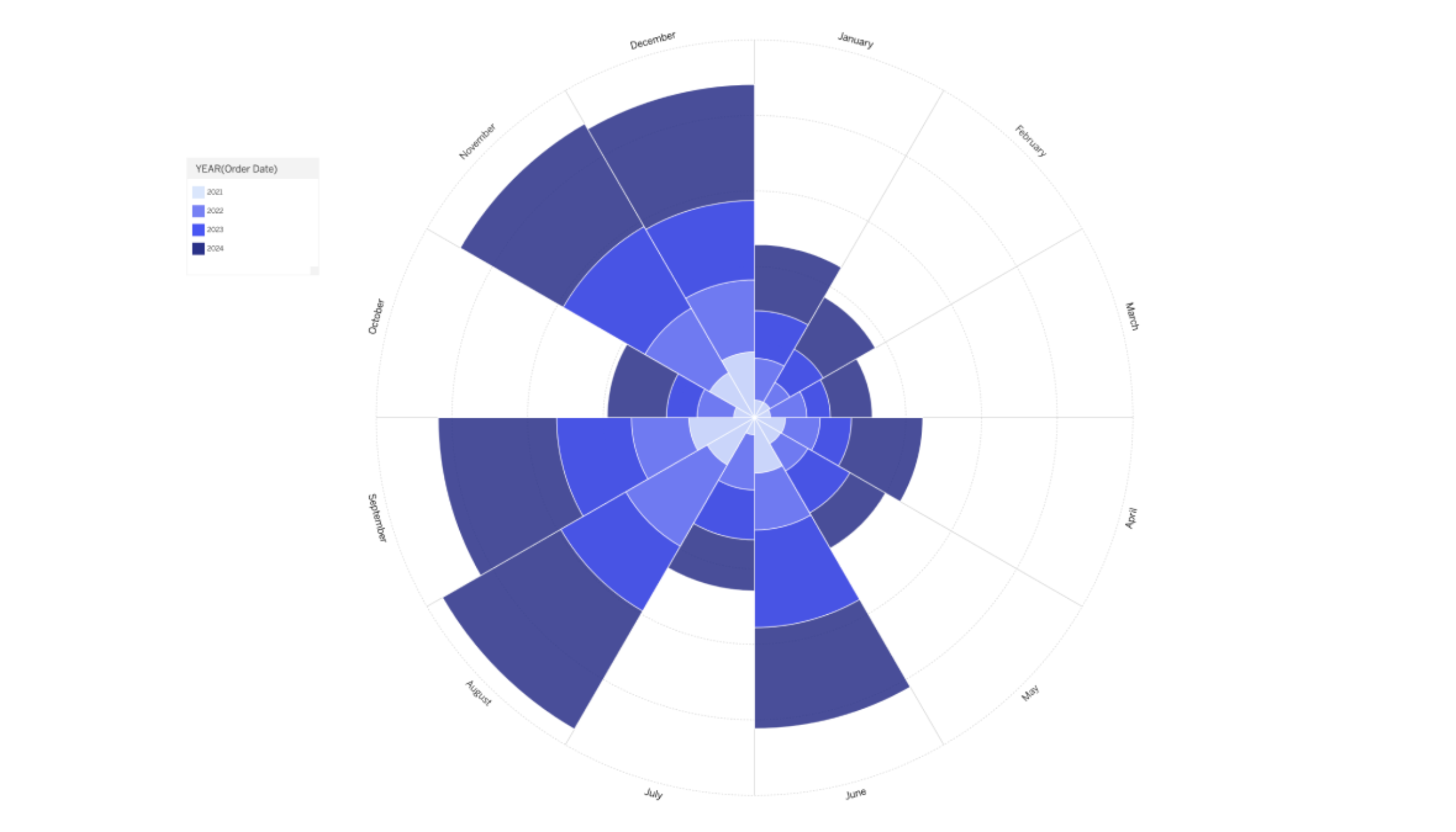
LaDataViz가 Tableau에서 개발한 극좌표형 영역 차트 비주얼리제이션 확장 프로그램.
기존의 콕스콤 차트 또는 나이팅게일 로즈 차트를 혁신적으로 개량한 Tableau용 극좌표형 영역 차트 확장 프로그램으로 데이터 시각화 도구를 강화하십시오. 이 버전은 시각적 매력을 강화하여 다변량 데이터 집합을 원형 형식으로 분석하고 제시하는 방법을 제공합니다. 극좌표 영역 차트는 비교와 추세를 강조하는 형식으로 여러 변수 간의 관계와 비율을 보여주는 데 특히 효과적입니다. 이러한 차트에서는 각 세그먼트가 나타내는 데이터에 비례하여 각 세그먼트의 반경을 변화시키는 방식으로 다양한 범주 또는 기간에 걸쳐 직관적이고 즉각적인 시각적 비교를 수행할 수 있습니다.
프로세스 차트
Infotopics의 ProcessMining | Apps for Tableau: 로그 파일 추출을 기반으로 프로세스를 시각화하고 분석합니다.
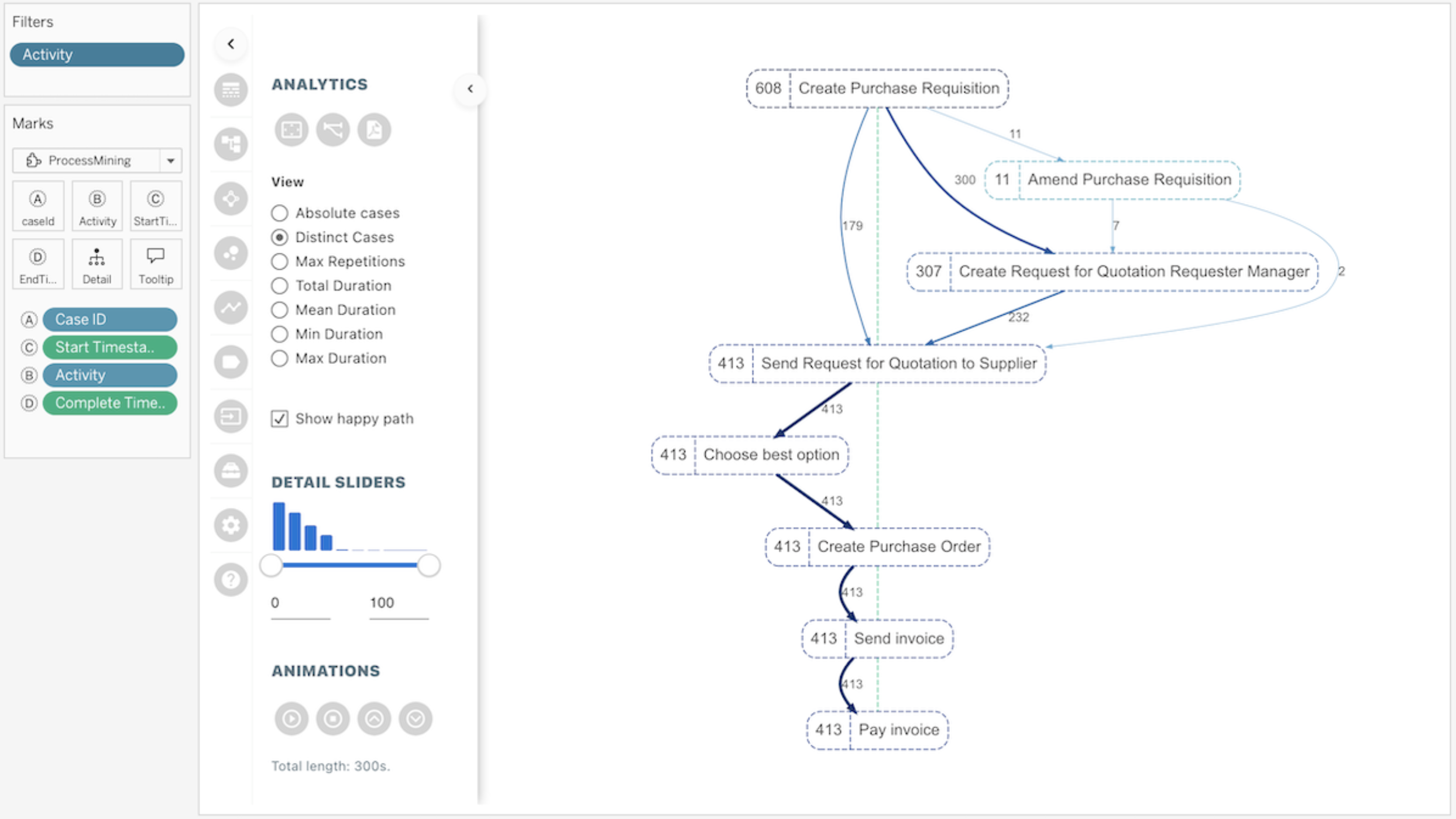
Infotopics가 Tableau에서 개발한 ProcessMining 비주얼리제이션 확장 프로그램.
이 Tableau용 ProcessMining 확장 프로그램은 프로세스를 추측하는 대신 시각화하는 데 도움이 됩니다. 규정 준수 관련 질문과 성과 관련 질문에 모두 답변하여 프로세스를 감사, 분석, 개선하십시오. 모든 하위 프로세스, 이상값, 편차, 프로세스 병목 현상 등에 대한 즉각적인 통찰력을 얻으십시오. Tableau의 대화형 기능을 사용하여 사용자가 특정 사례, 기간, 프로세스 단계(노드) 또는 프로세스의 연결(링크)을 필터링하고 확대하여 프로세스를 분석, 최적화 또는 조정할 수 있습니다.
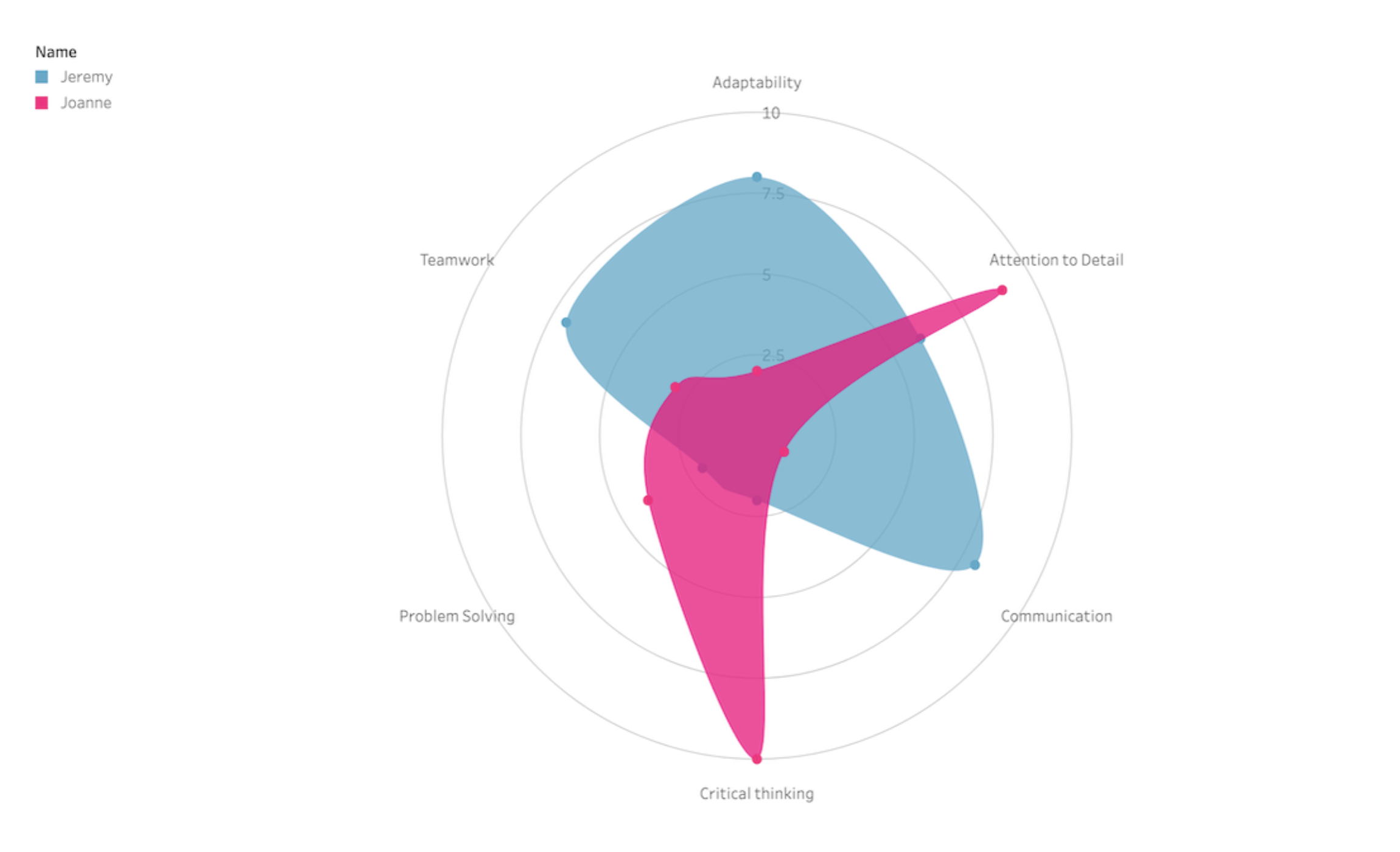
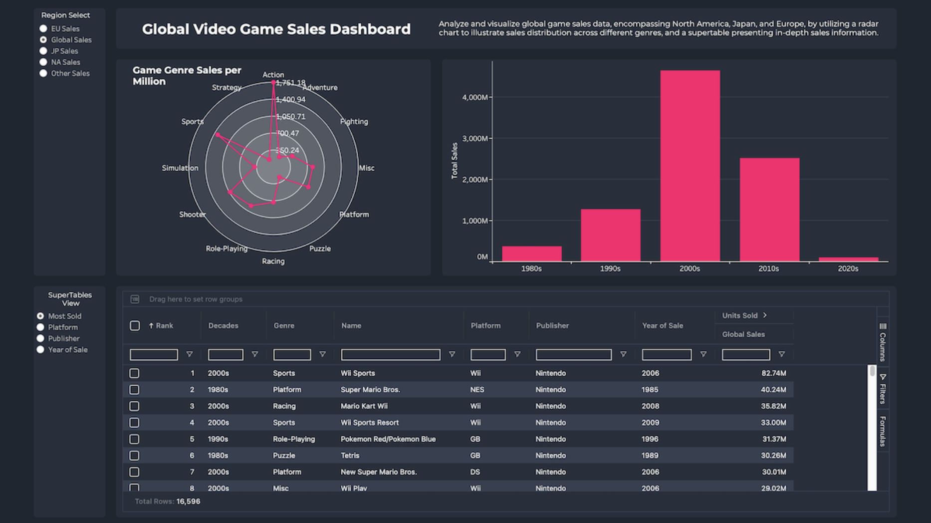
레이더 차트
LaDataViz의 방사형 차트: 하나 이상의 그룹에 속한 여러 변수를 시각화하고 비교합니다.
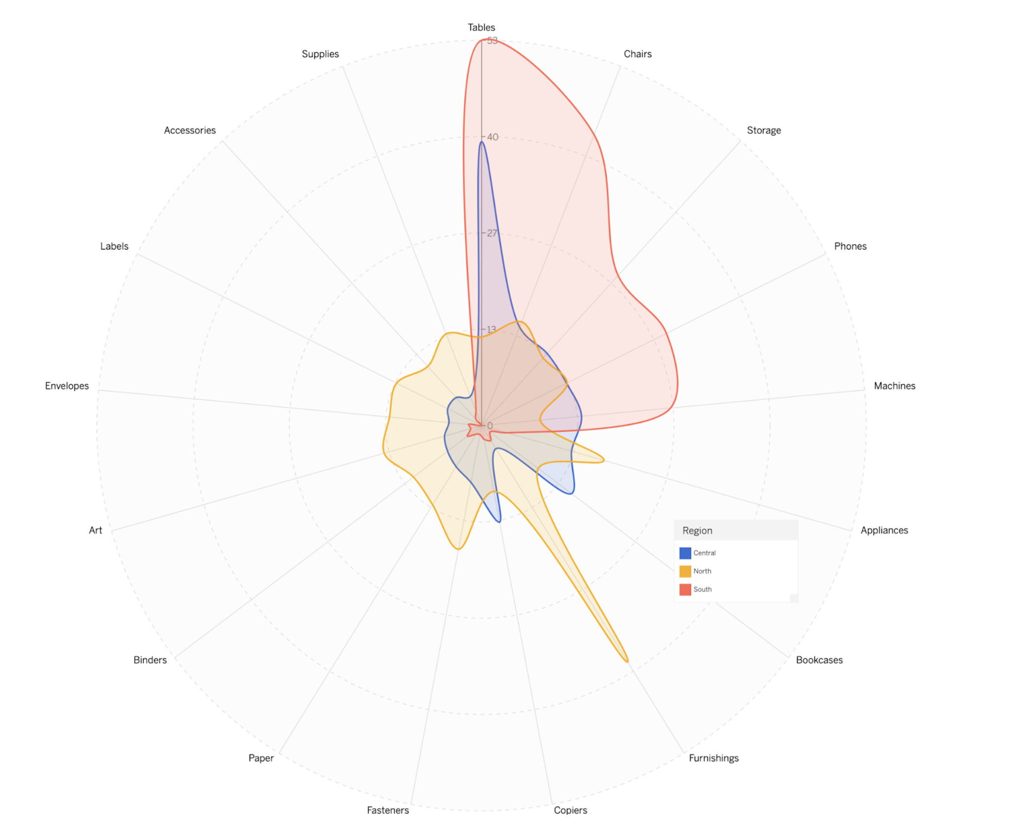
Tristan Guillevin이 만든 샘플 슈퍼스토어 방사형 차트.
방사형 차트는 여러 영역에 걸쳐 성능 메트릭을 쉽게 비교하고 대조할 수 있는 방식으로 표시하는 데 특히 유용합니다. 이러한 차트를 통해 강점과 약점을 한눈에 빠르게 파악할 수 있으므로 벤치마킹, 기술 평가 또는 다양한 범주에 걸친 상대적 성과를 시각적으로 요약해야 하는 모든 상황에 적합합니다.
Infotopics의 방사형 차트 | Apps for Tableau: 다변량 데이터를 2차원 차트로 표시하는 그래픽 표현 방법.
Infotopics가 Tableau에서 개발한 방사형 차트 비주얼리제이션 확장 프로그램.
방사형 차트는 거미줄 형태의 그래프를 사용하여 여러 범주의 데이터를 보여주는 시각적 도구입니다. 각 범주마다 고유한 축이 있는데, 축을 따라 각 범주의 값이 플로팅됩니다. 이는 다양한 제품, 팀원 또는 전략의 강점과 약점을 한눈에 비교하는 등, 다양한 개체의 성과나 특성을 비교하는 데 유용합니다.
Actinvision의 방사형 차트: 데이터를 방사형 차트로 표시합니다.
Actinvision이 Tableau에서 개발한 방사형 차트 비주얼리제이션 확장 프로그램.
Actinvision의 방사형 차트 비주얼리제이션 확장 프로그램으로 간단히 데이터를 방사형 차트로 표시해 보십시오. 방사형 차트의 모양 매개 변수를 하나하나 정밀 조정할 수 있는 고급 스타일 구성, 사전 정의된 색상표나 사용자가 선택한 색을 통한 색 사용자 지정, 점 레이블 구성 등의 주요 기능이 있습니다.
방사형 차트
Actinvision의 방사상 원형 차트: 극좌표 평면에 표시된 막대 차트.
Actinvision이 Tableau에서 개발한 방사상 원형 차트 비주얼리제이션 확장 프로그램.
원형 모양을 사용하여 다양한 범주를 비교한 결과를 보여주는 데 사용되는 방사상 원형 또는 원형 막대 차트는 단순히 직교 좌표계 대신 극좌표 평면에 표시되는 막대 차트를 지칭합니다. 나만의 차트를 만들려면 범주를 포함한 하나의 차원을 레벨 마크에 할당하고 1개 또는 여러 개의 측정값을 값 마크에 할당하십시오. Actinvision에서 만들어 호스팅한 이 확장 프로그램은 Tableau의 모든 상호 작용 기능을 활용합니다. 현재 버전에서는 아직 서식 지정 및 키보드 탐색을 지원하지 않습니다.
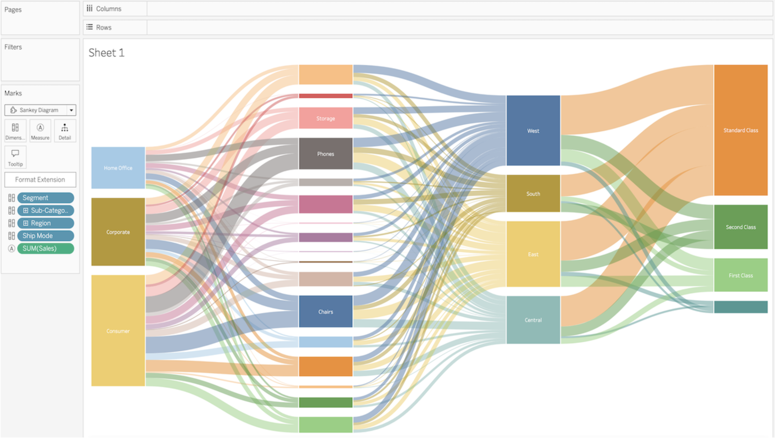
생키 차트
방Tableau의 Sankey: 여러 범주 간의 데이터 흐름을 보여줍니다.
Tableau의 Sankey 차트 비주얼리제이션 확장 프로그램.
Sankey 다이어그램은 변화 전후의 상태나 2개 이상 범주 간의 관계/전환을 보여주는 데이터 집합을 표현하기에 가장 적합합니다. 이 확장 프로그램으로 비주얼리제이션을 만들려면 레벨 인코딩 상자에 2~5개의 범주형 차원을 할당하고 링크 인코딩 상자에는 1개 또는 그 이상의 측정값을 할당하십시오. Tableau에서 만들어 호스팅하는 이 비주얼리제이션 확장 프로그램은 Tableau의 상호 작용 동작을 활용합니다.
LaDataViz의 방사상 원형 Sankey 차트: 원본과 대상 간의 상호 작용을 시각화합니다.
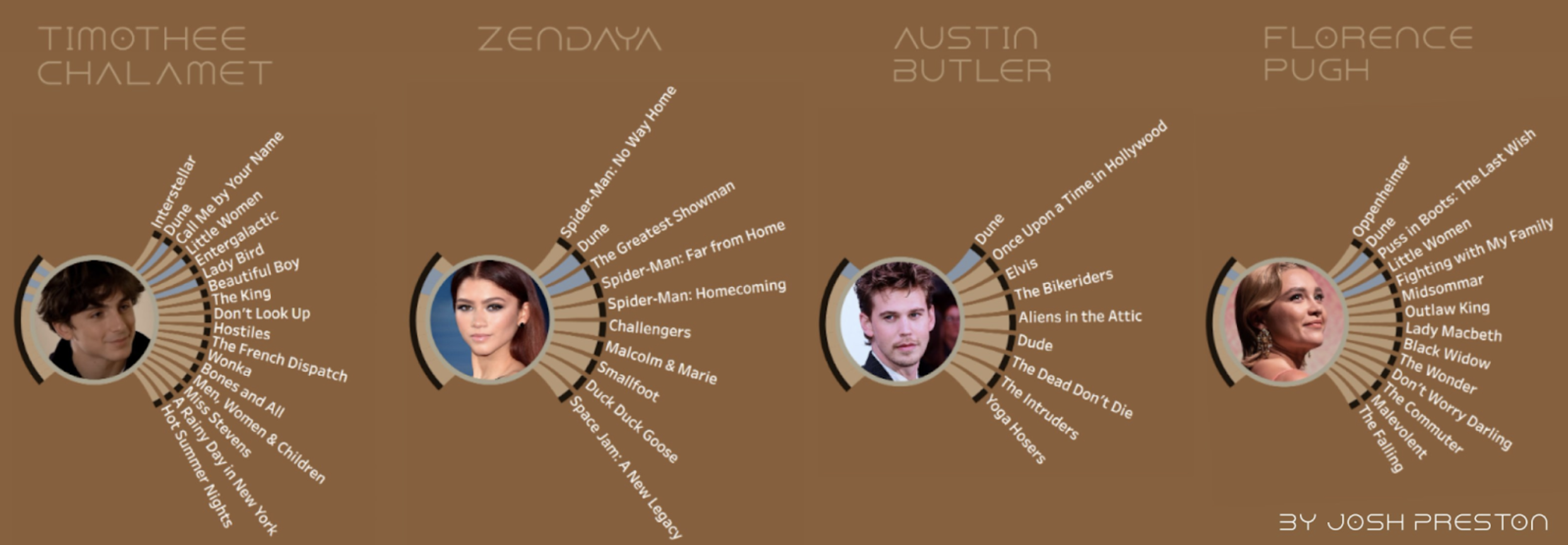
영화 듄 출연 배우를 주제로 하는 Josh Preston의 방사상 원형 Sankey 차트.
이 차트는 콤팩트한 원형 레이아웃으로 상호 연결성을 표시하는 데 탁월하므로, 데이터 흐름의 패턴, 강점, 병목 지점을 파악하는 데 매우 적합합니다. 이 형식을 사용하면 공간이 절약되며 데이터 상호 작용을 전방위적으로 확인할 수 있는 360도 뷰가 제공되므로 가독성과 참여도가 향상됩니다.
Infotopics의 Sankey 다이어그램 | Apps for Tableau: 여러 차원에 걸쳐 측정값의 흐름을 시각화합니다.
Infotopics가 Tableau에서 개발한 Sankey 다이어그램 비주얼리제이션 확장 프로그램.
Sankey 다이어그램은 여러 차원에 걸쳐 측정값의 흐름을 시각화합니다. 조직의 여러 부서를 통해 이루어지는 자금 흐름을 시각화하거나 웹사이트에서 방문자가 선호하는 경로를 확인해 보십시오.
Infotopics의 재귀적 Sankey 다이어그램 | Apps for Tableau: 데이터 집합이 시작 위치에서 목적지까지 흐르는 과정을 시각화합니다.
Infotopics가 Tableau에서 개발한 재귀적 Sankey 다이어그램 비주얼리제이션 확장 프로그램.
재귀적(원본-대상) Sankey 다이어그램은 특정 세트의 데이터가 시작 위치(원본)에서 목적지(대상)까지 흐르는 과정을 보여주는 비주얼리제이션입니다. 원본과 대상을 나타내는 노드와 이러한 노드 사이의 흐름을 나타내는 링크로 구성됩니다. 링크의 너비는 측정되는 양에 상응합니다. 이 유형의 다이어그램은 무엇보다도 시스템 내 에너지, 자금 또는 자재의 흐름을 묘사하는 데 자주 사용됩니다. 원본-대상 Sankey 다이어그램은 시스템 내 패턴과 병목 지점을 파악할 뿐 아니라 변경이나 개입의 영향을 보여주는 데도 유용합니다.
Infotopics의 원형 Sankey 다이어그램 | Apps for Tableau: 내부 루프로 여러 차원에 걸친 흐름을 시각화합니다.
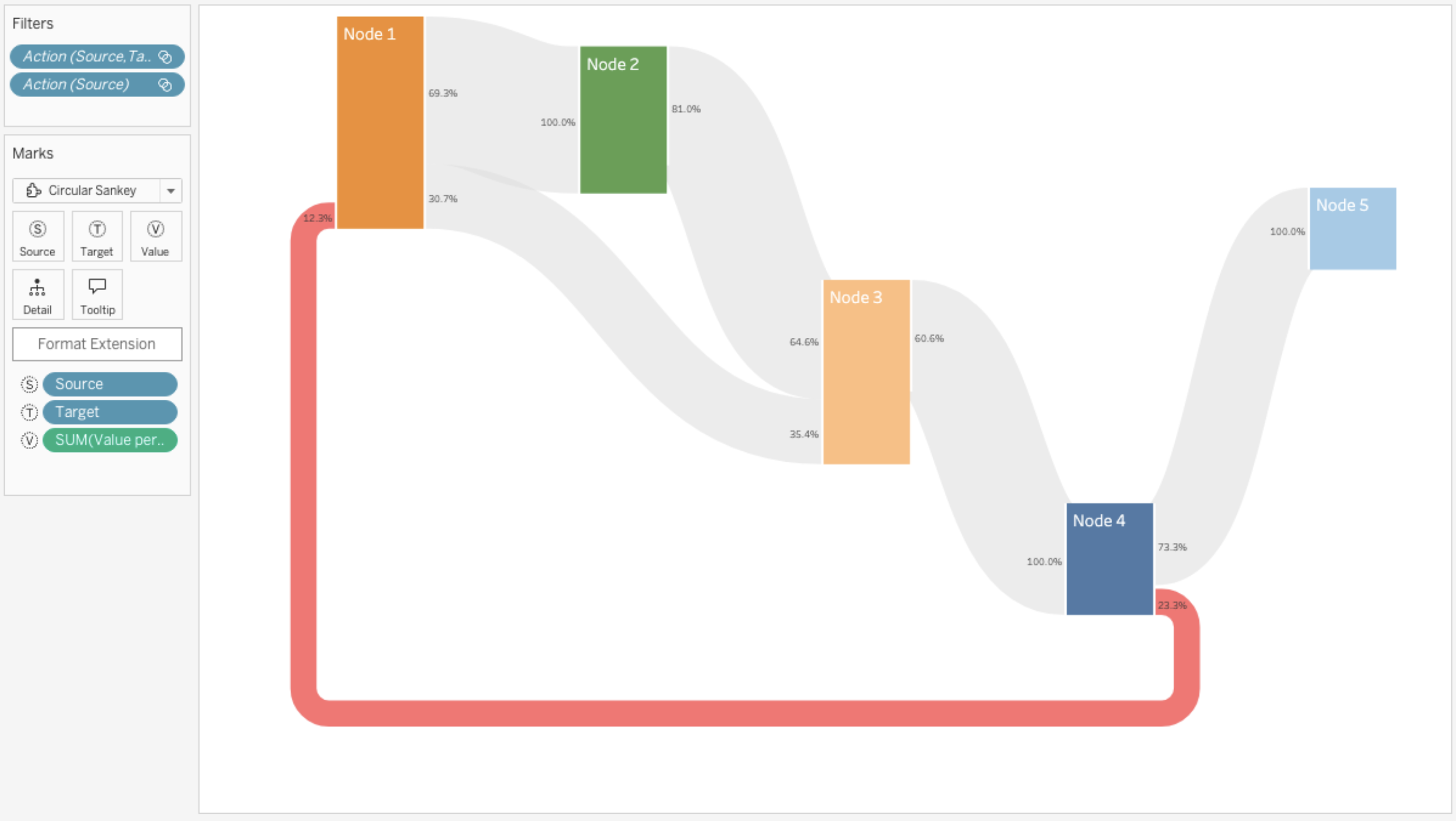
Infotopics가 Tableau에서 개발한 원형 Sankey 다이어그램 비주얼리제이션 확장 프로그램.
Sankey 다이어그램(원형)은 내부 루프로 여러 차원에 걸쳐 측정값의 흐름을 시각화합니다. Sankey 다이어그램은 화살표의 너비/높이가 유량에 비례하는 일종의 흐름도입니다.
스트림그래프 차트
LaDataViz의 스트림그래프: 시간 경과에 따른 변화와 추세를 유동적이고 유기적인 방식으로 시각화합니다.
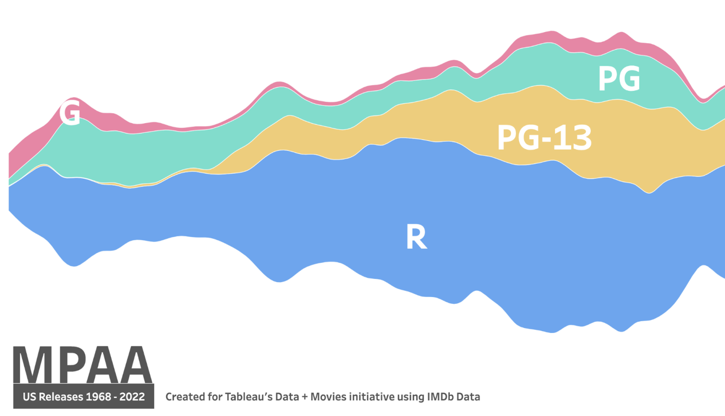
MPAA를 주제로 하는 Zach Bowders의 스트림그래프 차트.
스트림그래프는 기존의 꺾은선형 차트나 영역 차트보다 더 매력적이고 직관적인 형식으로 시계열 데이터를 표현하는 강력한 방법입니다. 누적된 레이어가 흐르는 형태로 표현되므로 손쉽게 여러 데이터 계열의 진행 상황을 이해하고 시간 경과에 따라 개별 범주가 전체에 기여하는 방식을 확인할 수 있습니다.
선버스트 차트
Actinvision의 Sunburst(확대/축소 가능): 동심원을 사용하여 계층적 데이터를 시각화합니다.
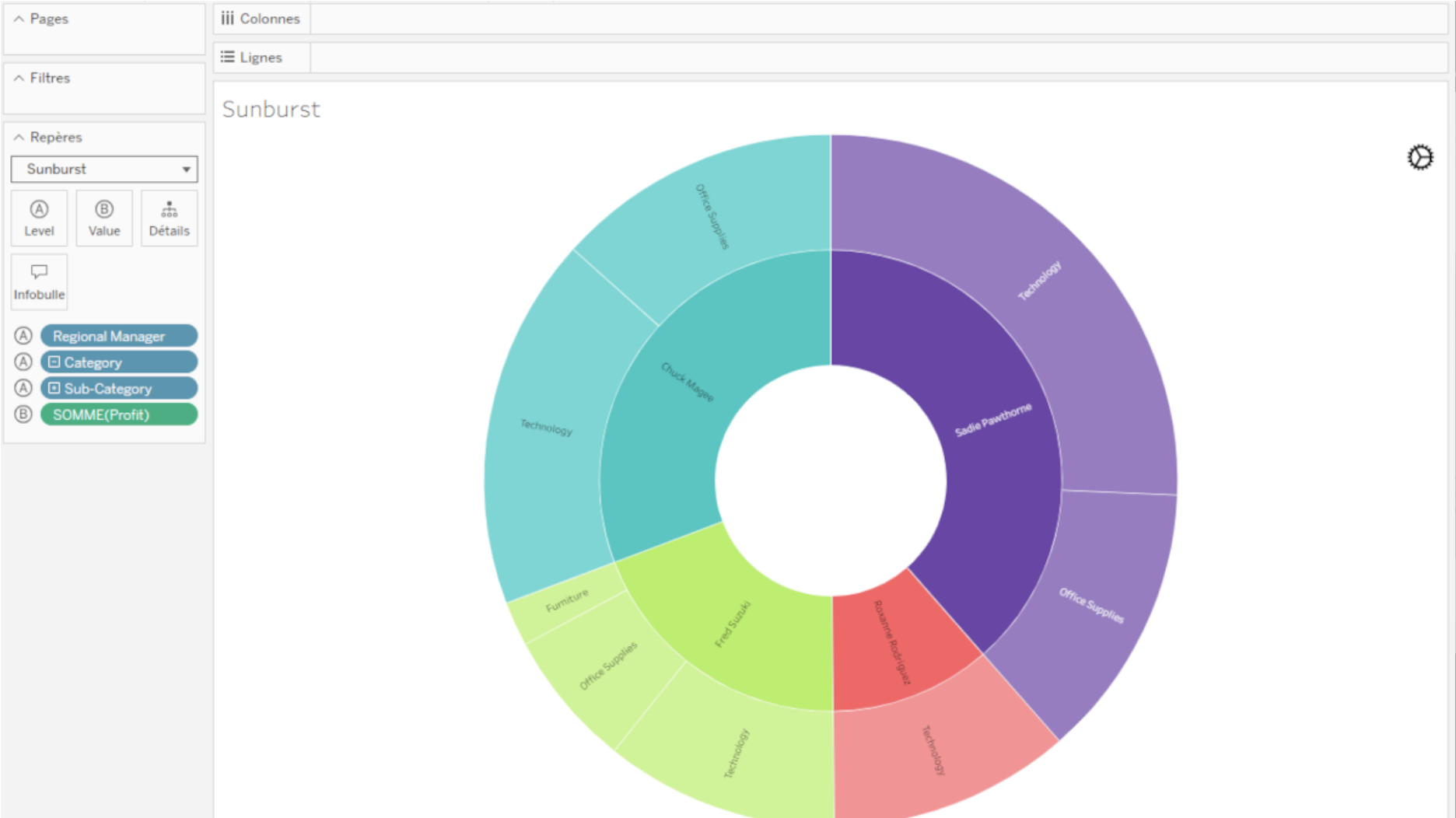
Tableau에서 Actinvision 비주얼리제이션 확장 프로그램으로 만든 Sunburst 차트(확대/축소 가능).
Sunburst 다이어그램은 동심원을 사용하여 계층적 데이터를 시각화하는 데 사용됩니다. 한가운데 원은 최상위 계층 수준을 나타내며, 중심에서 멀어질수록 점점 더 하위 계층으로 내려갑니다. 이 비주얼리제이션 확장 프로그램은 한 번에 2가지 수준을 표시하므로, 사용자는 특정 범주를 클릭하여 드릴다운할 수 있습니다.
Infotopics의 Sunburst 다이어그램 | Apps for Tableau: 각 범주 노드별로 잘린 형태로 일련의 고리를 통해 계층을 표시합니다.
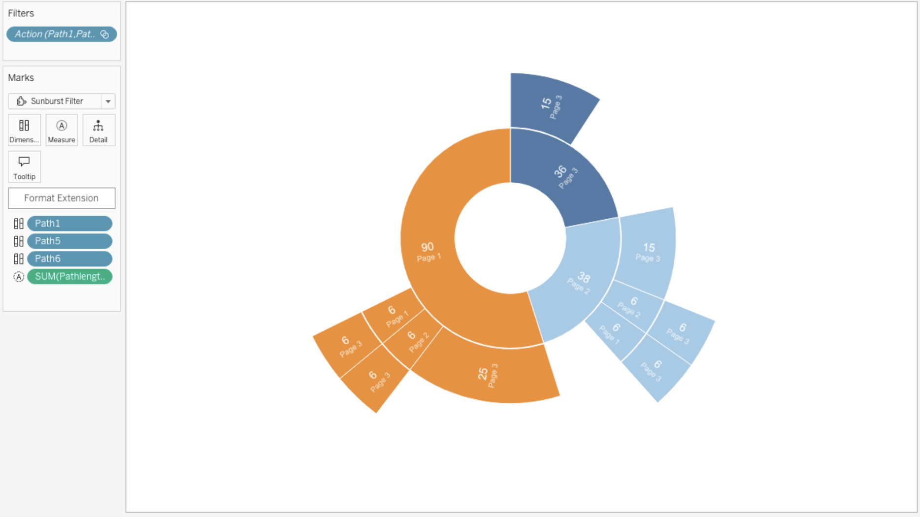
Tableau에서 Infotopics가 만든 Sunburst 다이어그램.
이 유형의 비주얼리제이션은 각 범주 노드별로 잘린 형태로 된 일련의 고리를 통해 계층을 표시합니다. 각각의 링은 계층 구조에서 하나의 수준에 해당하는데, 가운데 원은 루트 노드를 나타내며 루트 노드에서 계층이 바깥쪽으로 뻗어 나가는 형태입니다. 링은 상위 슬라이스와의 계층 관계를 기준으로 잘리고 분할됩니다. 각 슬라이스의 각도는 상위 노드 아래에서 균등하게 분할되거나 어떤 값에 비례하도록 설정할 수 있습니다.
Infotopics의 확대/축소 가능한 Sunburst 다이어그램 | Apps for Tableau: 데이터를 방사상 원형 레이아웃으로 표현합니다.
Infotopics의 Tableau용 확대/축소 가능 Sunburst 비주얼리제이션 확장 프로그램을 활용한 비주얼리제이션.
양파의 인엽(계층 형태의 비늘잎)이나 나무의 나이테를 닮은 방사상 원형의 레이아웃으로 데이터를 표현하는 계층적 비주얼리제이션. 이 비주얼리제이션 유형은 중첩된 링으로 구성되고 각 링은 계층의 한 수준을 나타내는데, 맨 안쪽 링은 보통 루트 수준을 나타내고 그 다음에 이어지는 링들은 하위 범주 또는 하위 그룹을 나타냅니다. 링 내부 각 세그먼트의 크기는 해당 세그먼트가 나타내는 데이터의 비율에 해당하며, 색이나 음영을 통해 추가 정보 또는 범주를 전달할 수 있습니다. Sunburst 다이어그램은 조직도, 디렉터리 구조 또는 계층 분류와 같은 계층적 데이터 구조를 시각화하는 데 흔히 사용되며, 이를 통해 사용자가 직관적이고 시각적으로 매력적인 방식으로 데이터의 구성과 관계를 탐색할 수 있습니다.
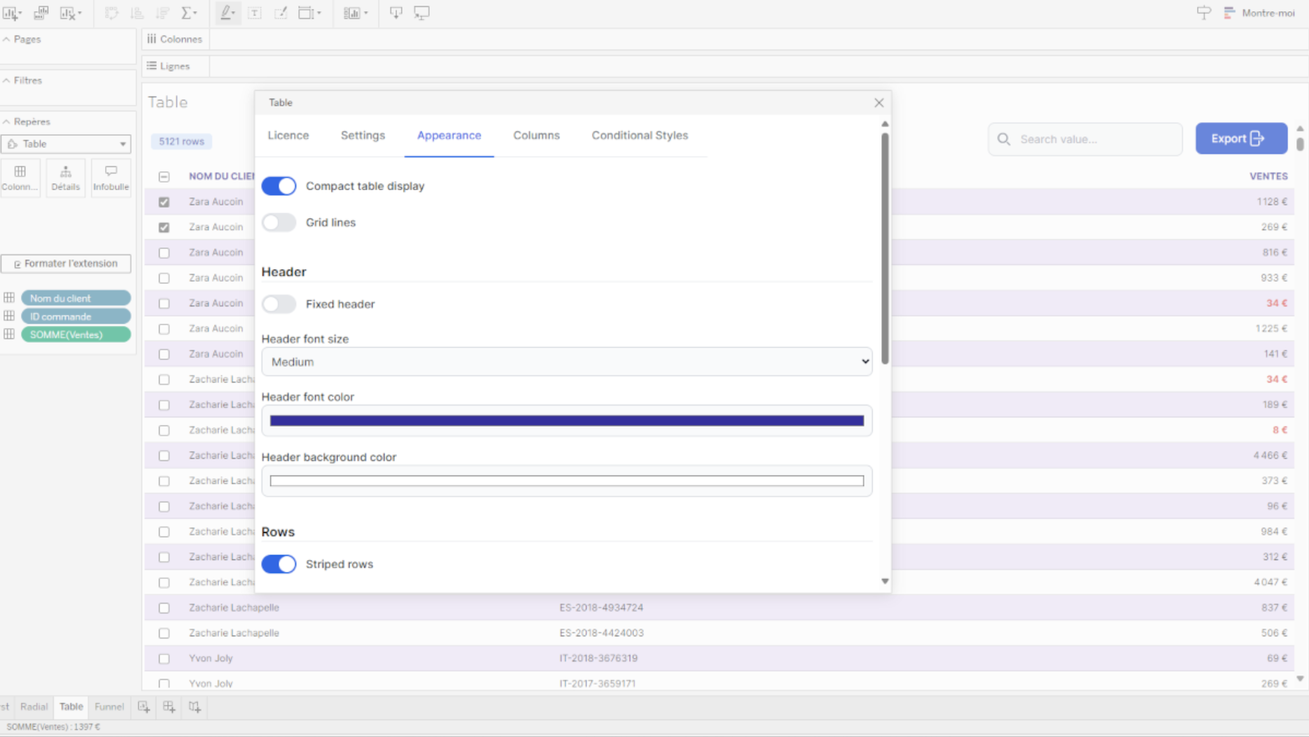
테이블 비주얼리제이션
Infotopics의 SuperTables | Apps for Tableau: 대화형 테이블로 비주얼리제이션을 지원하는 데이터를 분석하고 더 알아보십시오.
Infotopics에서 개발한 Tableau용 SuperTables Tableau 확장 프로그램.
Tableau에서 직접 데이터를 구성하고 분석할 수 있는 유연성을 제공하는 Excel과 유사하며 동적인 테이블로 대시보드 사용자의 역량을 강화합니다. SuperTables를 사용하면 데이터를 그룹화하고, 테이블을 피벗하고, 인라인 열 필터를 적용하고, 행을 확장하고, PDF, CSV 또는 Excel로 내보낼 수 있습니다. 이 도구는 추가적인 컨텍스트와 유연성으로 대시보드 기능을 강화하여 집계 데이터에 대한 정확한 계산을 보장하는 대시보드 작업을 지원합니다.
Actinvision에서 만든 테이블: 데이터를 성능 친화적인 간단한 테이블로 표시.
Actinvision이 Tableau에서 개발한 Tableau 비주얼리제이션 확장 프로그램.
데이터를 테이블 형식으로 간단히 표시합니다. 이 비주얼리제이션 확장 프로그램은 성능 지향적이며 사용자 지정 가능합니다. 필요에 맞게 스타일 설정을 간편하게 조정하고 대시보드 디자인을 통합하십시오. 열 이름을 바꾸고 셀 스타일을 변경할 수도 있습니다.
트리 다이어그램
LaDataViz의 트리 다이어그램: 계층적 정보를 시각화합니다.
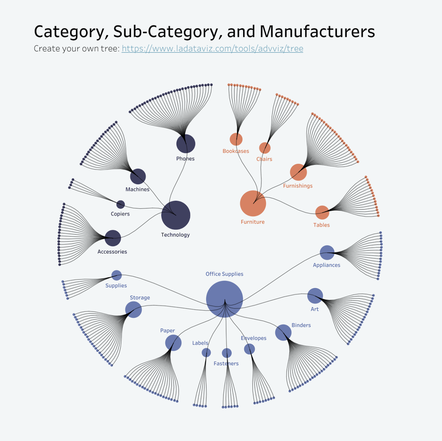
Tristan Guillevin의 제품 방사상 원형 트리.
계층적 정보를 명확하고 매력적인 형식으로 구성하고 표시하여 관심을 끌고 더욱 심층적인 분석을 손쉽게 수행할 수 있습니다. 트리 다이어그램은 복잡한 시스템을 관리 가능한 여러 부분으로 나누어 분석하는 데 매우 탁월합니다. 조직도, 웹사이트 사이트맵, 프로젝트 작업 등의 구조를 시각화하는 데 도움이 되므로, 사용자가 관계와 종속성을 직관적으로 탐색할 수 있습니다.
LaDataViz의 보로노이 트리맵: 독특하고 매력적인 보로노이 레이아웃을 통해 계층적 데이터를 시각화합니다.
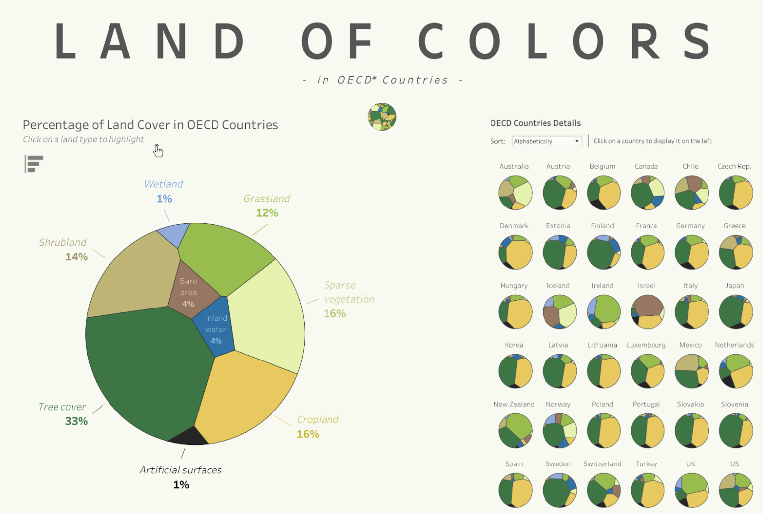
Tristan Guillevin의 'Land of Colors'(색의 땅)를 주제로 하는 보로노이 트리맵
중첩된 데이터를 시각적으로 매력적이면서도 유익한 방식으로 제시하는 데 적합한 보로노이 트리맵은 Tableau 대시보드에 새로운 관점을 더해줍니다. 이 차트 유형은 다양한 세부 수준의 계층 구조 데이터를 표시하는 데 특히 효과적입니다.
Infotopics의 DrillDownTree | Apps for Tableau: 여러 차원에서 데이터를 시각화하고 집계할 수 있으며 원하는 순서로 드릴다운할 수 있습니다.

Tableau의 DrillDownTree 비주얼리제이션 확장 프로그램.
DrillDownTree 확장 프로그램은 드릴다운 동작을 통해 데이터에 대한 개선된 인사이트를 제공합니다. 이 확장 프로그램은 애드혹 분석과 근본 원인 분석을 수행하는 데 매우 유용한 데이터 탐색 도구입니다. 어떤 측정값이라도 원하는 차원으로 드릴다운하고 계층을 미리 설정할 필요 없이 여러 차원에서 데이터를 시각화할 수 있습니다.
벤 다이어그램
Infotopics의 벤 다이어그램 | Apps for Tableau: 데이터 집합 간의 관계를 설명하는 데 사용되는 그래픽 표현.
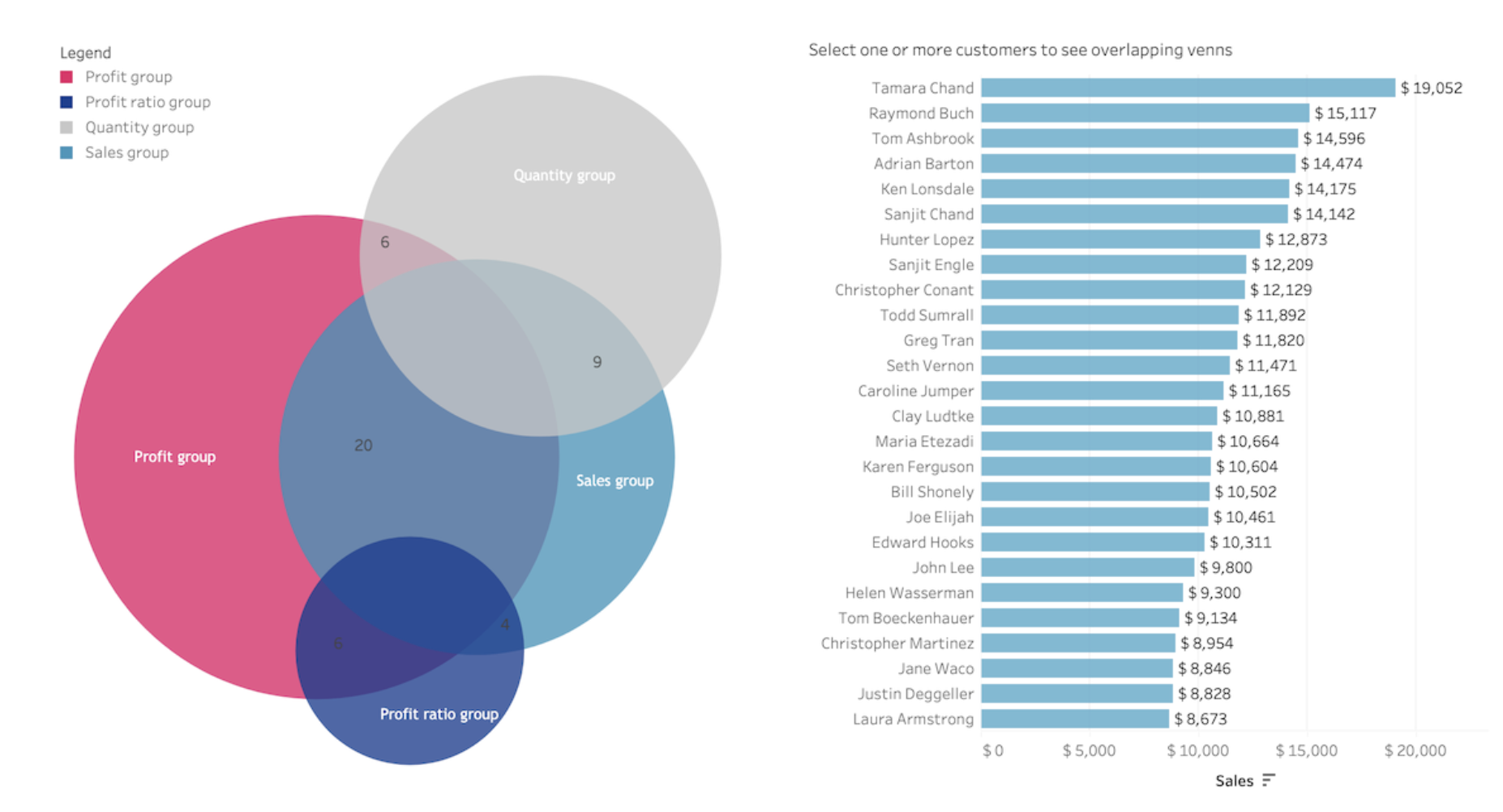
Infotopics가 Tableau에서 개발한 벤 다이어그램 비주얼리제이션 확장 프로그램.
벤 다이어그램은 다양한 데이터 집합이나 데이터 그룹 간의 관계를 설명하는 데 사용되는 그래픽 표현입니다. 겹치는 원이나 다른 모양으로 구성되는데, 각 도형은 하나의 집합을 나타내고 도형끼리 겹치는 영역은 집합 간의 교집합 또는 공통 원소를 나타냅니다. 벤 다이어그램은 일반적으로 수학, 논리, 통계 및 다양한 분야에서 논리적 관계를 시각화하고, 다양한 그룹 간의 공통 요소나 서로 다른 요소를 식별하고, 문제 해결 및 의사 결정 과정을 지원하는 데 사용됩니다.
대시보드 최적화를 위한 비주얼리제이션 확장 프로그램
LaDataViz의 드릴다운 필터: 고급 드롭다운 필터 메뉴를 추가합니다.

LaDataViz가 Tableau에서 개발한 드릴다운 필터 비주얼리제이션 확장 프로그램.
직관적이고 사용하기 쉬운 드릴다운 필터 메뉴를 통해 사용자 상호 작용을 향상하도록 설계된 드릴다운 필터 확장 프로그램으로 Tableau 대시보드를 최적화합니다. 이 확장 프로그램은 대시보드 내에서 직접 여러 세부 수준에 걸쳐 동적 필터링을 활성화함으로써 복잡한 데이터 집합 탐색을 간소화합니다.
Infotopics의 WriteBackExtreme | Apps for Tableau: Tableau 대시보드에서 직접 협업합니다.

Infotopics가 Tableau에서 개발한 WriteBackExtreme 비주얼리제이션 확장 프로그램.
Tableau에서 계속 머물며 흐름을 유지하십시오. 범주, 주문일 월, 관리자 등 대시보드의 모든 데이터 요소에 간편하게 협업 기능을 추가합니다.
Infotopics의 PictureThis | Apps for Tableau: 데이터를 기반으로 동적 이미지 테이블/카드를 생성합니다.
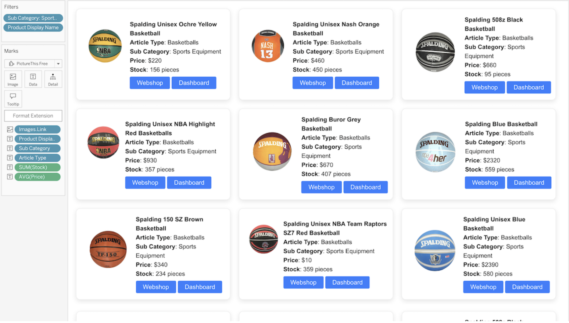
Infotopics가 Tableau에서 개발한 PictureThis 비주얼리제이션 확장 프로그램.
대시보드에서 필터로 사용할 수 있으며 익숙한 Tableau 환경 내에서 모든 것이 관리되고 보호되는 동적 이미지 테이블과 그리드를 생성하십시오. 데이터 집합에서 반응형 이미지 테이블 또는 그리드를 자동으로 생성하는 이미지 URL을 사용합니다. 이미지는 대시보드의 다른 대상 시트에서 필터 역할을 합니다. 이미지는 대시보드에 저장되지 않고, 데이터에 따라 이미지 테이블에서 동적으로 나열되며, 필터로 사용될 수 있습니다! 이 확장 프로그램은 테이블 레이아웃, 카드 레이아웃 및 고급 레이아웃 옵션을 지원합니다.
폭포형 차트 및 KPI 차트
LaDataViz의 게이지: 메트릭 및 KPI의 상태를 즉시 전달합니다.
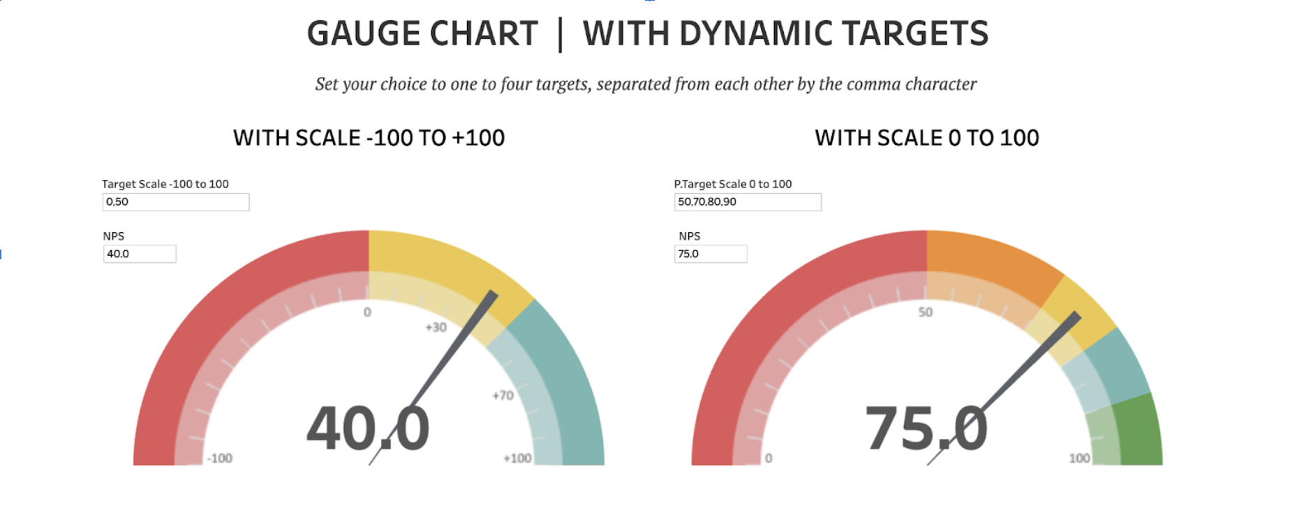
동적 목표를 주제로 하는 Rosario Gauna의 게이지 차트.
게이지는 목표나 목적 대비 진행 상황을 측정하는 데이터를 표시하는 데 적합합니다. 영업 실적, 완료율 등의 메트릭이나 미리 정의된 목표와 값을 비교하는 기타 모든 메트릭의 상태를 즉시 전달하는 데 탁월한 도구입니다. 이러한 차트는 시각적으로 매력적이고 이해하기 쉬운 형식으로 진행 상황을 명확하고 간결하게 시각화하여 보여주므로, 요약 대시보드 및 성과 모니터링 보고서에 매우 적합합니다.
Infotopics의 폭포형 차트 | Apps for Tableau: 순차적으로 도입되는 양수 값 또는 음수 값의 누적 효과를 파악할 수 있습니다.
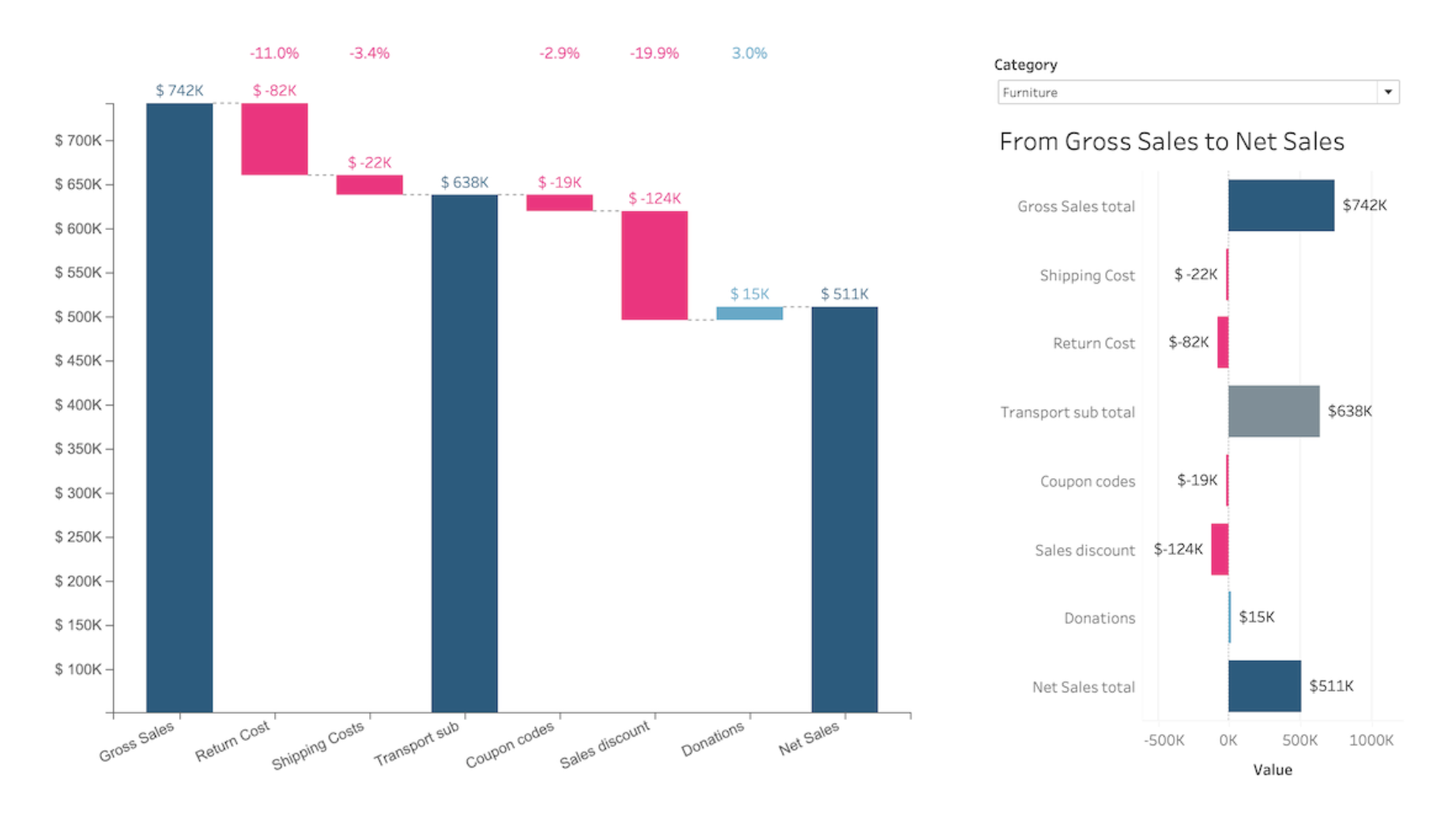
Infotopics가 Tableau에서 개발한 폭포형 비주얼리제이션 확장 프로그램.
폭포형 차트는 순차적으로 도입되는 양수 값 또는 음수 값의 누적 효과를 파악하는 데 도움이 되는 데이터 시각화 방식입니다. 이러한 중간값은 시간 기반이거나 범주 기반일 수 있습니다. 폭포형 차트는 기둥(벽돌)이 공중에 떠 있는 것처럼 보이기 때문에 날아다니는 벽돌 차트 또는 마리오 차트라고도 불립니다. 금융 분야에서는 브리지라고 지칭하는 경우도 많습니다. 폭포형 차트는 분석 목적으로, 특히 증가하거나 감소하는 개체의 수량 값의 점진적인 변화를 이해하거나 설명하는 데 사용할 수 있습니다. 폭포형 차트 또는 계단식 차트는 두 기간 사이의 매출이나 수익 변화를 보여주는 데 사용됩니다.
DataMa의 폭포형 및 KPI 트리: DataMa의 "내 변동성의 원인은 무엇일까요?": KPI 변동의 원인을 알아보십시오.
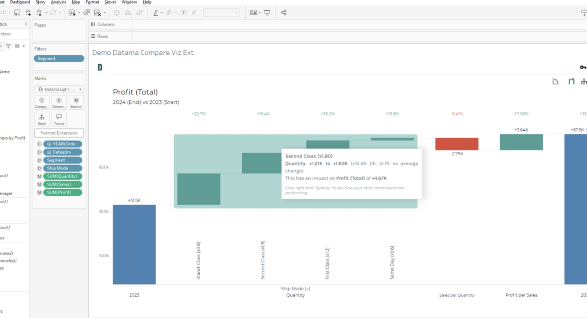
DataMa가 Tableau에서 개발한 폭포형 및 KPI 트리 비주얼리제이션 확장 프로그램.
핵심 성과 메트릭에 대한 강력한 인사이트를 활용할 수 있도록 설계된 이 비주얼리제이션 확장 프로그램으로 데이터 분석을 강화하십시오. 이 도구는 신속하고 지능적인 근본 원인 분석에 탁월하며, 비즈니스에 가장 큰 영향을 미치는 동인을 점수로 매기고 강조 표시합니다. 이를 통해 데이터 기반 의사 결정을 더욱 효과적으로 내릴 수 있습니다.
Infotopics의 PowerKPI | Apps for Tableau: 전략적 인사이트를 통합합니다.
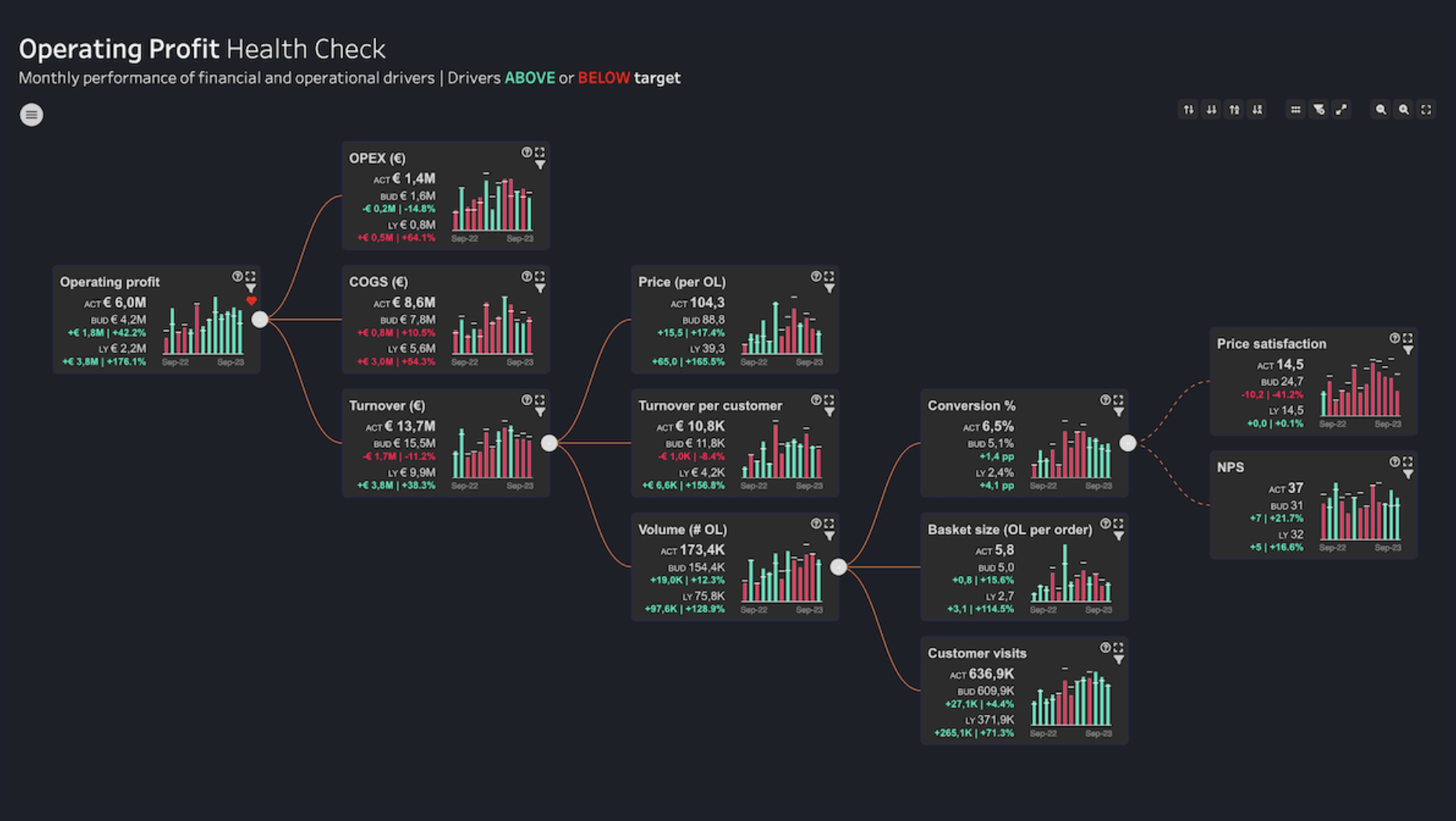
Infotopics가 Tableau에서 개발한 PowerKPI 비주얼리제이션 확장 프로그램.
Tableau에서 분석을 위한 새로운 중심 진입점으로 PowerKPI를 사용하십시오. PowerKPI는 다양한 KPI 간의 연결 관계를 매력적인 그리드 레이아웃 또는 밸류 드라이버 트리로 보여주는 강력한 플랫폼을 제공하여 데이터 기반 의사 결정에 귀중한 컨텍스트를 더해줍니다. PowerKPI는 최상위 수준 요약 정보부터 운영상의 특정 동인에 대한 세부 설명까지, 직관적인 단일 인터페이스를 통해 비즈니스 성과에 대한 설득력 있는 스토리를 전달하는 능력을 강화해 줍니다.
Actinvision의 불릿 차트: 매우 자유롭게 사용자 지정할 수 있는 불릿 차트.
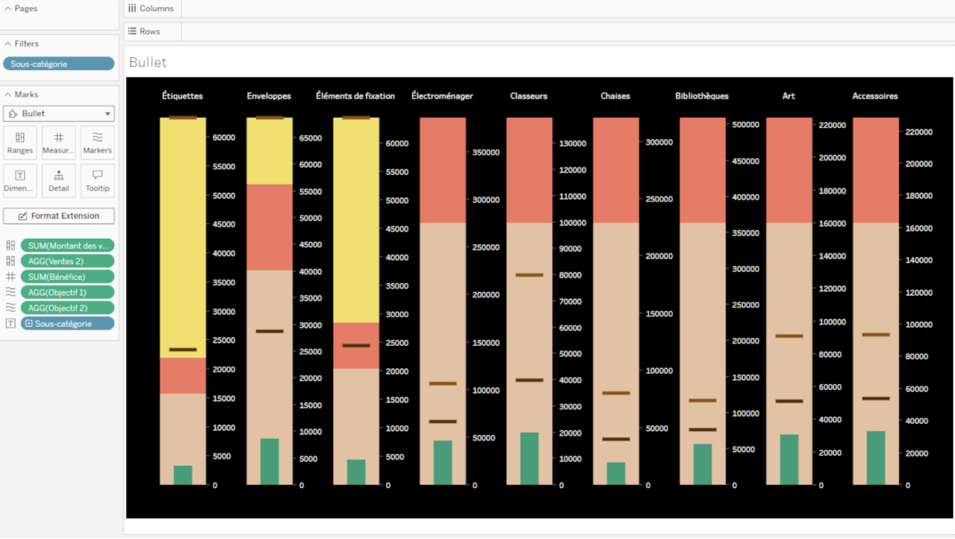
Actinvision이 Tableau에서 개발한 불릿 비주얼리제이션 확장 프로그램.
불릿 비주얼리제이션 확장 프로그램을 사용하면 향상된 사용자 지정을 위한 강력한 기능으로 데이터를 불릿 차트에 수월하게 표시할 수 있습니다. 고급 불릿 스타일 구성으로 여백부터 막대 방향까지 차트 모양의 모든 측면을 정밀 조정할 수 있습니다. 또한 이 확장 프로그램은 간편한 색 사용자 지정 기능을 제공하므로, 미리 정의된 색상표에서 선택하거나 텍스트, 배경, 범위, 마커 및 측정값에 대해 정확한 색을 정의하여 차트의 시각적 표현을 완벽하게 제어할 수 있습니다.
관련 스토리

9 Tips to Succeed in a Tableau DataDev Hackathon
 2025/01/08

A Guide to Mapping and Geographical Analysis in Tableau
 2024/11/15

Making Tables Smarter: Key Features of the Tableau Table Viz Extension
 2024/11/14