Your guide to Tableau Viz Extensions
Tableau Visionary Tristan Guillevin and DataDev Ambassador Jessica Bautista co-run LaDataViz, a data visualisation studio and Tableau Developer Partner.
Since Tableau’s first release in 2004, all visualisations created inside worksheets have been rendered using VizQL, a breakthrough technology that allows you to create a chart with a simple drag and drop. I still remember building my first visualisation in Tableau and thinking, "Wow, is that so easy?"
And most of the time, it is indeed that easy! However, after using Tableau for some time, we all eventually want to build a doughnut chart, be asked to create a Sankey or need a network diagram, and for that, things can get a little more complicated.
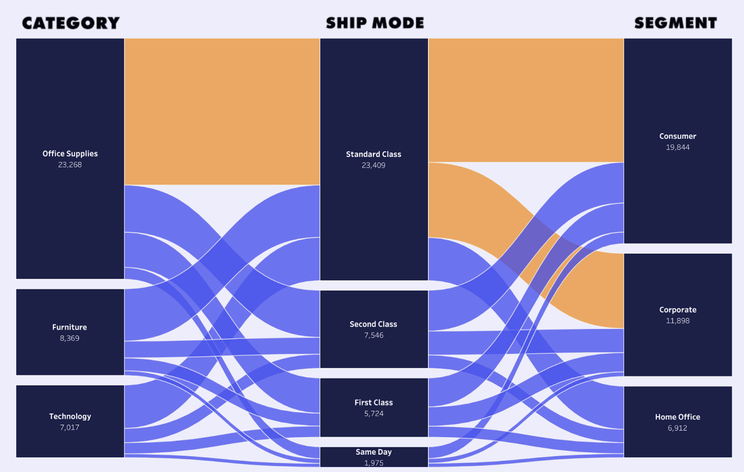
Delivery Sankey chart by Tristan Guillevin.
Thanks to the Tableau Community, blogs and YouTube videos, we always find a way to do it. Still, it often involves hacks, data densification or other complicated techniques that just feel off compared to the ease of making simple charts.
Or at least, that's how it used to feel.
Twenty years have passed since Tableau 1.0 and VizQL, and the next revolution, Viz Extensions, is now available in Tableau 2024.2. Say hello to complex charts, as easy as drag and drop.
What are Viz Extensions?
Viz Extensions expand Tableau’s visualisation options, making it easier for anyone to create new visualisation types without any calculations or templates.
Viz Extensions are available directly from your worksheet in Tableau. Select the chart you want to create and simply drag and drop your data fields into the Marks cards to generate a custom visualisation, filter your data or select a data point to trigger an action. It’s Tableau as you know it, but for any chart you can dream of.
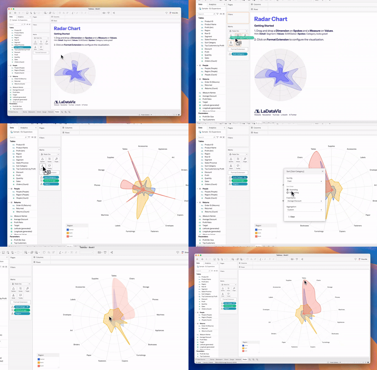
Walkthrough of LaDataViz radar chart.
Each Viz Extension is a new custom chart built by a developer. Do you need to compare football players' statistics? Use the Radar Viz Extension. Do you need to visualise the connections between many data points? Use the Network Viz Extension. It really is that easy.
Finally, for us at LaDataViz, Viz Extensions are everything we hoped for in the evolution of Tableau. We had already created a tool for the community to generate advanced charts in Tableau, but Viz Extensions allowed us to go further than we had hoped.
Available Viz Extensions
Tableau and developer partners LaDataViz, AppsForTableau, Actinvision and DataMa have created viz extensions that are all now available on the Tableau Exchange. Dive into a roundup of the Viz Extensions available, categorised by chart type.
- Beeswarm Chart
- Bump Chart
- Chord Diagrams
- Funnel Chart
- Network Diagrams
- Polar Chart
- Process Chart
- Radar Charts
- Radial Chart
- Sankey Charts
- Streamgraph Chart
- Sunburst Charts
- Table Visualisations
- Tree Diagrams
- Venn Diagram
- Viz Extensions for dashboard optimisation
- Waterfall and KPI charts
Get started with Viz Extensions
It all starts in your Tableau worksheet! Since Tableau 2024.2, you’ll find a new Add extensions button when selecting your marks. Then, you can choose between:
- Browse Viz Extensions: Viz Extensions from the Tableau Exchange (built by Tableau Partners like us). These are free to try.
- Access local viz extensions: If you purchase a viz extension or develop your own, you can use a local .trex file here.

A Tableau worksheet where you’ll find an “Add Extension” button when selecting your marks.
Each Viz Extension has its own marks type and behaviour, so try them!
You can find all the extensions available on the Tableau Exchange here: https://exchange.tableau.com/viz-extensions
To learn more about Viz Extensions, check out our FAQ, which includes a 40-minute deep-dive video hosted by TableauTim.
Beeswarm Chart
Beeswarm by LaDataViz: Visualise the distribution of data points without overlap.
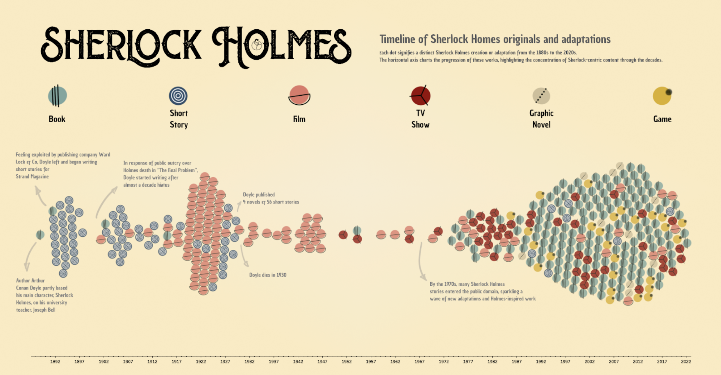
Beeswarm Chart Featuring Sherlock Holmes Canon & Adaptations by Jessica Bautista Gauna.
Beeswarm charts are excellent for displaying data distributions across categories in a way that maximises space and avoids overlapping points. This makes it easy to identify clusters, gaps, outliers and the overall spread of your data. By providing a clear view of each data point, Beeswarm charts are handy for detailed exploratory data analysis where individual data values are interesting.
Bump Chart
Bump Chart by LaDataViz: Visualise changes in rank over time among categories.
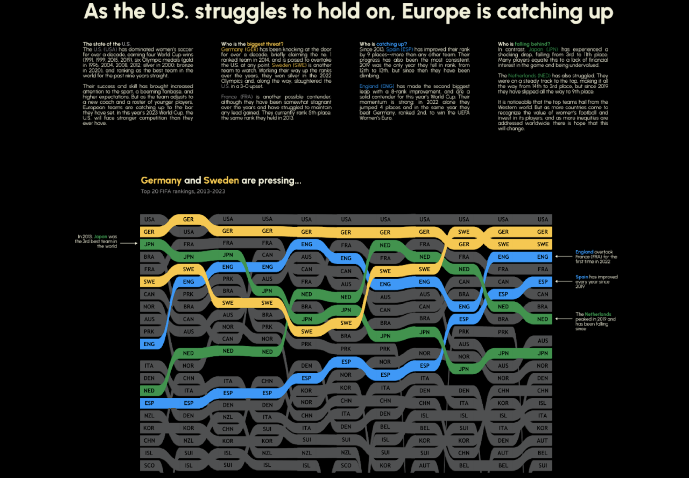
Bump Chart Featuring Women's FIFA Ranking by Becca B.
Bump charts are perfect for illustrating competitive dynamics, such as market positioning, sales rankings or sports standings, in a clear and compelling way. They are invaluable for displaying rank progression through time, allowing viewers to easily track the rise and fall of different entities within a dataset. They are particularly effective at identifying trends, highlighting winners and losers, and visualising shifts in position.
Chord Diagrams
Chord Diagram by LaDataViz: Visualise the interrelationships between entities in a compelling, circular layout.
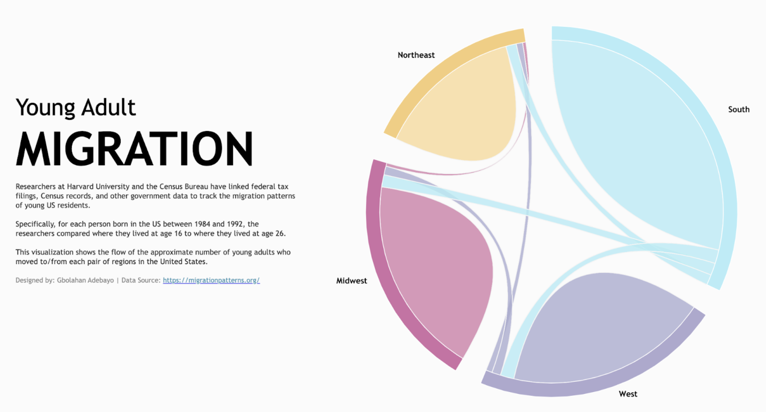
Chord Diagram Featuring Young Adult Migration by Gbolahan Adebayo.
Chord diagrams are convenient for displaying the flow or connections between different entities, such as the relationships in social networks, migration patterns or trade flows between countries. These diagrams use arcs and ribbons to visually connect data points around a circle, making it easy to see the interaction volume between components and identify dominant and minor relationships in a dataset.
Chord Diagram by Infotopics | Apps for Tableau: Illustrate the relationships and connections between entities in a network or system.
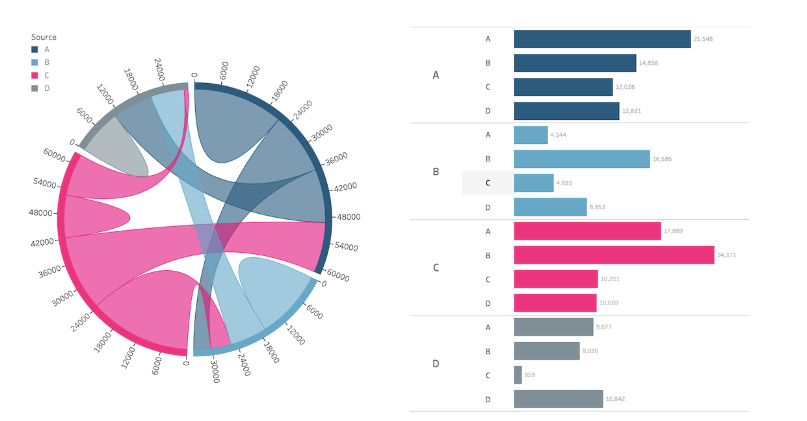
Chord Diagram Featuring Young Adult Migration by Gbolahan Adebayo.
A chord diagram is a visual representation that illustrates the relationships and connections between entities in a network or system. It typically consists of a circle divided into segments, with each segment representing a category or entity. The connections between the segments are depicted as curved lines, or “chords”, which indicate the interactions or relationships between the categories. Chord diagrams are commonly used in data visualisation to show patterns of interactions, flows of information or relationships between different elements, such as in social networks, genetic studies or supply chain analysis. They provide a clear and intuitive way to understand complex relationships and identify key connections within a system.
Funnel Chart
Funnel by Actinvision: Data progressing through stages.
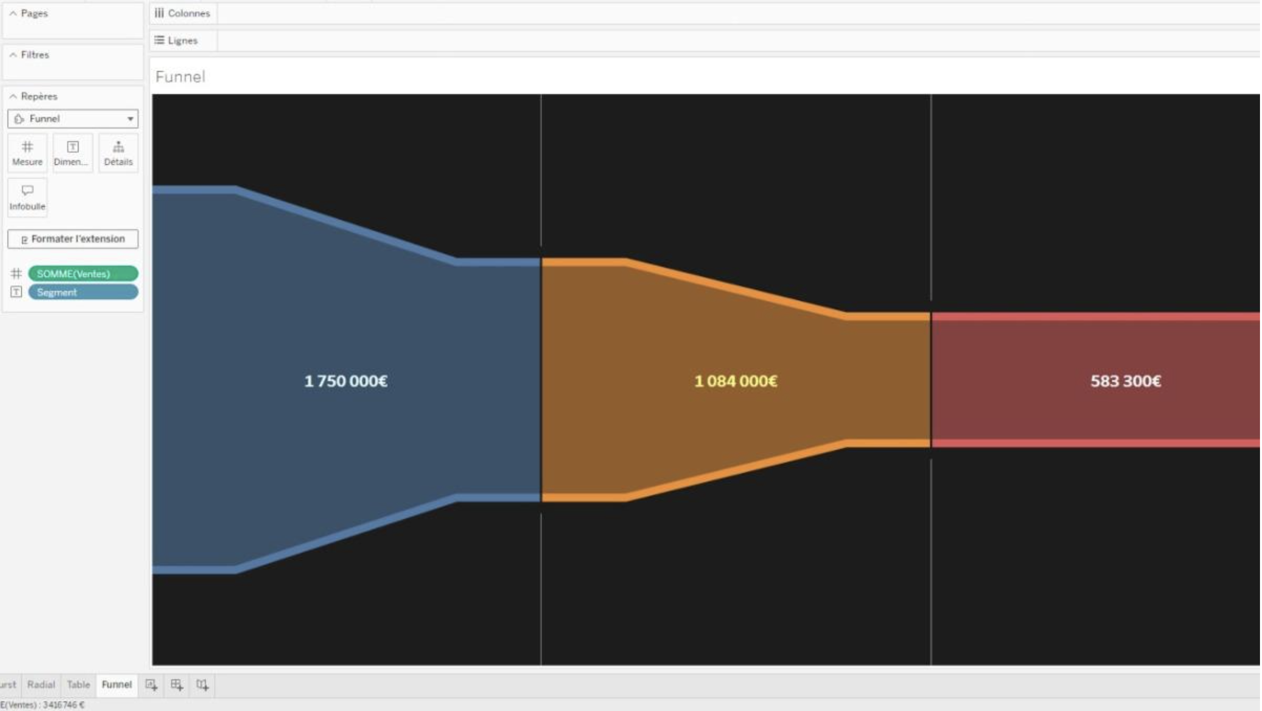
Funnel Chart Viz Extension by Actinvision in Tableau.
Visualise your data through stages with the Funnel Chart Viz Extension, which has advanced style configurations allowing fine tuning of the funnel’s appearance parameters. You can also customise colours and configure labels.
Network Diagrams
Network by LaDataViz: Visualise connections and relationships within your data.
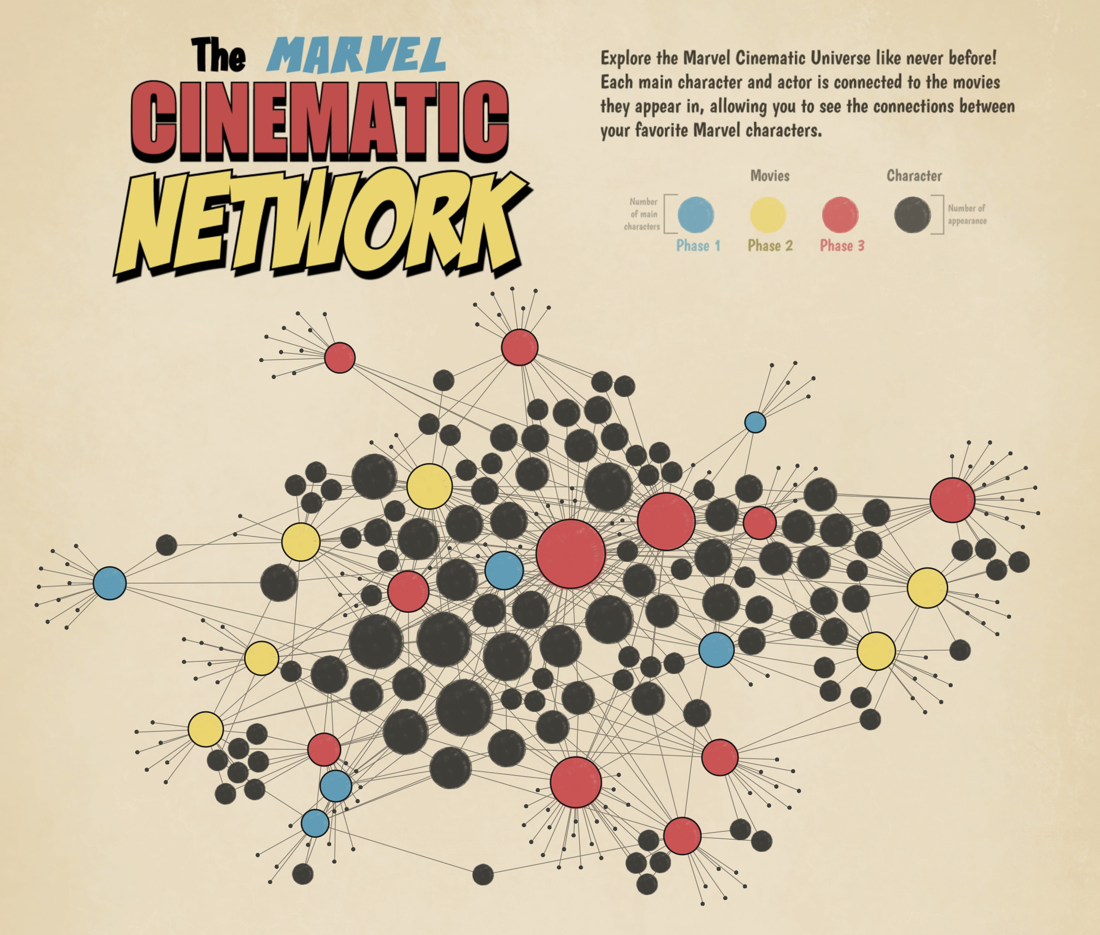
Network chart featuring the Marvel Cinematic Network by Tristan Guillevin
Network charts are invaluable for exploring and presenting the relationships between entities, whether individuals in social networks, infrastructure components or data structure items. These diagrams provide a visual map of interconnections, helping users to understand how data points interact and influence each other.
Network Diagram by Infotopics | Apps for Tableau: Understand the relationships in data.
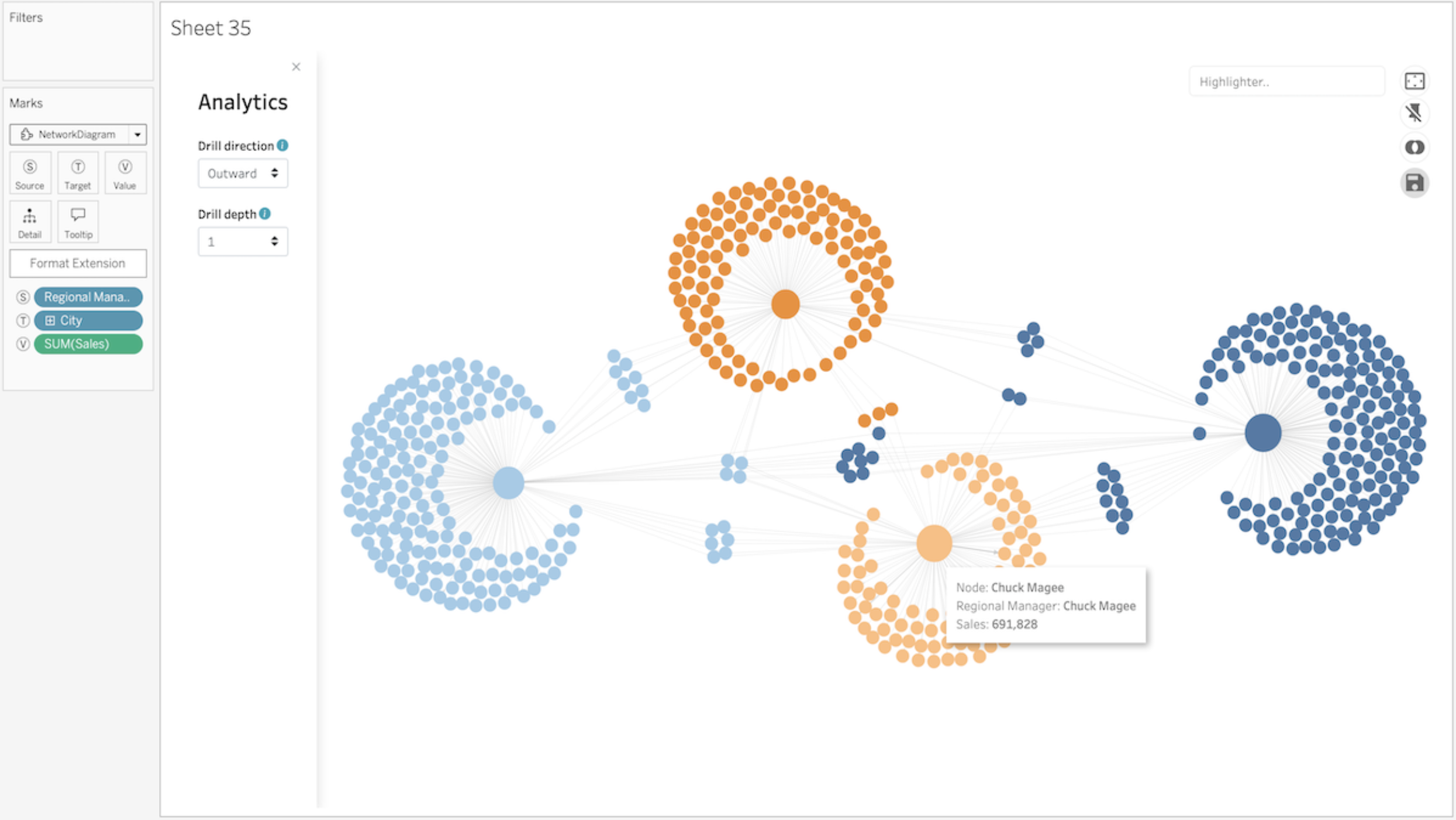
Network Diagram Viz Extension by Infotopics in Tableau.
A network diagram is a data visualisation method that allows users to understand relationships in data easily. Network diagrams are composed of nodes and paths. Nodes are singular data points that are connected to other nodes through paths. The paths show the relationship between two or more nodes.
Polar Chart
Polar Area Chart by LaDataViz: Analyse and present multivariate data sets in a circular format.
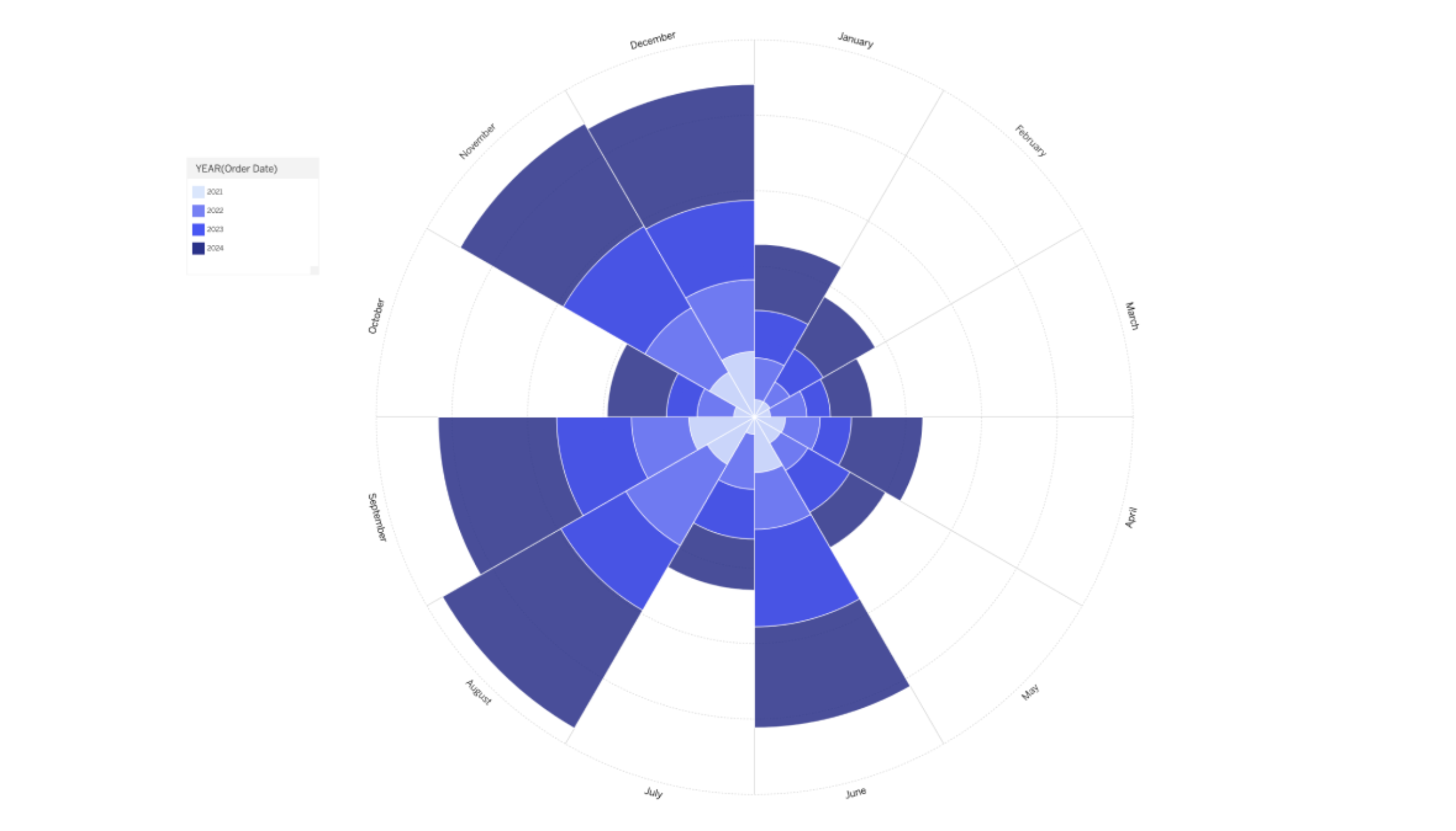
Polar Area Chart Viz Extension by LaDataViz in Tableau.
Enhance your data visualisation toolkit with the Polar Area Chart Viz Extension for Tableau, an innovative take on the traditional Coxcomb or Nightingale Rose chart. This version offers a visually compelling method for analysing and presenting multivariate data sets in circular format. Polar area charts are particularly effective for showcasing relationships and proportions among multiple variables in a format emphasising comparisons and trends. By varying the radius of each segment proportionally to the data it represents, these charts allow for intuitive and immediate visual comparisons across different categories or time periods.
Process Chart
ProcessMining by Infotopics | Apps for Tableau: Visualise and analyse your processes based on log file extractions.
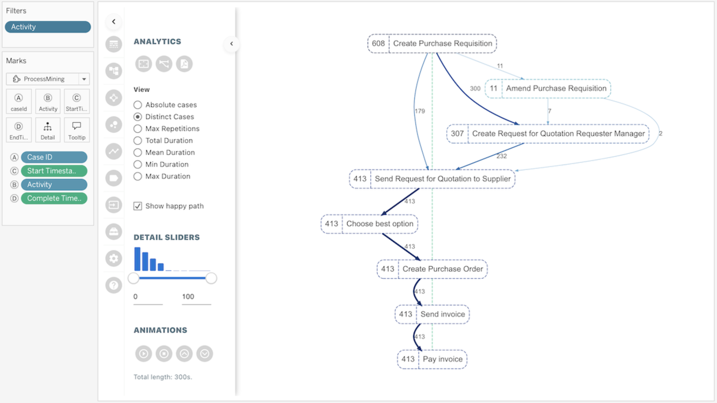
ProcessMining Viz Extension by Infotopics in Tableau.
This ProcessMining extension for Tableau helps visualise processes, instead of assuming them. Audit, analyse and improve your processes by answering both compliance-related and performance-related questions. Get instant insight into all subprocesses, outliers, deviations, process bottlenecks and more. Use the interactivity of Tableau to enable users to filter and zoom in on specific cases, periods, process steps (nodes) or connections (links) in your process to analyse, optimize or adjust your processes.
Radar Charts
Radar Chart by LaDataViz: Visualise and compare multiple variables of one or more groups.
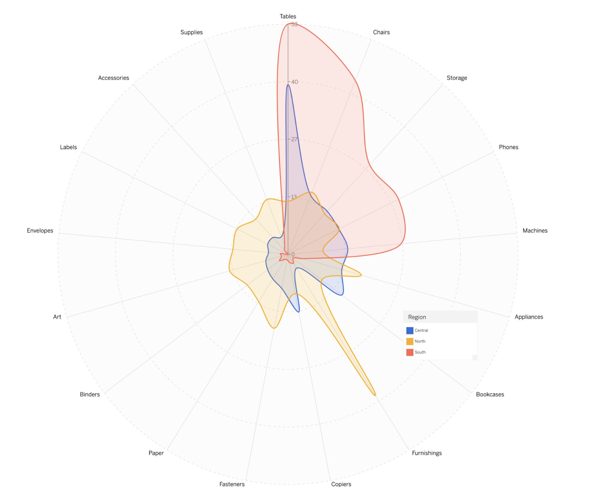
Sample Superstore Radar Chart by Tristan Guillevin.
Radar charts are particularly useful for displaying performance metrics across multiple areas in a way that is easy to compare and contrast. They allow viewers to quickly gauge strengths and weaknesses at a glance, making them perfect for benchmarking, skills assessments or any scenario where relative performance across various categories needs to be visually summarised.
Radar Chart by Infotopics | Apps for Tableau: A graphical method of displaying multivariate data in a two-dimensional chart.
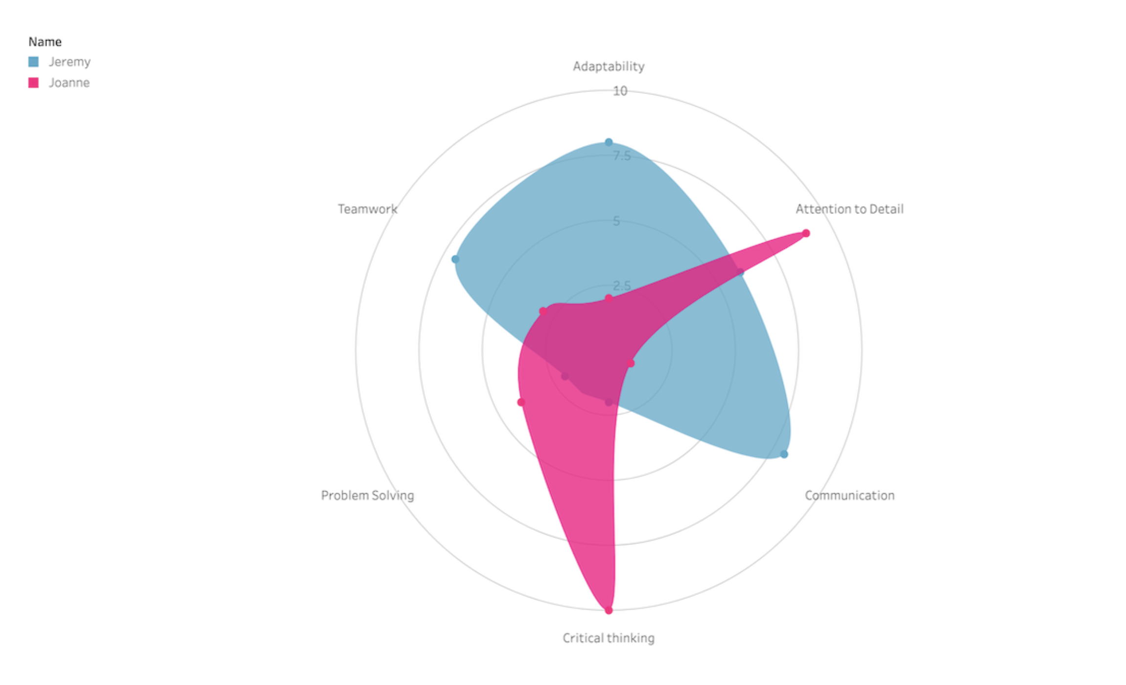
Radar Chart Viz Extension by Infotopics in Tableau.
A radar chart is a visual tool that shows data across multiple categories using a spider-web-like graph. Each category has its own axis, and the value for each category is plotted along its axis. It's useful for comparing the performance or characteristics of different entities, like comparing the strengths and weaknesses of various products, team members or strategies at a glance.
Radar by Actinvision: Display your data in a radar chart.
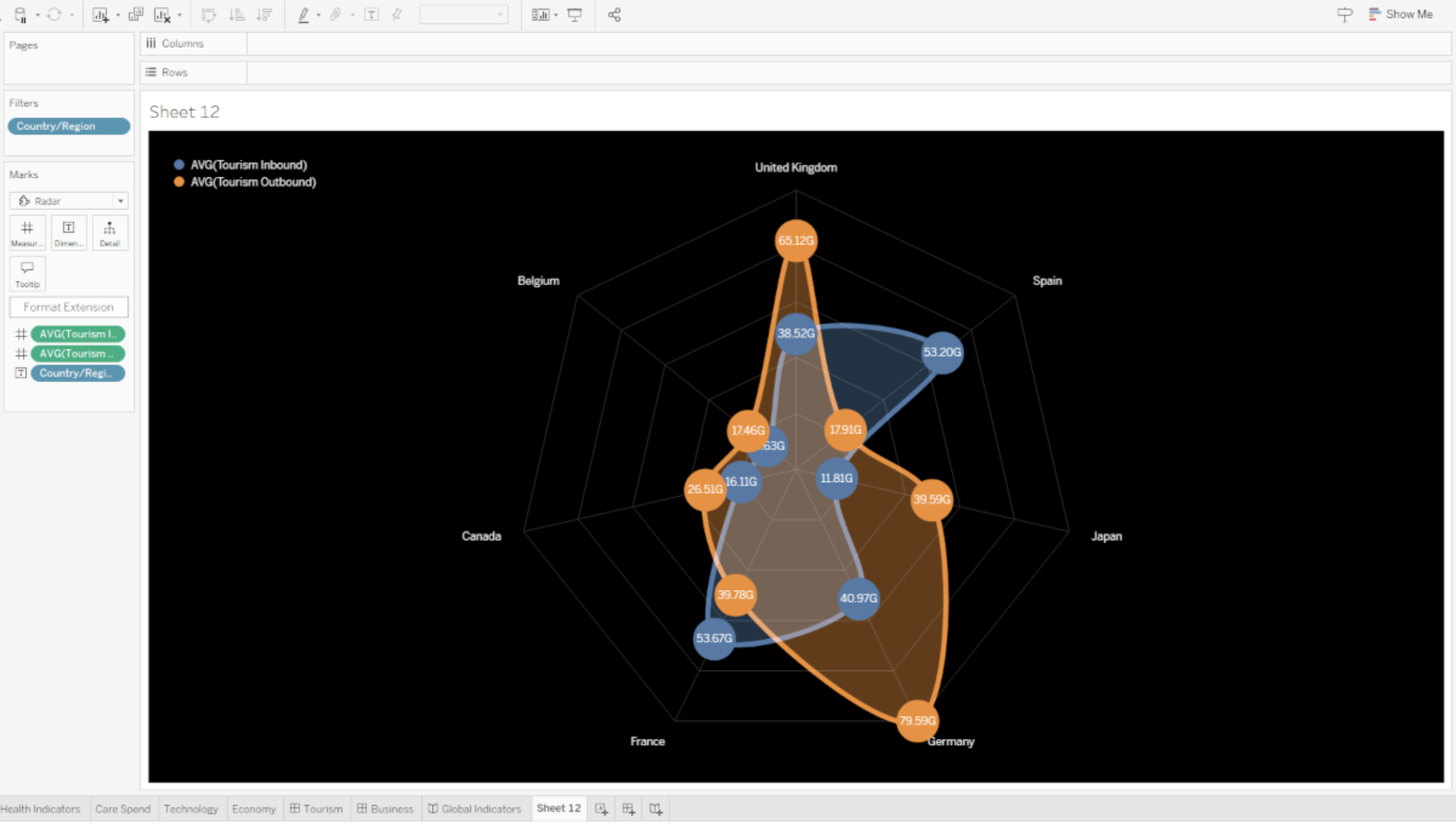
Radar Viz Extension by Actinvision in Tableau.
With the Radar Viz Extension from Actinvision, simply display your data in a radar chart. Main features include advanced style configuration to fine-tune every bit of the radar’s appearance parameters, colour customisation via a predefined colour palette or colour of your choosing, and dot label configurations.
Radial Chart
Radial Chart by Actinvision: Bar charts displayed on polar coordinate planes.
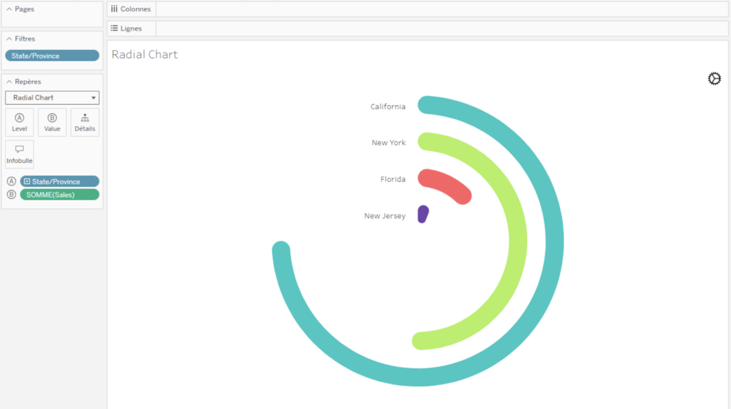
Radial Chart Viz Extension by Actinvision in Tableau.
Used to show comparisons among categories by using circular shapes, the radial or circular bar chart simply refers to bar charts displayed on polar coordinate planes instead of a Cartesian system. To build your own, assign one dimension with categories to the Level mark and assign one or multiple measures to Value. This extension is created and hosted by Actinvision and leverages all of Tableau’s interactivity. Please note the current version does not yet support formatting and keyboard navigation.
Sankey Charts
Sankey by Tableau: Show the flow of data between multiple categories
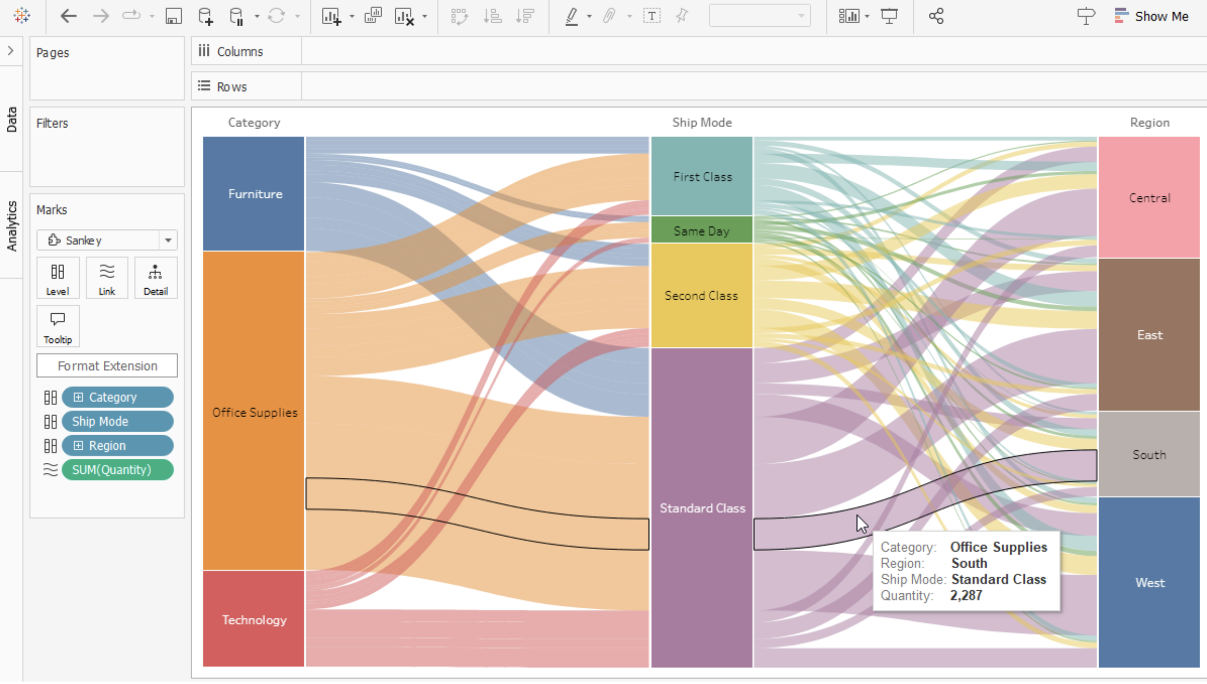
Sankey chart Viz Extension in Tableau.
Sankey diagrams work best with a data set that shows a before and after state, or relationships/transitions between two or more categories. To build a viz with this extension, assign two to five categorical dimensions to the Level encoding box and assign one or more measures to the Link encoding box. This Viz Extension is created and hosted by Tableau and makes use of Tableau interactivity behaviours.
Radial Sankey by LaDataViz: Visualise interactions between sources and targets.
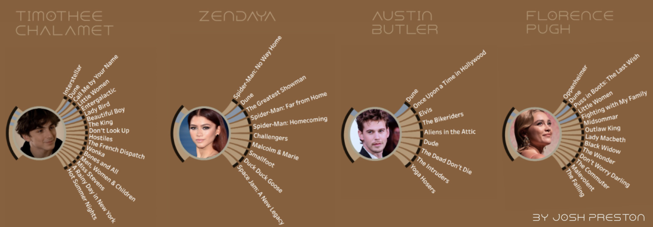
Radial Sankey chart featuring the Dune actors by Josh Preston.
This chart excels at displaying interconnections in a compact, circular layout, making it perfect for spotting patterns, strengths and bottlenecks in data flows. This format saves space and enhances readability and engagement by offering a 360-degree view of the data interactions.
Sankey Diagram by Infotopics | Apps for Tableau: Visualise a flow of measure across multiple dimensions.
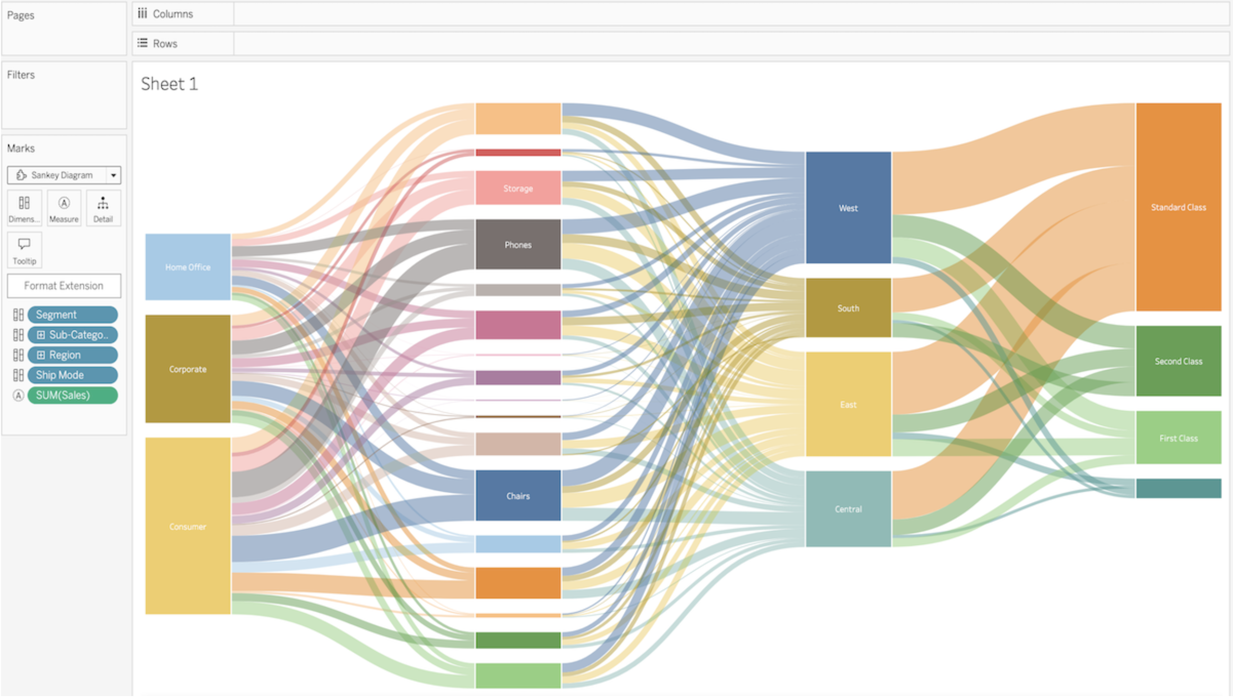
Sankey Diagram Viz Extension by Infotopics in Tableau.
The Sankey diagram visualises the flow of a measure across multiple dimensions. Start visualising the flow of money through your organisations' departments or see what paths your visitors enjoy on your website.
Recursive Sankey Diagram by Infotopics | Apps for Tableau: Visualise the flow of a set of data from origin to destination.
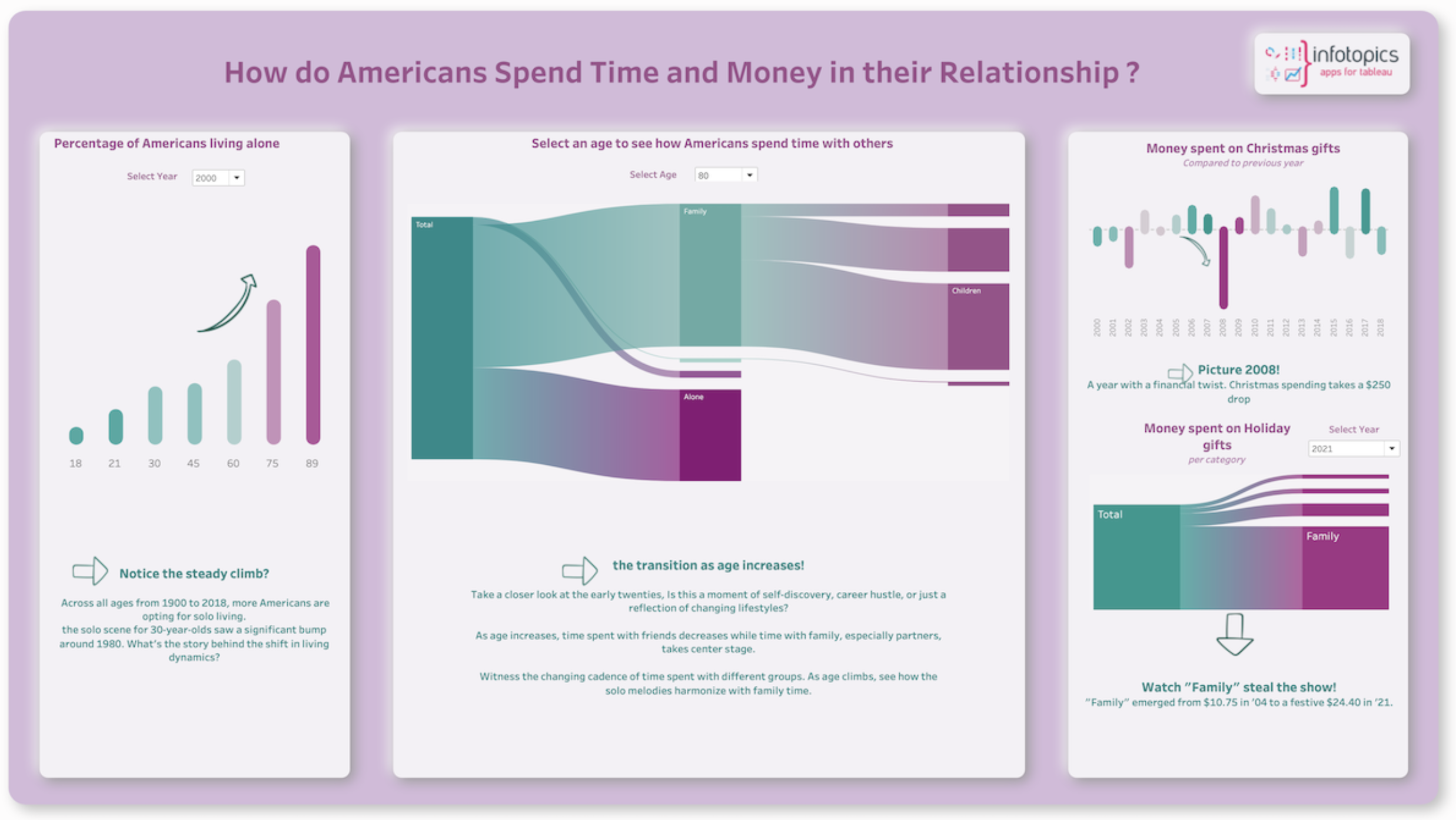
Recursive Sankey Diagram Viz Extension by Infotopics in Tableau.
A recursive (source-target) Sankey diagram is a visualisation that displays the flow of a particular set of data from its origin (source) to its destination (target). It consists of nodes, representing the sources and targets, and links, indicating the flow between them. The width of the links corresponds to the quantity being measured. This type of diagram is often used to depict the flow of energy, money or materials in a system, among other things. Source-target Sankey diagrams are useful for identifying patterns and bottlenecks in a system, as well as for demonstrating the impact of changes or interventions.
Circular Sankey Diagram by Infotopics | Apps for Tableau: Visualise the flow over multiple dimensions with internal loops.
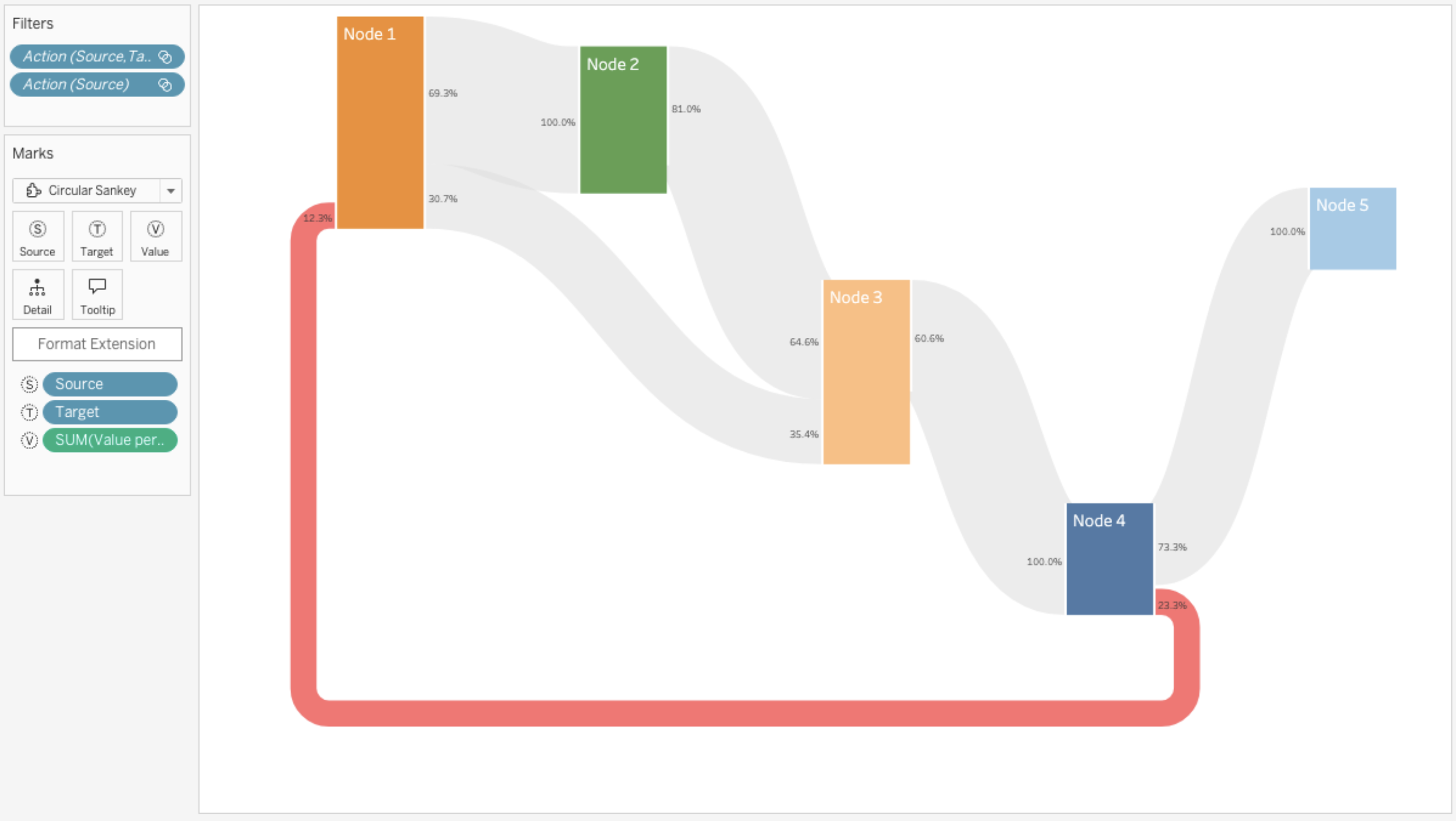
Circular Sankey Diagram Viz Extension by Infotopics in Tableau.
The Sankey diagram (circular) visualises the flow of a measure over multiple dimensions with internal loops. Sankey diagrams are a type of flow diagram in which the width/height of the arrows is proportional to the flow rate.
Streamgraph Charts
Streamgraph by LaDataViz: Visualise changes and trends over time in a fluid and organic style.
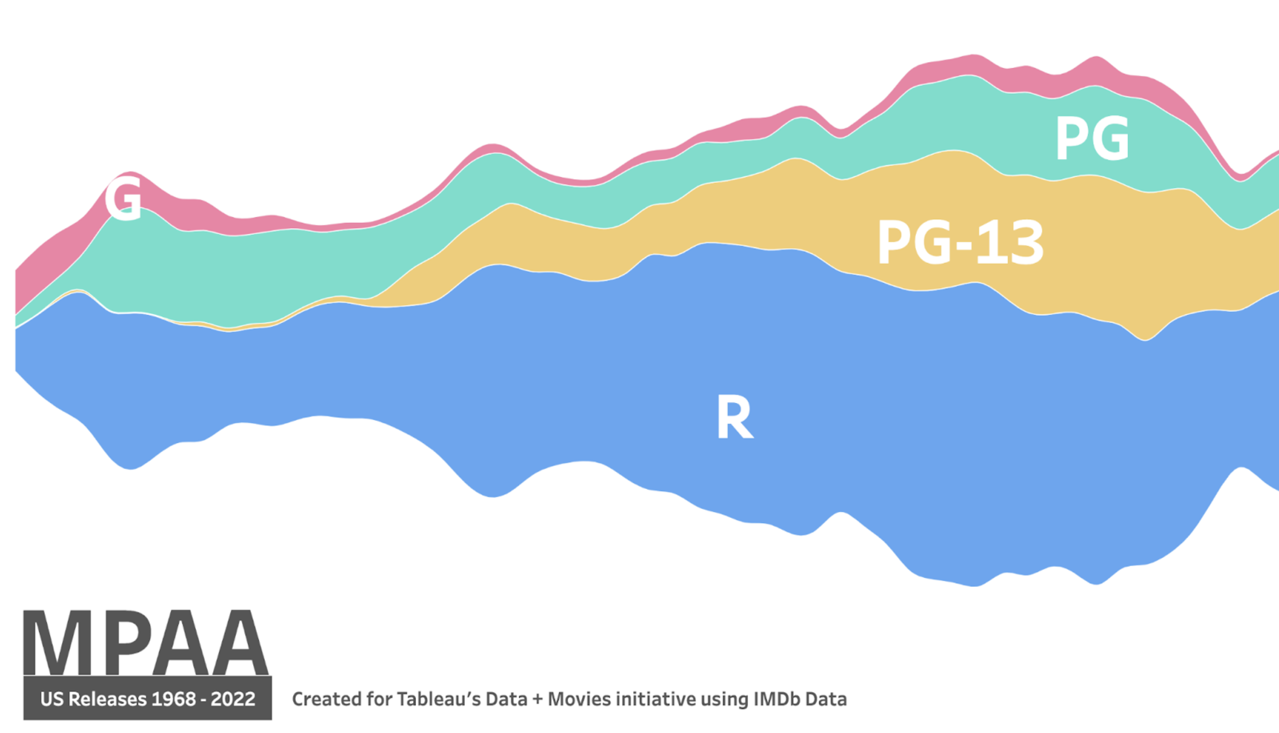
Streamgraph chart featuring MPAA by Zach Bowders.
Streamgraphs provide a powerful way to represent time-series data in a more engaging and intuitive format than traditional line or area charts. Their flowing, stacked layers make it easy to understand the progression of multiple data series and see how individual categories contribute to the whole over time.
Sunburst Charts
Sunburst (zoomable) by Actinvision: Visualise hierarchical data using concentric circles.
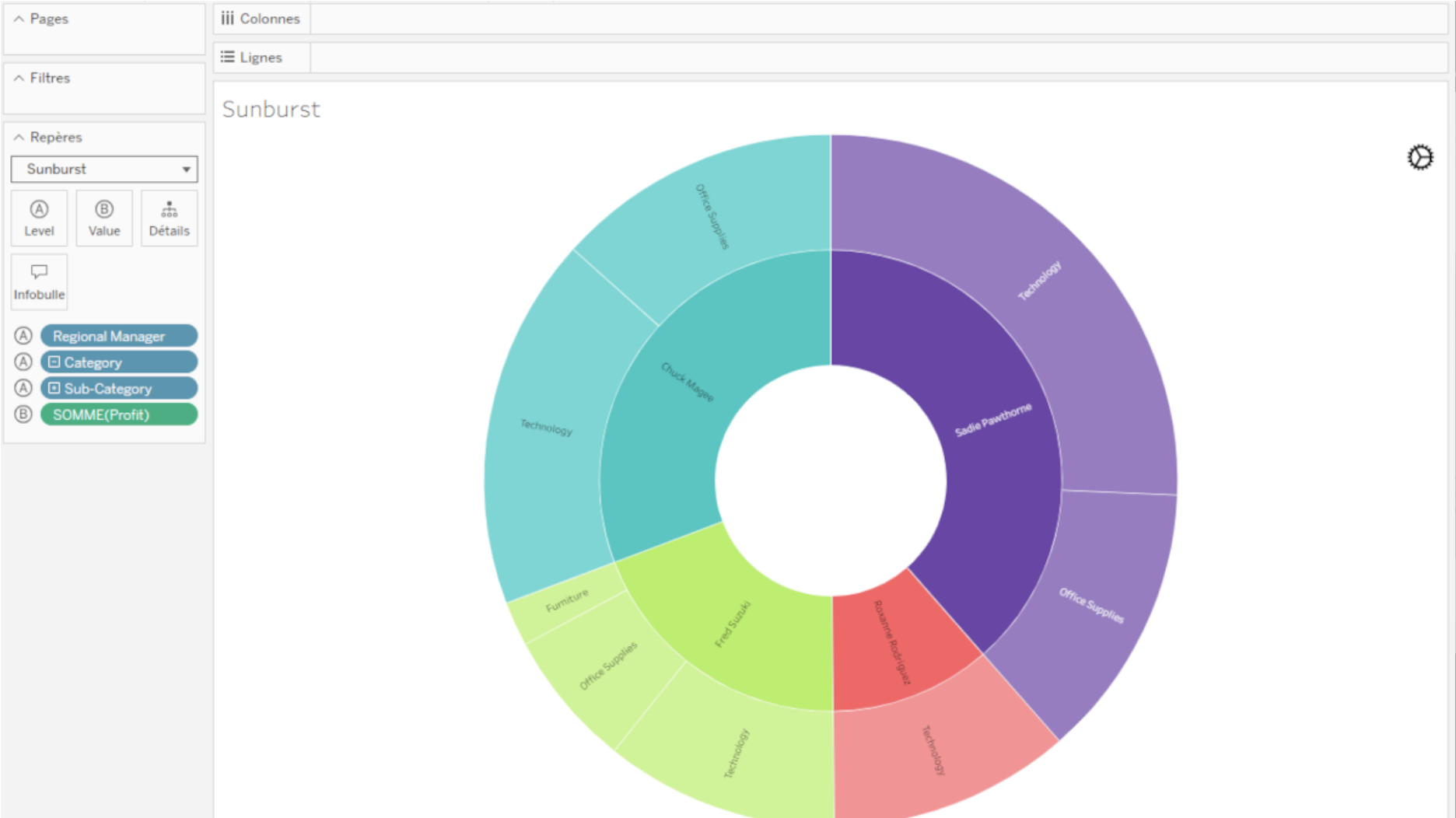
Sunburst (zoomable) by Actinvision Viz Extension in Tableau.
The Sunburst diagram is used to visualise hierarchical data using concentric circles. The centremost circle represents the highest hierarchy level, drilling down as it moves away from the centre. This Viz Extension displays two levels at a time, allowing users to drill down by clicking a specific category.
Sunburst Diagram by Infotopics | Apps for Tableau: Shows hierarchy through a series of rings, sliced for each category node.
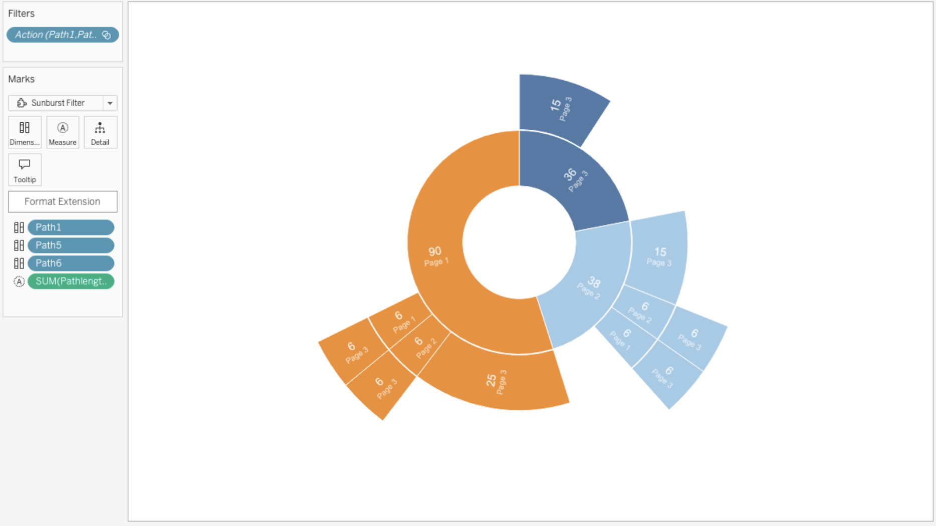
Sunburst Diagram by Infotopics in Tableau.
This type of visualisation shows hierarchy through a series of rings that are sliced for each category node. Each ring corresponds to a level in the hierarchy, with the central circle representing the root node and the hierarchy moving outwards from it. Rings are sliced up and divided based on their hierarchical relationship to the parent slice. The angle of each slice is either divided equally under its parent node or can be made proportional to a value.
Zoomable Sunburst by Infotopics | Apps for Tableau: Represent data in a radial layout.
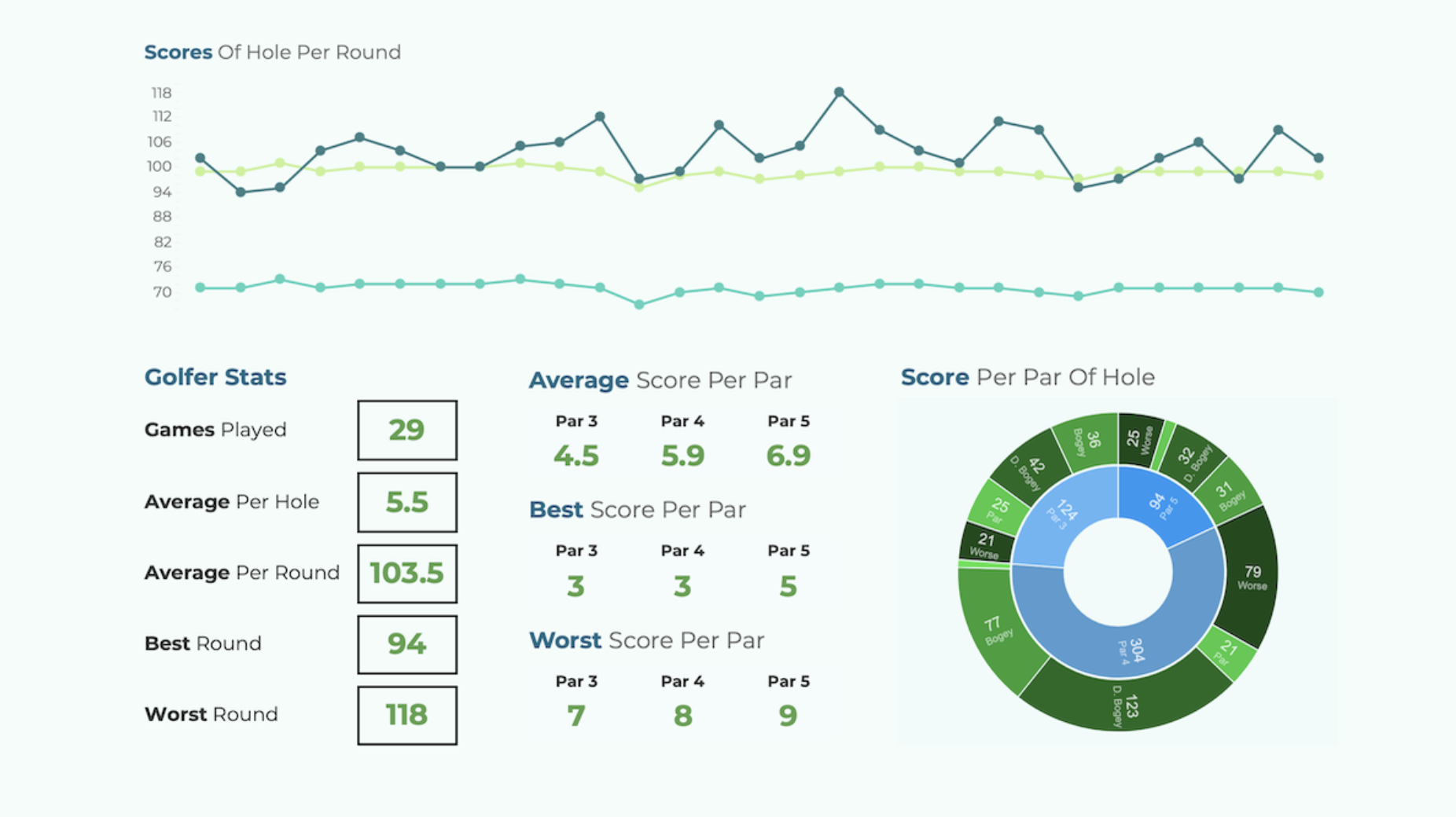
Visualisation featuring the Zoomable Sunburst Viz Extension by Infotopics for Tableau.
A hierarchical visualisation that represents data in a radial layout, resembling the layers of an onion or the annual rings of a tree. It consists of nested rings, where each ring represents a level of the hierarchy, with the innermost ring typically representing the root level and subsequent rings representing its child categories or subgroups. The size of each segment within the rings corresponds to the proportion of the data it represents, while the colour or shading can convey additional information or categories. Sunburst diagrams are commonly used to visualise hierarchical data structures, such as organisational charts, directory structures or hierarchical classifications, enabling users to explore the data's composition and relationships in an intuitive and visually appealing manner.
Table Visualisations
SuperTables by Infotopics | Apps for Tableau: Analyse and discover data to support your visualisation with interactive tables.
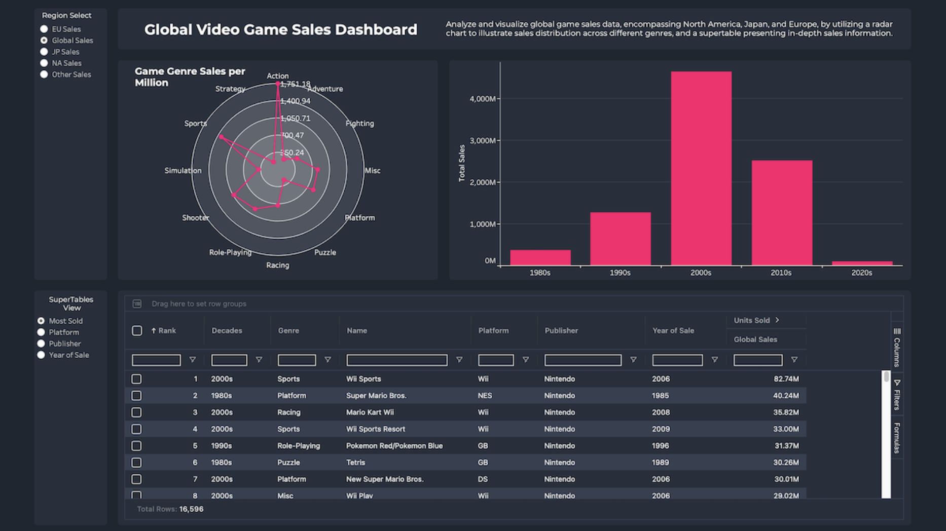
SuperTables Tableau Extension by Infotopics for Tableau.
Empower your dashboard users with dynamic, Excel-like tables that offer the flexibility to organise and analyse data directly in Tableau. SuperTables allows users to group data, pivot tables, apply inline column filters, expand rows and export to PDF, CSV or Excel. This tool enhances your dashboards with added context and flexibility, supporting dashboard actions to ensure accurate calculations on aggregated data.
Table by Actinvision: A simple performance-friendly table display for data.
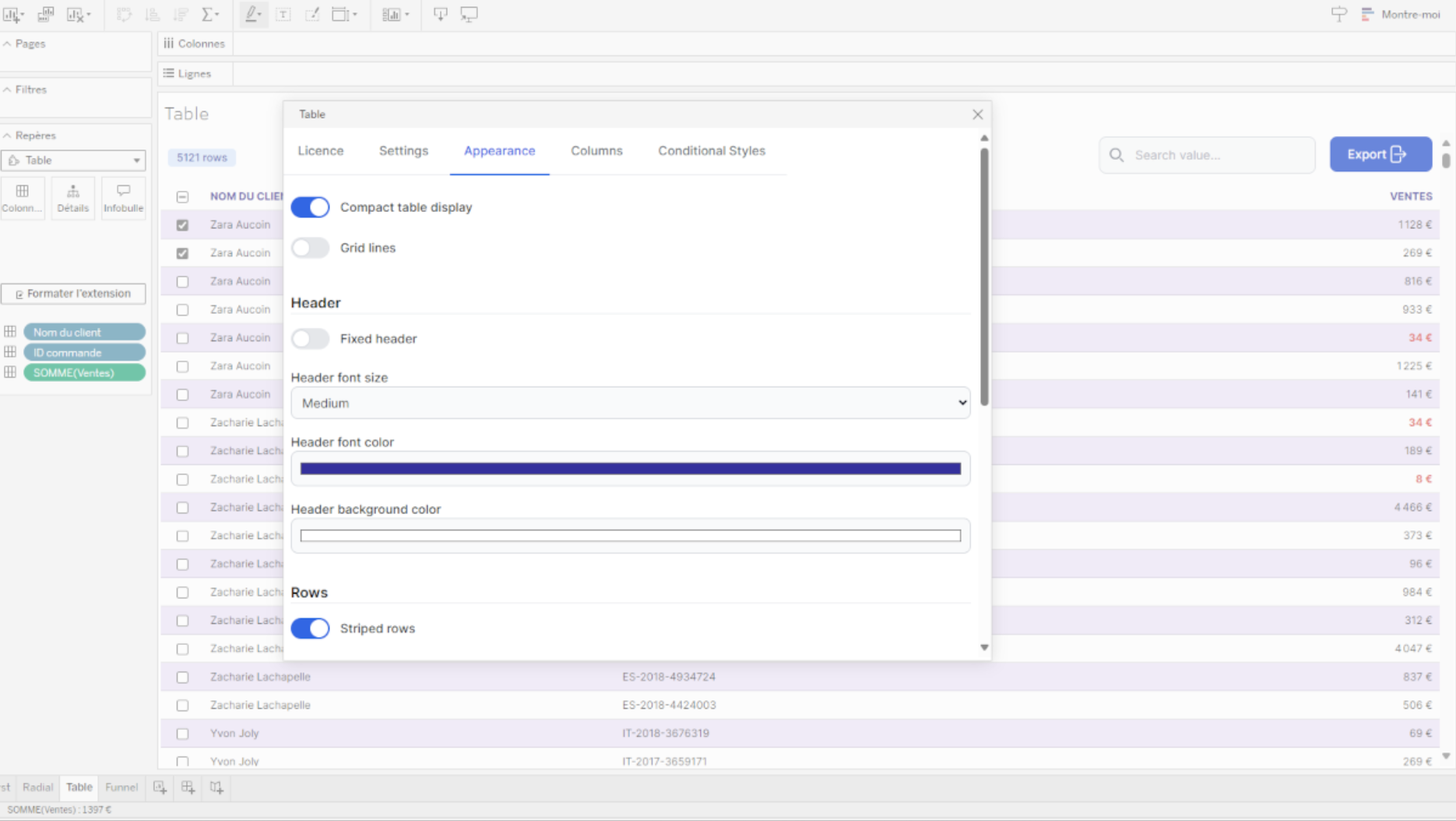
Tableau Viz Extension by Actinvision in Tableau.
Simply display your data in a tabular way. This Viz Extension is performance-oriented and customisable. Easily adjust style settings to match your needs and integrate your dashboard design. Renaming columns and changing cell styles is also possible.
Tree Diagrams
Tree Diagram by LaDataViz: Visualise hierarchical information.
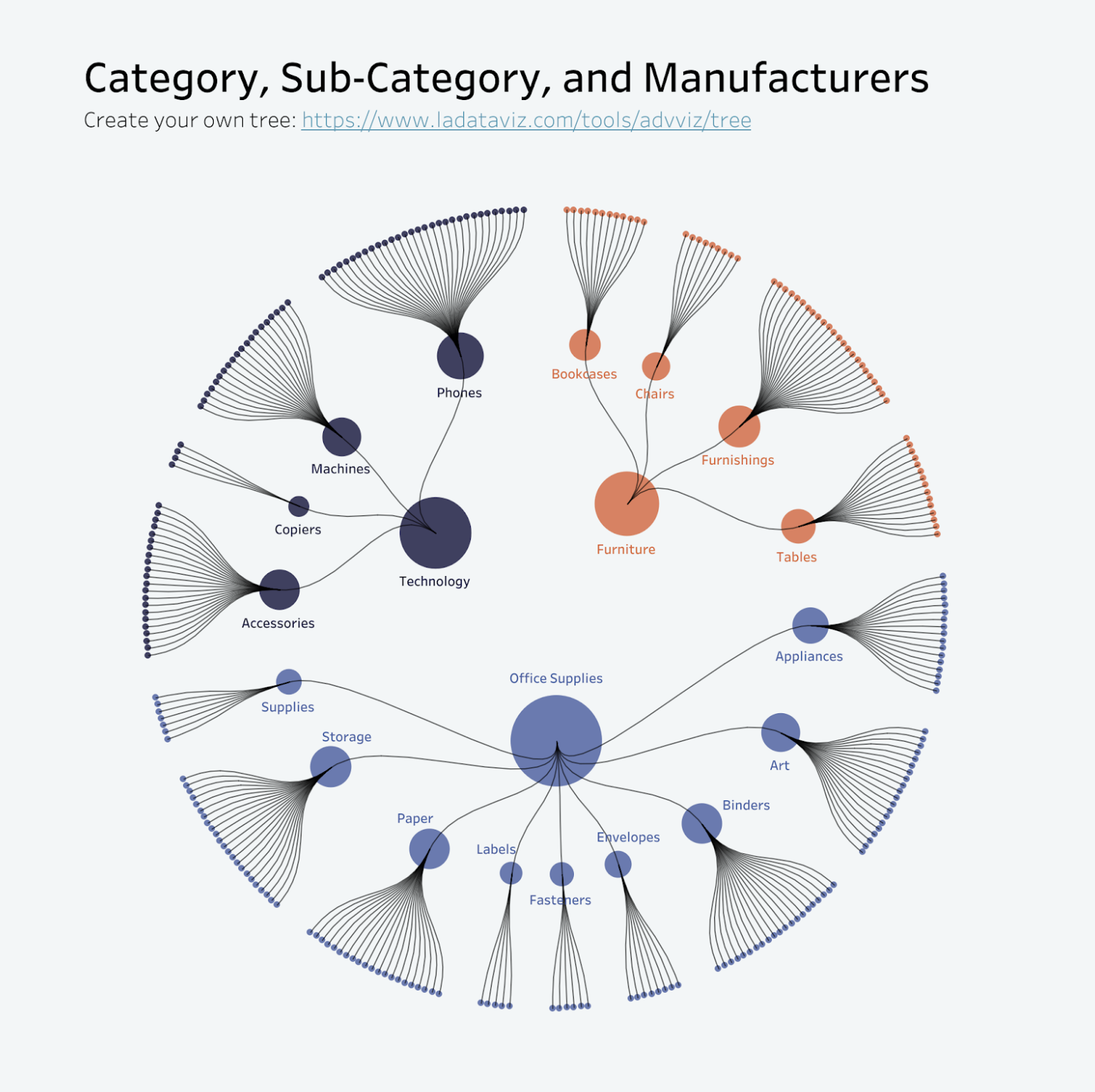
Product Radial Tree by Tristan Guillevin.
Organise and display hierarchical information in a clear, engaging format that captures attention and facilitates deeper analysis. Tree diagrams are fantastic for breaking down complex systems into manageable parts. They help visualise structures, such as organisational charts, website sitemaps or project tasks, allowing users to explore relationships and dependencies intuitively.
Voronoi Treemap by LaDataViz: Visualise hierarchical data through a unique and engaging Voronoi layout.
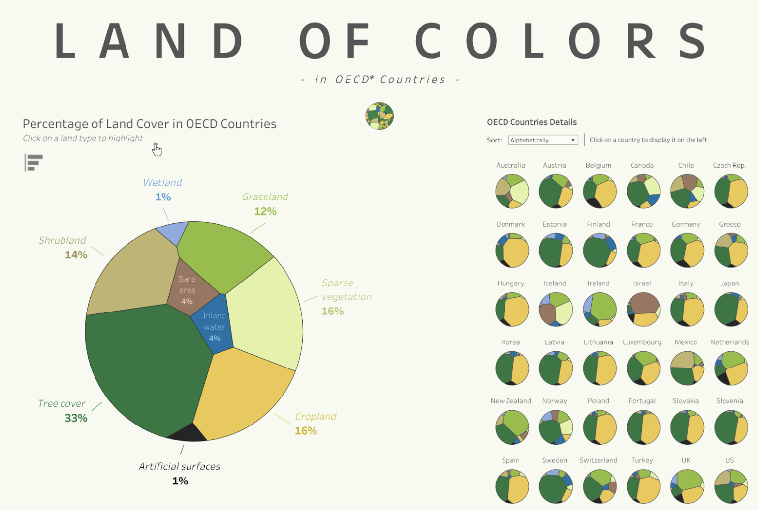
Voronoi Treemaps featuring Land Of Colors by Tristan Guillevin
Perfect for presenting nested data in a way that is both visually striking and informative, the Voronoi Treemap adds a fresh perspective to your Tableau dashboards. This chart type is particularly effective for displaying hierarchically structured data with varying levels of granularity.
DrillDownTree by Infotopics | Apps for Tableau: Visualise and aggregate data across multiple dimensions – drill down in any order.

DrillDownTree Viz Extension in Tableau.
The DrillDownTree provides better insights into your data through drill-down actions. It’s a great data exploration tool for ad-hoc analysis and conducting root cause analysis. Drill down on any measure to any dimension you wish and visualise data across multiple dimensions without setting up hierarchies upfront.
Venn Diagram
Venn Diagram by Infotopics | Apps for Tableau: A graphical representation used to illustrate the relationships between sets of data.
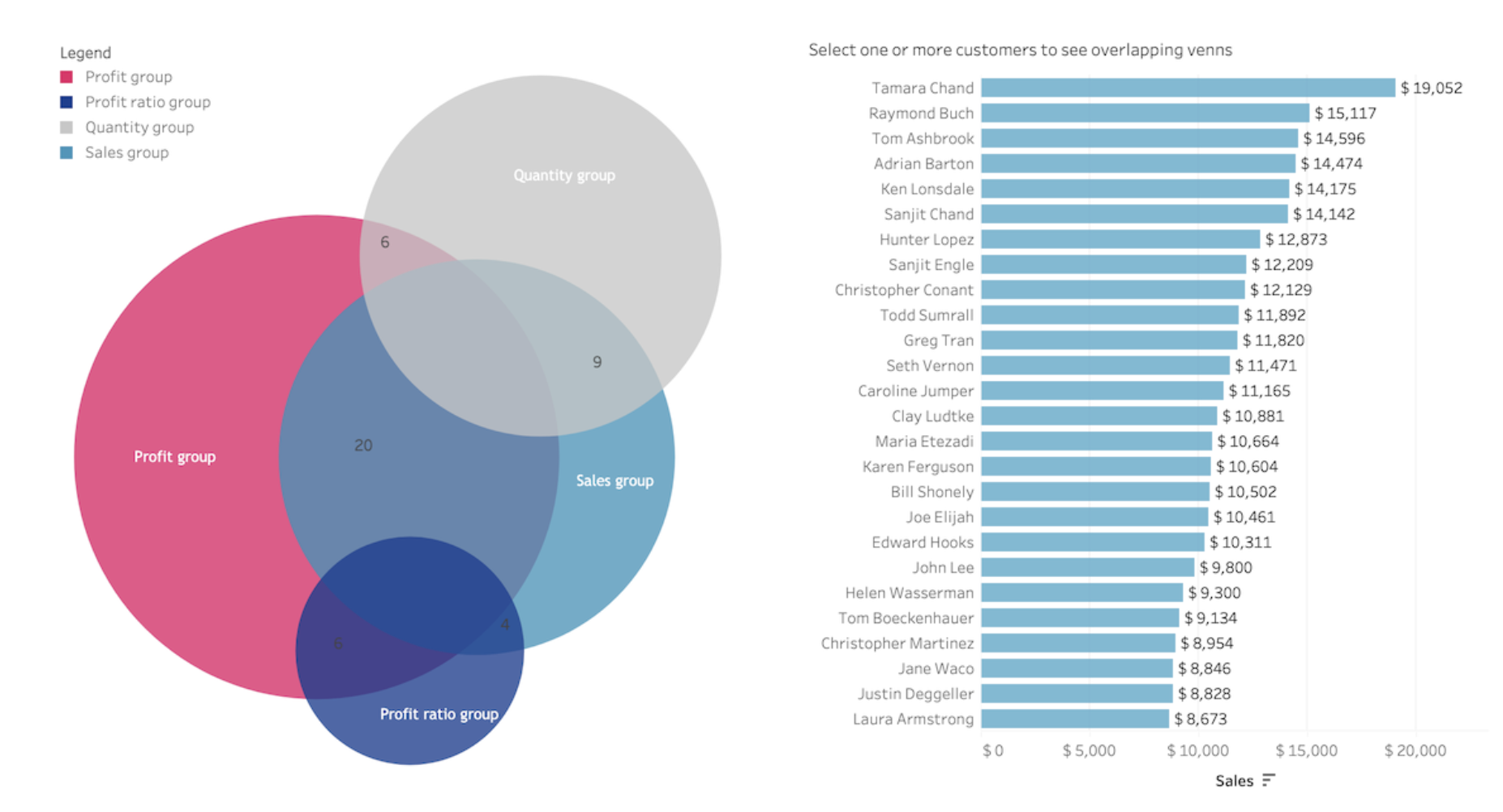
Venn Diagram Viz Extension by Infotopics in Tableau.
A Venn diagram is a graphical representation used to illustrate the relationships between different sets or groups of data. It consists of overlapping circles or other shapes, each representing a set, with the overlapping areas representing the intersections or commonalities between the sets. Venn diagrams are commonly used in mathematics, logic, statistics and various fields to visualise logical relationships, identify shared or distinct elements among different groups, and aid in problem-solving and decision-making processes.
Viz Extensions for dashboard optimisation
Drill Down Filter by LaDataViz: Add an advanced drop-down filter menu.

Drill Down Filter Viz Extension by LaDataViz in Tableau.
Optimise your Tableau dashboards with the Drill Down Filter Extension, designed to enhance user interaction through an intuitive and easy-to-use drill-down filter menu. This extension simplifies the exploration of complex datasets by enabling dynamic filtering across multiple levels of detail directly within your dashboards.
WriteBackExtreme by Infotopics | Apps for Tableau: Collaborate directly with your Tableau dashboards.

WriteBackExtreme Viz Extension by Infotopics in Tableau.
Stay in the flow and stay in Tableau. Easily add collaboration functionality to any data point in your dashboard like a category, month of order date or manager.
PictureThis by Infotopics | Apps for Tableau: Create dynamic image table/cards based on your data.
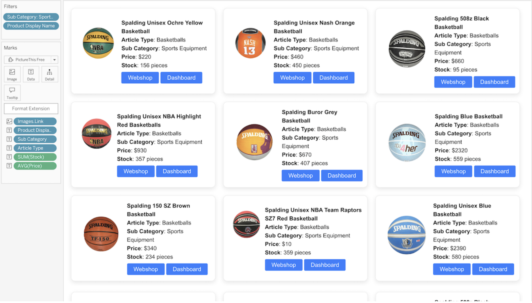
PictureThis Viz Extension by Infotopics in Tableau.
Create dynamic image tables and grids that can be used as a filter in your dashboard, all within your familiar Tableau environment – governed and secured. Use image URLs from your dataset that automatically create a responsive image table or grid. The images will act as a filter on another target sheet in your dashboard. Images are not stored in your dashboard; they will be dynamically lined up in an image table based on your data and can be used as a filter. The extension supports a table layout, cards layout and advanced layout options.
Waterfall and KPI charts
Gauge by LaDataViz: Instantly convey the status of metrics and KPIs.
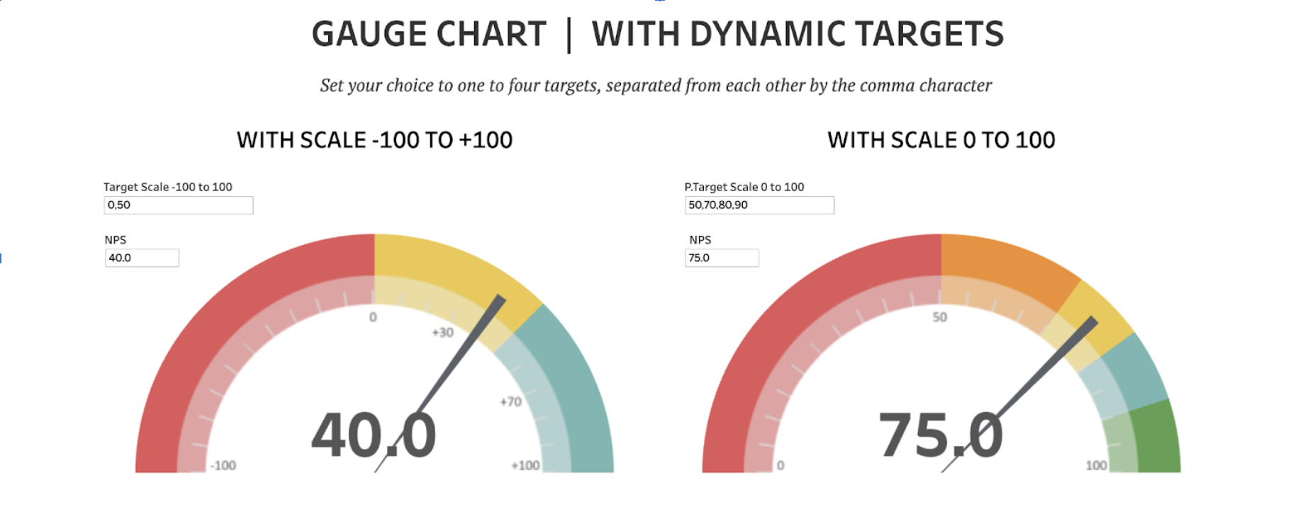
Gauge Chart featuring Dynamic Targets by Rosario Gauna.
Gauges are ideal for displaying data that measures progress against a target or goal. They are an excellent tool for instantly conveying the status of metrics such as sales performance, completion rates or any other metric where the value is compared to a predefined target. These charts provide a clear and straightforward visualisation of progress in a visually engaging format that is easy to understand, making them perfect for executive dashboards and performance monitoring reports.
Waterfall Chart by Infotopics | Apps for Tableau: Understand the cumulative effect of sequentially introduced positive or negative values.
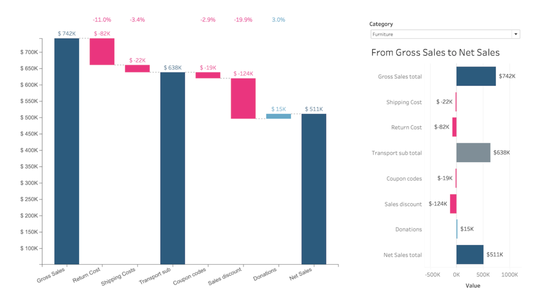
Waterfall Viz Extension by Infotopics in Tableau.
A waterfall chart is a form of data visualisation that helps with understanding the cumulative effect of sequentially introduced positive or negative values. These intermediate values can either be time-based or category-based. The waterfall chart is also known as a flying bricks chart or Mario chart due to the apparent suspension of columns (bricks) in mid-air. In finance, it will often be referred to as a bridge. A waterfall chart can be used for analytical purposes, especially for understanding or explaining the gradual transition in the quantitative value of an entity that is subjected to increment or decrement. Often, a waterfall or cascade chart is used to show changes in revenue or profit between two time periods.
Waterfall & KPI Tree by DataMa: What's driving my variations? by DataMa: Discover the why behind your KPI variation.
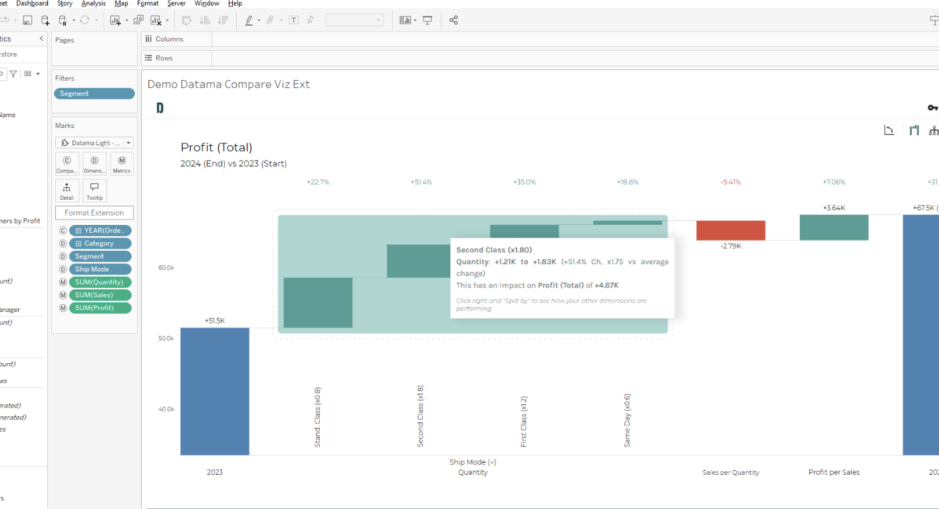
Waterfall and KPI Tree Viz Extension by DataMa in Tableau.
Enhance your data analysis with this Viz Extension, designed to unlock powerful insights into your key performance metrics. This tool excels at quick and intelligent root cause analysis, scoring and highlighting the most impactful drivers for your business. This enables you to make data-driven decisions with greater effectiveness.
PowerKPIs by Infotopics | Apps for Tableau: Integrate strategic insights.
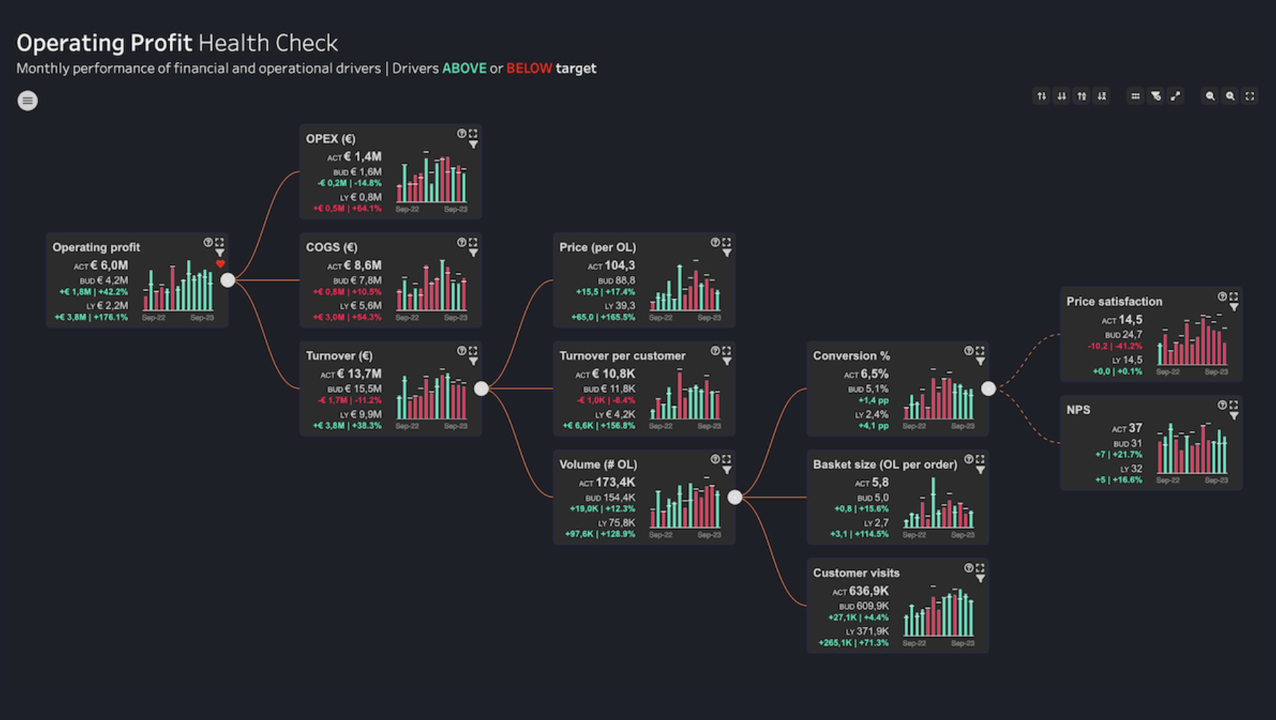
PowerKPIs Viz Extension by Infotopics in Tableau.
Use PowerKPIs as the new central entry point for analysis in Tableau. It provides a powerful platform for illustrating the connections between different KPIs in an engaging grid layout or value driver tree, adding valuable context to data-driven decisions. From top-level summaries to detailed examinations of specific operational drivers, PowerKPIs enhances your ability to tell a compelling story of business performance through a single, intuitive interface.
Bullet by Actinvision: An ultra-customisable bullet chart.
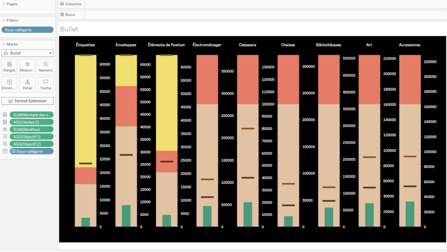
Bullet Viz Extension by Actinvision in Tableau.
The Bullet Viz Extension allows you to effortlessly display your data in a bullet chart, with powerful features for enhanced customisation. With advanced bullet-style configuration, you can fine-tune every aspect of the chart's appearance, from margins to the direction of the bars. Additionally, the extension provides easy colour customisation, allowing you to choose from a predefined colour palette or define precise colours for text, background, ranges, markers and measures, giving you full control over your chart’s visual presentation.


