How do I make my data visualisation more interesting, dynamic, relevant and well received by diverse audiences? For anyone developing a visualisation – whether you’re a newcomer or a seasoned data analyst – these questions should be at the top of your mind, because you want to make it great. If they’re done well, visualisations tell an interesting story. They can also shine a light on hidden information and details that you wouldn’t uncover in a spreadsheet, bar chart or pie graph.
Before jumping to specifics, think about what you want to accomplish with the visualisation, which helps you decide what data to include.
Ask yourself these questions:
- Who is my audience?
- What questions do they have?
- What answers am I finding for them?
- What am I trying to say?
- What other questions will my visualisation inspire or what conversations may result?
When you’re ready to dive in and create, these tips and techniques will make your visualisation intuitive and interesting so it’s digested quicker, easier, and the intended messages come through clearly, leaving viewers with specific, helpful takeaways. For more tips, read 10 best practices for effective dashboards.
1. Choose the right charts and graphs for the job

One size does not fit all, so carefully consider and choose the right format for your visualisation that will best tell the story and answer key questions generated by data – all of it connecting with your main purpose. Sometimes even combining related charts is helpful; it can fuel deeper exploration that leads to helpful business insights and answers that drive action.
What are popular formats?
- Bar charts are effective at comparing categories within a single measure and one of the most common data visualisations. They’re especially effective when you have data that can be split into multiple categories.
- Bullet charts show progress against a goal by comparing measures and were designed to replace dashboard gauges, meters and thermometers.
- The line graph connects several distinct data points, presenting them as one continuous evolution. The result is a simple, straightforward way to visualise changes in one value relative to another.
- Histograms and box plots show where your data is clustered and can compare categories.
- Maps are a no-brainer for visualising location-specific questions or aiding geographical exploration.
- Pie charts are powerful for adding detail to other visualisations, but aren’t as effective on their own. In fact, every year on Pi Day (March 14), data scientist Kaiser Fung and his colleague find a pie chart and remake it into a more suitable version, as their way of protesting against flagrant overuse.
To learn about more visualisation formats and see helpful examples, read and bookmark this white paper.
2. Use predictable patterns for layouts
Humans are visual creatures by nature. Our eyes are drawn to indicators that tell us important information at a glance. We naturally seek patterns, and if patterns are random or don’t make sense, it’s very difficult to understand what the visualisation conveys.
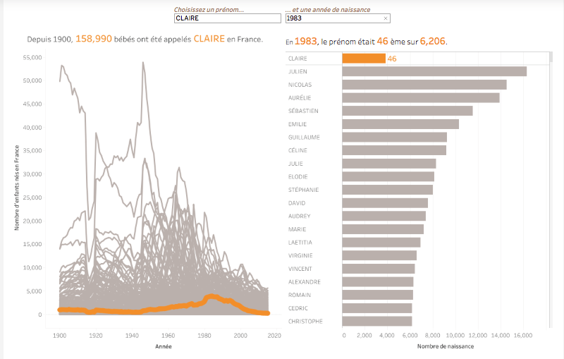
To capitalise on these human tendencies, make sure the order or format in which you present data makes sense to viewers, whether it’s numeric, alphabetical or sequential. A simple example: if you are communicating in a language that reads from left to right, then orient your visualisation to adhere to that convention. If you’re using multiple graphs, make sure the order is consistent and connections between the data are clear. You don’t want your viewers to get lost as they follow one point to another quickly and easily.
3. Tell data stories quickly with clear colour cues
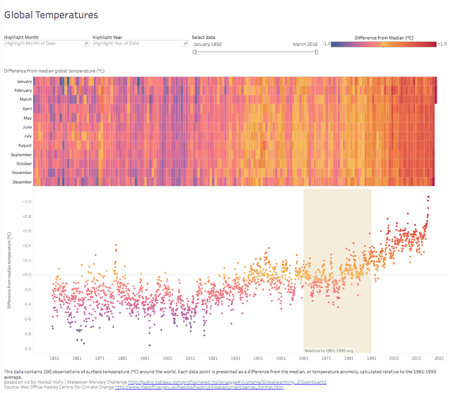
Colour is important. It can convey so much without using words. However, there’s a delicate balance to using colour; keeping it simple is best. Use colour to highlight and accentuate the information. Too many colours will create a cacophony, while using a single colour or too many shades of one colour can cause the data to blend together
Colour association matters, too. Use intuitive colours that make sense to the viewer so they process the information faster. If you’re working with temperatures, use red to indicate heat and blue for cold. And how you use colours also has serious effect. It’s helpful to show consistency across values or to highlight contrasts in the data.
4. Incorporate contextual clues with shapes and designs
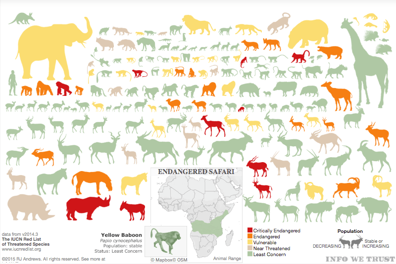
Context helps us decipher information at first glance instead of sitting and scrutinising it. Subject matter shapes can tell a compelling story. For example, the above chart on endangered species in Africa tells us at a quick glance what animals are endangered and how vulnerable they are. Instead of using bar charts with values, where each animal is minimised to numbers and text that mean the data and the viewer get lost, using the animals’ silhouettes makes it far more interesting and intuitive.
5. Use size strategically to visualise values
Size can help emphasise poignant information and add contextual clues. In the previous visualisation, the endangered animal shapes mimic how large an animal is in relation to others. However, size can also denote scaled values. Instead of using colour, shape size can adjust based on data values.
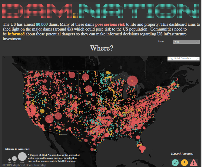
Using size to indicate values also works well with maps. When you have several data points of the same size on a visualisation, they blend together and it’s difficult to differentiate values. By making size relative to value, and adding colour as another marker, the visualisation becomes easier to navigate – as depicted in this example.
6. Apply text carefully and intentionally
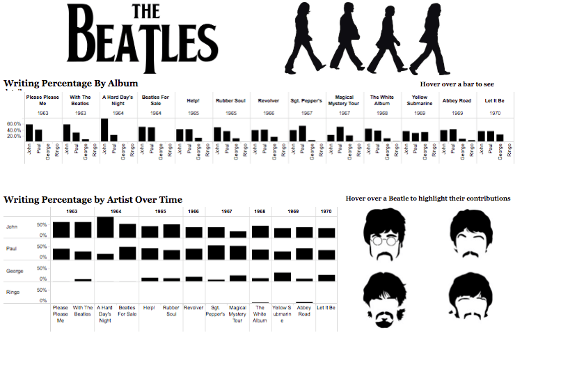
Lastly, your choice of text can improve your visualisation, whether it’s the kind of text you use or even how much. While text is distracting when there’s too much or if it’s not organised in a visually pleasant way, sometimes relying only on visuals doesn’t suffice. When using text, make sure it points out important details – like individual contributions of the Beatles members to the signature songs and albums that they released at the height of their popularity. While we’re hardwired to process patterns and images over words, applying text where it really counts can make a major difference.
Here are a few other guidelines to help take your visualisations from good to great:
- Place the most important view at the top, or in the upper-left corner. Your eye is usually drawn to that area first.
- Limit the number of views in your visualisation to three or four. If you add too many, the big picture gets lost in the details.
- If you have multiple filters, try grouping them together. A light border around them gives a subtle visual cue that they have shared features.
- Interactivity can make the difference between a horribly confusing visualisation and an all-star analysis. You need to guide the story and encourage exploration. When building in interactivity, make sure viewers know that they can engage with it – perhaps offering subtle instructions for them.
To learn about data visualisation best practices, read 10 best practices for building effective dashboards.