Four steps to using data in your COVID-19 business continuity plan
Most organisations have a business continuity plan to respond to an unanticipated shock to business. Resilient organisations execute these plans with data at the forefront, because up-to-date information is key to taking effective action. While no one could anticipate the unprecedented disruption caused by COVID-19, the most effective leaders stay one step ahead, using data to address challenges related to customers, operations, finances and more.
In this blog, we offer a four-part framework on how to use data and analytics as you adjust to new ways of operating. We share examples from our Tableau on Tableau: Leading Through Change webinar on how Tableau teams across marketing, sales, finance and more spun up solutions to respond to the crisis and better manage our resources.
Here are four steps to refine your data and processes in crisis:
- Seek understanding with available resources.
- Identify opportunities and gather new data as needed.
- Take informed action, using data as an asset.
- Assess and improve impact of actions.
1. Seek understanding with available resources.
It is a truism: Make the most out of what you currently have available. If you’ve established a strong analytics practice, you can probably answer critical business questions in a pinch. But in situations where using data and analytics is a new muscle, a little bit of work can go a long way.
In the webinar, the Tableau finance analytics and customer solutions teams presented how they started from existing resources, like previously-built dashboards, to gather new data about the current state of the business.
When the crisis hit, before building anything new, the finance analytics team at Tableau turned to their own team’s variance dashboard to determine how changes in the economy were affecting Tableau. Serving as a single source of truth for leaders across all lines of business, this variance dashboard brings together up-to-date results – from monthly financial reforecasting, total expenses and more – to inform how to allocate resources. Having this broad, but also deep, level of insight across the company supports agile and strategic decision-making as needs evolve.

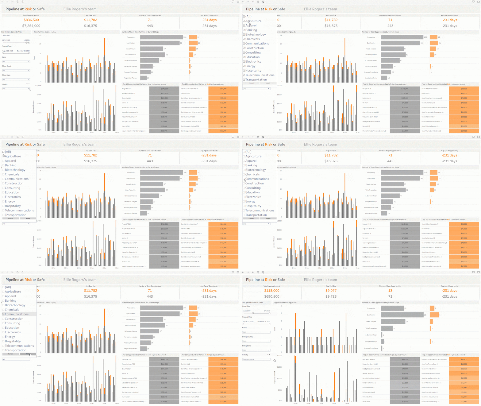
The customer success team also leveraged existing analytics resources to pivot quickly. To understand how deals were affected by COVID-19, the team made small changes to an existing sales pipeline dashboard to quantify the impact to our business.
Sellers were asked to tag COVID-impacted deals by putting "COVID" as a prefix to the opportunity name in the CRM platform. With these data updates and some additional filters, the dashboard now shows sellers which deals are at risk (in orange) and allows for deeper analysis into how quarterly results are affected by the crisis. Now sellers can focus on the segments and territories that need them most during this time. Watch this video to find out more about this process and learn how to do it yourself.

2. Identify opportunities and gather additional data as needed.
Another critical part in your business continuity plan is the data itself. Examine your existing data sources and then identify gaps. Start with these questions: What data sources do we need to tweak and what additional data do you need to collect to answer new questions?
You may be able to fill these gaps with a combination of existing and new sources of data. The Tableau people analytics team, for example, used aggregate COVID-19 case data combined with employee data to understand how to support our employees in this unprecedented crisis.
Early on, human resources needed to understand where employees are located in relation to outbreaks of the virus. The people analytics team at Tableau built a new dashboard using geographical data and COVID-19 data to inform decisions about office closures and additional prevention efforts. Now, this data is being used to help HR determine when offices are safe to reopen.

To understand employee mental health in response to COVID-19 and working from home, the people analytics team gathered data from employee survey responses. They used this data to identify how to improve the transition to a work-from-home environment, address concerns and support employees in the best way possible.

These new dashboards are two ways organisations can gather and apply new data to move forwards and form a business continuity plan with room to grow.
3. Take informed action, using data as an asset.
The third part of this business continuity framework is about taking action. Instead of being bogged down by the pressure to design the perfect solution to a problem on the first try, focus on solutions you can stand up quickly and be prepared to iterate as you learn more about what works.
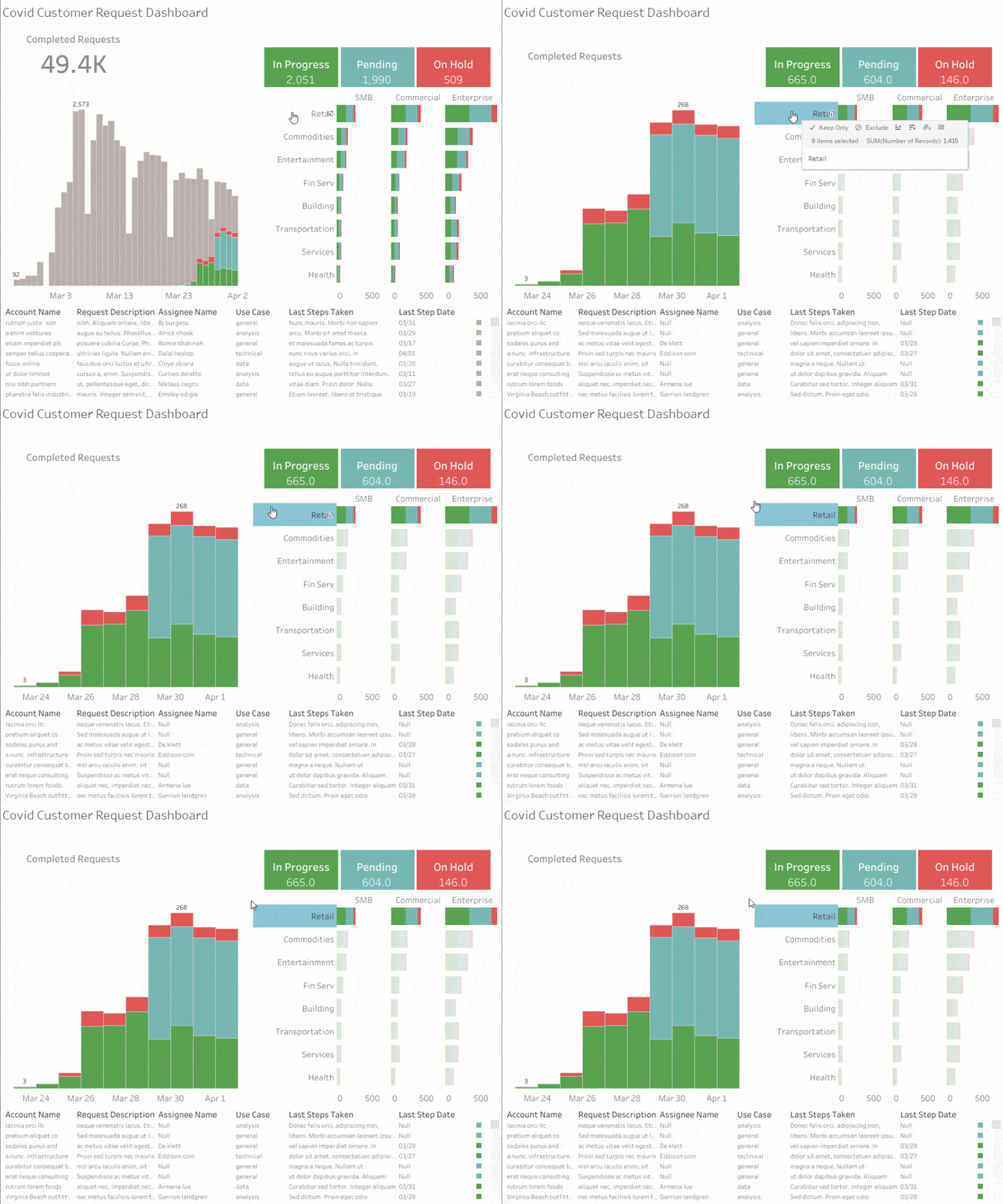
As the crisis escalated, the Tableau customer solutions team had a large influx of customer requests. In order to gather clean, accurate data on those requests and allocate newly assigned resources to them, they developed a process outside of traditional support channels to manage the volume of requests and triage potential solutions. To manage the response workflow, the team created a visualisation to track the number of requests, the status of the requests (pending, in progress, on hold) and the employee assigned to the task.

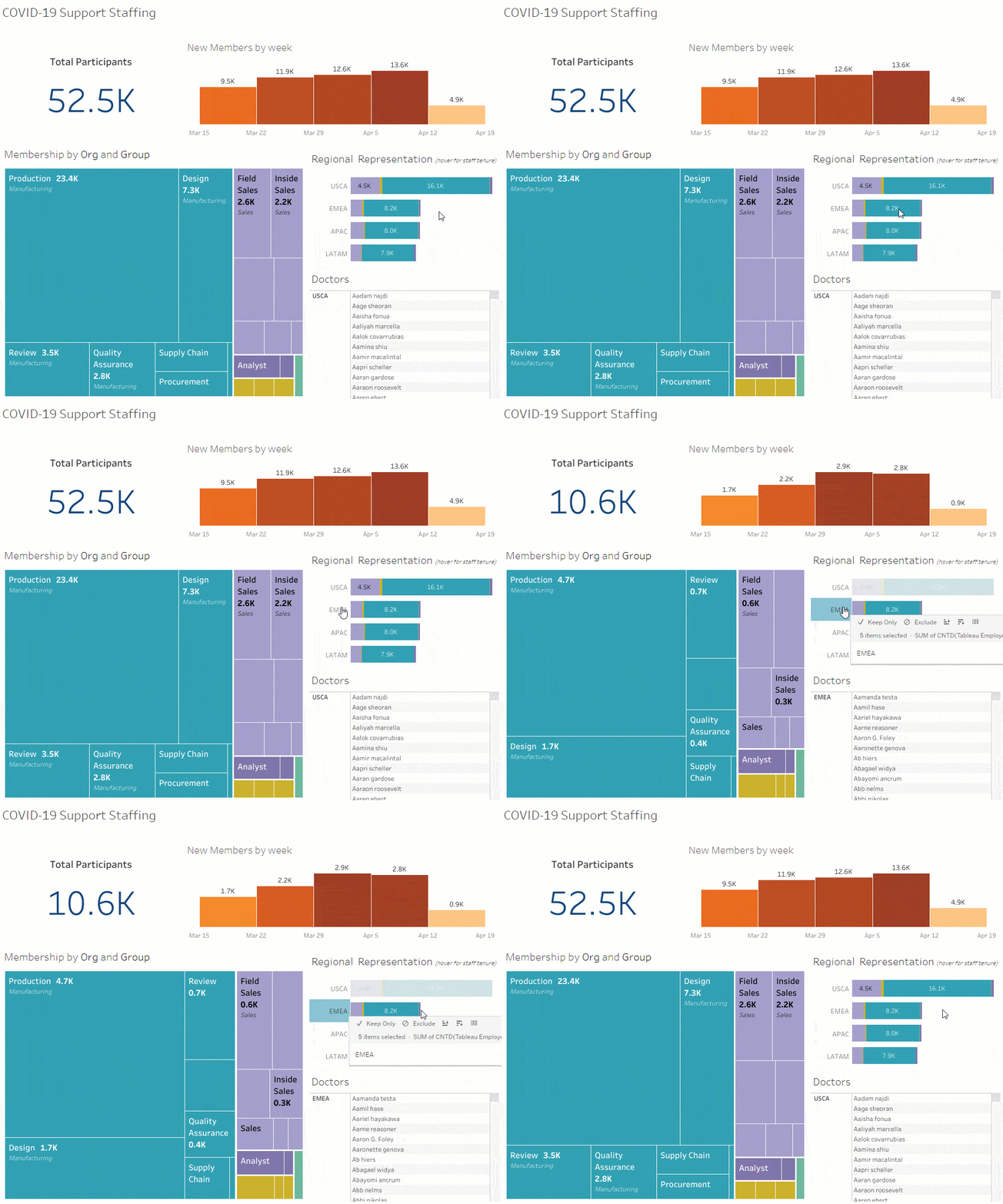
Crafting this new COVID-specific workflow led to the creation of two additional dashboards: a volunteer staffing dashboard and a work tracking dashboard. The staffing dashboard merges geographical data with Slack channel data to match skilled employees with customers in their region, improving timeliness and the overall customer experience.
The amount of time spent on requests and the solutions used to resolve them are tracked in a COVID-19 work tracking dashboard, which helps managers resource more effectively and understand the impact their employees are having.

This new customer solutions process was spun up quickly, but it continues to evolve, improving with each iteration. Early action meant that customer solutions, support and account management teams could quickly address customer needs.
4. Assess and improve impact of actions.
Once you have a set of foundational dashboards, you can start to iterate and refine your approach.
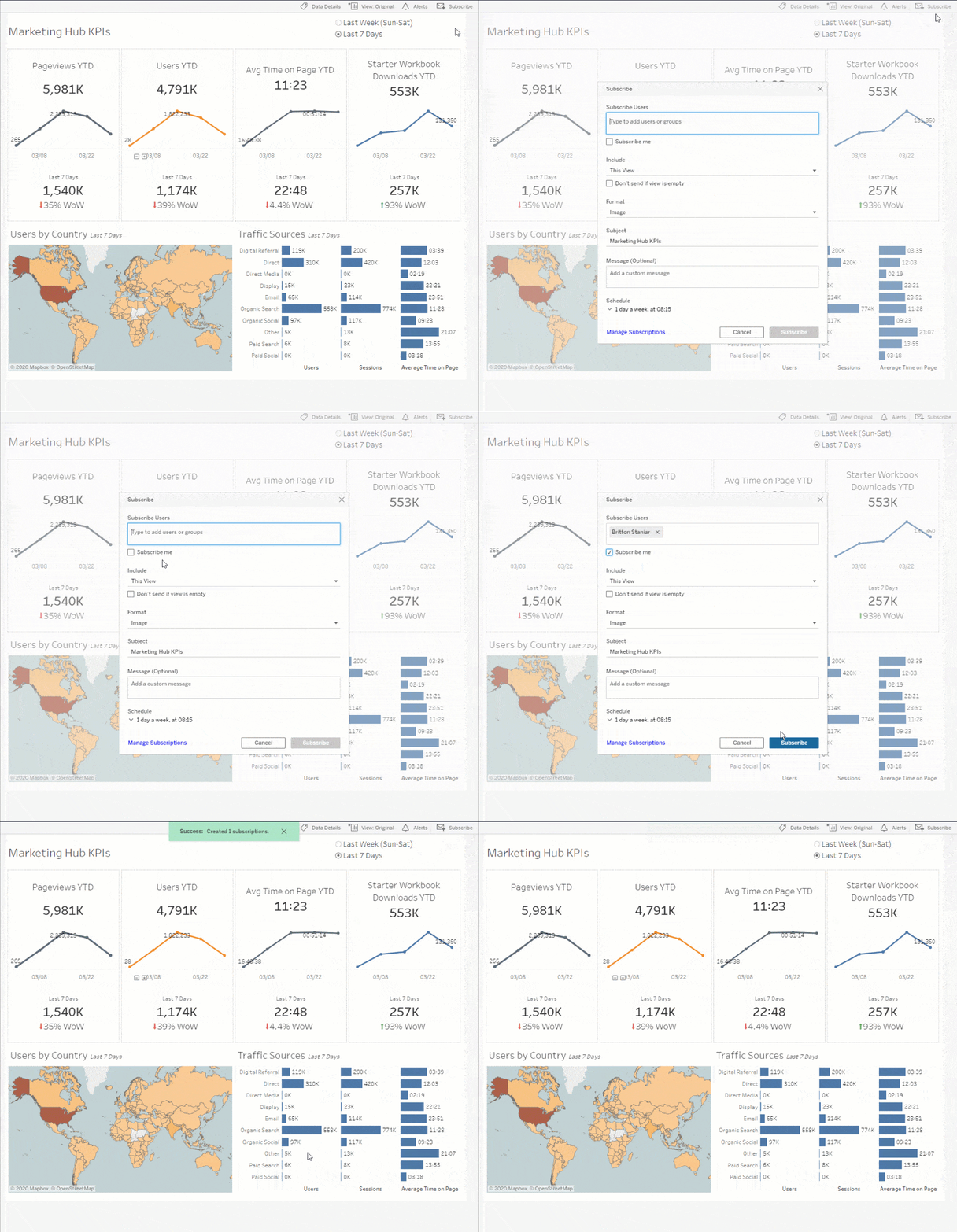
Shortly after our Seattle offices closed, the Tableau marketing team launched a public COVID-19 data hub to help companies track the impacts of the pandemic. To assess the performance of the Data Hub website and related digital initiatives, our marketing analytics team developed two dashboards: a website KPI dashboard and a website content engagement dashboard.
While we knew that the data hub had been seeing a lot of traffic since it went live, we wanted more details about the number of visitors, where they were coming from and if they were downloading free resources. So, the team built the website KPI dashboard, pulling disparate data from Google Analytics into a centralised, easy-to-understand overview. One of the many useful insights from this dashboard is understanding where visitors are located, helping our localisation team prioritise the translation of content.

Having this performance inspired the marketing analytics team to dive deeper into elements of the data hub. They created a website content engagement dashboard to understand how people flowed through the website from the webpage. This data informs how we optimise the overall experience and improve our content for maximum customer value.

Data and analytics processes are incremental, particularly in times of crisis where businesses are learning as they go. Take a step-by-step approach, but as new information emerges, remember to go back and audit your data sources (and dashboards) to determine if they still make sense, or if you need to tweak them to answer new questions.
Explore more resources to lead through change
These teams across Tableau used data to respond to the crisis, manage resources efficiently and focus on our customers’ needs. As you look to the future, we hope that this framework grounds your recovery efforts to better manage uncertainty and rapid change with confidence.
For more in-depth examples, watch the Tableau on Tableau: Leading Through Change webinar recording. Get advice from experts on how to manage through crises on our Leading through change with data resource page.
Related stories
Subscribe to our blog
Get the latest Tableau updates in your inbox.


