7 tips and tricks from the dashboard experts
Do you build dashboards for people in your organization? Tableau Technical Evangelist Director Andy Cotgreave shares examples to implement the best ideas in your work.
By Andy Cotgreave
Technical Evangelist Director, Tableau
Do you build dashboards for people in your organization? In our book, The Big Book of Dashboards, we show 28 different examples that succeed in data storytelling and delivering insights. Each is a complete case study with ideas you can implement in your own work. In this post, we've highlighted seven best practices you can apply right now to make your dashboards more effective. And for even more tips and tricks, be sure to join our webinar series to dive into the art of dashboarding.
1. Be inspired like an artist
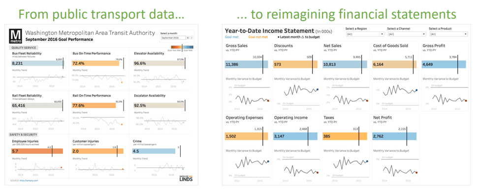
 Austin Kleon, author of Steal Like an Artist, encourages us to embrace the influence of others. This holds true in designing dashboards as much as in any creative endeavor. Don’t create your work in a vacuum: Take inspiration from as many places as you can. A great example is Andy Kriebel’s financial statement dashboard, based on the work of Lindsay Poulter. Lindsay’s original design was applied to public transport data, and Andy redesigned a financial statement using that idea. When you see a great visualization, examine it and consider any aspects that would benefit your own work.
2. Avoid clutter

When you first start building dashboards, it’s tempting to throw every possible applicable chart or graph onto them. Don’t fall into that trap.
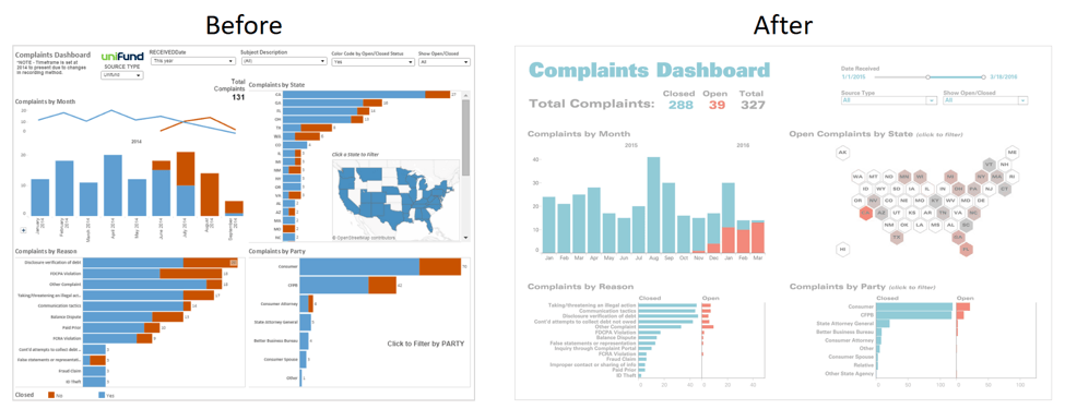
The trick is to remove as much as you possibly can while ensuring the end user gets the right insight from your dashboard. This is often an iterative process, as you can only discover the “better” version over time. Go take a look at the latest dashboard you created: does it have too much on it? Is there anything you can remove or rearrange to add clarity?
3. Use a grid layout

When placing objects on a dashboard (views, filters, titles, etc.), consider a grid format.
A grid helps provide a reading order for your dashboard, allowing your users to guide themselves through the dashboard in a predictable and logical way. You can use a columnar- or row-based flow to create a narrative that leads users from overview to detail.
4. Use the right fonts

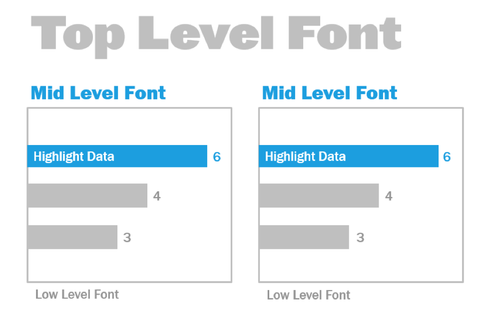
Typography is important. It can be tempting to use too many font types and sizes in a dashboard. Don’t do that; instead, define a clear hierarchy for your typography.
In the example above, there is a top-, mid-, and low-level font. The mid-level is blue to focus viewer attention. Color draws the eye to the most important level (which needn’t necessarily be the top-level font).
Reducing the levels of hierarchy to only the most necessary reduces confusion for your users, and color is one of the best ways to attract viewers.
5. Simplify your use of color

How many times have you seen a dashboard that looks like an accident in a paint shop? Color is one of the most tempting things to play with when building a dashboard. It feels productive, and it seems like you’re adding value by making things colorful. But get this: unnecessary color does not add value.
You should be able to justify every single color on your dashboard: why did you choose any specific color, and what does it communicate to your user? If you can’t answer that question, remove the color.
Keep in mind that 8% of males have color-vision deficiency (CVD): choose palettes that work well universally. This means avoiding reds and greens, or at least choosing reds/greens that can be seen by people with CVD. To dive deeper, review Tableau’s best practices for color.
6. BANs

Don’t bury the most important fact, your KPI, in a chart. Show it loud and proud as a Big A** Number (BAN)!
This technique hits users with the most vital information immediately, and charts provide further context. At Tableau, our research team has been studying the impact of BANs using eye-tracking software. Check out their top 5 key learnings.
7. Collaborate and iterate

If you take one tip away from this post, it’s this one: no dashboard is right the first time. Time and collaboration are the only ways to hone in on the best representation of your data. Other people’s opinions will bring you fresh perspectives.
All the dashboards in our book went through many iterations. Even now, we are still evolving them to make improvements and adapt to changing business questions.
Don’t know where to start? Here are some ideas:
- Attend a Tableau User Group (or start your own).
- Join Tableau Community to ask and answer questions on the forum.
- Get involved in #MakeoverMonday.
- Set up an internal Tableau group at your company.
Dive into dashboarding
I hope this has gotten you thinking about how to optimize your own dashboards.
To learn more, check out our resource page dedicated to helping you create optimized dashboards for any industry:
Showcasing the best in business dashboards
And don't miss our webinar series, featuring the Tableau Research team, and the authors sharing tips and tricks galore:
Building dashboards that inform and inspire


