Tips for creating mobile dashboards with new automatic layouts for Tableau
Recently, Tableau introduced a faster way to mobilize your dashboards to users on their phone with the automatic mobile layouts feature. Now every new dashboard includes a mobile layout. Besides automatically appearing, the new smart technology builds with you, so feel free to focus on the desktop while it works behind you. As long as the setting is set to automatic, it continuously updates everything you add, remove, or change on the dashboard.
Tableau’s smart layout follows known best practices, reading from left to right to help our dashboards flow nicely on the phone. Each object on our dashboard will build down for mobile. If I keep this in mind while I design, I can make my transition from desktop to phone quite smooth.
In this post, I put automatic layouts to the test with a dashboard analyzing shipping from the superstore data set that comes with Tableau. I’ll review some best practices for creating mobile dashboards and explain how this relates to the new automatic layouts feature.

I designed this dashboard using floating objects and made use of set actions. Will automatic layouts preserve the simple elegance of this dashboard?
Start building dashboards with mobile in mind
One principle for successful mobile dashboards comes from the basics of web design. Web pages use CSS to create breakpoints. I don’t want to use CSS, but I do want to find ways to tell Tableau what I want. Sometimes, we might build these KPIs as a whole unit or in numerous pieces. I know that I want to make a 2x2 box on my phone layout, both to make the best use of space and to create something that feels natural on the phone. With this in mind, I’ll build my chart that way from the beginning.
I’ll also consider some good design practices for mobile, like surfacing the high-level takeaways for the audience, with intentional interactivity. Remember that your audience won’t always be able to drill down on a small screen, so you have to think about giving them the most important metrics and KPIs that they need to have readily available to them.

Minimize glare and make clicking easy
Fight the blue light: Screens are probably one of the key offenders in the blue light war. It used to be the sun. With always-on set-to-the-max-brightness screens that are near-constant, we’re setting our retinas up to fail. White in particular loves to amplify this effect, which is why some of the nicer phones offer a night-mode and blue light filter. To ease screen glare, I’ve opted to soften the white with a lemon cream background.

Make vizzes easier to click: Smaller screens not only mean less real estate, but reconsidering the how the data itself is presented due to an entirely different shape (most people interact with their phone upright). We also have less precision on a phone. We’ve learned (and anyone who remembers the 1980’s or ’90’s knows it was learned) to use mice as inputs. Our fingers are instinctual, but the lack of texture and minimal feedback is not. With this is mind, I made the bars in super chunky to help my users click.
Intentional filters: Phones have a compressed space and are likely used in the middle of other activities. My targeted end user may be in a warehouse and dividing attention. I’ve also added a set action focused on the Shipping Mode that activates the charts surrounding it. This highlights that category and lets me compare it to others versus removing details with a traditional filter.
Use automatic layouts for instant mobile-friendly dashboards
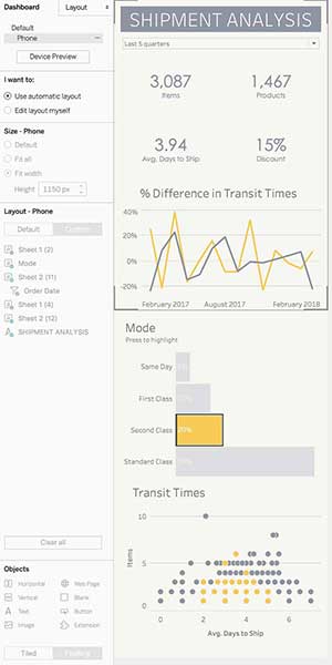
Now I’ll bring this dashboard into the device designer to create the mobile version. Right away my dashboard looks like this:

In the image above, you’ll notice that I have new options in my dashboard pane. Automatic layout is selected and my dashboard is slightly greyed out as a signal that I don’t need to do anything. Tableau Desktop tiles each chart one by one in z-reading order. I don’t need to, but I could choose to edit this if I want to tweak it even further. This dashboard looks exactly how I hoped it would! If I leave it automatic, it will continue to update as I make changes.
My tips for optimizing automatic layouts:
● Filters go above the charts that display them. Using a global filter? Select them from the first chart, so it goes to the top of the dashboard.
● Automatic follows a z-reading pattern based on the upper left corner of every worksheet. Remember this when creating the desktop version of your dashboard so you have an idea of how it will display on mobile.
● Floating designs get converted to tiled in the mobile layout. Items that are stacked get read by their starting pixel.
Learn more about creating automatic phone layouts in Tableau.
関連ストーリー
Subscribe to our blog
Tableau の最新情報をメールでお知らせします


