Learn how organizations are visualizing and sharing Coronavirus data
Originally published on Tableau Public.
As the world attempts to understand the impacts of Coronavirus (COVID-19), publicly sharing data and analysis on a quickly-evolving situation has become an urgent priority for many. Organizations are working as fast as they can to meet an increased need for public communication, transparency, and trustworthy information. Governments specifically have a heightened responsibility to serve as a source of truth. Over the past few months, many organizations and governments have used Tableau Public as a platform for accomplishing this.
“Beginning in late February, traffic to Tableau Public data visualizations began to increase exponentially, driven by a spike in governments and nonprofits communicating COVID-19 data with their constituents. Meanwhile, there was a dramatic growth in people searching for local and up-to-date information,” says Ellie Fields, SVP of Tableau Product Development. With some Tableau Public dashboards garnering more than 20 million views, the Tableau Public team acted quickly to ensure platform availability and continue seamless sharing of critical information.
Three ways organizations are using Tableau Public
There are thousands of COVID-19 vizzes published on Tableau Public, so we’ve curated a gallery of some of the community's most impactful work. The below examples highlight just a few of the ways that organizations are using Tableau Public to share important information.
- Automatically updating dashboards that provide ongoing visibility
- Mapping locations of local resources
- Spotlighting insights about the broader community impact
Sharing Coronavirus (COVID-19) data in the form of trackers and dashboards on Tableau Public is becoming increasingly popular among a variety of organizations. Whether it’s state health departments publishing their primary data like Virginia, Colorado, California, and dozens of others, or media outlets like CNBC and Argentina’s La Nacion amplifying trusted secondary data sources, people feel more informed when they can view regularly updated Coronavirus (COVID-19) data. For instance, this Coronavirus Tracker by the Kaiser Family Foundation’s Coronavirus provides real-time updates on cases and deaths around the world.*
“The KFF dashboard provides a high-level summary on the Overview tab, with the small area charts across the top, but then allows the user to customize their view in an expanded window on the Analyze Trends pane. Rather than being limited to the choice of a log or linear scale, for example, users can toggle between different views to explore the data,” - Amanda Makulec, Senior Data Visualization Lead at Excella.
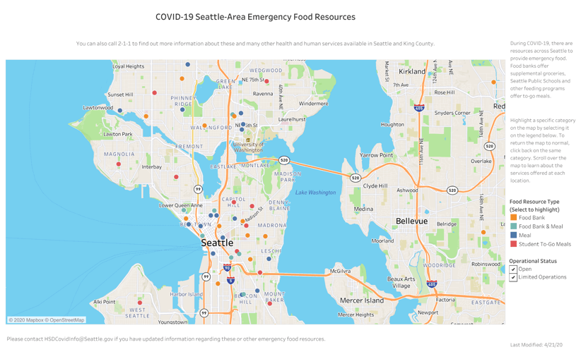
Data doesn’t need to be consumed by the masses to be effective. What’s most important is that the right people get the right information at the right time. For example, this map by the City of Seattle’s Human Services Department shows the locations of various emergency food resources around the city. Some of our other favorites include similar maps of food resource locations in Cincinnati and New Orleans (created by individuals rather than organizations).

“In a time where we are in a global pandemic, it's not surprising to see a surge of global maps. However, it's great to see examples of visualizations applying data in a local context. State and county maps provide individuals local data so they can find certain types of resources in a time of need.” - Lindsay Betzendahl, Tableau Zen Master, Consultant at HealthDataViz.
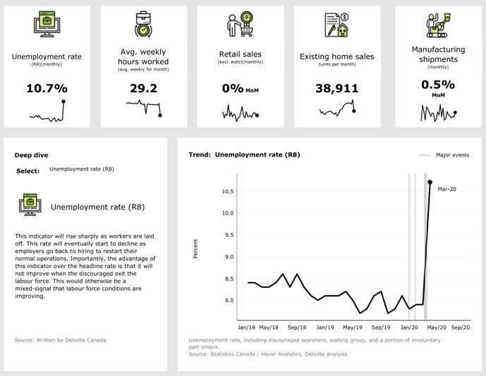
Many are tracking and analyzing response efforts to the crisis. How is the response being funded? How are educational systems adapting? What is the effect on businesses like retail stores? In this dashboard, Deloitte monitors and analyzes various health, economic, and geographic indicators to help organizations to manage and mitigate risks.

“I love in this example how Deloitte displays indicators in an easily digestible format with big numbers and trend arrows, but still allows for interactive analysis. They've thought deeply about the audience experience and how a viewer can follow a 'flow' of information,” - Andy Cotgreave, Tableau Technical Evangelist.
Three tips for organizations considering Tableau Public
- Choose the right platform for your needs.
- Create and customize device layouts for viewers on phones.
- Store data in Google Sheets for automatic daily updates.
Looking to share a Tableau dashboard publicly? You can do this with either Tableau Public or Tableau Server. Tableau Public is a free, managed service, meaning that Tableau will oversee all of the infrastructure needed to handle high traffic loads. Only public data should be saved to Tableau Public. For organizations with a greater need for collaboration, telemetry, and database connectors, Tableau Server is the platform of choice. Tableau Server can be deployed on-premises or in the public cloud, and you manage the hardware to handle the traffic. To embed dashboards publicly, you will need a core-based license of Tableau Server, which you can learn more about in this deployment guide. If you choose Tableau Server, we recommend having an external repository to handle high traffic, which is only supported on AWS deployments.
Whether hosted on Tableau Public or Tableau Server, there’s a high probability someone will view your dashboard from their phone. Mobile devices account for nearly half of all traffic to Tableau Public vizzes. For tips on optimizing your visualization for mobile consumption, read this blog post by Zen Master Bridget Cogley.
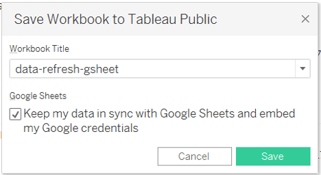
Although all data sources on Tableau Public are extracts, Google Sheets connections give you the option to refresh the data every 24 hours. When saving your dashboard to Tableau Public, check the box to “Keep my data in sync with Google Sheets.” Every 24 hours, Tableau Public will automatically refresh the Google Sheets data source, adding new rows and updates from the Google Sheet into your dashboard. Learn more about using Google Sheets with Tableau Public in this blog post by Tableau Public ambassador Jacob Olsufka.

Curious about other visualizations created by the community? Check out the Coronavirus (COVID-19) Gallery, and don’t forget to “favorite” vizzes for easy access later. Looking to create and share your own analysis? Head over to the Tableau COVID-19 Data Hub for access to trusted data sources. Remember your data literacy basics, consider the context, and always remember to #VizResponsibly.
*Please remember to #VizResponsibly. Here are some resources that can help you when visualizing Coronavirus (COVID-19) case data:
関連ストーリー
Subscribe to our blog
Tableau の最新情報をメールでお知らせします


