How Do People Communicate and Collaborate with Data in Organizations?


Data is everywhere in organizations, but how do people actually use it to communicate, present, and collaborate? Matt Brehmer and I investigated this question in a pair of studies that we report on in a paper to be published at the VIS 2021 conference this week, titled From Jam Session to Recital: Synchronous Communication and Collaboration Around Data in Organizations. In addition to asking about people’s uses of data presentations in meetings, we showed them a series of mock-ups for ideas that we thought would make for better recorded and live presentations.
After conducting the interviews, we came up with three main scenarios, which we refer to using a music performance analogy: jam sessions for small, very interactive meetings; semi-improvised performances for more formal meetings across teams; and recitals for highly-produced presentations on a stage or to large audiences.

Jam Sessions: Small, Interactive Meetings
Big, flashy presentations get all the attention, but small meetings are much more common throughout organizations. Several of our interviewees described meeting multiple times a week, and one even multiple times a day. These meetings are data-intense, where the organizer or a presenter might bring early data after a first analysis or for familiarization and sense-making in the group.
Jam session-style meetings are highly interactive and collaborative, such that the presentations often are just the starting point for intense discussions where participants bring in their own perspectives and even their own data. They also serve as venues to test out material to be presented in more formal settings.
Semi-Improvised Performances: Cross-Functional Team Meetings
When meetings go beyond an immediate team, they become more formal and tend to be less interactive. Presentations in these meetings tend to be more prepared than the ones in the smaller team meetings.
The meetings in this category tend to happen at a regular cadence, such as weekly, monthly, or quarterly, which means that the audience is familiar with the data (at least on a high level) and is looking for updated numbers.
Recitals: Formal Presentations
The final category is that of the highly polished presentation to C-level executives, owners, and customers. These presentations stand out not just because they tend to be prepared and rehearsed much more intensely, but also because they are much more commonly presented by people who did not prepare them.
Materials for this type of presentation are also sometimes prepared by outside agencies that specialize in graphic design to turn simple charts into more visually appealing (and often 3D) graphics. Several of the presenters in this and the previous category expressed their frustration with the lack of appeal of bar charts and were looking for more engaging and interesting charts, like lollipop charts, donut charts, etc.
Research Design Probes
Our design probes—speculative prototypes and mockups— covered three main topics: progressive reveals in live presentations, second-screen use, and more interactive recorded presentations. You can get a better sense of them from our video.

Progressive reveal was received well by most participants, with them describing their own ways of covering up parts of charts so they could build them up slowly rather than all at once, and create a sense of suspense and drama.

We also showed a sketch of a separate view on the presenter’s screen that would be hidden from the audience. Reactions to this idea were more mixed, in that it was considered potentially useful, but not crucial for many presenters. Allow presenters to control the visualization from their screen without exposing all the filters on the presentations screen, which we though might be considered problematic. This ended up being less contentious than we had expected, however.

Finally, the prototype showing a way for a presenter to author a recorded presentation with video, which would synchronize with operations in the visualization that would steer it while keeping it interactive, garnered a more mixed response. While participants generally appreciated the “cool” factor, they did not see themselves creating such elaborate presentations. Though they did acknowledge that this approach could be useful to onboard users to new data or complex dashboards.
One of our conclusions from the interviews and the responses to the design probes was that the tools used in data presentations are really not well suited for this task. Presentation tools (slideware such as PowerPoint or Google Slides) do not go beyond basic charts and lack direct access to databases, etc., while business intelligence tools lack the presentation capabilities people are used to or would want to have. We believe that this is an untapped area for further research and development, in particular because it is such a common use case in organizations.
This was just a brief overview of our findings, we have a lot more detail and quotes from participants, thoughts on chart types and tool use, etc., in the paper and supplemental video.
関連ストーリー

Beyond the Default: Customizing Automated Data Insights with GROOT
 2024/10/24

Beyond the Visuals: Elevating Text as a First-Class Citizen in Dashboard Design
 2024/10/16
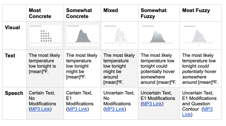
Exploring Data Uncertainty through Speech, Text, and Visualization
2024/08/09
Subscribe to our blog
Tableau の最新情報をメールでお知らせします