Clarifying Goals & Progress for Better Strategic Planning at University of Illinois
The University of Illinois at Urbana-Champaign is committed to the values of transparency and accountability—both within the university and externally.
This commitment extends to the university’s strategic planning efforts—and was a big part of why they chose to visualize their metrics and publish them publicly.

“We’re accountable to the general public, the taxpayers, and to our parents and the students who are writing checks to this place.”
But there’s another facet to accountability that the university wanted to consider.
“To help the leadership make good decisions and jointly hold everybody accountable, we believe that the more information we can put out there for everybody—that helps with decision-making and accountability of the leaders, of the different colleges and the campus overall.”
Lanesskog’s team had been tracking performance metrics for years, but found that traditional spreadsheets were simply not being used by many of the exact people they wanted to reach.
“There were many people who were not really numbers people—they got intimidated by spreadsheets or walls of numbers. So we really needed to have something that was more accessible to a broader audience,” he says.
For example, Lanesskog notes that when these spreadsheets were printed and distributed in multi-page spreadsheets for use in budget planning, they were “just one more thing stapled onto a bigger packet.”
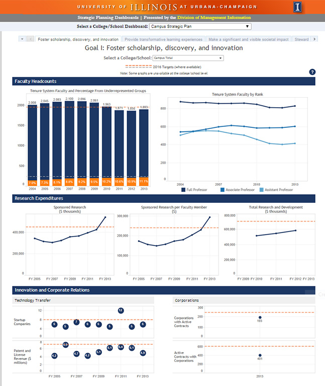
Click to interact with the dashboard
The team’s visualizations of that same information received a far warmer welcome at the last budget meetings. “People were actually, I think for the first time, really asking questions related to this data through those budget conversations,” he says.
Chris Lehman, Assistant Director of Data Management - Division of Management Information, designed the dashboards to feature a high-level view at the campus level, with the option to filter by school. Each view—whether campus- or school-level—aligns with the greater goals the metrics support.
Additionally, Lehman made the design as user-friendly and intuitive as possible.
“The visual elements—the categories, the targets, the blue bars—helped to organize it almost into ‘chapters’ within a single page. And that helps to tell the story and make it more consumable for others,” says Lanesskog.
“We found that we really could squeeze a lot of data into the display—we could put a lot of information in a much smaller space than we had imagined, thanks to the ability to be creative with how we organized the display,” Lehman says.
Lanesskog is very optimistic about the impact their dashboards will have on future decision-making at the university.
“You can see right away—are you going in the right direction or not? And how far away are you from where you need to be—and why?” Lanesskog says.
His expectation is that these dashboards will become a greater part of the budget discussion each year, to support decisions about how to sustain success and make investments in areas that need improvement.
Subscribe to our blog
Tableau の最新情報をメールでお知らせします


