A one-day curriculum for teaching Tableau: Tips from a Master
Note: The following is a guest post by Tableau Zen Master Yvan Fornes.
I recently had the privilege of teaching my passion—data visualization—at the EDHEC Global MBA program in Nice, France. I was sent by my company, Amadeus, the leading IT solutions provider for the travel industry and largest processor of travel bookings in the world.
As institutions with similar goals, EDHEC and Amadeus often collaborate. For several years, EDHEC Global MBA participants have spent two months consulting for Amadeus, providing valuable project insights. In addition to welcoming interns from EDHEC, Amadeus also recruits graduates from the MBA program, as it is ranked among the top 25 in the world by The Economist.
A curriculum for onboarding Tableau
The goal of my one-day class was to teach students how to answer a business question using Tableau. To achieve this goal in such a short period, I had to find a way to make the students learn by themselves before and after class. When I’m asked how to teach Tableau, I usually recommend doing it in five steps:
- Familiarize yourself with the basics to understand concepts like using pills, shelves, aggregation, and data types. There are great videos on the Tableau site that explain these principles. I asked students to watch the videos below to get comfortable with visual analytics:
- Get hands-on by creating your first dashboards. Before the class, students had to publish a draft visualization to Tableau Public. The criteria? Answer a business question with a public data set that I provided.
- Attend an advanced class or two to learn deeper concepts. Myself, I waited too long (two years) to pursue advanced classes: I would have saved a lot of time by finding one sooner. My recommendation is to do so a few months after you start using Tableau. This will allow you to elucidate and apply more complicated concepts—for example, differentiating between row-level, aggregated, LOD, and table calculations.
- Have a look at the Tableau Public gallery. Find vizzes you like, download them with the button in the bottom-right corner, and try to understand how they were made. By reverse-engineering visualizations and dashboards, you’ll internalize best practices and better understand visualization techniques.
- Practice, practice, practice by creating new vizzes and publishing them to Tableau Public. At work, you will be confronted with the same data sets often, and will have to answer the same types of questions. But by practicing with Tableau Public, you’ll expose yourself to more varied situations that teach you novel analytical approaches.
To motivate students to practice, we organized a data viz challenge in collaboration with the EDHEC, Tableau, and Amadeus. Participants delivered a final visualisation that was graded, and the top three teams were rewarded. (Scroll down for the competition details!)
Step One: Get familiar with core data visualization concepts
My class dealt with data visualisation best practices and hands-on Tableau exercises. These approaches underscore these three data visualisation concepts:
- Start with a question to answer or hypothesis to test. As Alberto Cairo says in his book, The Functional Art: “Any good infographic is functional as a hammer.”
- Keep it simple, but not boring. When it comes to visual best practices, while there is much to consider, keep this core concept in mind: Don’t use too many colors or fonts (I try to stick to two). Play with shades of one color and styles of the same font instead.
- Choose the right chart. You can use the well-known Andrew Abela diagram to select an appropriate chart type, but the takeaway is this: Circles and area charts have to be used with caution. You can also review William Cleveland and Robert McGill’s 1984 paper on graphical perception to learn about the most precise charts, 2D bare charts, and those that allow more generic comparisons like areas charts and color shades.
Step Two: Set students on the right track with these tips for building vizzes
To put these concepts into action, I presented nine data visualisation tips to the class. Here are the top three:
- Add context. We need to help viewers interpret our vizzes. Do they understand the key questions in your viz? Do they know how to explore it? Think about your viz’s context, and use these tools to orient your viewer:
- Time lines with a trend
- Year over year evolution
- Benchmarks
- Titles and text are key. An article published on Story Bench about Michelle Borkin’s latest study, “Beyond Memorability: Visualization Recognition and Recall,” changed the way I build my vizzes. Using heat maps, the article explains that humans are drawn first to titles, text, and pictograms. If you are like me, numbers-focused, this is may be an eye-opener. Remember that others aren’t as familiar with the underlying data as you are.
- Test, test, test. You can never test enough:
- Does your viz display properly on the web, and at different screen sizes? Open it in Chrome and Firefox for best results. Pro tip: Try device designer for guaranteeing a good user viewing experience on any device.
- Does your target audience understand your viz? We learn a lot by watching people interact with a viz, so ask users: Do you understand how the viz is set up? Can you find the answers you’re looking for?
Step Three: Give your students a challenge
After my one-day class, the 96 students formed groups of three to compete in the Amadeus-EDHEC-Tableau data visualization challenge. In this competition, participants had two weeks to deliver their final Tableau Public vizzes, given these simple rules:
- Use the publicly-available Airport Eurostat data set. (Download a viz below to view the data.)
- Choose a business question based on the data.
- Build a Tableau dashboard answering your question.
- Publish your dashboard to Tableau Public.
I was a bit afraid to ask too much of my students, since most didn’t know anything about data visualization or Tableau just a few days before. However, I was very pleased with what the students came up with. They all managed to publish informative, relevant dashboards. Check out the winning vizzes:
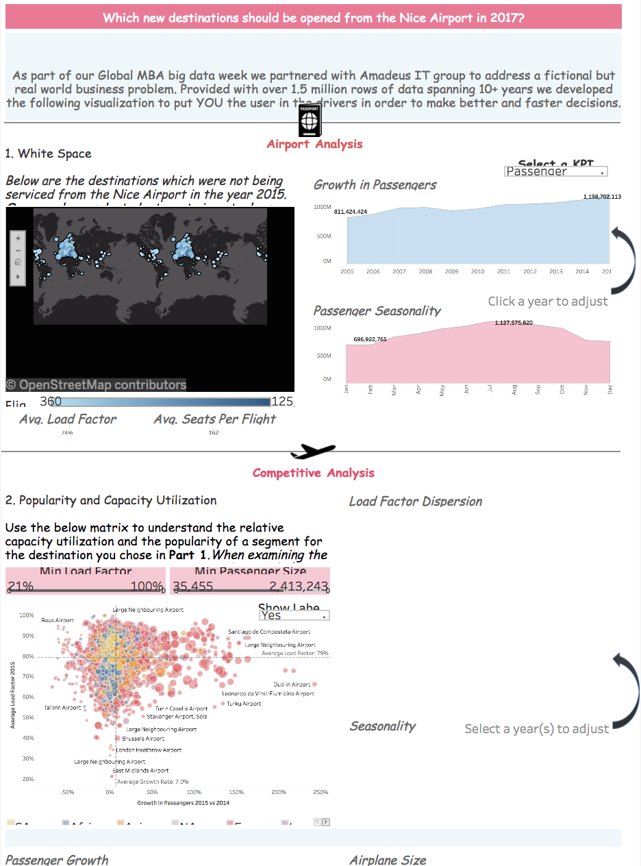
1st Place: New Airport Destinations for Nice, France
"I’ve come to realize the power a great story holds in a modern business setting. We are bombarded each waking moment with data from varying sources and scope, but it’s only those data points, accompanied by a great story, which take hold. With the help of Tableau, and expert advice from Yvan Fornes, my team and I worked to embody this concept of data storytelling into our visualization."

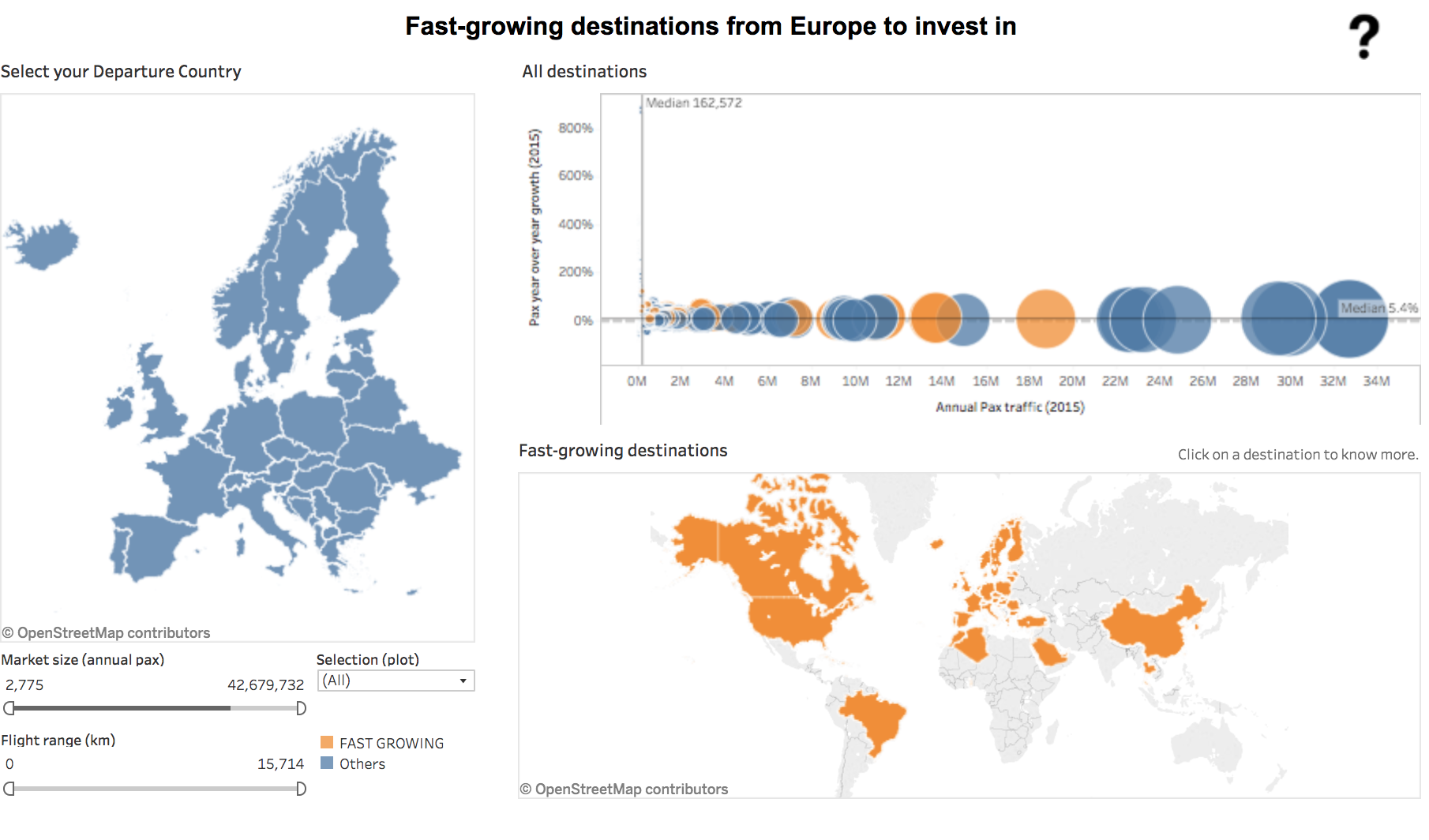
2nd Place: Where to Invest in Europe

"I discovered Tableau thanks to EDHEC MBA and Yvan Fornes, Tableau Zen Master at Amadeus. As a PMP project manager, I'm excited about using this tool in a professional context! In addition, the gallery of Tableau Public is a very valuable source of information I now regularly browse as a complement to traditional news media."
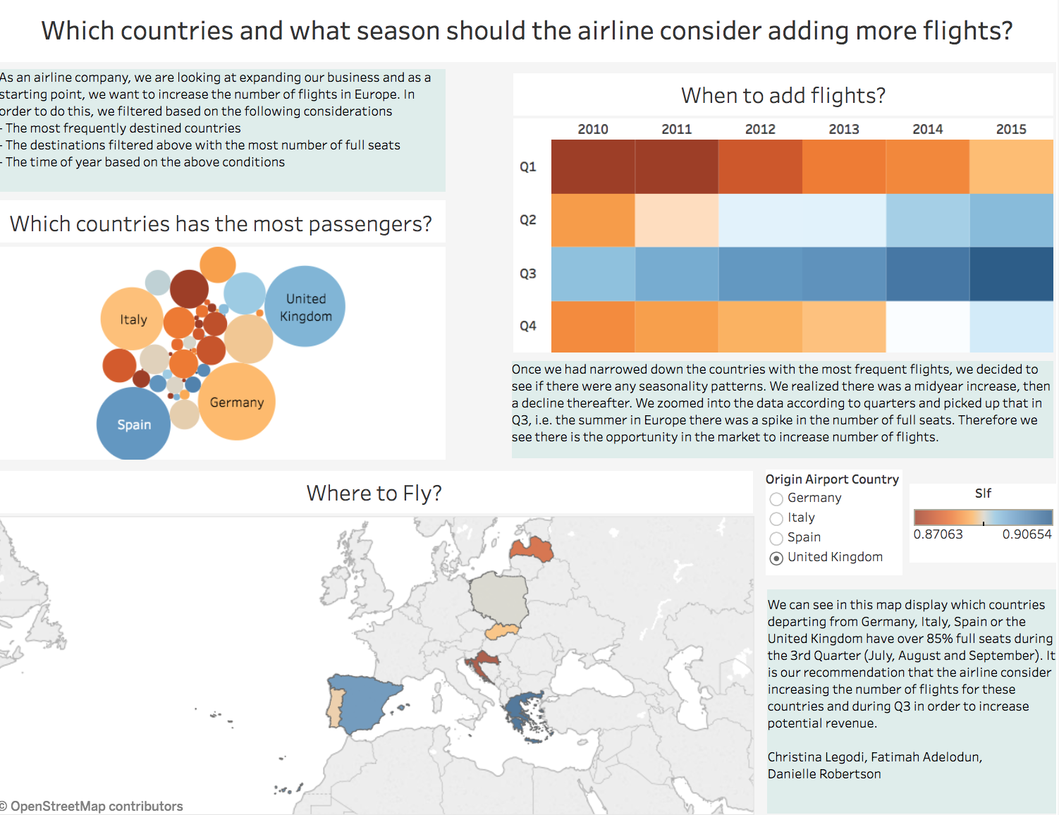
3rd Place: Flight Seasonality and Airline Expansion
"With the fast pace at which decisions have to be made, and the quantity of data now available, Tableau is a powerful tool to quickly see patterns, trends, narrow in on problems, and come up with quick solutions."

Let’s keep learning
It’s been a real pleasure teaching the EDHEC Global MBA students, who were highly involved and quick learners. Because they enriched the class with their extensive professional experiences from countries from all over the world, I’ve been able to improve and refine my teaching methodology.
I hope you can use these classroom resources to get to know Tableau better, and to help others learn about visual analytics in just one day. Be sure to leave a comment about which resources you rely on the most for learning about visual analytics and teaching. The more we communicate and share our experiences working with data, the better people will be able to see and understand it.
Check out Tableau’s instructor resource page for self-service learning options, ready-made curriculum materials, answers to frequently asked questions, and license support.
For more tips, tricks, and vizzes by Yvan, check out his Tableau Public page and connect with him on Twitter @YvanFornes.
Storie correlate
Subscribe to our blog
Ricevi via e-mail gli aggiornamenti di Tableau.


