UX Notebook: Designing Tableau Prep’s coordinated workspace
Imagine that you’re in a city you’ve never been to before. What is the first thing that you do? You probably orient yourself, asking questions like: What direction is north? Where is the closest coffee shop? What are popular things to do nearby?
To help you understand your surroundings, you may use a digital map on your phone, which shows you multiple views—a bird’s eye view of your surroundings, along with step-by-step directions to help you track your journey. A digital map also allows you to zoom in and see more details to determine where you might want to stop along the way.
Now, take the zoom experience on a map and apply it to data preparation. When we created the Tableau Prep workspace, we wanted to help users orient themselves with:
- An overview of their data journey (the flow pane)
- A summary view of their domains so they can quickly understand all the stops needed to clean up their data with auto-tracked changes (the profile pane)
- A row-level view that is granular and familiar (the data grid)

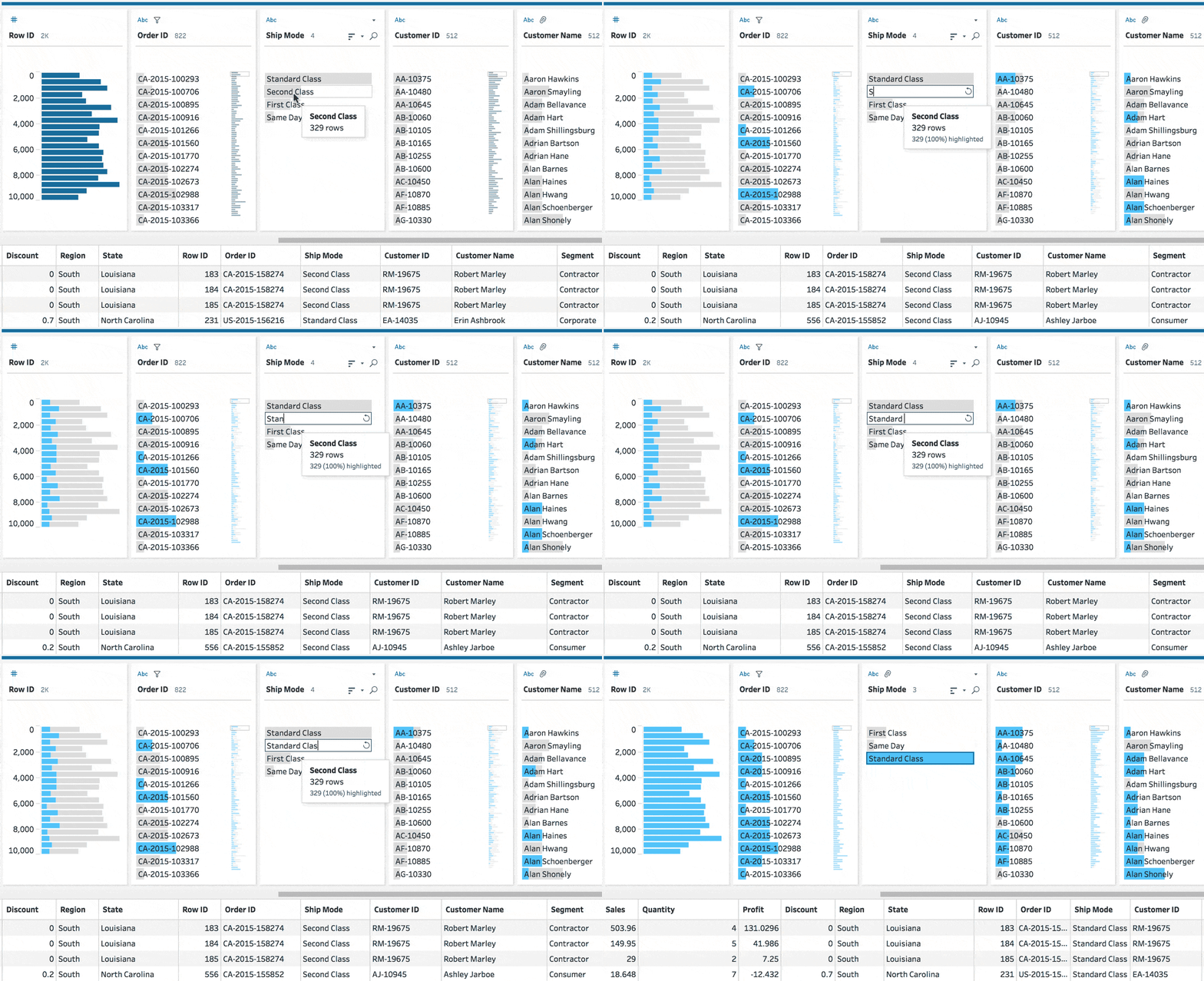
We made these three views coordinated so when you select a data value in the profile, for example, it will filter down to rows that use that value in the data grid. Each view has its own use because different levels of granularity allow for different insights. This is the foundational element of a very visual and direct experience in Tableau Prep.
Flow
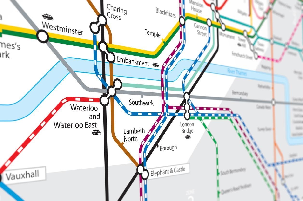
Before we designed the flow pane, we looked at subway maps for inspiration. Subway maps are complex but readable, and the more successful ones take a freeform geography and plot it on a grid. We wanted to create a flow diagram that had visual clarity, much like subway maps.

We used subway maps as inspiration for the Tableau Prep flow pane.
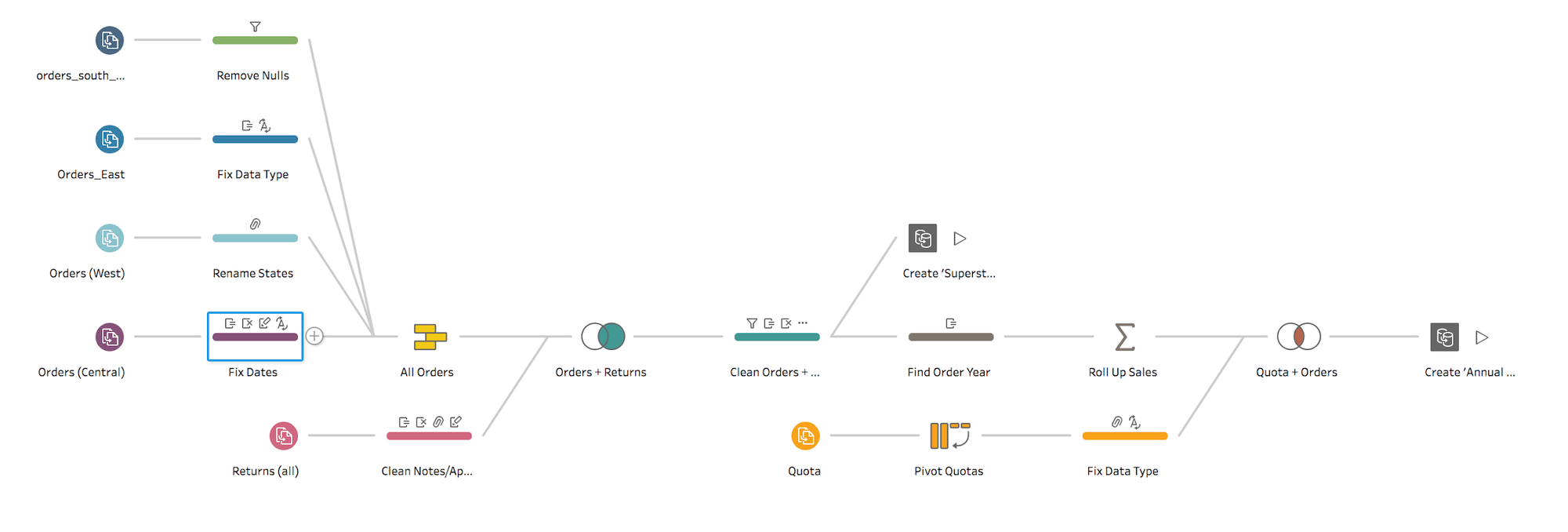
Traditional ETL flows document everything as a unique step. This can create very large, dense, and complicated graphs. However, when you evaluate what users are doing in their flow, (did I mention we talked to lots of users?) there were lots of actions that seemed to happen in succession: connecting to data, cleaning data, and combining data. These actions represent clear steps in the flow, and we used this insight as a baseline for our decision to organize actions into groups. We added icon annotations in the flow pane to have a visual documentation of these cleaning actions, reinforcing our vision for a simple, clear, high-level map of the major operations in a data preparation flow.

The Tableau Prep flow pane.
Profile
Profiles are extremely powerful in helping you understand the distribution of values in a particular column or field. For our Tableau Prep profile pane, we created around 50 prototypes—five variations in code—before we landed on the product as it is today.
The utility of the profile pane is simple, helping you see the number of records for each unique value in a field and allowing you to easily spot outliers within massive amounts of data. In the process, we asked a lot of questions to clarify the utility: How do I see the shape of the whole domain? Are discrete and continuous data better served by using different display strategies?

Based on our research, we found that there are a variety of tasks that the profile pane must support for a range of data types and volumes. This can be difficult to support in a single view, so we focused on the most common tasks, providing solid defaults that are contextual to the data, along with view options that give the user control.
For example, people wanted to spot outliers and understand the contours of their data. When presented with a profile, it is easy to spot outliers, including null values, values outside of a normal distribution, or a specific domain value that doesn't match what you'd expect.
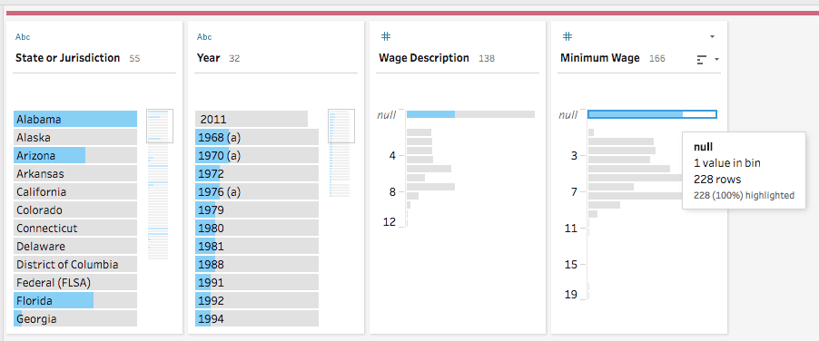
We know how important it is to determine if there are null values in a field. That's why we decided to always display null values at the top of every profile. When you click on a value, Tableau Prep highlights related values, helping you make sense of your data set—even if its thousands or millions of rows of data. For example, the following screenshot illustrates how easy it is to identify the source of all of the nulls in the Minimum Wage field.

We designed the Tableau Prep profile pane to make it easy to spot outliers and nulls in your data.
Data grid
The data grid is the row-level representation of your data. This is a layout that presents itself as very familiar to people that work with data. In many studies, we found that users wanted the data grid to confirm what they were seeing in the profile, and they wanted to be able to inspect a series of complete records. Once we had all three panes coordinated with highlighting in the profile and filtering in the data grid, it created a really amazing user experience to see and understand your data.

The coordinated Tableau Prep workspace in action.
Data preparation can be very tedious, complex, or even bewildering. Our goal is to make products that are easy, simple, and beautiful. We’ve dedicated a lot of time and effort honing the overall experience of Tableau Prep—the concept, the interactions, and the interface—to accommodate users of various skill levels.
We’re so excited to see how you’re using Tableau Prep in your day-to-day work! Now, go change the world...one data flow at a time.
Learn more about Tableau Prep with these resources
- Try Tableau Prep for free
- Become a data prep master with free training videos or instructor-led training
- Learn the best practices for tidy data using Tableau Prep
เรื่องราวที่เกี่ยวข้อง
Subscribe to our blog
รับอัปเดต Tableau ล่าสุดในกล่องข้อความ


