Fit the Chart to the Story, Not the Data
"Hey, Andy, check out this data I have. What's the best chart to show it?"
I get asked this question a lot. My answer is always the same: It depends. This is partly because it depends on the audience, the purpose, and the type of data you have. What is most important is that your choice of chart is determined by the story within the data just as much as it is by anything else. Just because you have geographical data, it doesn't mean you should make a map.
Just because you have a date, it doesn't mean a trend line is the best thing. And just because you want to see the relationship of a part to a whole, it doesn't mean you should use a pie chart. (Actually, you should rarely use a pie chart, but that's another, well-documented story!)
"Wait a minute, Andy. Are you saying I shouldn't use a map when I have geographical data?" No!
What I'm saying is that you must explore the data first. You must find the stories or trends in your data, and then find the best articulation of that story: the one that will most resonate with your audience. If you simply choose the chart everyone says you should do for a particular type of data, how can you know you've found the best story, let alone the best way to show it?
A famous, if controversial, example is the chart used by space shuttle engineers to try and abort the fatal Challenger explosion. What happened? The rocket booster engineers had been aware for some time that the O-rings could fail in cold temperatures. They tried to communicate this to flight planners over time. On the day before the flight itself, one of the engineers’ last attempts to outline the problem, and abort the flight, was made using the chart above. NASA overruled, and the takeoff went ahead.
Edward Tufte argued that if only they had drawn the chart differently, they would have been able to persuade the flight planners to abort the flight, and thus save the lives of seven astronauts. His argument is a gross oversimplification of the circumstances leading up to the disaster; there was much more to the abort attempt than one single chart. However, the idea that showing data in the best way is vital is key.
Let's look at another example: small multiple maps. These are great if you have geographical data over time.
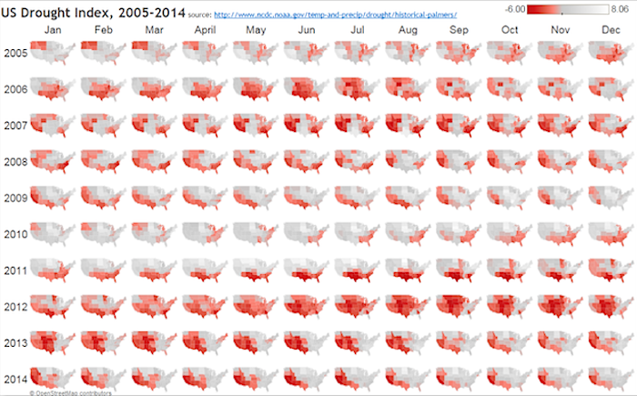
Two datasets that apparently fit the bill are US road fatalities (data here) and the U.S. drought index (data here). Both contain many incredible stories. I've written extensively about my discoveries with the fatalities data set, and the drought index data became an incredible graphic in The New York Times. Below is a view of the data showing just the period 2005 - 2014. Each map shows the drought index for one month, exposing the trend within a single year period.

US drought index, 2005-2014
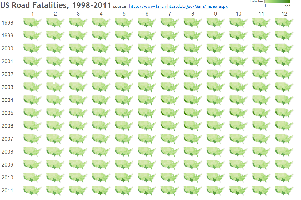
The small multiple map is amazing for the drought data; I can see national and regional intensity as it changes throughout a year. The US road fatalities data contains similar fields (state, date, etc.), so it, too, should make a great small multiple, right? Wrong. Here it is:

US road fatalities, 1998-2011
Boring isn't it? Why is that? It turns out that there just aren't any interesting monthly variations at the state level. This data does contain incredible geographical and time-related stories, but the small multiple map does not reveal them.
Here are three simple steps you can take to get this right:
1. Know the guidelines for working with different data types. I highly recommend books by Stephen Few or Ben Jones for the perfect foundation in this area. Once you know the guidelines, you know the starting points for your explorations.
2. Explore your data and iterate quickly. You need to fail fast, and fail often, in order to discover the story in your data.
3. Seek feedback from others. While the story in the chart might resonate with you, there’s no guarantee others will get the same message. Get feedback on your charts to be sure your story is clear.
Note: This piece first appeared in ComputerWorld.
เรื่องราวที่เกี่ยวข้อง
Subscribe to our blog
รับอัปเดต Tableau ล่าสุดในกล่องข้อความ


