Dear Data Two: Quantifying the 'Smaller Moments that Define Our Lives'
Note: This is the last installment of our series on the quantified self. you can find links to the first three parts at the bottom of the page.
Andy Kriebel and Jeffrey Shaffer live an ocean apart. But for the past 10 months, the two have been corresponding by postcards each week—all for the love of data.
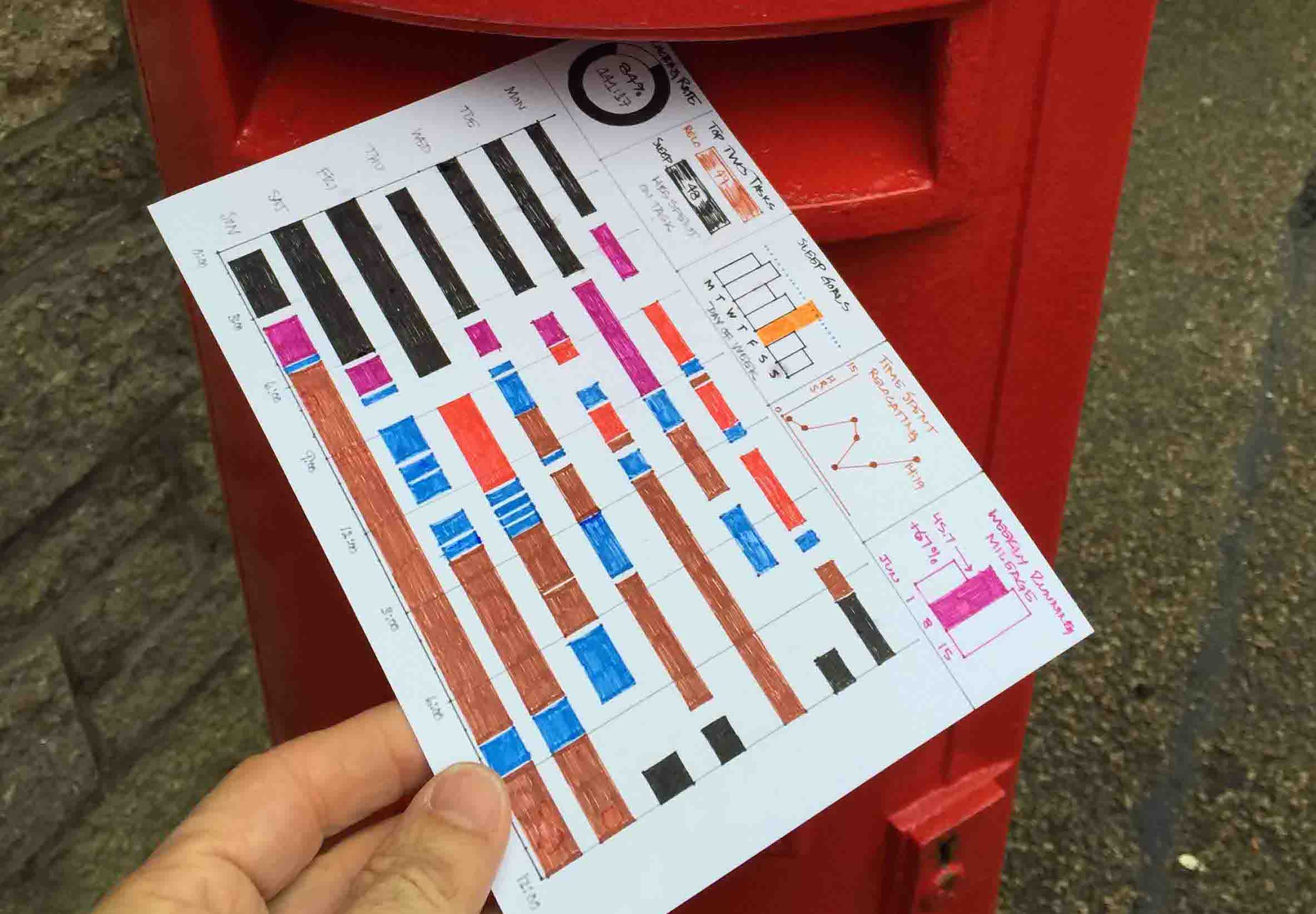
The two are following in the footsteps of Giorgia Lupi and Stefanie Posavec’s award-winning Dear Data project. Aptly named Dear Data Two, Jeffrey and Andy’s project follow the same rules. Every week, they each collect data based on the week’s theme. Then they each visualize the findings by hand on a postcard and mail it to the other.
As tech-focused data-viz wizards, Andy and Jeffrey knew their handiwork would be no match for the original pair’s artistic works. But that wasn’t the point, says Jeffrey.
“We had to put that all aside. We wanted to see what our take on it would look like and how it would be different from the original project, not try to imitate it,” says Jeffrey. “At the same time, we both take lots of inspiration from the original authors.”
Collecting the Data
Examining life through lenses like beauty, desires, and complaints has required some manual data-collecting. For a week themed doors/spaces, Andy set out with his daughter to note the colors of the doors in his neighborhood.
“We got lots of strange looks, but thankfully no one called the police,” says Andy. “The resulting card was really cool and very colorful.”
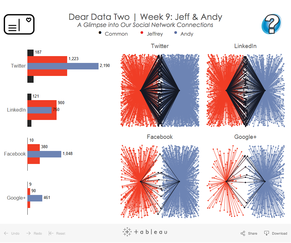
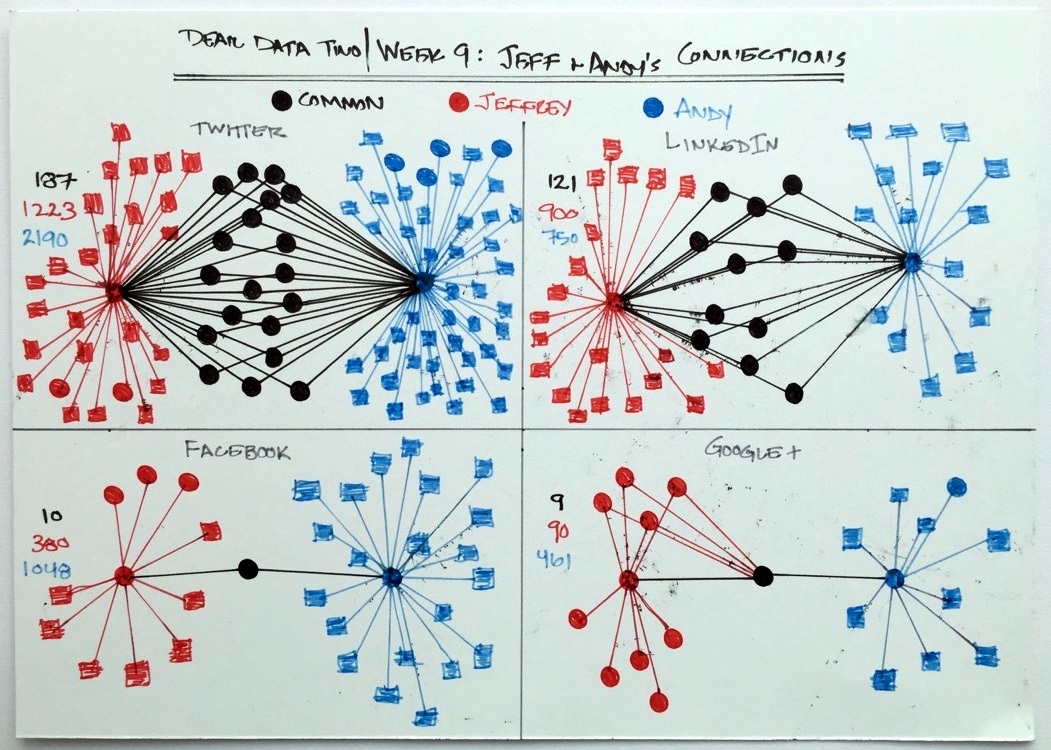
To explore connections, Andy gathered both Jeffrey’s and his own social-network data. Then he manually created a data set to find the common connections they share across various social networks.
Exploring the Data
Once he has his data, Andy began his exploration in Tableau.
“I generally create a dozen or so visualizations, looking for stories in the data. I then narrow this down into a more refined story and ultimately create my card,” he says.
Jeffrey, on the other hand, began with pen and paper, intentionally challenging himself to think outside the Show Me box. Then on some weeks, after he’s drawn his postcard, he tried to recreate the viz in Tableau.
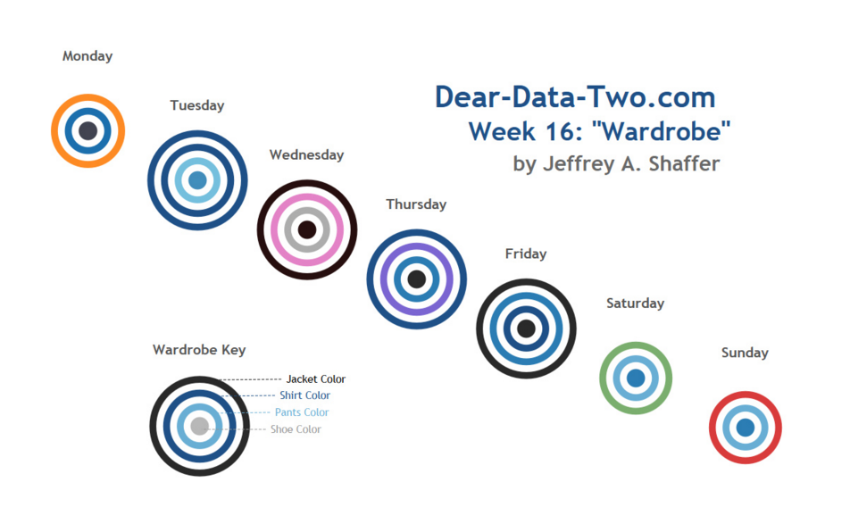
“Some weeks have been really challenging, pushing me to try different things in Tableau—for example, week 16 (wardrobe) when I made color circles into bullseyes with a data set that didn’t have a single measure, only dimensions.”
Visualizing the Data
For two viz experts used to creating dynamic dashboards, the postcard’s small size posed a challenge. Without interactivity, they had to rely heavily on preattentive attributes to convey insights.
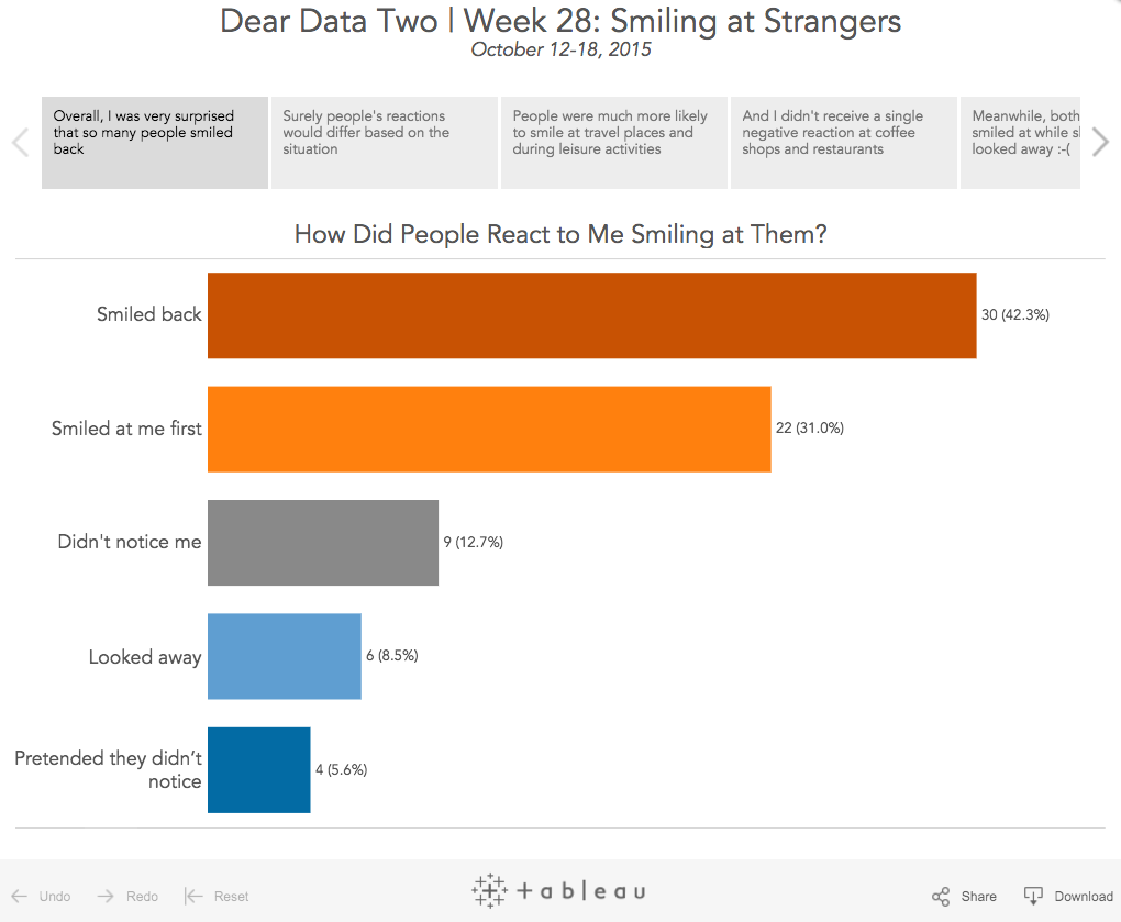
“In week 28, Andy created a card that used six different preattentive attributes,” says Jeffrey.
Even with the limitations, the two managed to get creative. For the theme of mirrors, Jeffrey plotted his moods using the Seven Dwarfs in his “mirror, mirror, on the wall” viz. Jeffrey drew the postcard backwards, which meant Andy had to hold it up in the mirror to properly view it.
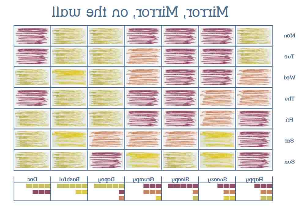
(Jeffrey’s conclusion from this week: “Based on the data, it appears that if I were one of the Seven Dwarfs, I would be Sleepy.)
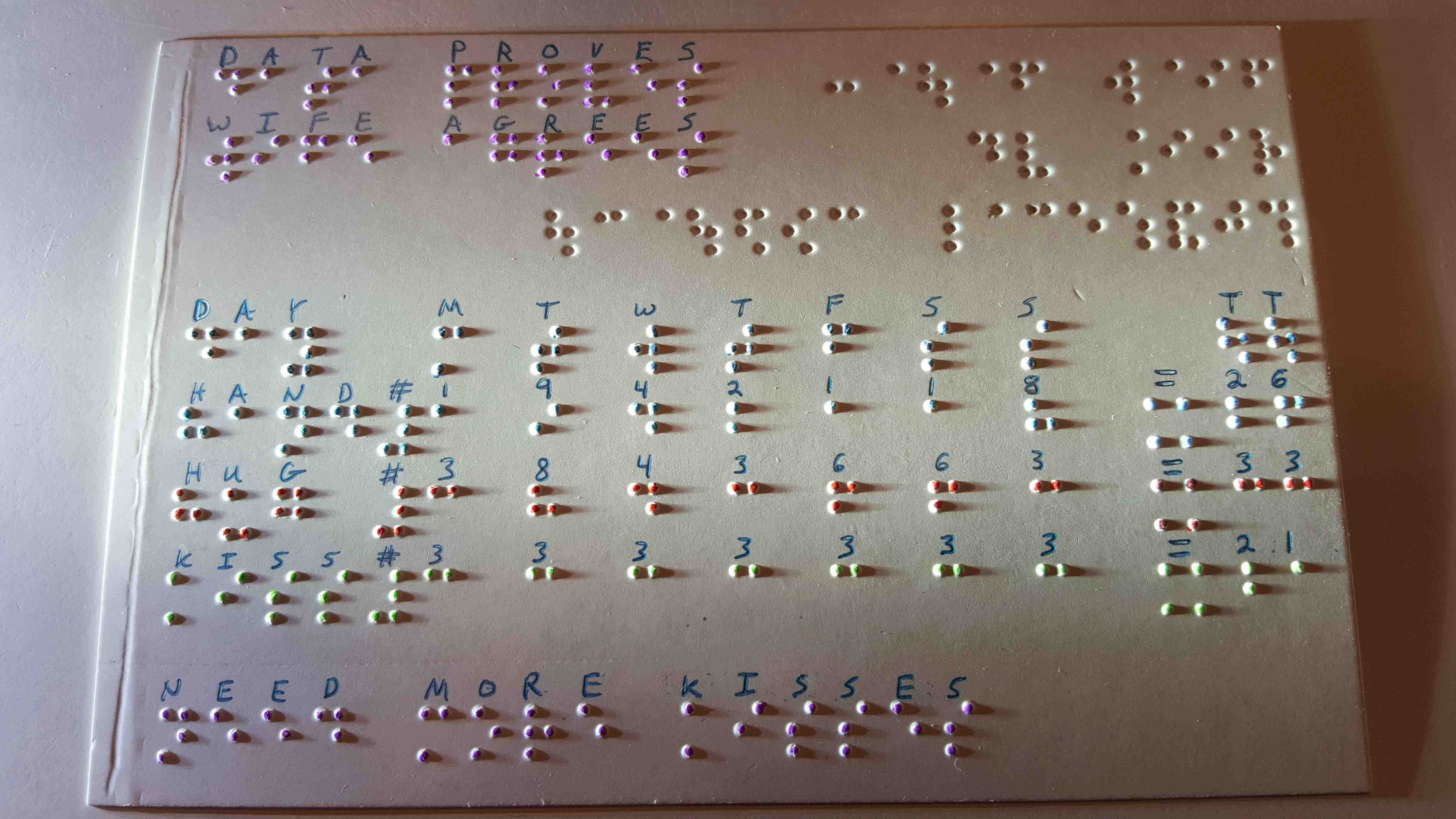
For a week themed physical contact, Jeffrey incorporated a tactile element to his card.
“I wanted something that could be touched. I ended up using a braille technique, punching braille into the card then coloring the raised dots,” he says.
Understanding the Data and Themselves
For Andy and Jeffrey, the weekly exercise is a great way to hone data-visualization skills.
“I’ve done things in Tableau that I never thought were possible, and I now see Tableau more as a drawing canvas than a charting tool,” says Andy.
“We’ve inspired some cool Tableau techniques too,” says Jeffrey, pointing to this tutorial on creating polygons as an example. “I mentioned at the Tableau Conference that week 3 (thank yous) was particularly challenging in Tableau. And a few weeks later, Brian Prestige from the Information Lab posted an incredible solution.”
"Buster Benson has said about quantified self, ‘Be aware of the smaller moments that define our lives.'"
Techniques aside, something else also happens when you spend week after week measuring and examining snippets of your life. Those pieces add up to a fuller picture of yourself, says Andy.
“Buster Benson has said about quantified self, ‘Be aware of the smaller moments that define our lives.’ Tracking data week by week, you start to pay attention to the little things that are going on around you that you otherwise would probably ignore,” Andy says.
For the week themed “being nice,” for example, Andy began thinking about how he’s wanted to treat his friends and co-workers versus how was treating them in reality.
“If it weren’t for this project and focusing on the data, there is no way I would have been thinking about that,” he says.
These insights have been the point all along, says Jeffrey.
"We stepped out of our comfort zone and explored ourselves and visualized our lives in ways that we would not have done otherwise" he says. "Coming into the final weeks of our project, I can already see that I will miss it. It's been a ton or work, but a great journey."
Andy and Jeffrey shared their insights at the Tableau Conference in October. You can watch their session as part of the Virtual Tableau Conference.
Visit the Dear Data Two website for the latest updates and a full transcript of the interview.
Read the Rest of the Quantified-Self Series
Subscribe to our blog
รับอัปเดต Tableau ล่าสุดในกล่องข้อความ


