Visual Data Analysis
Try Tableau for Free See it in action
Full-version trial. No credit card required.
Data analysis was once a function typically reserved for analysts or data scientists. As business intelligence (BI) evolves, visual analytics make it possible for everyone to see and understand their data. When you can observe and collect feedback while analyzing simple or complex data sets at the same time, the power of exploration, learning, and discovery is in your hands; and it’s infectious.
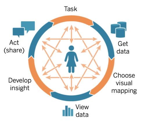
The cycle of visual analytics
Seamlessly flow from asking questions of your data, collecting and preparing it for analysis, and acting on your discoveries to generate positive results, individually and as a business. With visual analysis, it’s that easy to find the “where” and “why.” Take these steps to make the most of your data:
- Start with questions
- Get the data you need
- Choose how to visualize the data
- View and explore it
- Develop insights
- Act on and share your findings
Start with questions
Whether you create a report for yourself or others, it’s best to start with a question. Start broad and then narrow your focus to deepen your understanding. For example, a national, regional or supply chain manager may ask these questions:
- What is the average profit by state?
- How are we performing with certain customers?
- What discounts have been offered and how much do they total?
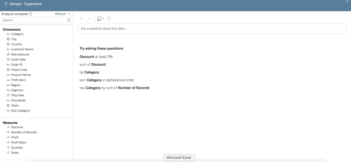
Get and prepare your data
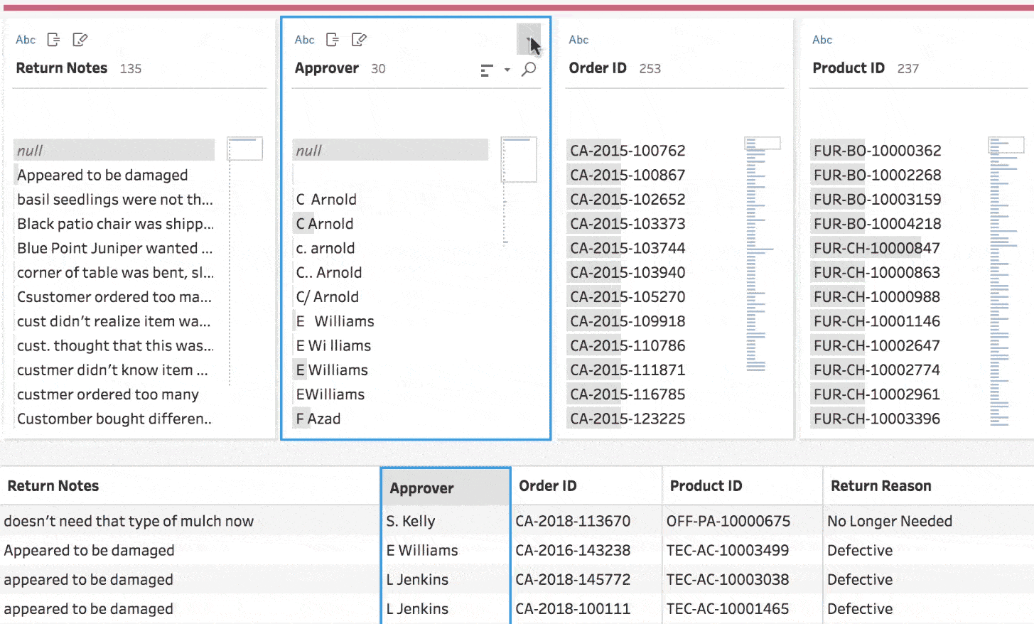
Knowing how to access quality, trusted data for your analysis is a big hurdle for companies that want to be data-driven. Choose a platform that connects to many data sources, on-premise or in the cloud so people in your organization can dig in and explore—working smarter and faster.
Consider using a data preparation tool to combine, shape, and clean up your data and a data catalog to manage data, including user permissions, usage metrics, and lineage.
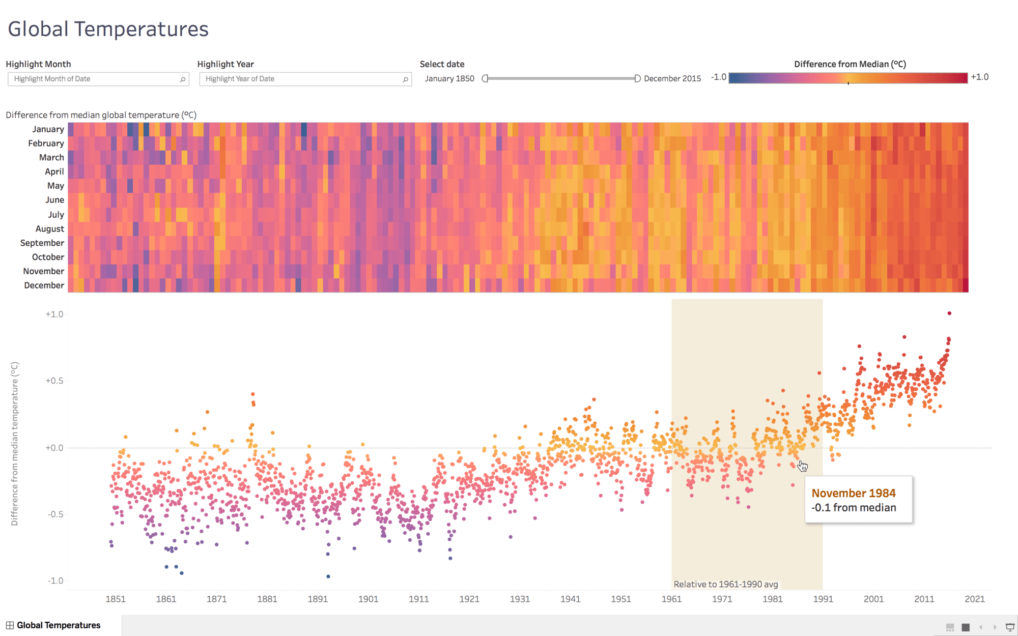
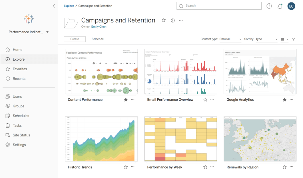
Visualize and explore your data
With visual elements like charts, graphs, and maps, data visualization provides an accessible way to see and understand trends, outliers, and patterns in data. Consider these popular visualization types:
- Bar chart for comparison
- Map for spatial data
- Line chart for temporal data
- Scatterplot to compare two measures
Act (Develop and Share Insights)
Once you’ve found an insight, you need to share it so others can take action. Using a visual analytics platform, you can provide finished dashboards in a secure, governed environment, so others can search, view, and reference them in their workflows. Wider access means greater impact with data for organizations.
We were early adopters of Tableau with version 4.0. Today we have three servers globally and 67 active instances, supporting 25,000 people globally. Tableau is an integral part of how we operate.


Full-version trial. No credit card required.
게시 매체