Lessons from the Inaugural Class of The Information Lab's Data School

Note: This is the first installment of a three-part series celebrating the back-to-school season and the joy of learning.
The Information Lab’s Data School opened its doors earlier this summer to “create the next generation of Tableau Jedis and Alteryx Aces.” The London school’s training focuses on using Tableau and Alteryx to see and understand data. The school’s inaugural class is halfway through its training. The students shared these thoughts and tips on learning to visualize data.
<a href="http://www.thedataschool.co.uk/blog/niccolo-cirone" target="_blank">Nicco Cirone</a>: Get Ready for a Path Studded with Eureka Moments
Stop reading this if you’re not eager for rewarding challenges! Approaching Tableau is not as much about learning a software (it is so easy that you don’t really need to “learn” it) as about combining its potential with your quest for insights and meaningful information.
At Tableau, they call the software’s user experience “the flow,” and after two months of extensive use of the product, I know what they are talking about! Learning this software is a path studded with eureka moments, and you won’t need to write a single line of code for start answering your questions with data. These guys made all the background operation so far from you that you can just focus on what really matters: analyzing your data, and making sense of them.
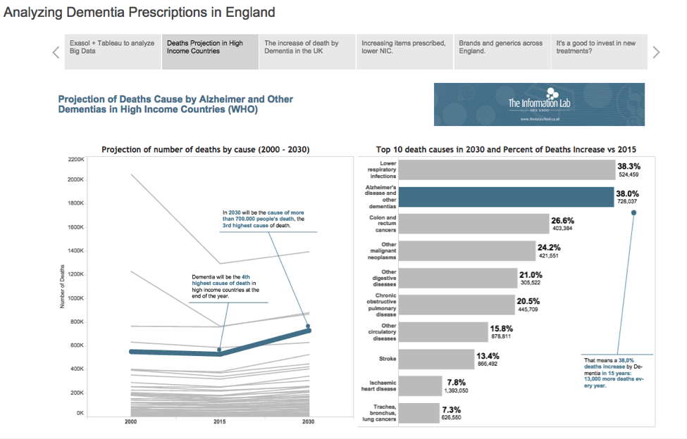
This viz by Nicco was chosen as the Viz of the Day.
<a href="http://www.thedataschool.co.uk/blog/pablo-saenz" target="_blank">Pablo Sáenz de Tejada</a>: Remember: Anyone Can Analyze
Read, practice, ask questions, and have patience. This is my top advice after almost 70 days of training at The Information Lab Data School to anyone who wants to start or improve using Tableau, or even become an advanced user. In the Data School, we are all very fortunate to learn Tableau from some of the best users in the world, but even if you want to learn it on your own, these are the key points that I will recommend:
Read: There’s a big, really helpful community of Tableau users with lots of blogs, posts, and books (Ben Jones’s Communicating Data With Tableau, Daniel G. Murray’s Tableau Your Data! or Joshua N. Milligan’s Learning Tableau, for example) that will make it much easier to learn and understand how Tableau works, and help you to leverage your skills faster than you expected.
Practice: There’s no better way to really internalize those things you’re reading about. One of the main advantages of Tableau is that there are so many different ways to create anything. And practice will help you to find your own way of doing things.
Ask: This has a close relationship with reading. The Tableau Community is really helpful, and there are more people than you can imagine disposed to help others. If you are not sure about how to do something, just ask the community.
Have patience: This is not because Tableau is a difficult software; on the contrary, it has one of the most incredibly short learning curves that I have seen in my life. But as with anything new, it requires time and a bit of effort. You wouldn’t become a Zen Master in six months, but just like Ratatouille character Gusteau’s book, Anyone Can Cook, I can assure you that Tableau could use the motto “Anyone can analyze.”
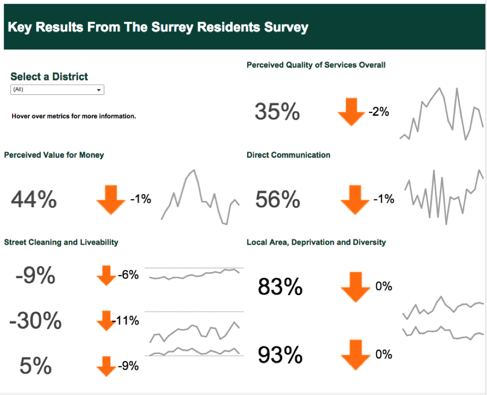
This viz by Pablo was chosen as the Viz of the Day.
<a href="http://www.thedataschool.co.uk/blog/ravi-mistry" target="_blank">Ravi Mistry</a>: Learn by Doing. Repeat.
The last two months have Ta-blown my mind. From jumbo crayons to Level of Detail Expressions, the spectrum that Tableau can cover is incredible.
Downloading and installing Tableau Public takes two minutes and 20 seconds—I timed it! It’s super-easy to do, and I’ve even written a short blog post on why this should be a practice taken by many people.
The learning process? Do. Show. Do more. Discover more. Keep doing.
<a href="http://www.thedataschool.co.uk/blog/alexandra-hanna" target="_blank">Alexandra Hanna</a>: Tackle the Charts that Impress You
The number one tip is to do exactly what it says on the tin, and unleash your creativity with Tableau. There are several ways to start:
Exercise: Build as many charts as possible with two data points. This will allow you to visualise all conceivable combinations of their relationship, which can be drag-and-dropped into the different Marks cards options or shelves.
Recreate: Tackle those chart types that made you wonder, “How did they make this?”
Use your own data: It is delightful to picture how something you have produced takes form.
Write: Blogging has helped me tons because I learn more efficiently this way. And I believe sharing knowledge leads to further evaluation and improvement.
<a href="http://www.thedataschool.co.uk/blog/emily-chen" target="_blank">Emily Chen</a>: ‘Be Obsessed’ about Building Vizzes
The fastest way to learn Tableau? Constantly build vizzes and break them. Be obsessed about this. Look at as many vizzes as possible—Tableau Zen Masters, The New York Times, The Economist—then download and figure out how they did it. (This requires a lot of patience.)
One of my biggest challenges is understanding how Tableau thinks. I used to work with Excel, so I’m conditioned to reading tables. So building table calculations and parameters were challenging, because I couldn’t understand how they were functioning. Thank goodness for “duplicate as crosstab.”
Another challenge I had was with the formatting and storytelling elements of design. I used to work on business teams where I leaned on my graphic designer to build what I needed. Learning about color and design concepts have helped my analysis to be more compelling in ways I didn’t think were possible.
This viz by Emily was chosen as the Viz of the Day.
<a href="http://www.thedataschool.co.uk/blog/hashu-shenkar" target="_blank">Hashu Shenkar</a>: Sharing Is a Key Ingredient for Success
A good friend at my previous workplace introduced me to Tableau. He taught me that the best way to learn is to simply dive into a data set and start answering questions. Whenever I faced a problem in Tableau and didn't know what to do, the Tableau Community and the Information Lab’s blog helped me power through.
I found that most of the solutions to my problems had been solved or explained many years before!
One of my favourite skills we've learnt was one I mentioned in a blog post during #TableauTipWeek—switching between different views on a dashboard using a parameter. When I learnt this, it was truly magical.
<a href="http://www.thedataschool.co.uk/blog/damiana-spadafora" target="_blank">Damiana Spadafora</a>: You’ll Start to See Everything as Dashboards
Coming from a traditional SPSS/R/Excel BI background, my world was pretty much flat in terms of showing data. There are bar charts, there are scatter plots, there are trend lines, there are pie charts (if you are that unlucky). And they are all wonderfully static.
The biggest challenge I had was breaking from this mentality and realising all that Tableau could do. You want the user to switch across values? Use a parameter. You want to show the parent-child relationship between certain variables? Meet hierarchies. What about advanced analysis? Hello, LOD Expressions! And don’t get me started on displaying a lot of different variables on a map. But this doesn’t even scrape the surface!
I have seen Tableau being used to display Andy Kriebel’s family as a series of little people, with their own customised head and sizes proportioned to their real height in life. And that is the whole point. Go exploring in Tableau Public for one hour every day. It will open your eyes to the full potential of Tableau. When you get tired of Tableau Public, look at the authors’ blog posts, then move on to the Zen Masters. Trust me, by the end of it, you will think in Tableau terms rather than Excel. And the next time you see a bunch of raw data, you will start automatically building dashboards in your head!
<a href="http://www.thedataschool.co.uk/blog/alex-muntus" target="_blank">Alex Muntus</a>: Don't Overcomplicate the Task
The biggest pain was appreciating the fact that despite Tableau being very user-friendly, it still takes a bit of time to learn new concepts and ways of thinking. Like anything that instantly grabs you, you want to dive straight in at the deep end and do the most complicated and awesome stuff. You might try to sprint before you learn to walk, so to speak. The amusing thing was realizing how logical and straightforward Tableau actually is to use. So many times I have overcomplicated a task, and when I have gotten it to work, it is because I realized I have been thinking about it in an overly complex and less logical way than Tableau.
Tableau is not just a data visualisation tool, but a way of thinking. The eureka moments have been when I have adopted this, stripped back the complexity (leaving that to Tableau), and created cool visualisations.
A good example deals with creating dashboards and wishing to filter them for different users. Users within an organization often have different data privileges. I started to create filters for a particular dashboard, and this quickly got very tricky. A short bit of research, and I discovered user filters with which the author can assign different privileges to different users. Simple, quick, effective. Job done.
More Tips & Resources
Subscribe to our blog
Tableau の最新情報をメールでお知らせします


