If Data Could Talk: How Covid-19 is transforming consumer patterns
Welcome back to another recap of our livestream series, If Data Could Talk! Each episode, data experts from the community share resources you can read, watch, or listen to around the topic of data literacy. This episode features co-hosts Andy Cotgreave, Technical Evangelist at Tableau, and Amanda Makulec, MPH, Senior Data Visualization Lead at Excella, along with special guest Chantilly Jaggernauth, VP of Visualization and Training at Lovelytics.
How has consumer behavior been affected by the pandemic?
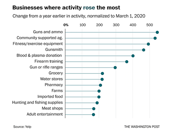
Amanda starts off with a segment about how consumer behavior is changing in the midst of COVID-19. She highlights both a Yelp report that looks at the economic impact of coronavirus on U.S. businesses and a Washington Post article about society’s changing behaviors. We look at several charts, including a small multiples view of categories where consumer interest is rising and a lollipop chart to show businesses where consumer activity rose and fell the most. Watch the segment here.

Same data, different framing
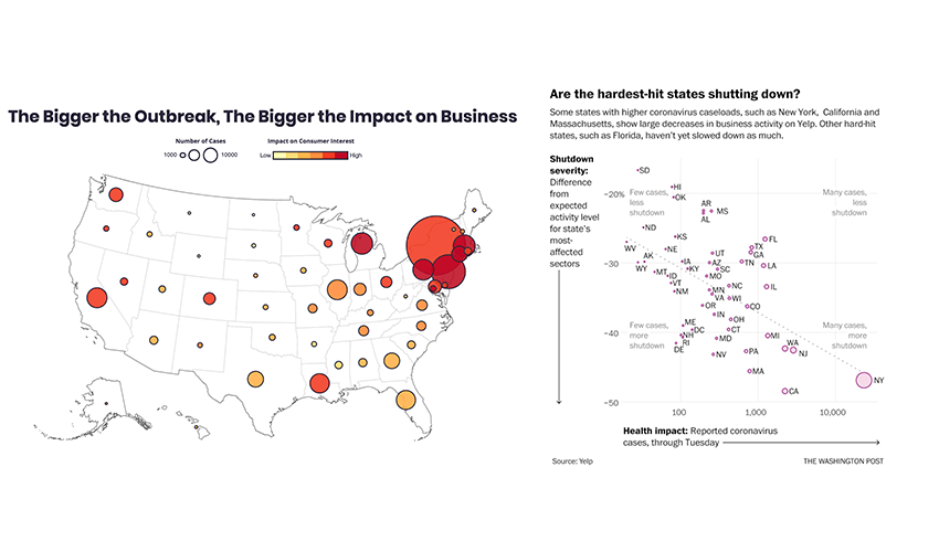
We then look at a side-by-side of two different visualizations of the same data—coronavirus caseloads and the impact on consumer behavior. Amanda shows us a map from Yelp and a scatterplot from The Washington Post. Amanda, Andy, and Chantilly point out what they would change about the visualizations to make them more intuitive and tell a more accurate story. Watch the segment here.

Measuring the world’s dependence on travel
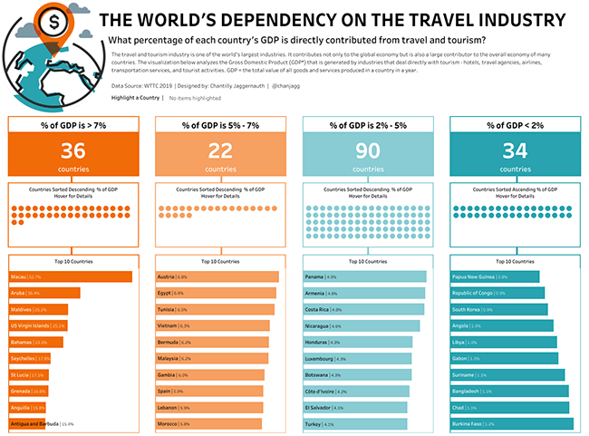
Chantilly walks us through her visualization which shows the percentage of a country’s GDP that is based directly on the travel and tourism industry. She explains that she created the viz to better understand how her own travel patterns affect different parts of the world. We also hear from Chantilly about her process for putting together an analysis, why she loves exploring data, and what it’s like to go “down the rabbit hole.” Watch the segment here.

Wait—there’s more!
- Want to catch the next episode of If Data Could Talk live? Tune in on Facebook, Twitter, LinkedIn, or YouTube.
- Watch the entire series or revisit an episode by checking out our YouTube playlist.
- To learn more about COVID-19 and see how Tableau can help you start analyzing the data on the virus yourself, visit our Data Resource Hub.
Historias relacionadas
Suscribirse a nuestro blog
Obtenga las últimas actualizaciones de Tableau en su bandeja de entrada.


