How To Spot Misleading Charts: Check the Axes


Charts are all around us. When communicating with data, viewing a chart instead of a table of numbers helps us quickly understand data, make comparisons, see patterns, and make better decisions. In today’s world, swift decision-making with data is crucial. When viewing and creating charts, it’s vital that we gain the ability to critically discern the integrity of the information and conclusions shown in charts.
Many people don't realize that charts are as flexible and malleable as the written word. In the same way that words can deceive, so can charts. In a world of increasing misinformation, it is vital everyone has the skills to spot the tricks used by some. It's also possible to accidentally create misleading charts if one has gaps in their data literacy: these pitfalls outline ways to ensure our own charts fit to high standards.
To aid your thoughtful review of charts, we created a handy 4 part checklist with an easy to remember acronym, SCAM. SCAM stands for Source, Chart, Axes, and Message. Be aware of the SCAM!
This blog will cover the third part of the checklist—check the axes. Read on to learn how to spot misleading charts with confidence and continue your learning with the rest of the checklist:
- How to Spot Misleading Charts: Know the Source
- How to Spot Misleading Charts: Check the Chart Design
- How To Spot Misleading Charts: Review the Message
Check the Axes.
For most graphs or charts, axes (singular: axis) create the structure for how data is displayed in a chart usually with a horizontal or x-axis and a vertical or y-axis. When spotting misleading charts, it’s important to be able to discern if the axes are being used appropriately.
Does the chart use the appropriate scales and intervals?
As discussed in Check the Chart Design, checking that the right type of chart is used for quantitative or qualitative data is crucial. Even when viewing the right chart type, it is still important to check the scales and intervals. A missing value can create an uneven interval and lead to misinterpretation.
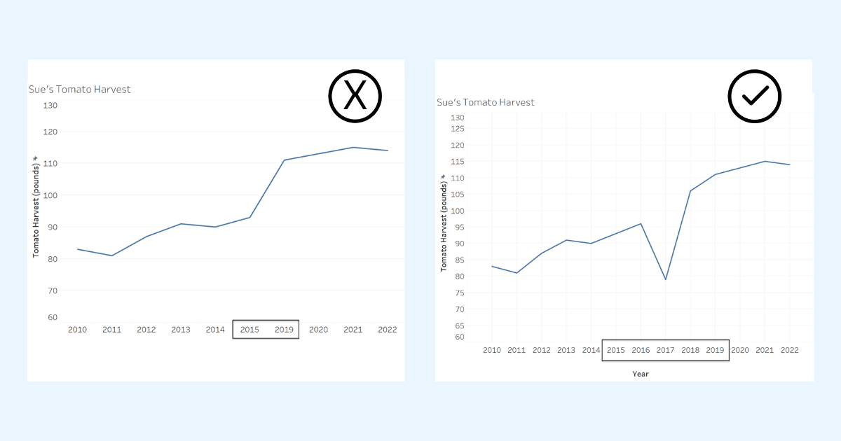
Two line graphs showing the same data with different intervals on the axis. The graph on the left is missing 2016, 2017 and 2018. Viewing a graph that includes the missing years creates a very different interpretation.
Do the axes start at zero?
While there is leeway with line charts, see Misleading Axes on Graphs, bar charts must always begin with a zero baseline. In other words, the bottom of the bar is zero. When bar charts don’t start at zero, we are led to believe that there is a much larger difference between categories than in the actual data.
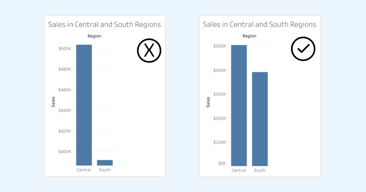
Two bar charts showing the same data, the bar chart on the right has the x-axis start at zero while the bar chart on the left starts at a value higher than zero and does not indicate the value the x-axis starts at (probably about $390K). The bar chart on the left leads us to believe that there is a very large difference in sales between the two regions. When we include the zero baseline, we can quickly see the accurate difference between the two regions.
Are there multiple axes?
There are a few legitimate use cases for multiple axes. For example, it can be effective to show the same set of data points on two different scales using dual y-axes such as inches and centimeters or degrees Fahrenheit and degrees Celsius. However, there are many instances where multiple axes can be misleading.
The dual-axis chart below shows the world GDP and GDP for the Americas. We are led to believe that GDP for The Americas is the same as and more than World GDP! How can that be? Notice the scales of the y-axis. The Americas scale doesn’t match the World GDP scale.
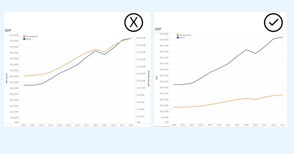
Two dual axis line charts showing the same data but using different scales. Manipulating the ranges on the second axis shows two different stories and can mislead. Images from Avoiding the Dual Axis Chart by Jon Schwabish.
Alternatively, when we remake the graph to show the Word GDP and The Americas using the same scale on a single axis. We now can see the accurate difference in GDP between The Americas and the World. Data with the same units of measure are best shown using the same scale on a single axis.
When encountering dual axes with two different units of measurement, in most cases, two separate graphs are a better option than a dual-axis chart. In the below example from Jon Schwabish’s discussion of dual axis charts, we see how the scale on the second axis can be manipulated to show differing patterns with the same data. In this example, a more accurate way to present these data is one two separate graphs.
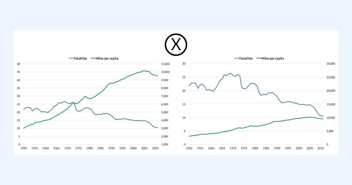
Two dual axis line charts showing the same data but using different scales. Manipulating the ranges on the second axis shows two different stories and can mislead. Images from Avoiding the Dual Axis Chart by Jon Schwabish.
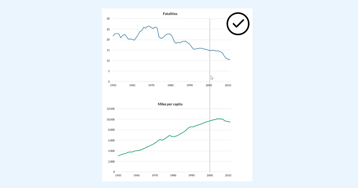
Two separate graphs vertically aligned allows the reader to make accurate comparisons between Fatalities and Miles per capita. Image from Avoiding the Dual Axis Chart by Jon Schwabish.
Remember to always check the axes when you view graphs to ensure the right axes are used for the type of data being used and the appropriate scales and intervals are being used.
Practice and be confident
Interpreting charts can be challenging work. You can all help improve how decisions are made every time you accurately read charts or call out misleading charts that you encounter. It’s important to practice. Follow the SCAM checklist every time you see a chart in your daily life.
Share and help the community
While it’s important to think critically and ask yourself smart questions, it can be extremely helpful to analyze data with others. Discuss your interpretations and chart critiques with your peers and friends. You’ll find that you can help improve the decision-making within your organization and help stop misinformation in our communities.
Want more data resources?
Data Skills Resources: Whether you’re a seasoned data veteran, or totally new to the world of data, we have the resources to fill in the gaps, or build a solid foundation to launch from.
Tableau Academic Resources: Want to use this information in your academic classroom? Visit the Tableau Academic Curriculum website to request access to this information and more.
Trailhead Module: Guidelines to Recognize Misleading Charts: A five unit badge that will help you accurately read and present chart data and avoid misleading chart designs. A perfect follow-on after reading this blog!
Trailhead Module: Communication with Charts: A five unit badge that will help you apply best practices for designing and reading charts to tell the story of your data.
Trailhead Trail: Build Your Data Literacy: Multiple badges that will help you explore, interpret, and communicate effectively with data. The trail covers topics such as the basics of data literacy, aggregation and granularity, well-structured data, distributions, understanding variation, and correlation and regression.
Blog: The Problems with Dual Axis Charts: Lisa Charlotte Muth discusses the risks of using dual axis charts and offers alternative ways to present data and lists other resources to explore deeper.
Blog: Avoiding the Dual Axis Chart: Jon Schwabish shares why we should avoid dual axis charts and provides alternatives in presenting data.
Website: Misleading Axes on Graphs: Reading for a module for the course Calling Bullshit at the University of Washington. The reading describes how best to use axes on graphs.
Historias relacionadas

Meet 2025 Iron Viz Finalist Bo McCready
 8 Abril, 2025

Meet 2025 Iron Viz Finalist Kathryn McCrindle
6 Abril, 2025

DataFam Roundup: March 31-April 4, 2025
Suscribirse a nuestro blog
Obtenga las últimas actualizaciones de Tableau en su bandeja de entrada.