If Data Could Talk: Color legends, data uncertainty, and forecasting pitfalls
Welcome back to another recap of our livestream series, If Data Could Talk! Each episode, data experts from the community share resources you can read, watch, or listen to around the topic of data literacy. This episode features co-hosts Andy Cotgreave, Technical Evangelist at Tableau, and Amanda Makulec, MPH, Senior Data Visualization Lead at Excella, along with special guest Sarah Wachter, Product Manager of Augmented Analytics at Tableau.
Telling the story of social distancing
Andy kicks things off with a segment about how the New York Times is excelling at data storytelling. He walks us through their article about social distancing and highlights two great techniques they used—satellite imagery to make the data feel relatable and a map that uses color to show when people began reducing their daily travel distance. Watch the segment here.

Disaggregating location data
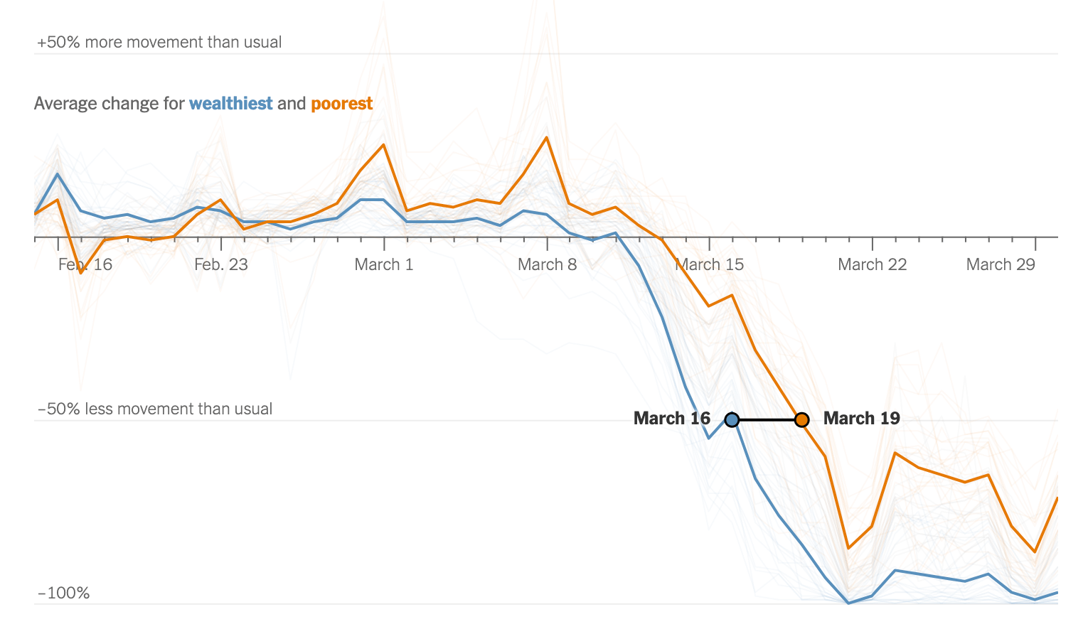
Sticking to The New York Times, Amanda dives into an article about location data that focuses on more nuanced information—like which communities have the ability to practice social distancing. The article uses ‘scrollytelling’ to break down the information until, finally, you’re able to look at the highest and lowest income areas separately. Amanda highlights the importance of looking beyond the maps to consider what social distancing looks like between different demographic groups. Watch the segment here.

Putting charts into context
Next up, we look at an NPR feature about how different groups of people are being disproportionately affected by COVID-19, which includes a chart showing the different outcomes among people with pre-existing conditions. Amanda explains how to put the article’s chart into context and how important it is to pay attention to the gaps in our data. Watch the segment here.

Forecasting COVID-19 data—and why you shouldn’t do it
The episode closes on the topic of data forecasting tools. Andy and Sarah explain how and when it makes sense to use a forecasting tool, and when it doesn’t (hint: COVID-19 data), and why you’re most likely not qualified to make predictions about the pandemic. Watch the segment here.
Wait—there’s more!
- Want to catch the next episode of If Data Could Talk live? Tune in on Facebook, Twitter, LinkedIn, or YouTube.
- Watch the entire series or revisit an episode by checking out our YouTube playlist.
- Read Andy and Sarah’s blog on COVID-19 forecasting.
- To learn more about COVID-19 and see how Tableau can help you start analyzing the data on the virus yourself, visit our Data Resource Hub.
Historias relacionadas
Suscribirse a nuestro blog
Obtenga las últimas actualizaciones de Tableau en su bandeja de entrada.


