Using Gantt charts in Tableau to manage projects
You already know Tableau is great for exploring and analyzing data, but did you know you can also use Tableau to create a robust project management tool? All you have to do is build a Gantt chart.
You already know Tableau is great for exploring and analyzing data, but did you know you can also use Tableau to create a robust project management tool? All you have to do is build a Gantt chart.
Looking for a project management viz template? Download this Gantt chart workbook:
To refresh your memory, Gantt charts display a series of horizontal lines that track completed work over time. The chart type was invented in 1910 by Henry Gantt, a mechanical engineer and management consultant. He was called on to create a data view for the US during WWI to improve communications about how long it took to place and fulfill arms and ammunition orders. (Read more about the Gantt chart’s history at archive.org.)
While your use case might be less militaristic, you should still be staunch about the quality of your project management tool. And while many companies have released project management-specific software to take advantage of the Gantt chart, Tableau was made to adapt to your changing analytics needs.
If you’re managing project timelines, or just trying to understand data about events or activities, Tableau’s flexibility and live updates make budgeting time and assets a breeze. You’ll start to relish quickly identifying process gaps and preempting the challenges that emerge when tasks take longer than expected.
In this blog post, we’ll take four simple steps to create a viz that communicates project details quickly and effectively. We use a data set about a fictitious marketing team tackling many projects. Download it here to follow along in your own copy of Tableau Desktop. (Don’t have the software? Try Tableau for free.)
1. Connect to your project data
If you store your project details in a spreadsheet, you can create a powerful project management tool in Tableau. (If you store project details somewhere else, connect to the data source you use—Tableau connects to hundreds.)
Import and combine project data from any source in Tableau with a couple of clicks. In this example, our project management data is stored in an Excel spreadsheet, so we drag and drop the file into Tableau.
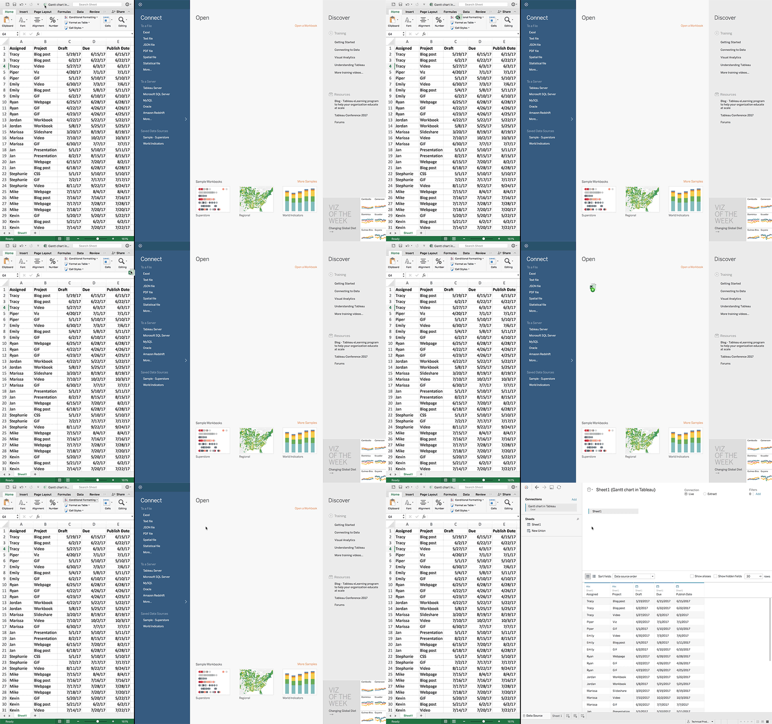
In Tableau, you’ll immediately see a table that matches our Excel spreadsheet. In the Data Source pane, you can edit the data—renaming fields, pivoting, and more—without affecting the underlying Excel file. If you update the Excel file directly, saved changes will appear in Tableau after clicking the refresh icon.
In other words, don’t worry about duplicating efforts to track your project data—the most up-to-date version will always be available for you to visualize in Tableau.
2. Customize your view
Now that your data is available in Tableau, click on Sheet 1 to start customizing.
Tableau uses marks to display your data visually. Your data can be represented using bars, maps, and other shapes—but for managing project data, the Gantt Bar mark type is your best bet.
In this example, Tableau automatically identifies the Gantt Bar mark type, but you can also manually select it.
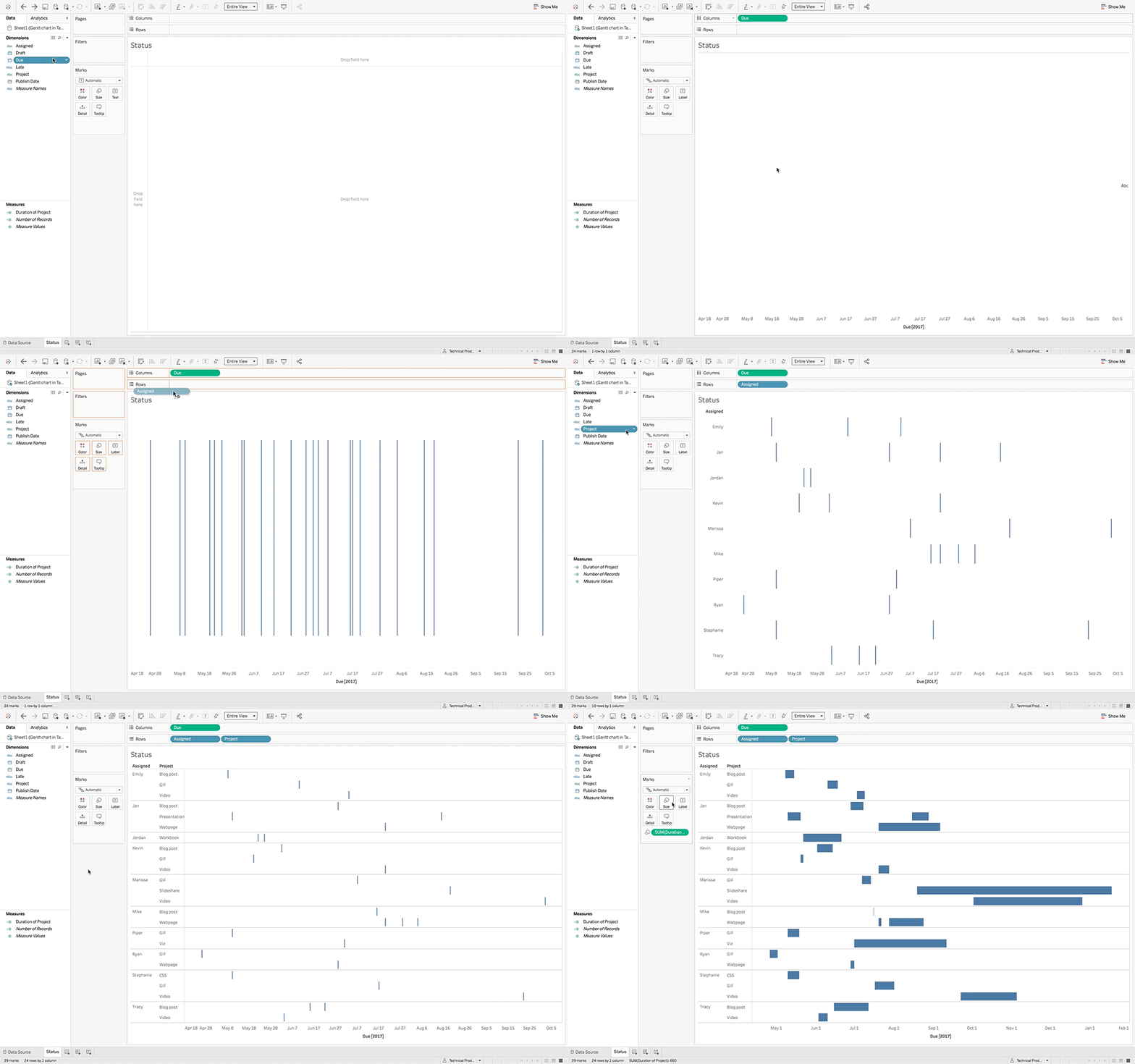
To create this initial view, we created a calculated field, Duration of Project, that represents the number of days each project takes. Then we followed these steps:
- Drag Due to the Columns shelf.
- Right-click Due, and select Exact Date.
- Drag Assigned and Project to the Rows shelf.
- Drag Duration of Project to Size.
You can also use color to display project owners, timeliness, and more. In this example, we created a second calculated field to differentiate between projects that are late and on time.
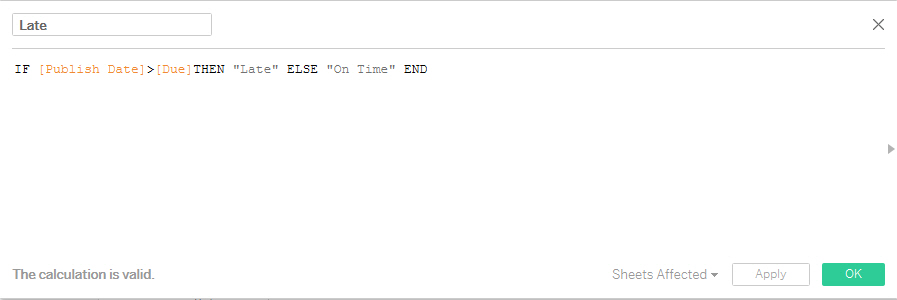
We then dragged it to Color so that it was easy to see which projects were on track: dark grey for timely projects and red for those that were behind.
3. Understand your project
With an initial view in place, you can now use your Gantt chart to explore: Spot the gaps in your timeline that allow you to optimize resources, and see how your Gantt chart complements related business data.
Here we can see that “videos” are consistently late. An action item appears: The team needs to re-evaluate expectations and timelines for when this type of content can be completed.
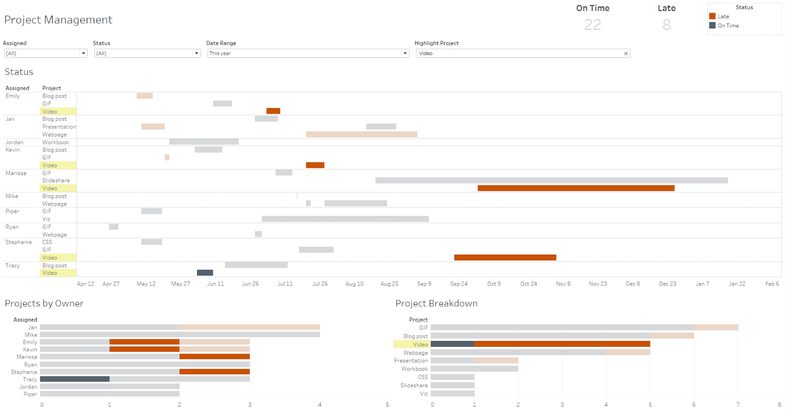
With Gantt charts tracking projects in Tableau, you can make your workflows more efficient, and instantly spot areas for improvement.
4. Share with your teammates
If you want others on your team to stay on track, publish your new project management tool to Tableau Server, Tableau Online, or Tableau Public. (And then you can embed it anywhere, like we did above!)
Click the Publish icon to get started.
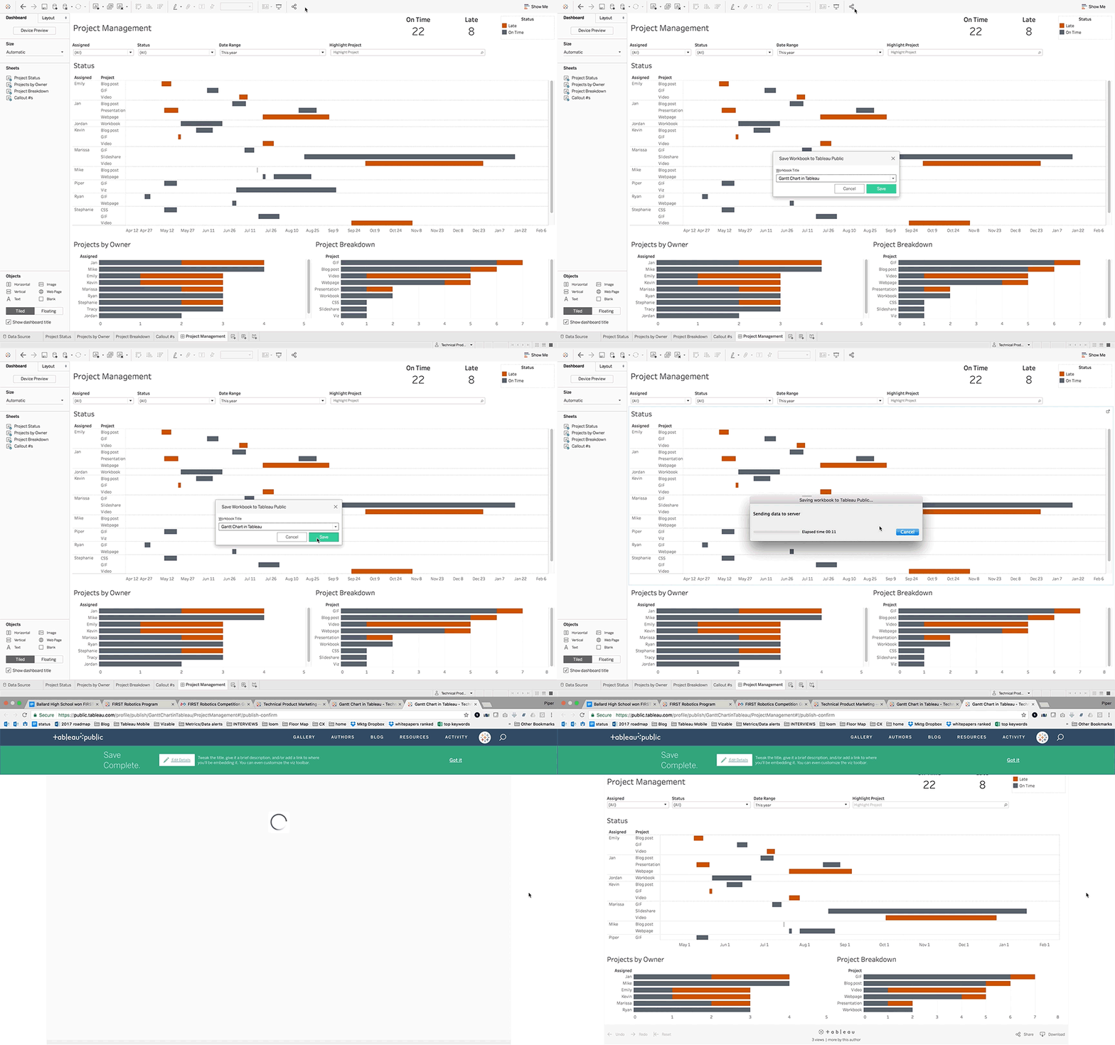
You can share the resulting URL with anybody, or embed your published viz on a website or corporate portal. With web authoring available in the browser, anyone can explore and iterate on views that make the most of your shared project management data.
Your interactive Gantt chart gives the whole team access to the project details they need, available in any browser on any device.
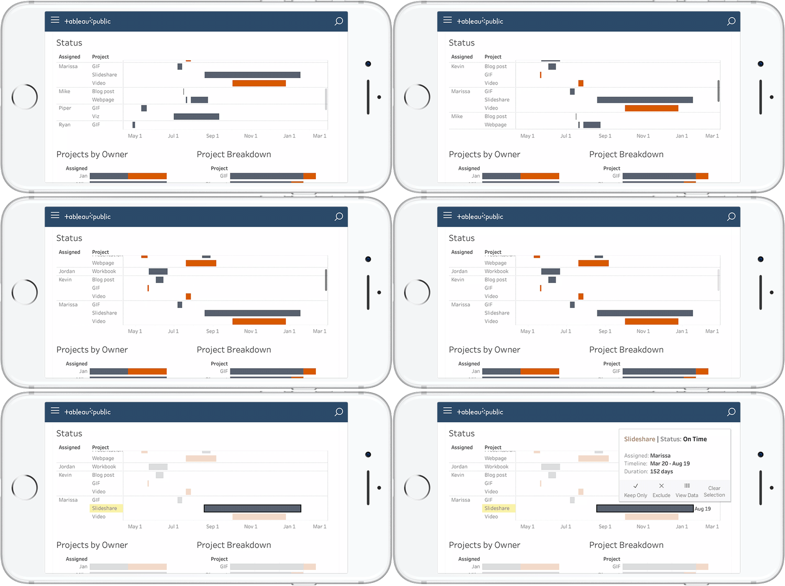
Become a Gantt chart pro
For more tips and tricks for building the best Gantt charts, check out these resources:
- Tableau Community thread: Gantt chart creation in Tableau
- Tableau Help: Build a Gantt Chart
- Tableau Help: Gantt Bar Mark
Do you use Tableau to track projects? Let us know what your go-to methods are in the comments below!
Related stories
Subscribe to our blog
Get the latest Tableau updates in your inbox.


