Why the Time-Tested Science of Data Visualization Is So Powerful
Note: This post first appeared in VentureBeat.
For almost as long as we have been writing, we’ve been putting meaning into maps, charts, and graphs. Some 1,300 years ago, Chinese astronomers recorded the position of the stars and the shapes of the constellations. The Dunhuang star maps are the oldest preserved atlas of the sky:

More than 500 years ago, the residents of the Marshall Islands learned to navigate the surrounding waters by canoe in the daytime—without the aid of stars. These master rowers learned to recognize the feel of the currents reflecting off the nearby islands. They visualized their insights on maps made of sticks, rocks, and shells:
On stick-charts, the sticks represent wa...
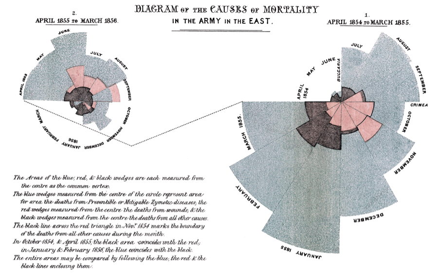
In the 1800s, Florence Nightingale used charts to explain to government officials how treatable diseases were killing more soldiers in the Crimean War than battle wounds. She knew that pictures would tell a more powerful story than numbers alone:

Why Visualized Data Is So Powerful
Since long before spreadsheets and graphing software, we have communicated data through pictures. But we’ve only begun, in the last half-century, to understand why visualizations are such effective tools for seeing and understanding data.
It starts with the part of your brain called the visual cortex. Located near the bony lump at the back of your skull, it processes input from your eyes. Thanks to the visual cortex, our sense of sight provides information much faster than the other senses. We actually begin to process what we see before we think about it.
This is sound from an evolutionary perspective. The early human who had to stop and think, “Hmm, is that a jaguar sprinting toward me?” probably didn’t survive to pass on their genes. There is a biological imperative for our sense of sight to override cognition—in this case, for us to pay sharp attention to movement in our peripheral vision.
Today, our sight is more likely to save us on a busy street than on the savannah. Moving cars and blinking lights activate the same peripheral attention, helping us navigate a complicated visual environment. We see other cues on the street, too. Bright orange traffic cones mark hazards. Signs call out places, directions, and warnings. Vertical stripes on the street indicate lanes while horizontal lines indicate stop lines.
We have designed a rich, visual system that drivers can comprehend quickly, thanks to perceptual psychology. Our visual cortex is attuned to color hues (like safety orange), position (signs placed above road), and line orientation (lanes versus stop lines). Research has identified other visual features. Size, clustering, and shape also help us perceive our environment almost immediately.
What This Means for Us Today
Fortunately, our offices and homes tend to be safer than the savannah or the highway. Regardless, our lightning-quick sense of vision jumps into action even when we read email, tweets, or websites. And that right there is why data visualization communicates so powerfully and immediately: It takes advantage of these visual features, too.
A line graph immediately reveals upward or downward changes, thanks to the orientation of each segment. The axes of the graph use position to communicate values in relationship to each other. If there are multiple, colored lines, the color hue lets us rapidly tell the lines apart, no matter how many times they cross. Bar charts, maps with symbols, area graphs—these all use the visual superhighway in our brains to communicate meaning.
The early pioneers of data visualization were led by their intuition to use visual features like position, clustering, and hue. The longevity of those works is a testament to their power.
We now have software to help us visualize data and to turn tables of facts and figures into meaningful insights. That means anyone, even non-experts, can explore data in a way that wasn’t possible even 20 years ago. We can, all of us, analyze the world’s growing volume of data, spot trends and outliers, and make data-driven decisions.
Today, we don’t just have charts and graphs; we have the science behind them. We have started to unlock the principles of perception and cognition so we can apply them in new ways and in various combinations. A scatter plot can leverage position, hue, and size to visualize data. Its data points can interactively filter related charts, allowing the user to shift perspectives in their analysis by simply clicking on a point. Animating transitions as users pivot from one idea to the next brings previously hidden differences to the foreground. We’re building on the intuition of the pioneers and the conclusions of science to make analysis faster, easier, and more intuitive.
When humanity unlocked the science behind fire and magnets, we learned to harness chemistry and physics in new ways. And we revolutionized the world with steam engines and electrical generators.
Humanity is now at the dawn of a new revolution, and intuitive tools are putting the beautiful science of data visualization into the hands of millions of users.
I’m excited to see where you take all of us next.
Subscribe to our blog
Get the latest Tableau updates in your inbox.


