Getting people to get data visualization
In my business dashboard design workshops, I ask data visualization practitioners if their clients and stakeholders prefer spreadsheets to charts and dashboards.
Lots of hands go up.
Many people are comfortable looking at cross tabs and have a hard time giving them up (and you may feel the same way). Many people don’t understand the power of data visualizations because they don't understand how to interpret them...yet.
One of the biggest challenges of building a data culture is getting people the skills they need to understand data. And not only the skills, but a willingness and enthusiasm to learn what some people think is a second language.
If your organization doesn’t develop this ability and apply its power, your organization is not making the most of its data. Not only are you increasing the time to insight, without data visualization skills you may miss the insight altogether.
Let me walk you through a few examples that I hope will get you excited – or will help you get other people excited – about data visualization. In this video, I’ll show you
- Why “just the numbers” isn’t good enough
- Good data visualization doesn’t just answer questions, it also poses new questions
- The “gateway drug” to data visualization and how it helps people feel more comfortable with data visualization
- Fluency with charts and dashboards will help you make better decisions, faster
Having Intelligent, Informed Conversations
I don’t want anyone to think learning to create charts and dashboards can be mastered in a weekend. This is something that will take effort and practice.
But becoming a savvy consumer of charts and dashboards? I think that’s something everyone can, and should do, and it can be learned quickly.
In attaining this baseline graphic literacy, aka “graphicacy,” you and everyone in your organization will be able to have informed, intelligent discussions about data.
The return on that investment will be enormous.
_________________
Steve Wexler is the founder of Data Revelations, a data visualization consultancy. He has helped scores of organizations worldwide understand how to visualize their data. Steve is in the Tableau Zen Master Hall of Fame, has been a Tableau Iron Viz Champion, and serves on the advisory board to the Data Visualization Society. He is the coauthor of The Big Book of Dashboards: Visualizing Your Data Using Real-World Business Scenarios.
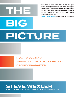
Steve’s newest book, The Big Picture: How to Use Data Visualization to Make Better Decisions—Faster is now available for purchase.
And Steve’s newest LinkedIn Learning course (based on the book) is available here.
Related Stories
Subscribe to our blog
Get the latest Tableau updates in your inbox.


