Top New Tableau Pulse Feature Releases to Know


Tableau Pulse is a reimagined data experience, built on the Tableau platform, that empowers every employee with intelligent, personalized, and contextual insights delivered in the flow of work. Tableau Pulse helps everyone in your organization integrate data into their daily jobs to make better, faster decisions. Without having to learn a new tool or build comprehensive visualizations, Tableau Pulse helps you go beyond the how and what and shows you the why behind your data.
Here are the latest Tableau Pulse features and capabilities to know.
- NEW — Mute Metrics
- NEW — Mobile Metric Filtering
- Enhanced Q&A
- Digest Scheduling
- Unfavorable Trend Alerts
- Insight Summary Enhancements
- Multilingual Support
- Time Range Grouping
- Group and Sort in Slack Digests
- Revamped Pulse Homepage on Mobile
- Drill Down from Breakdown or Insight Charts
- Period Change in Breakdown Chart
- Tableau Pulse in Microsoft Teams
- Global currency symbols
- Dynamic sorting and grouping on mobile
- Enhanced Insights: Seasonality
- Manually created goals
- Dynamic sorting and grouping
- Enhanced Ask: Related metrics
- Popular metrics
- Set Tableau Pulse as mobile start page
- Change mobile time period
- "Check your Pulse" mobile reminders
- Personalized insights ranking
- Pulse Q&A - Ask and Guided questions
- Sparklines in Slack Digest
Looking to implement the newest features? Check out the Tableau Pulse release notes.
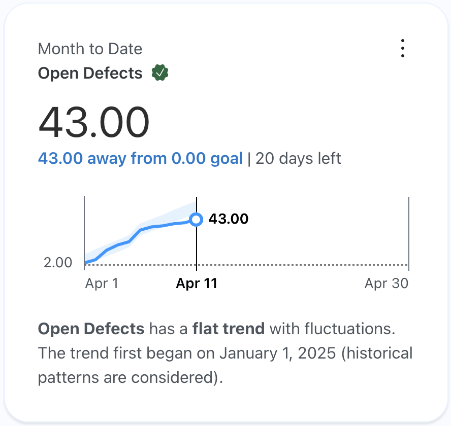
- NEW — Certified Metrics
- Custom Daily Comparisons
- Custom Decimal Places
- Metric Definition Governance
- Datasource Goals
- Link Related Content
- Corner Style for Pulse Metrics
- Turn Off Expected Range
- Easier Metric Definition Deletion
- Tableau Mobile Site Switcher
- Pulse metrics in dashboards
- Restrict metric definition editing
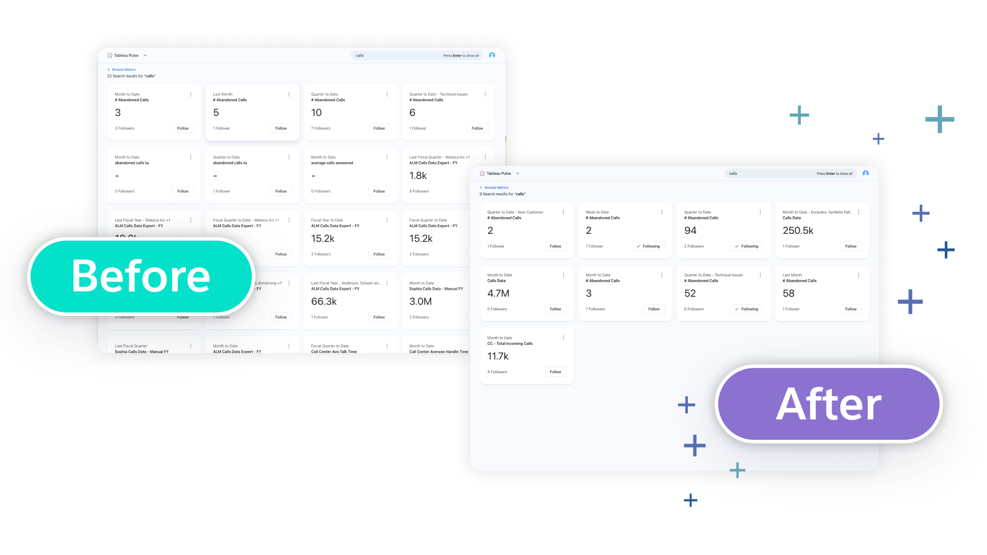
- Streamlined metric discovery
- Time handling enhancements
- Date offset
- Minimum granularity and week start day
- Metric bootstrapping enhancements
Looking to implement the newest features? Check out the Tableau Pulse release notes.

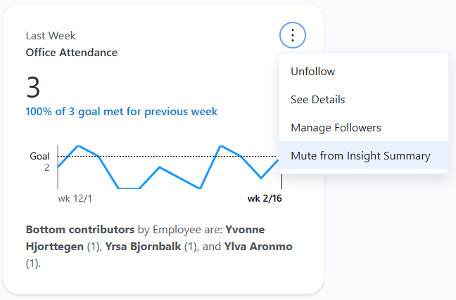
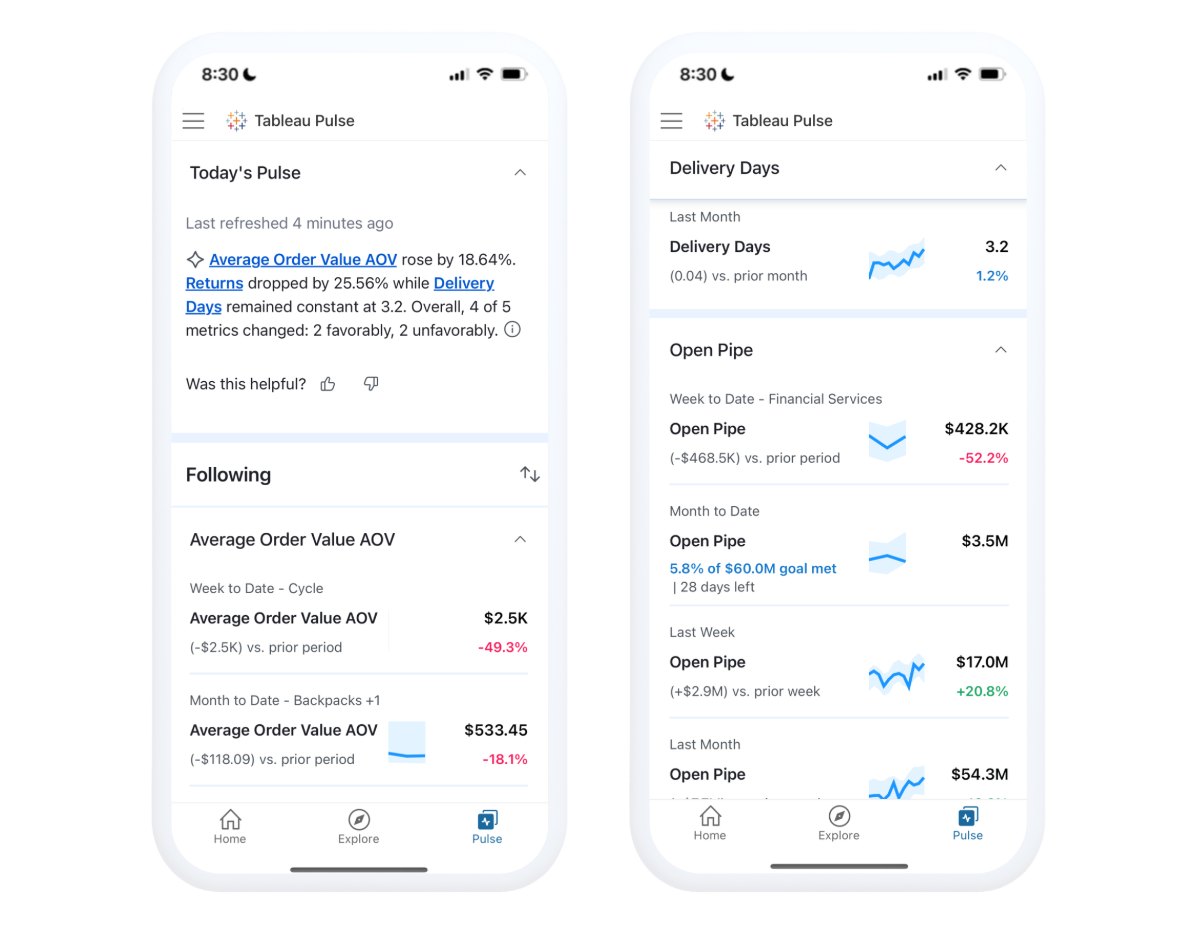
Mute Metrics
Stay focused on what matters most by excluding less critical metrics from your insights summary for a clearer, more relevant view. Use the following tab on Web or Mobile to easily mute metrics you are following and keep your key insights in focus.
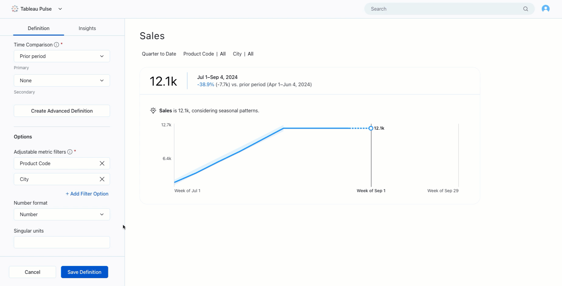
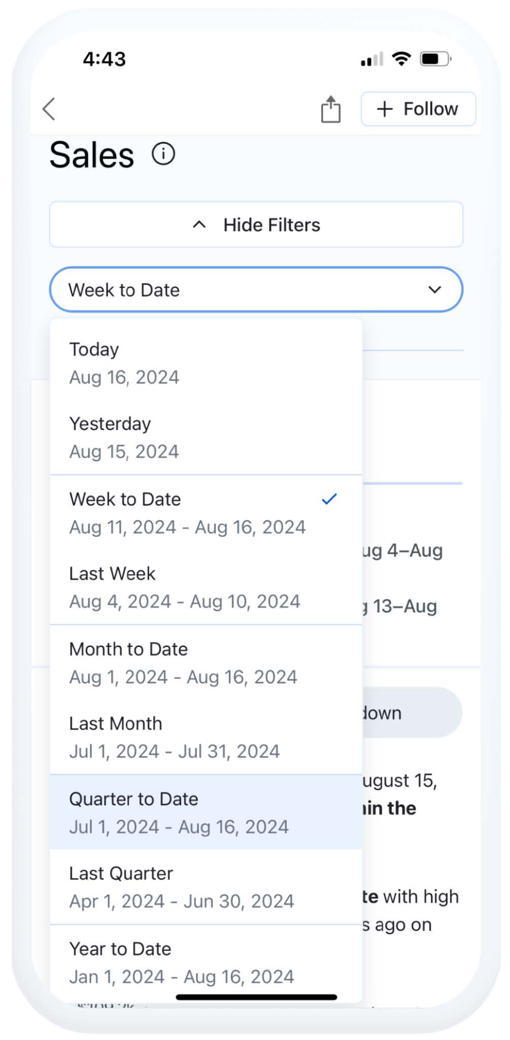
Mobile Metric Filtering
Make more informed decisions by focusing on specific data dimensions, like regions or time periods on mobile. Click the pencil icon and drill down to different dimensions.

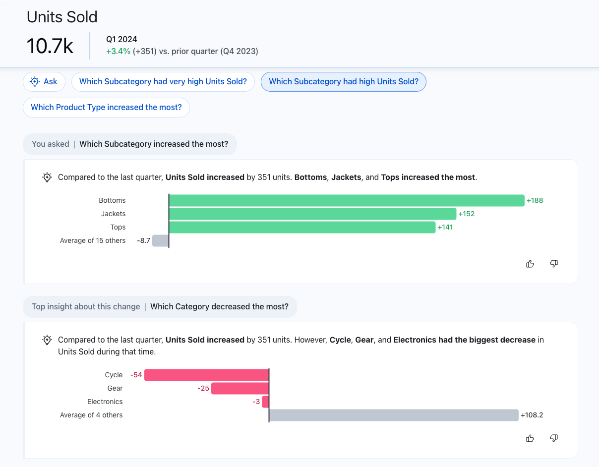
Enhanced Q&A
Discover insights conversationally across related metrics and see how they impact business trends with speed and ease, all powered by AI. Pulse’s enhanced Q&A experience provides intuitive key insights, relevant visualizations, source references, and suggested follow-up questions to help you dig deeper. Available as a premium feature on both web and mobile.
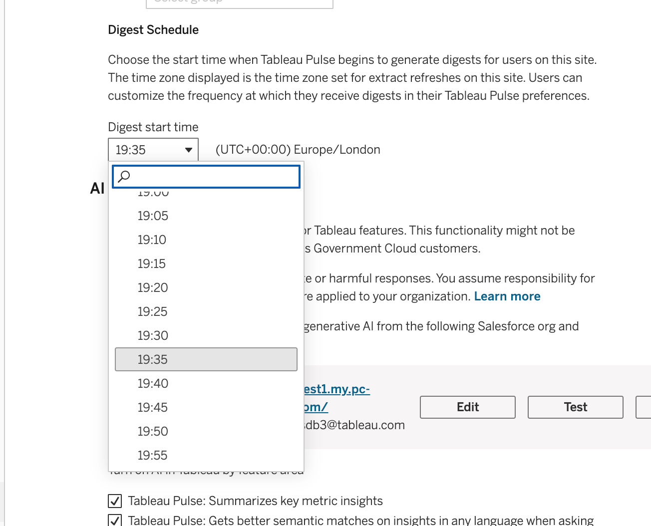
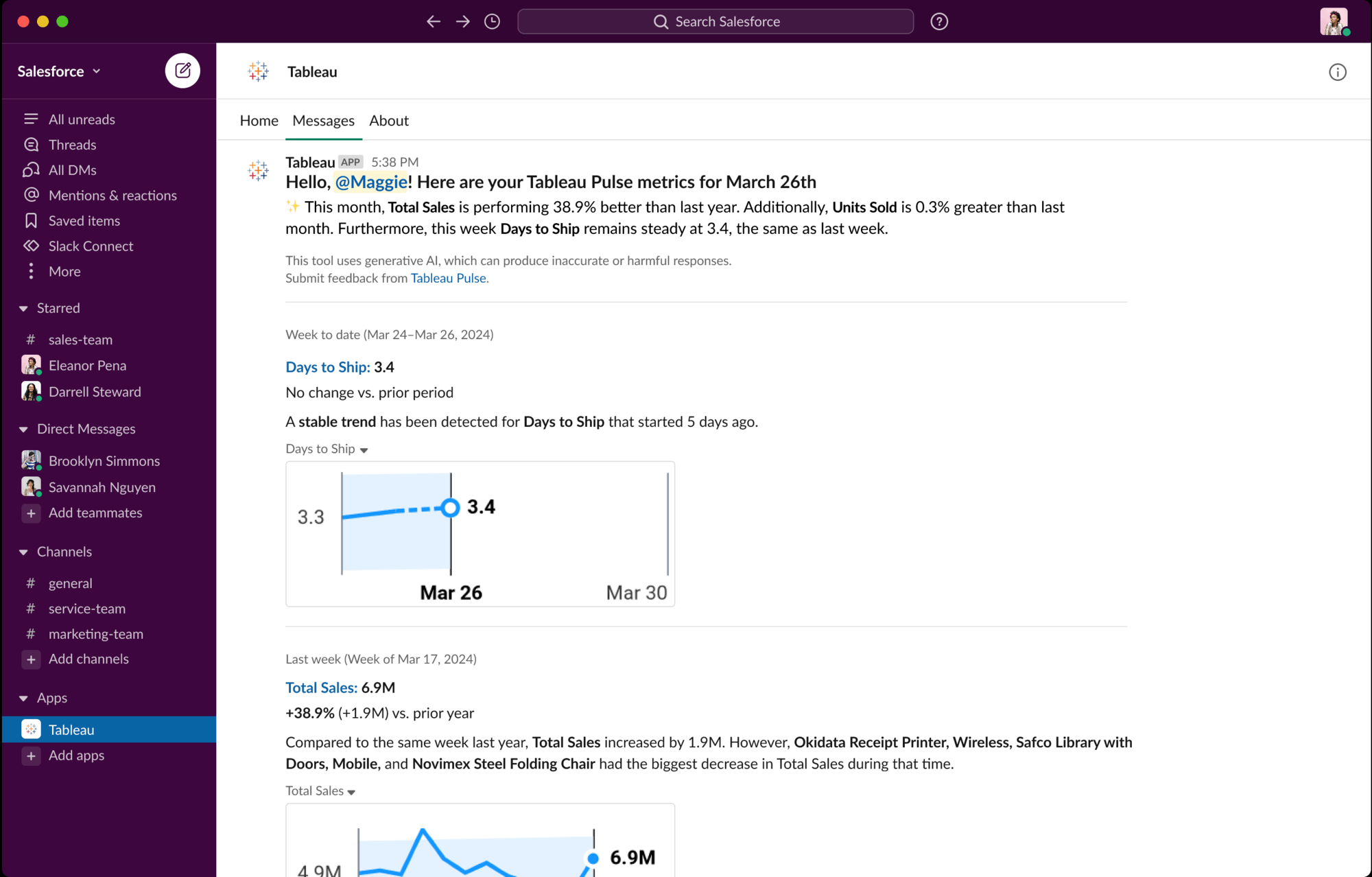
Digest Scheduling
Get timely, relevant insights by scheduling Pulse digests based on data refresh times.
Unfavorable Trend Alerts
Stay informed of unfavorable metric changes and eliminate the need for manual checks with proactive alerts on mobile, email, Slack, and desktop. Pulse checks metric trends daily and sends alerts when changes are detected. Alerts are sent during digest updates to manage query volume, and mobile notifications are only delivered when the app is active.
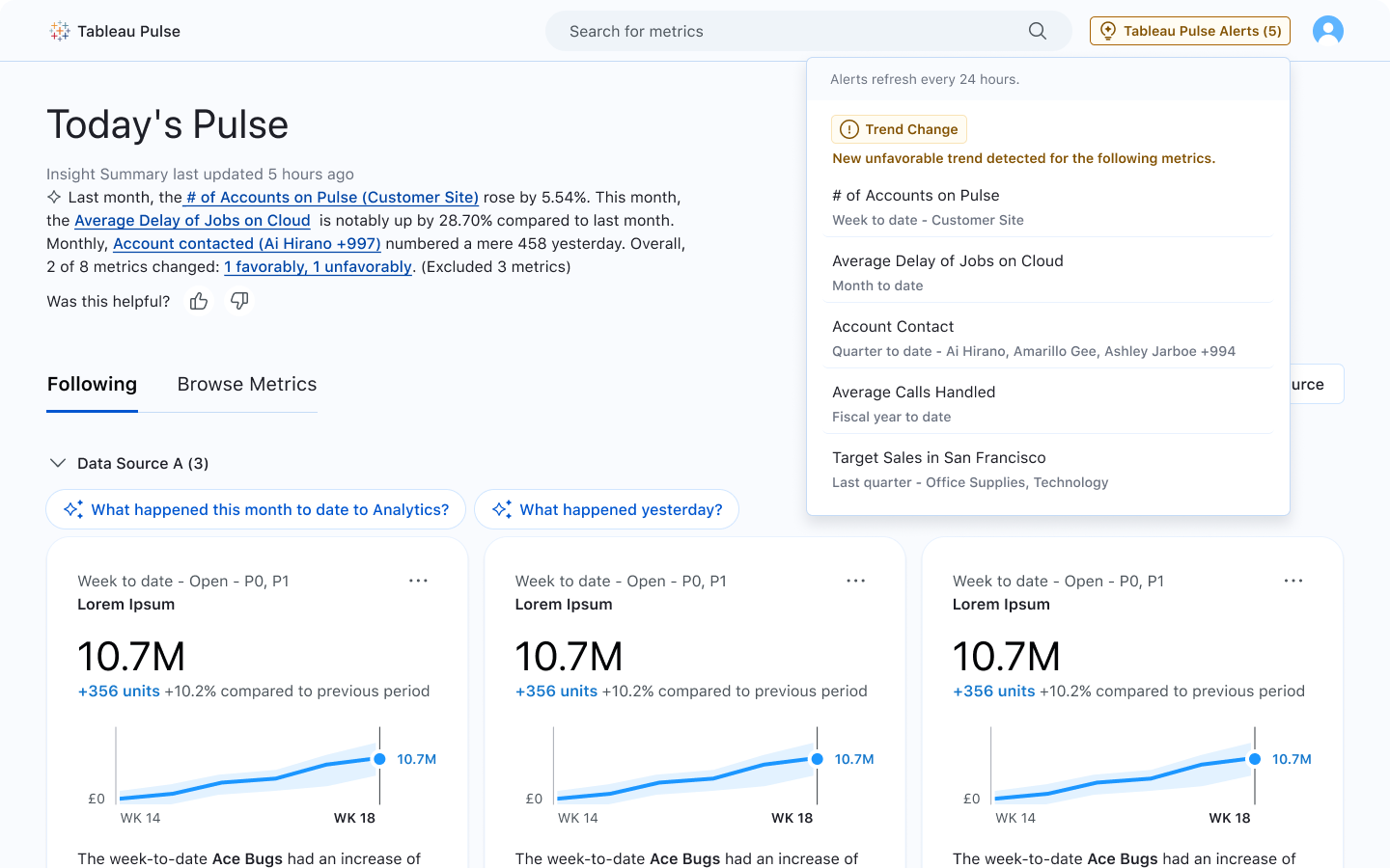
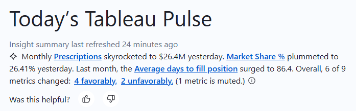
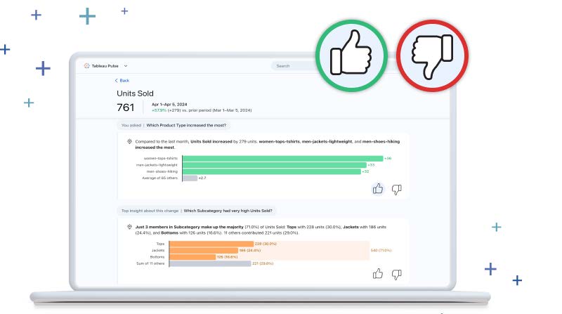
Insight Summary Enhancements
Take timely action by identifying metrics driving both favorable and unfavorable trends in the insights summary. Explore the metrics behind these trends by selecting 'favorable' or 'unfavorable' in the summary.
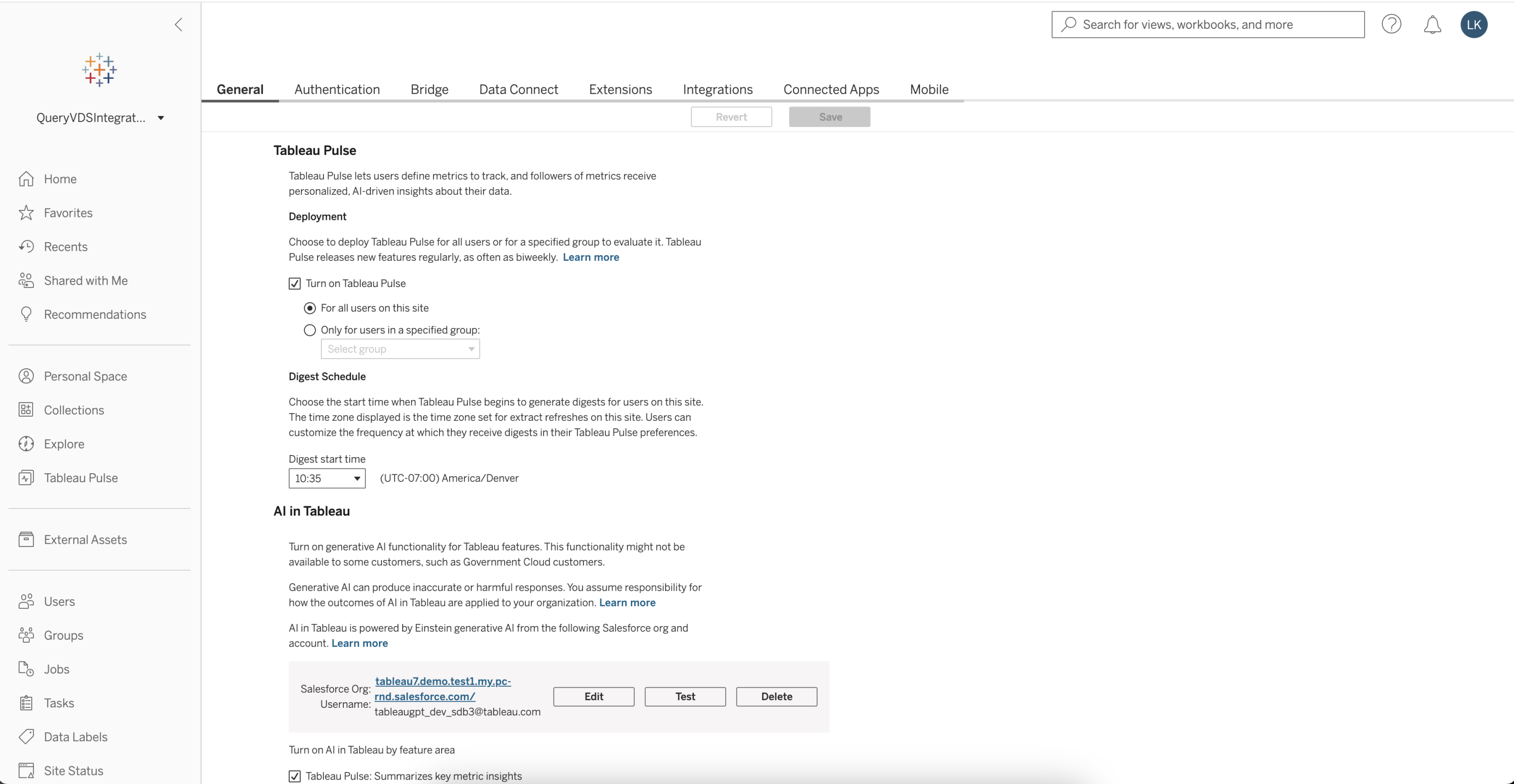
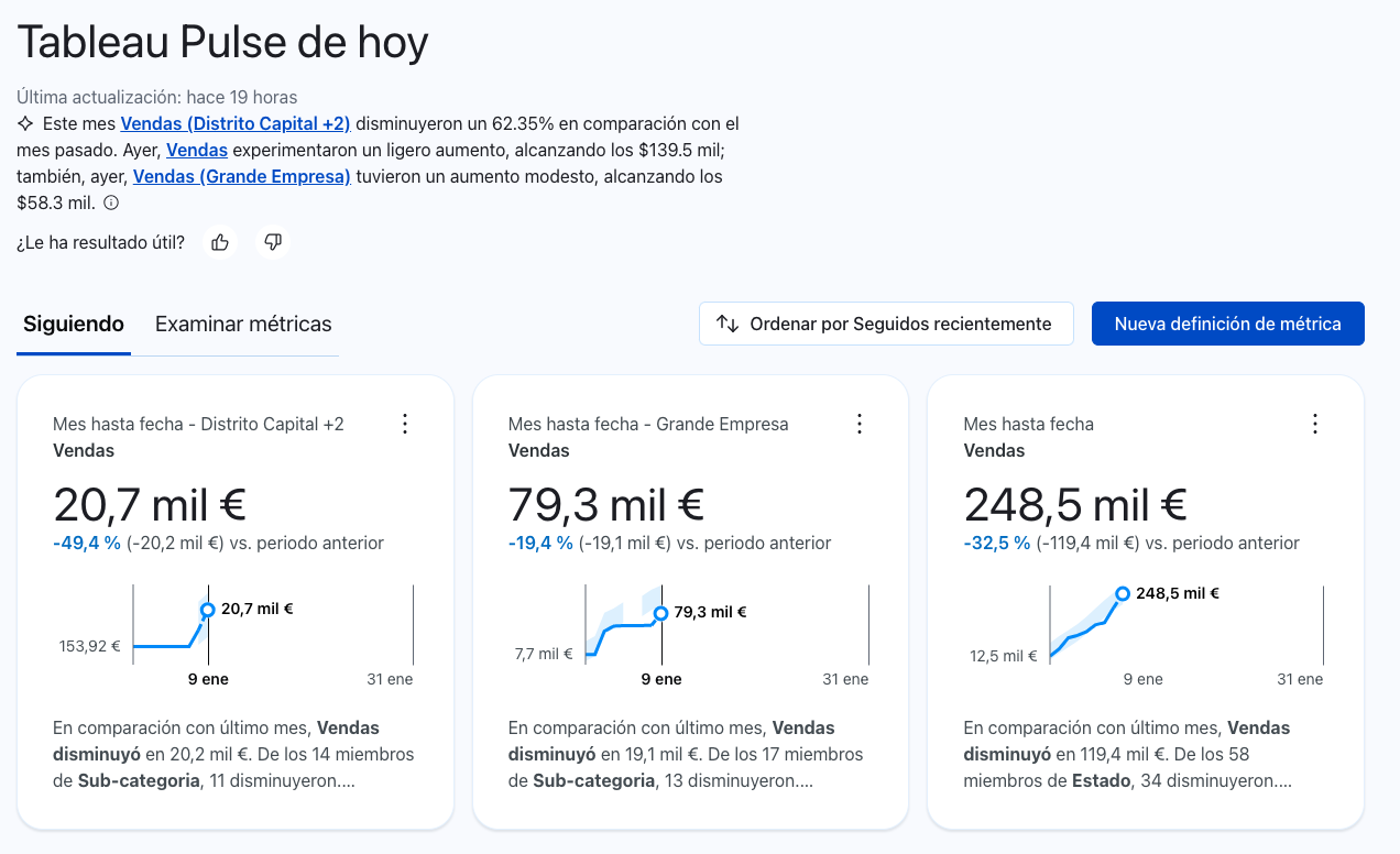
Multilingual Support
Enhance scalability and reduce misinterpretation of your business trends by getting insights in your local language on both web and mobile. Pulse is available in all Tableau-supported languages and also respects the locale setting on your Tableau account, so specific regional settings such as currency are reflected in your insights.
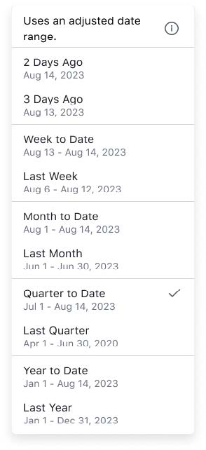
Time Range Grouping
Increase relevance and actionability from your insights by grouping metrics by time range. This allows you to review your metrics' performance in the context of a specific time frame, in addition to the existing grouping options. Setting a default view will be reflected across email and Slack digests, the Tableau mobile app, and the web.

Group and Sort in Slack Digests
Organize and evaluate your metrics with greater relevance in Slack digests using grouping and sorting. Settings in the 'Following' tab will be reflected in Slack digests.
Revamped Pulse Homepage on Mobile
Easily access and compare key metrics on the go with the revamped Pulse homepage on Mobile. You can now see at least three metrics at a glance and instantly identify trends for quicker, easier decision making.
Drill Down from Breakdown or Insights Chart
Quickly pinpoint and understand insights more precisely by drilling down into a specific dimension value. When you click on a specific item within an insight or breakdown, you'll see data and insights focused solely on that item. This helps you quickly delve one level deeper to better understand changes in your metrics.
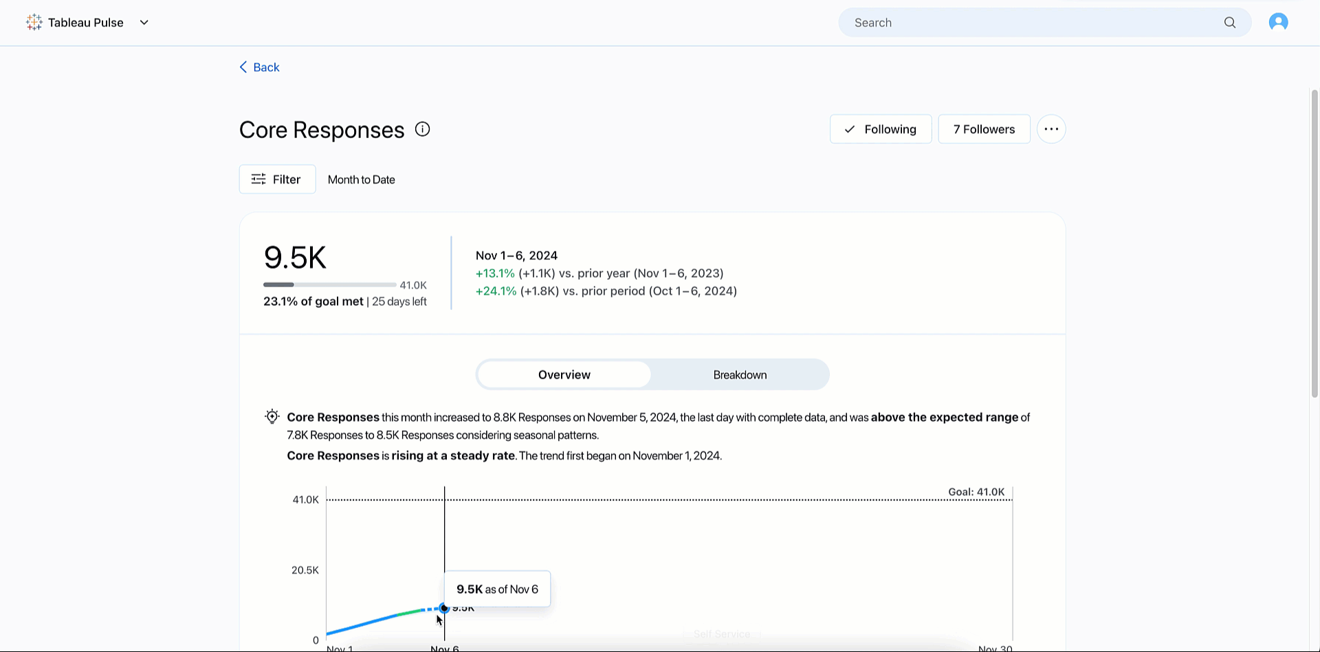
Period Change in Breakdown Chart
Identify what is driving your business with period-over-period changes of dimensions in the breakdown chart on the metric detail page. Tableau Pulse now shows you the percent change of dimension values next to the overall value within your breakdown chart.
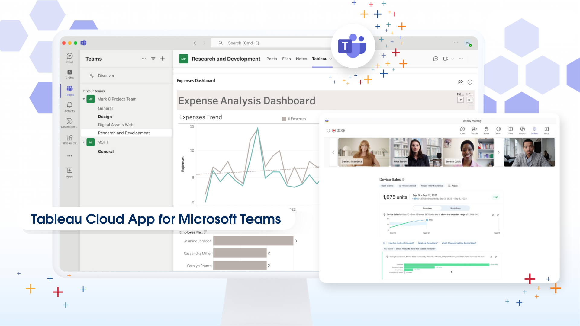
Tableau Pulse in Microsoft Teams
Make informed decisions quickly and effortlessly in Teams, with the power of Tableau Pulse. This integration delivers AI-powered, personalized, and contextual insights directly into your workflow, boosting productivity, efficiency, and data utilization.
Global currency symbols
Make your Tableau Pulse metrics clearer and more personalized by showing the right currency symbol. Tableau Pulse now supports over 130 different symbols. Once you specify the currency symbol in your metric definition, the value will be used across all the metrics that use that central definition. Please note that the currency symbol location is fixed for now and precedes the value.
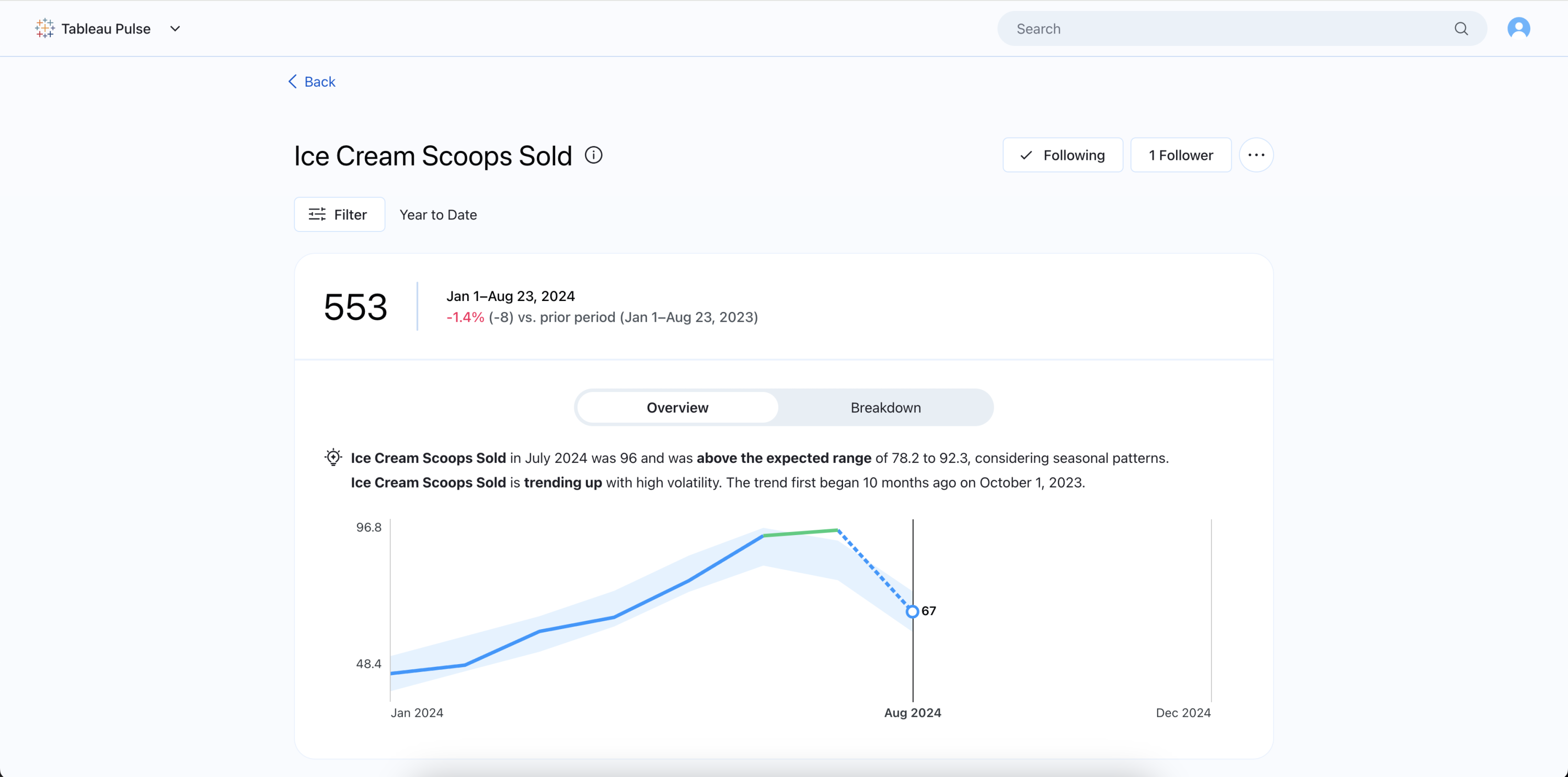
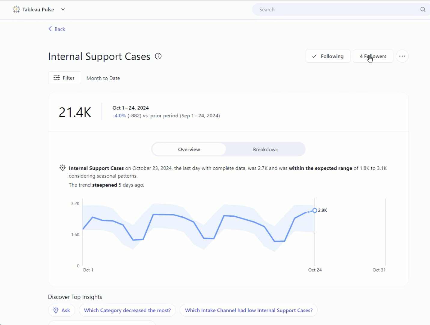
Enhanced Insights: Seasonality
Tableau Pulse now more accurately reflects the expected range of metrics and recognizes unusual changes for data with seasonality trends.
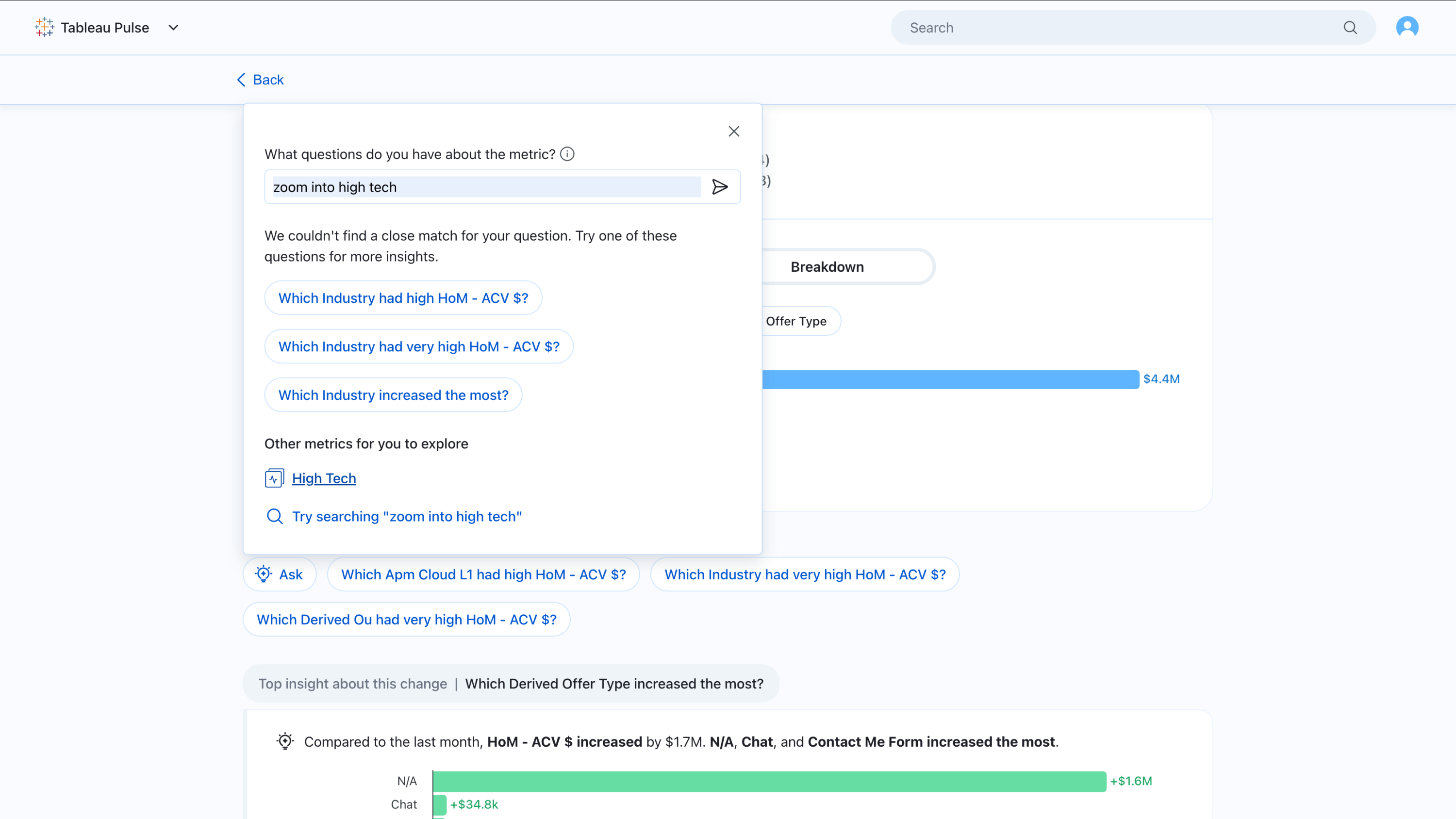
Enhanced Ask: Related metrics
Answer questions extending beyond what Pulse insights previously detected—in particular, asking about another metric from the same metric definition.
Users can now ask questions down to the filter level to navigate to more accurate metric views with ‘Ask’. Other enhancements include: better case handling for varying levels of answer confidence, global metric search as an additional fallback, and more informative visual treatments.
These enhancements not only enable dimensional drilldowns on entity-level insights, but also use cases that involve changing the time granularity of a metric, applying multiple filters at once in a question, and navigating to parallel metric scopes.
Manually created goals
Set a manual goal for a given metric. For those with goal creation permissions: select ‘set goal’ in the ellipsis drop down in the web Insight Exploration page and add any relevant edit restrictions.
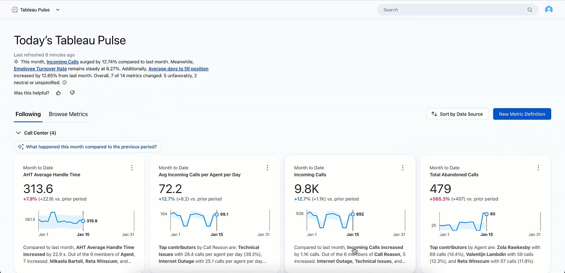
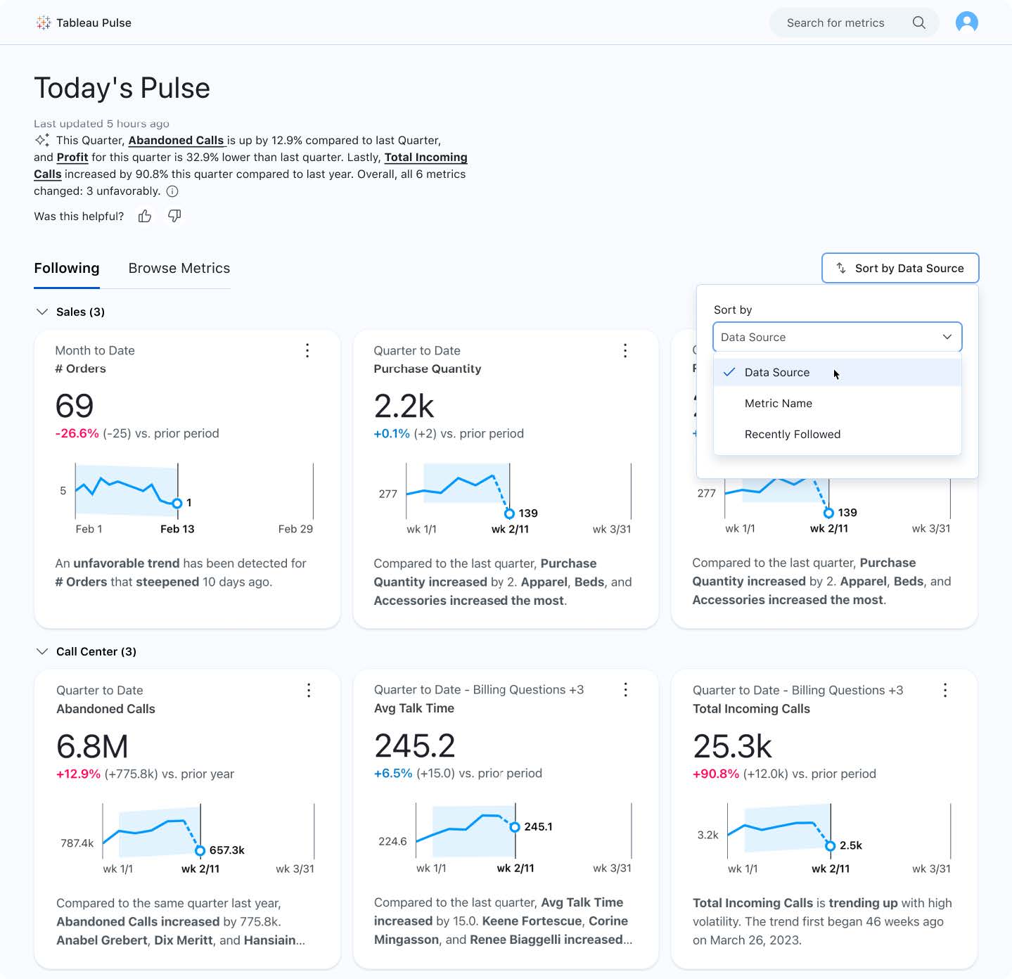
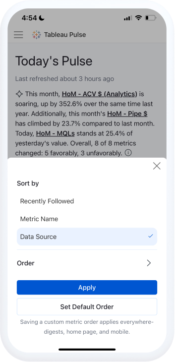
Dynamic sorting and grouping
Sort and arrange your metrics leveraging metadata such as metric name, data source, and time range. This feature allows you to organize and evaluate related metrics together, on web and mobile. Detect important patterns and trends in your data with a flexible and user-friendly method for organizing and grouping metrics.
Sort the ‘following’ tab on web or mobile by:
- Data Source Name
- Metric Name
- Recency (Recently Followed)
And set that default view consistent across:
- Email Digests
- Tableau Mobile app
- Following tab in the web
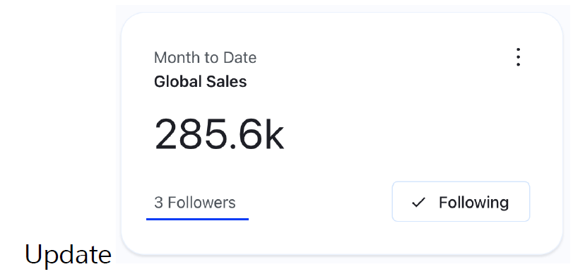
Popular metrics
Pulse helps you discover metrics more easily by exposing metric follower count in the insight exploration page and metric search. Metric follower count will be shown automatically, without any admin or user configuration.
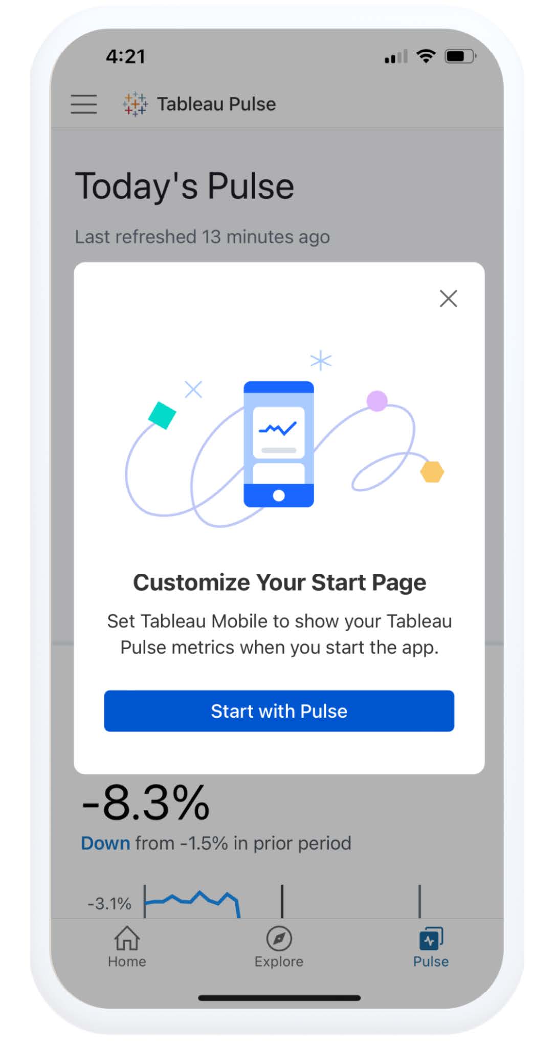
Set Tableau Pulse as mobile start page
For frequent users of the Tableau mobile app, set Pulse as your default start page for easier, faster access to Pulse.
To configure, update the Tableau mobile app. The app will automatically prompt start page selection upon first access and redirect you to your mobile app settings. In cases where one is connected to Tableau Server or Tableau Cloud with Pulse disabled, selecting Pulse will fallback to default (default set by admin or user on web).
Change mobile time period
Pulse on Tableau Mobile now better matches web functionality around the most common Pulse interactions. Select the ‘filter’ dropdown to change the time period for a metric when browsing your metrics on mobile—without needing to switch to the web to explore.
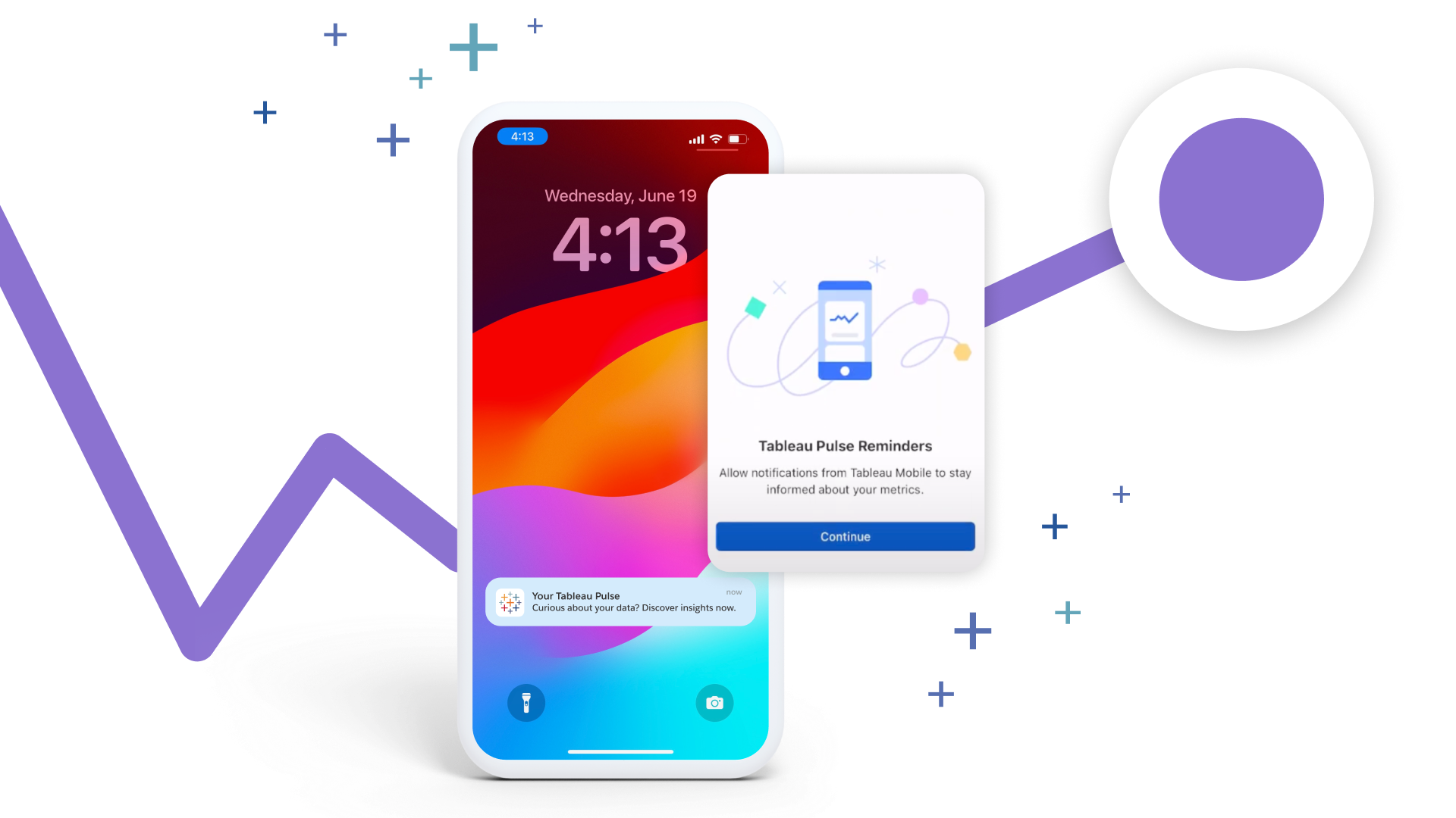
“Check your Pulse” mobile reminders
Never miss important insights with daily mobile reminders. Enable notifications for the Tableau mobile app to remind you to "Check your Pulse" daily—so you always stay up-to-date with your business metrics.
Personalized insights ranking
Get insights ranked according to what you find most useful through thumbs up and thumbs down feedback. Feedback informs insight ranking for the user that provided the feedback and other users following the same metric. It is considered in the context of metric, filtered population, and insight type.
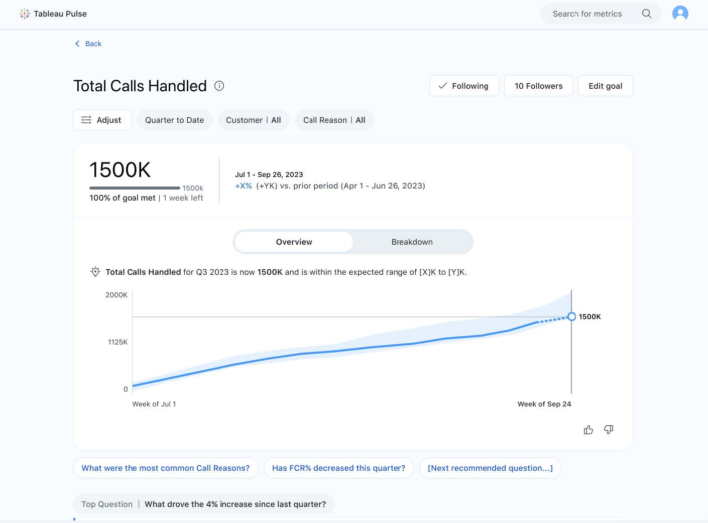
Pulse Q&A
Pulse Q&A unlocks more ways to explore your insights through guided questions and the ability to ask questions. Tableau Pulse can automate the most frequently asked business questions on the metric definition context, such as drivers, contributors, trends, and changes. Pulse performs these analyses then delivers them in the form of plain language insights shared in guided conversations via point-and-click (guided questions) or through typing in questions (“ask”).
“Ask”: You will now see an additional "Ask" button next to the existing guided questions which enables you to ask questions related to metrics you are investigating. Using the "ask" feature will prompt suggested questions that match the insights you are investigating.
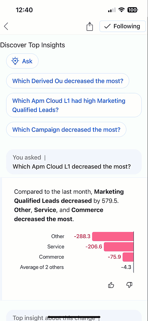
Guided questions: Users can also see up to three top guided questions recommended for them already before they know to ask. Powered by AI, these representing questions are ordered in a way that is highly relevant to what users want to see. In one click, users can self-serve the answer alongside other common questions, speeding up time to insight and reducing repetitive work.
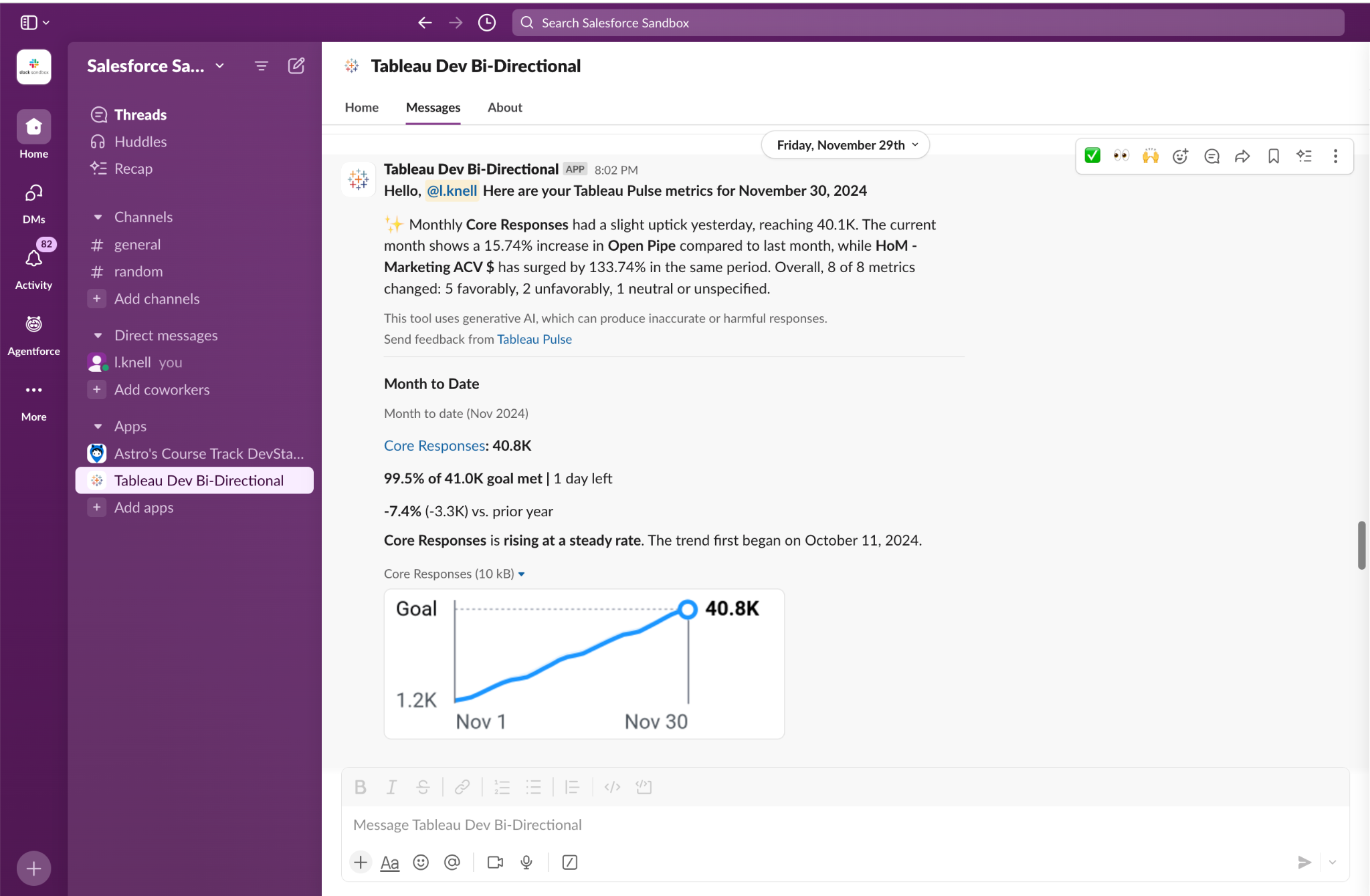
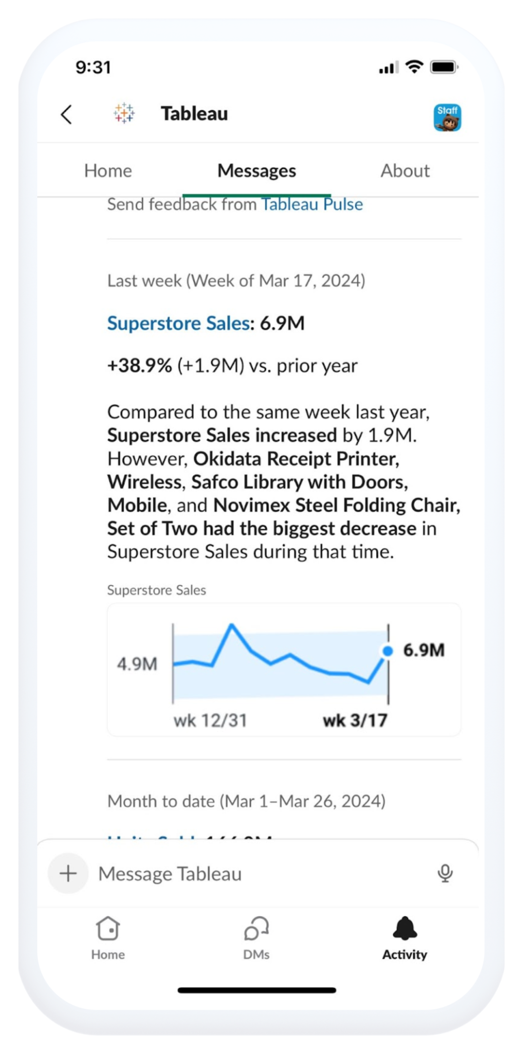
Sparklines in Slack Digest
Receive natural language insights accompanied by visual explanations, making it easier to assess the changes in your metrics in your flow of work. Quickly identify the trend in your metrics and if it’s within the expected range so you can make appropriate and timely decisions—without leaving Slack.
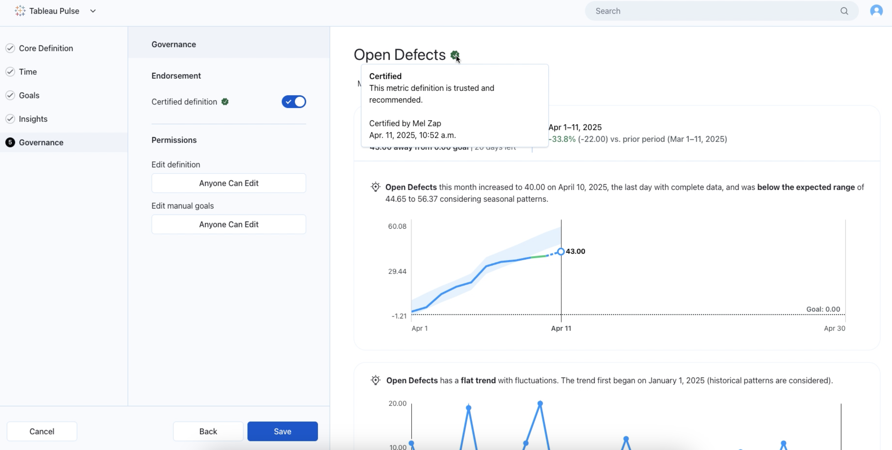
Certified Metrics

Certified Metrics
Make trusted and informed business decisions by certifying metrics. Toggle ON metric certification when accessing the new step under metric definition titled "Governance".
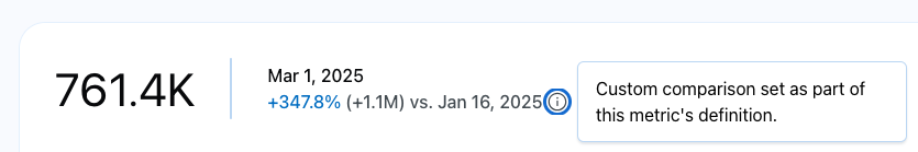
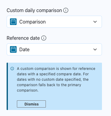
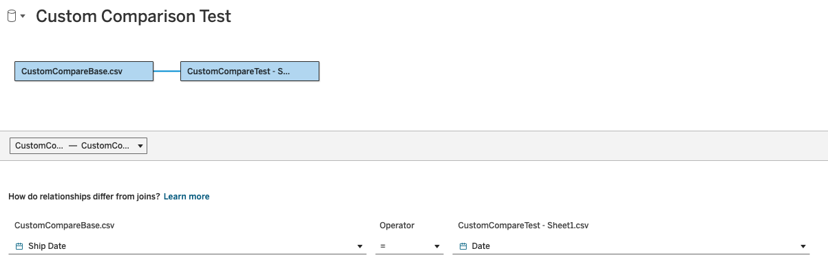
Custom Daily Comparisons
Enable more accurate period-over-period comparisons by specifying a 'comparison date' for metrics in the datasource. You can now set a 'comparison date' for metrics in Pulse, ensuring that the 'today' and 'yesterday' time ranges use relevant, like-for-like comparisons—such as comparing a weekday to the same weekday in the previous year—while leaving other time ranges unaffected.
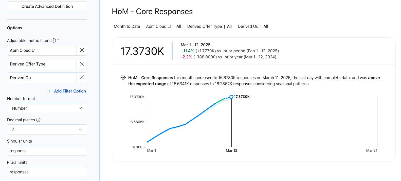
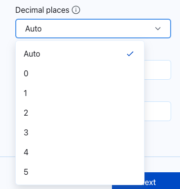
Custom Decimal Places
Customize how your metrics are displayed in Pulse. When creating or editing a definition, select the exact number of decimal places (up to five) or choose Auto to use Pulse's default rounding—ensuring your data remains clear, accurate, and easy to interpret.
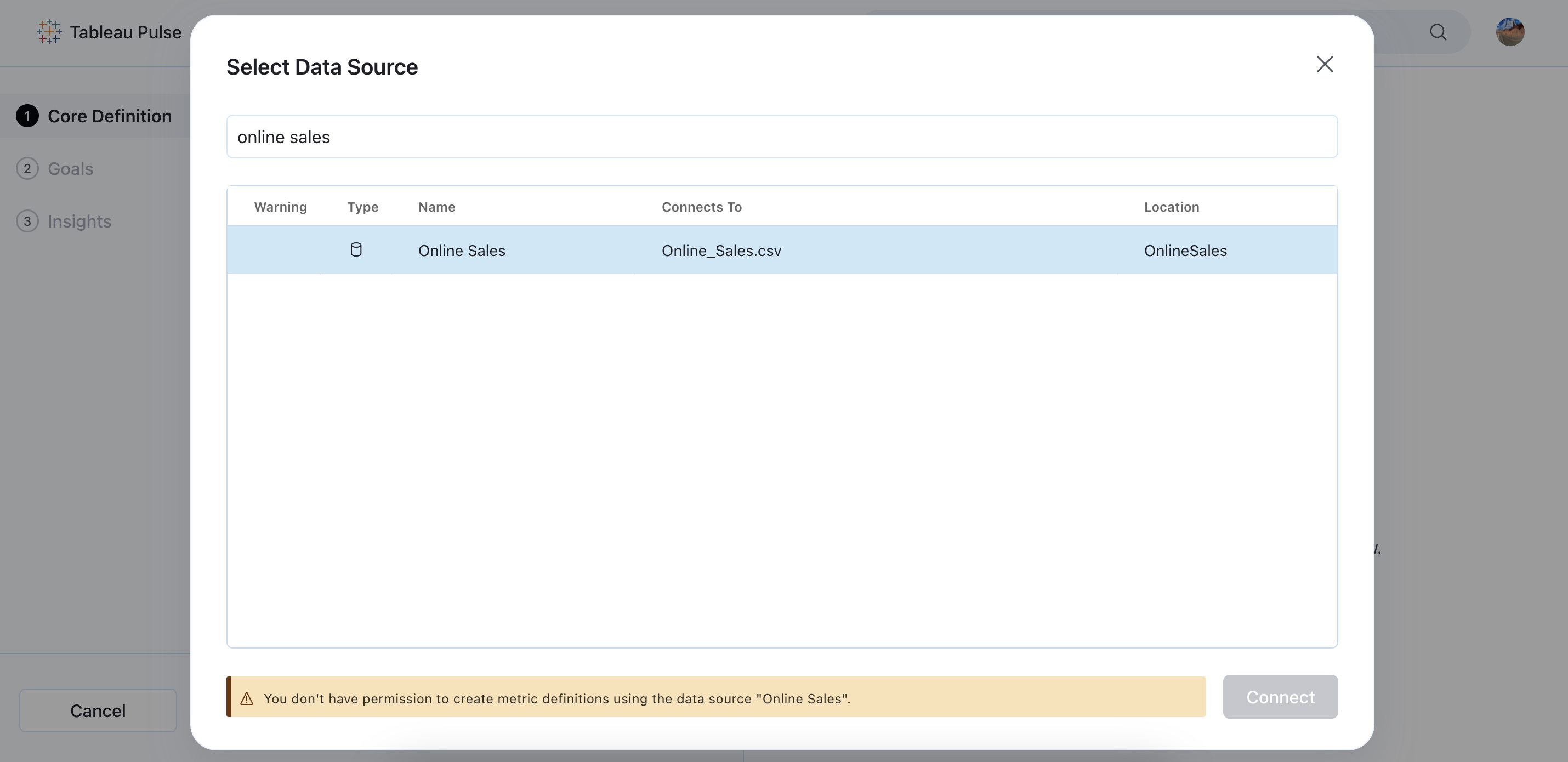
Metric Definition Governance
Enhance data governance and accuracy by allowing admins to control who can create metric definitions for a given datasource.
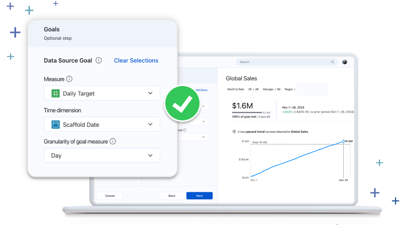
Datasource Goals
Drive efficiency and accuracy by tracking your metrics performance in relation to goals from your data source. Rather than create a goal for each metric, you can now reference goals from the datasource in the metric definition. Datasource goals are optional, apply to all related metrics, and support partial and full periods.
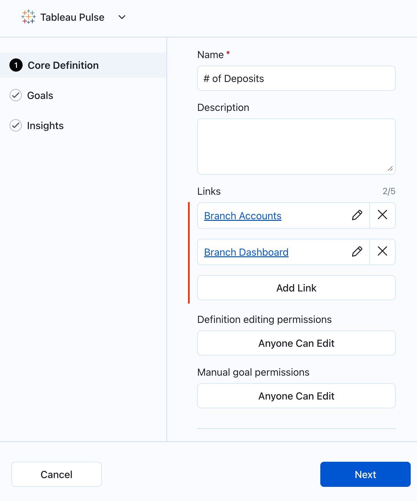
Link Related Content
Access content relevant to your analysis easily by linking related content to metrics. You can now add up to five links in the core definition step, which will be presented on the insight exploration page and related metrics page.
Corner Style for Pulse Metrics
Enhance the look of Pulse metrics in your dashboards with the ability to toggle between square and rounded corner styles. You can now switch between corner styles for Pulse metrics in the Pulse Dashboard Object settings.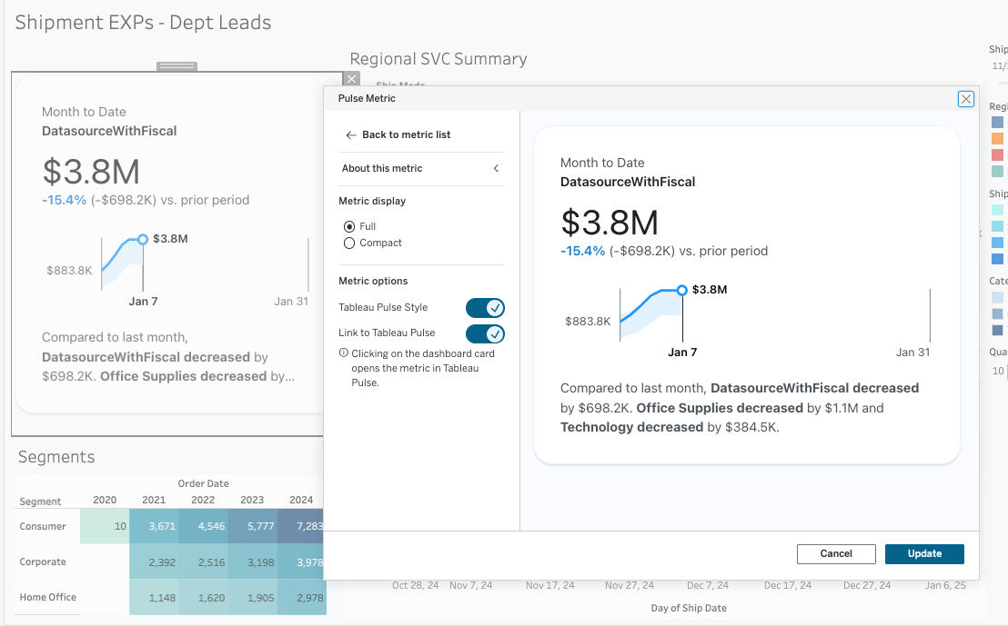
Turn Off Expected Range
Enhance the clarity of your insights by toggling off unexpected values directly in the metric definitions within the Insights tab. By doing so, you'll disable the expected range, and remove the insight text and blue visual indicator from the chart on the insights page.
Easier Metric Definition Deletion
Clean up your data more easily and get to your insights faster by deleting metric definitions directly from the All Metrics page with the new 'Delete Definition' button.
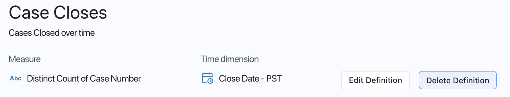
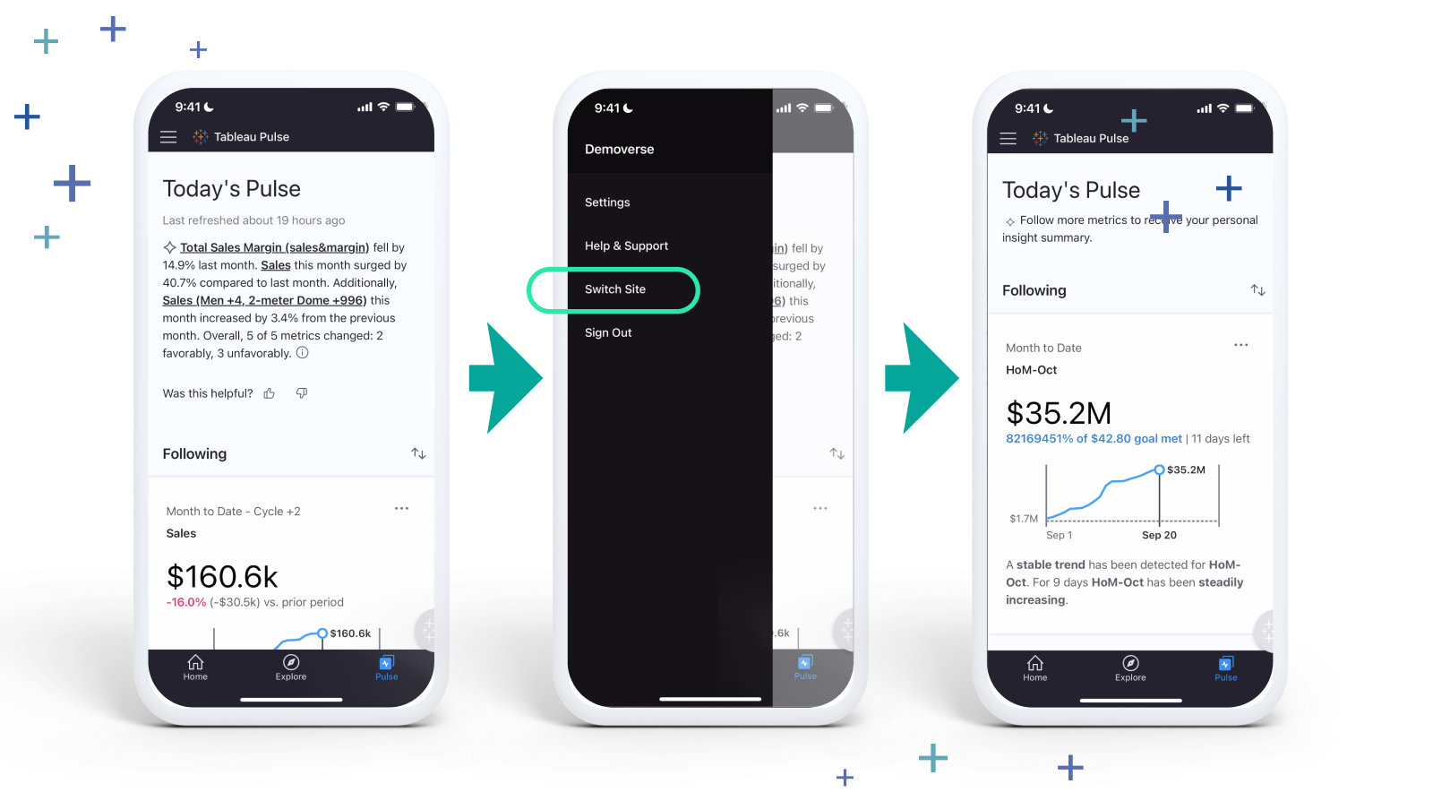
Tableau Mobile Site Switcher
Eliminate repetitive manual steps and save time by easily switching between multiple cloud sites from a drop-down list on Tableau Mobile. The 'Switch Site' feature allows you to bypass the need to manually find and input the site URL or re-enter credentials each time you switch.
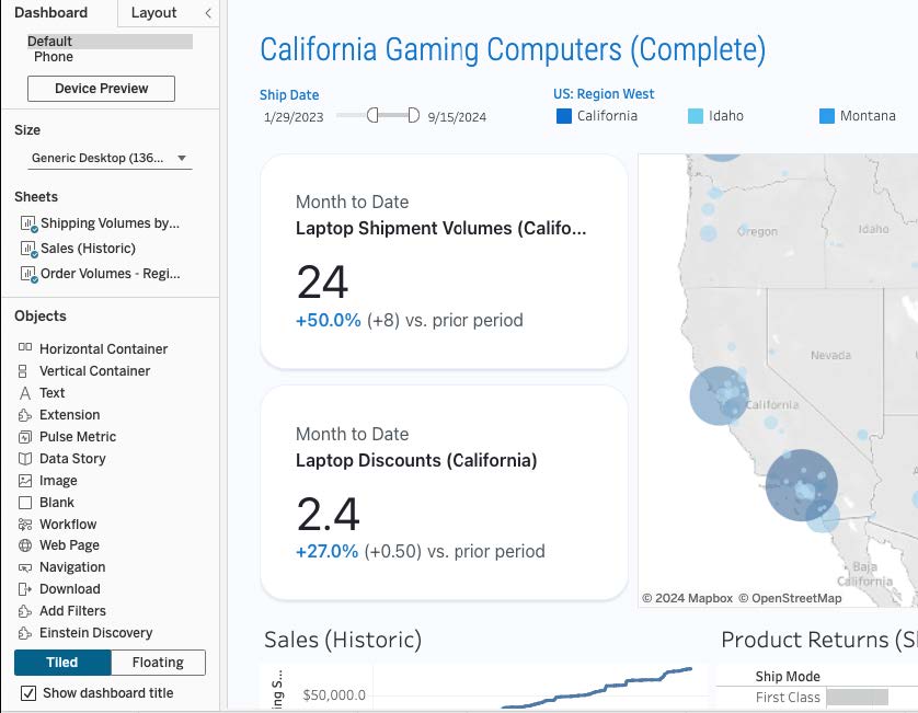
Pulse metrics in dashboards
Tableau dashboard creators can now embed Pulse metrics using a built-in dashboard object available in both Desktop and Server dashboard authoring. By embedding Pulse metrics in operational, strategic, and performance dashboards, users can click on a metric to navigate to its detail page, delving deeper into metric trends and readable insights.
Drag and drop the new Pulse Metric dashboard object on your dashboard, and the object will automatically detect all published data sources and their Metric Definitions.
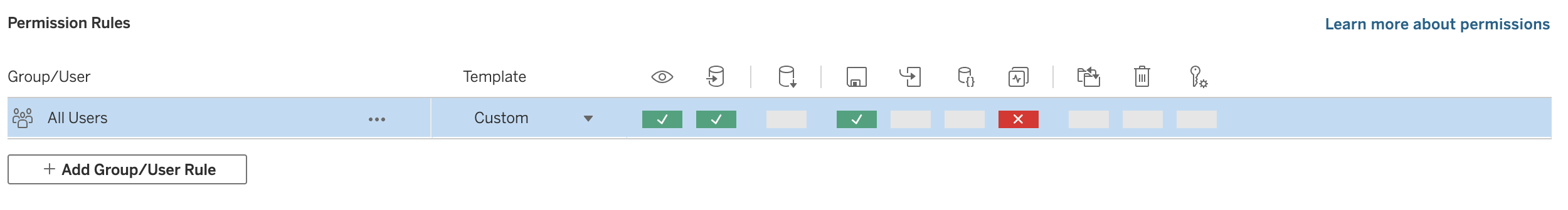
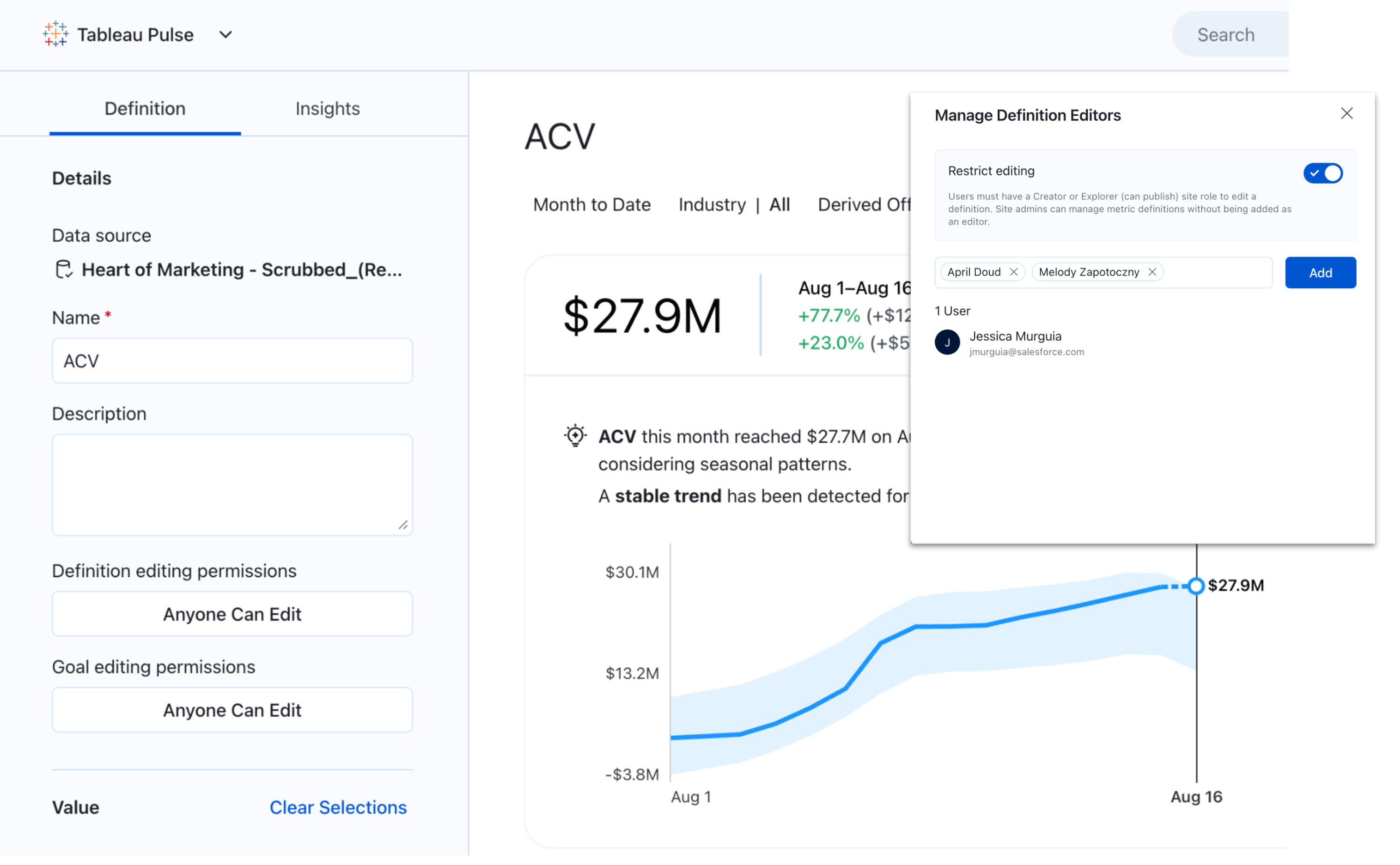
Restrict metric definition editing
Improve governance by restricting editing or deletion of metric definitions to site admins and authorized analysts. With these updated permissions, metrics are safeguarded from changes by unauthorized users.
Streamlined metric discovery
Streamline metric selection—only main metrics and variations with followers are displayed when searching and browsing metrics.
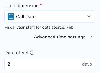
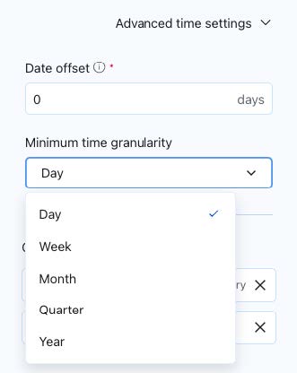
Time handling enhancements
Date offset: Improve time handling with specified date offsets. Set a date in the metric definition to specify how the system determines ‘today’. This allows users to line up metrics to when the data source refreshes—eliminating inaccurate gaps for non-standard calendars or when data doesn't update daily.
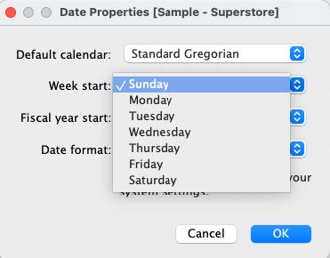
Minimum granularity and week start day: Specify a minimum time granularity in metric definitions and set a custom week start day—so you only see relevant time periods that match your data source.
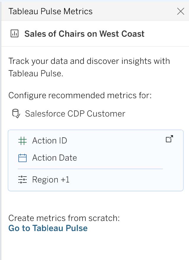
Metric bootstrapping enhancements
Discover metrics hidden in dashboard vizzes with smarter heuristics and more context using Tableau Data Guide. Enhancements include improved heuristics to identify primary measures and dimensions in key Tableau viz types (bar, area, and line charts), recognition and inclusion of calculated fields within Published Data Source (PDS), and improved visualization of icons for measures and dimensions.
Want to try out the latest features? Check out the Tableau Pulse release notes.
相關文章

What to Know About Tableau Next: FAQ
 2025/04/07

Engineering AI for Automated Relationships in Tableau Next

AI-Driven Data Modeling with Tableau Semantics: A Principal Architect’s Perspective
Subscribe to our blog
在收件匣中收到最新的 Tableau 消息。