Why design theory should apply to business intelligence
A version of this post originally appeared in InfoWorld.
"Great designers produce pleasurable experiences." So wrote Don Norman, the director of UC San Diego's Design Lab, in his book, The Design of Everyday Things. Norman’s observation can be seen in most revolutionary products. Take the iPhone: One of the key reasons it succeeded was the removal of the physical keyboard. Steve Jobs loved the idea and created an object of desire that transformed society.
Don Norman’s observations led him to the assessment that there are three levels of processing people go through when using an everyday thing: visceral, behavioral and reflective. If you create successful experiences at each level, then you’ll have a successful design. While Norman’s prescription refers to physical products, we can apply these principles to dashboards in your organization, too.
Let’s see how those three levels can create a pleasurable experience for your dashboard audiences. To learn more about applying design and psychology to dashboards, download the whitepaper.
1. Visceral Level - Seeing

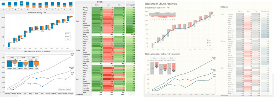
Subscriber Churn, The Big Book of Dashboards
The visceral phase is the first, instantaneous response to seeing something. It’s a primitive response but very important. Look at the two dashboards above: which has the better visceral appeal?
It’s the one on the right. It contains fewer labels, lighter bars, and more modern typography. The data in both is identical, but the one on the right was the result of a redesign intended to improve the visceral response.
Look at your own business dashboards. What is the first reaction? Do people have a good visceral response? If not, they are unlikely to begin their engagement with enthusiasm.
2. Behavioral Level - Doing
The second level of processing is behavioral. When someone wishes to use an everyday thing, such as a door at an entrance to a building, they have an objective (enter the building). Using that object, can he or she successfully complete the task at hand? Are the things the object can do apparent and obvious? Don Norman shares many failures in the book, including examples of poorly designed doors where a lack of hinges and push/pull signs thoroughly confuse people. It's just as important on your dashboards: Can the person understand how to interact with it? Can the dashboard answer the users' questions?
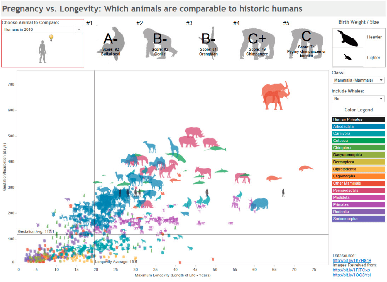
Check out the excellent dashboard on animal gestation and longevity below, designed by Eric Brown. Do you see how can you interact with this dashboard, or what you can click on?

Longevity and Gestation in Humans and Animals by Eric Brown
There are eight ways to interact with Eric’s dashboard. Did you spot them all? I'm guessing that you didn’t, but that’s ok. Not all the “affordances” (things an object can do) have a “signifier” (a visual indication that it can be done). If there’s nothing telling your audience what they can do, how do you expect them to know?
Whenever advising dashboard designers, I implore them to observe other people using their dashboards. This test always reveals whether the behavioral aspect of their dashboard is successful or not.
Also, note: You don’t necessarily need to signify everything; training or familiarity can get over that problem, but it is something you need to consider. Can you sit and train your users or change the experience for first-time users?
3. Reflective Level - Feeling
The person’s work is over; they leave the dashboard and reflect on the experience. Did they like the thing they were using? Could they complete the task they had? If the answers are yes, then they are likely to come back to this dashboard the next time they have the question. Get it wrong and next time they’ll find the answers another way or, even worse, make a decision based on guesswork.
Each of these processes work together. A business’s dashboards are designed objects just as much as a car or smartphone. “Well-designed devices,” writes Don Norman, “can induce pride and enjoyment, a feeling of being in control, and pleasure.”
Your colleagues should find this pleasure and enjoyment in your data too.
For more information on dashboard design, download the whitepaper.
相关故事
Subscribe to our blog
在您的收件箱中获取最新的 Tableau 更新。


