What to Expect from Data Storytelling in 2016
Note: This piece first appeared in ComputerWorld.
Data storytelling is undergoing a big change, one that will influence not only data journalism but also how data is shown in the business world. And 2016 will only accelerate this trend.
Five years ago, data journalism focused on rich interactives designed primarily for a monitor or laptop screen. Those interactives were complete applications, destinations to be browsed. You could explore, drill down, filter, and play with them. This was a rich experience in the days when we used a mouse and keyboard.
The world has changed. First, we’re mobile. Second, social media has transformed the way we consume content. We scroll through streams and streams of content, quickly, on sites such as Twitter, Facebook, and Buzzfeed. This has led to an increase in "scrollytelling": using scrolling to reveal videos, sounds, and animations which flow into and out of the story text. A great example from this year is "The Dawn Wall," the New York Times’ piece on the astonishing 19-day free climb in Yosemite National Park in California.
These trends are affecting interactive data journalism, leading to fewer rich interactive data destinations. Does this mean data is playing less of a role in journalism? Not at all. Let’s look at the effects on data journalism.
1. Scrolling Animates the Charts

Click to visit the full interactive version.
Scrolling, not mouse clicks, are being used to change charts. My favorite is "Why Pinellas County Is the Worst Place in Florida to be Black and Go to Public School" by the Tampa Bay Times. It tells the sad story of increasing segregation of schools in Pinellas County in Florida. The scroll action transitions from chart to chart, making the story easy to follow, and making the data itself central to the view on the screen.
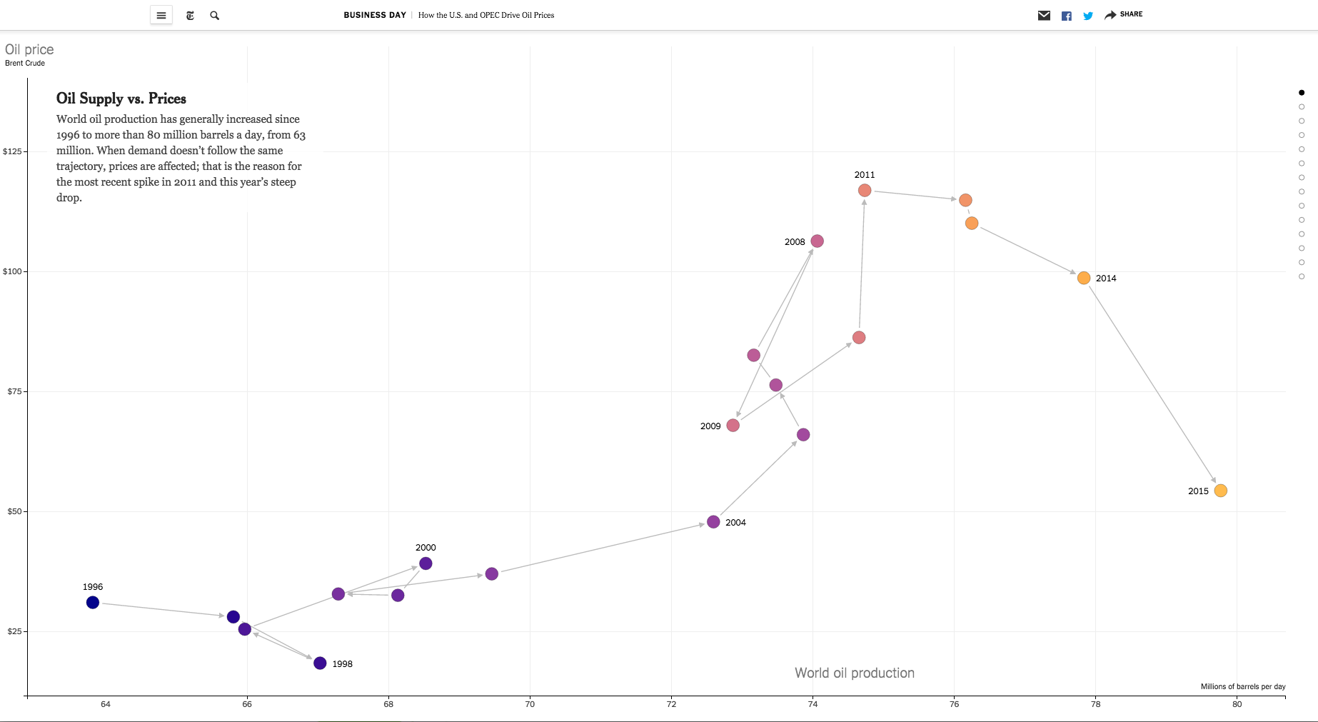
A similar example comes from the New York Times' "How the US and OPEC Drive Oil Prices." Once again, each scroll transitions the chart to a new view, with a supporting paragraph.

Click to visit the full interactive version.
Hannah Fairfield, senior graphics editor at the New York Times, highlighted this trend last year at Tapestry, the data storytelling conference. "Design for mobile requires strong editing because the visuals and the text have to work tightly together," she says. Instead of expecting a reader to explore a big data visualization with filters, she says, it is more effective for a graphics editor to surface the most revealing data.
2. Embedding Simpler Charts to Add Context
Source: Sydney Morning Herald
The second effect is the move from large, complex pieces of work to simpler charts embedded in long-form stories. The charts remain interactive but they are in line with the story text. A recent example is this story on "The Science behind Australia’s Most Popular Wedding Dates" from the Sydney Morning Herald by Inga Ting.
"Breaking a story down, chart by chart, is a way of taking them along for the ride," says Ting. "When it comes to exploring the data themselves, they approach it with ideas of what to look for rather than just being thrown into the deep end from the get-go."
3. Lightweight Is Top Priority
Buzzfeed’s science reporter Peter Aldhous has moved from standalone desktop pieces to simple animated D3 charts or looping GIFs. "Our audience is mostly coming to our content on mobile," he says. "I avoid graphics that require people to tap on buttons or menus."

Click to visit the animated version.
This trend was also highlighted by Aron Pilhofer, executive editor of digital at The Guardian in the excellent PolicyViz podcast last July. He told Jon Schwabish that "meaty, destination interactives" are no longer viable. Instead, "data viz should complement the story, weaving organically into the narrative."
If those are the trends, what do they mean for you?
Whatever data we work with, when we share our insights, our goal is to move people to see things they haven’t seen before. Charts alone don’t do it. Text alone doesn’t do it.
Marrying the two together is vital. It needs to be done in a manner that works with mobile technology and fits the way we consume information. 2016 will be an interesting year in data journalism.
Subscribe to our blog
在您的收件箱中获取最新的 Tableau 更新。


