What This 250-Year-Old Chart Can Teach Us about Visualizing Data

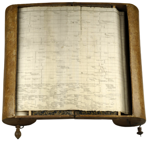
Jacques Barbeu-Dubourg's Machine Chronologique (Princeton)
Note: This is the final installment of a three-part series on the pioneers of data visualization. Catch up on the first post and the second post.
In 1753, Jacques Barbeu-Dubourg took on the non-trivial task of creating a timeline showing the complete history of the world. It was a noble effort, and his final chart came in at a whopping 54 feet (16 meters) wide! In 2015, we could easily display this on a screen with a horizontal scroll bar. The best modern equivalent I can find is Chris Love's excellent History of the English Football League.
Barbeu-Dubourg didn't have screens, of course. Instead, he had to be creative. He created a mechanical scroller:

How does this help us today?
Barbeu-Dubourg was driven to solve a problem with the tools he had available at the time. As you work with data, you, too, might need to go beyond your software's defaults and show something a little outside the norm to communicate your findings.
How? Well, I don't suggest you begin some carpentry and start constructing wooden scrolling devices. Instead, you can play around and see what chart types you can create. Being creative could unlock a new, effective way to communicate your data's story.
An application's default chart types are great, but you can communicate subtly different things by experimenting with new ways of showing data. Edward Tufte's sparklines and Stephen Few's bullet graph are two new visualisations borne of creative thinking that have made it into standard software.

Edward Tufte's sparklines, left, and Stephen Few's bullet graph.
Others in our community have come up with some great new approaches, such as Robert Rouse's creative way to visualize the size of the pyramids. I asked Rob what inspired him. "I try to avoid thinking of what I can build in a certain tool with available chart types until I have thoroughly explored the data and answered the question: 'What's the best way to visually represent this?' That mindset often leads me to push hard against the edge of what's possible in Tableau," he said.
Another creative Tableau user is Adam McCann. "Creating new charts and pushing the boundaries of Tableau is one of the things that builds a great community," he told me.
You may stumble across an effective new way of sharing your data. I recently discussed this on my own blog, in a post titled "Killing the Paired Bar Chart."
To learn more, check out our whitepaper on other ways the pioneers of data visualisation can inspire you.

相关故事
Subscribe to our blog
在您的收件箱中获取最新的 Tableau 更新。


