With Tableau 10, exploring big data just got even easier
Note: The following is a guest post by Josh Klahr, vice president of product at AtScale.
Earlier this week, Tableau released the much-anticipated Tableau 10. The team here at AtScale, being both big-data geeks and data-visualization nerds, has been eager to see how some of the great new features work with our business interface for Hadoop. We’ve been thrilled so far, and thought it would be nice to share some of the features we are most excited about.
A simply delightful data visualization environment
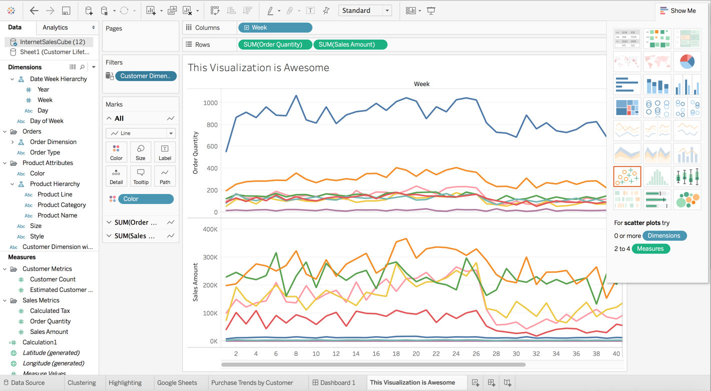
First off, the new interface is much more visually appealing, with great attention to little details that make a big difference. For example, when you name a worksheet tab in Tableau 10, that same name now shows up as an inline title complementing the viz—simple but awesome!

Find patterns in your big data using Tableau’s clustering feature
The next thing I wanted to play with is the new clustering feature that’s available as part of Tableau’s great analytics capabilities.
This feature will automatically look at the characteristics of a group of data values and visually highlight a discrete number of clusters that exist in the data. When visualizing large data sets with a large number of values, this capability makes it easier for the business analyst to quickly spot potential groups in the data sets they are investigating.
In the example below, I was able to quickly use the clustering feature on my scatter plot of average sales amount versus order quantity for all zip codes, and easily spot the zip codes that tend to cluster together.
Using highlighting to find the needle in the big-data haystack
Building great data visualizations often involves balancing the need to show a comprehensive view of the data while giving data consumers the ability to easily find just the data elements they are looking for. With Tableau 10’s new highlighting feature, both of these objectives can be accomplished within the same visualization.
For example, in the visualization below, we are able to see the weekly trend of sales and customer count across all of the states in my sales transaction data. This view gives the user great insight into the overall trends for the entire business. In addition, with highlighting, I am able to quickly isolate the trend lines for specific areas without needing to apply a filter or navigate to a new visualization.
Data connections to Google Sheets and shared filtering
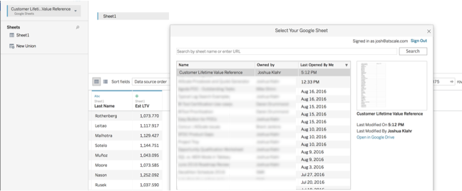
Among the most anticipated capabilities in Tableau’s recent release is a host of new features related to multi-source data integration and blending. Tableau 10 doesn’t disappoint. With Tableau 10, users can now directly connect to data stored in Google Sheets, as shown below:

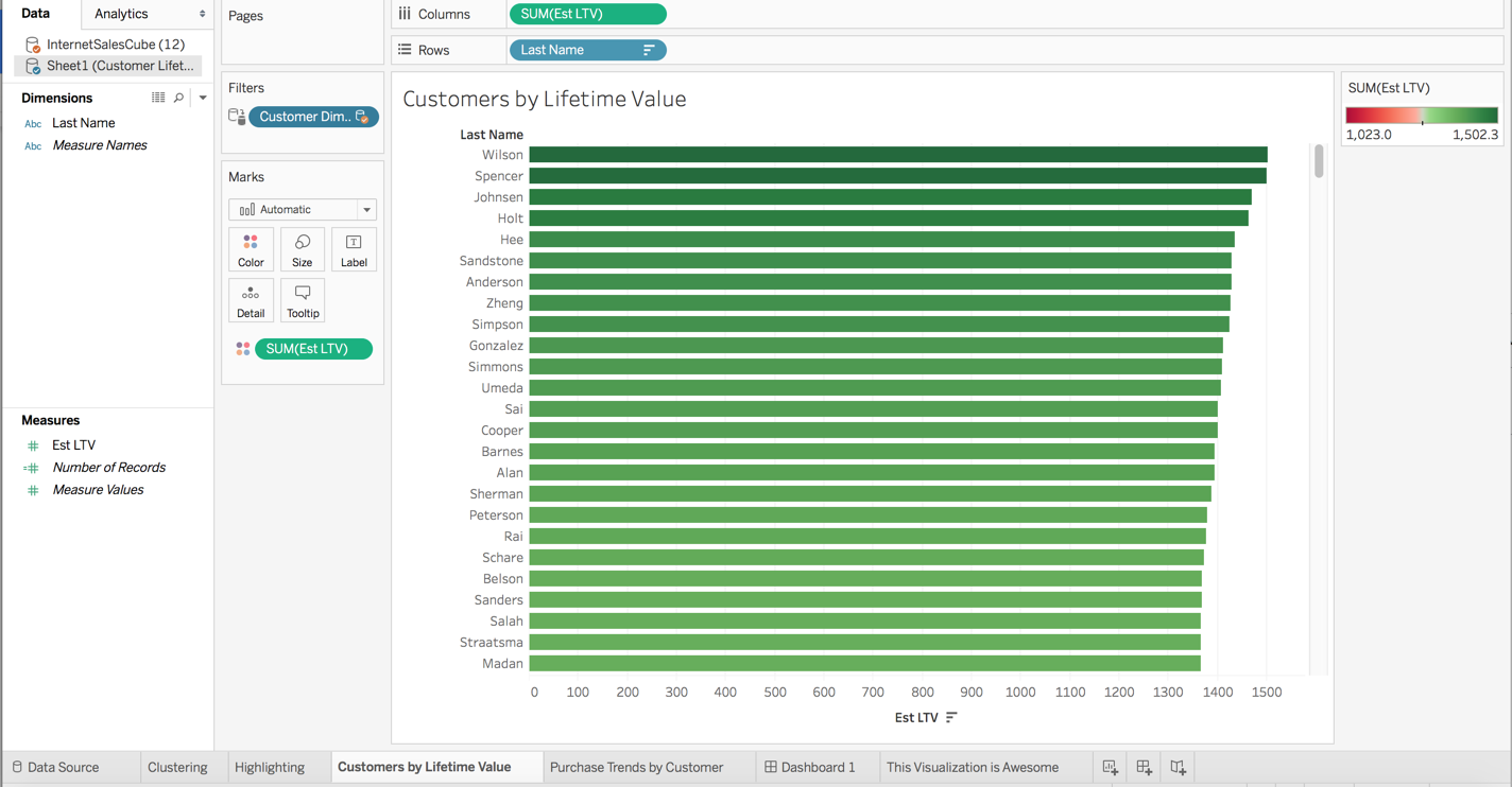
This allows me to create a visual representation of the top customers ranked by estimated lifetime value.

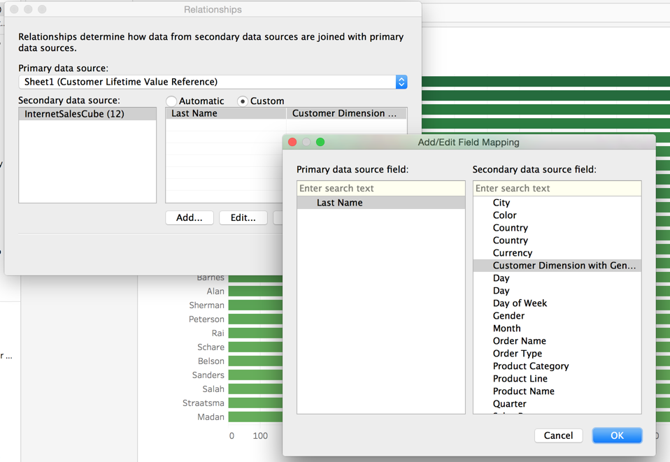
Once I have created the new data source in Tableau along with my visualization, I can use the data-relationships feature to let Tableau know that the Last Name column from my Google Sheets data set is mapped to the Customer Dimension column from my AtScale big data virtual cube.

Once this relationship has been established, a filter can be created on my Purchase Trends by Ranked Customers dashboard. The values in the filter can be shared across data visualizations across both data sets, as the video below shows.
Believe it or not, the above demonstrations only touch on the great new features that are part of Tableau 10. We are truly excited to see what kinds of new insights our customers are able to discover by combining the great self-service capabilities of Tableau with the scale, performance, and simplicity of big-data analytics that the AtScale Intelligence Platform enables.
Learn more about Tableau 10
- Uncover patterns in your data with Tableau 10’s clustering feature
- Quickly find marks in context with Tableau 10's new highlighter
- Build your own custom territories in Tableau 10
- Do more with bar charts in Tableau 10
- Tableau 10 includes more maps data, multilingual auto detection
Answers through analytics
- Integrate your data with cross-database joins in Tableau 10
- As requested, you can filter across data sources in Tableau 10
- Do more with APIs in Tableau 10
- Tableau 10 includes even more data-source options
- Connect directly to Google Sheets in Tableau 10
- (Finally!) see and understand your IoT data with our Google Sheets connector
- Connect directly to your QuickBooks online data in Tableau 10
- Favorite your data sources in Tableau 10
- Tableau 10 includes even more data-source options
Data breakthroughs
- Check out the beautiful look and feel of Tableau 10
- Format your workbook with just a few clicks in Tableau 10
- How we designed the new color palettes
- Tableau 10 includes a new typeface designed for data
Beautiful by design
- Design dashboards that shine on any device in Tableau 10
- Tips for designing device-specific dashboards that make everyone happy
- Manage your Tableau Mobile deployment with AirWatch or MobileIron
Delightfully mobile
相关故事
Subscribe to our blog
在您的收件箱中获取最新的 Tableau 更新。


