How to take something positive from the UK’s EU referendum campaign
Note: This piece first appeared in ComputerWorld.
The recent referendum campaign in the UK reminded me of a familiar refrain thrown at data analysts like myself: “Lies, damn lies, and statistics.”
The modern take, as seen in the campaign, was led by Leave campaigner Michael Gove whose main response to expert economic arguments was, “People in this country have had enough of experts.”
The Leave campaign did not debate maturely with data-driven opinions. Instead of debating the economic opinions of the IMF, the Bank of England, and many other independent organizations, the campaign dismissed them without constructive debate.
The Remain campaign was not guilt-free, either. Treasury predictions focused on the worst-case scenarios as fact instead of emphasizing the range of possible outcomes.
Many people did engage with and debate the campaigns’ use of data. The central Leave claim of £350 million being sent each week to the EU was roundly debated and dissected by multiple organizations. The data-informed rebuttals came from many areas, such as a UK Commons Committee made up of pro-Remain and pro-Leave politicians, by the UK Statistics Authority and independent fact-checking organizations such as FullFact. These level-headed responses were brushed aside.
How can we, in our businesses, rise above the problems of the UK’s referendum and instead focus on sharing the multiple truths in data? Are your employees able to communicate multiple opinions, based on the multiple truths in a data set?
We need to move beyond “lies, damn lies and statistics” and instead embrace a new refrain. “Data is a language,” said Kim Rees, co-founder of Periscopic, on the PolicyViz podcast recently. “It’s a means to convey an opinion, an argument.”
Data can tell multiple stories
Let’s look at some data and see how easy it is to convey different, valid opinions.
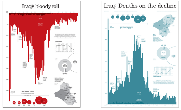
“Iraq’s Bloody Toll” appeared in the South China Morning Post in late 2011, designed by Simon Scarr. It shows the number of deaths per month in Iraq from 2003 until the beginning of the US withdrawal of troops at the end of 2011.
What visual metaphor is this chart creating, and how does that control how you read it?
Three simple choices create the strong emotive message: title, color, and orientation of the bars.
The title tells you how to read the chart. Just three words—“Iraq’s Bloody Toll”—establish the author’s agenda. Second, the bars point downward. Finally, they are red. What do you see? A smear of blood, dripping down the screen or page.
This isn’t deception; it’s design put to great effect. This piece of work rightly won silver at Malofiej, an annual infographics awards conference, in 2012.
How easy, then, is it to control the message of this chart only by changing those three decisions Simon made? Let’s point the bars upward and change the color:

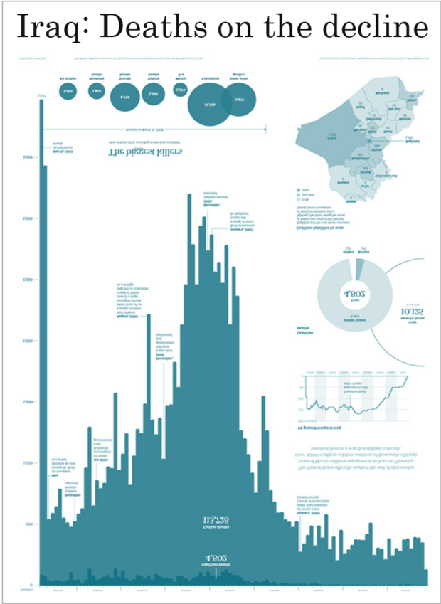
Now look again at the pattern of deaths over time. Sure, the total death count is a terrible tragedy, but when the bars point upward, the picture begins to look a little more optimistic.
After the initial combat phase in 2003, deaths dropped. By 2006 and 2007, sectarian violence was ripping Iraq apart. After that, however, deaths again began to drop. In fact, there are fewer monthly deaths at the end of 2011 than at any period since the start. Now, instead of “Iraq’s Bloody Toll,” we could legitimately call it “Iraq: Deaths on the Decline.”

Title, orientation, and color are the only three differences between the two versions of the chart, and yet their messages are totally different. Think about the implication for the charts you see and the charts you read.
Neither of those charts is lying. The opinionated nature of charts should be acknowledged and embraced. We should include opinionated charts in our daily discourse.
The drama of climate change
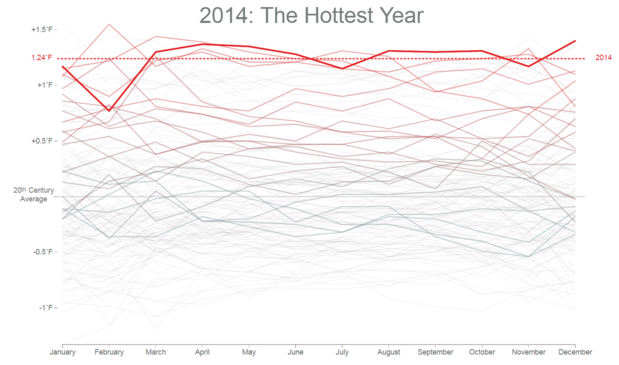
A second example is Bloomberg’s monthly temperature chart.(While the chart is shown below, you have to go to the actual site to see its powerful animation. I highly recommend you check it out.) This chart uses animation to create suspense and a sense of anticipation—or even dread—as you watch each year’s average temperatures rise and rise, and rise.
The animation enhances the impact. If the line had been drawn as one long line chart over 100 years, the slope would have been seen to be going up, but it’s the animation that adds drama, and suspense.
The animation creates a narrative. It’s not lying.
Both of these examples use valid visualization techniques to convey powerful messages. Any data set can tell many different legitimate stories. A single truth does not exist in any data set; there are many truths that can be communicated. These are controlled by the author and by how they use visualization building blocks to create a persuasive and powerful piece.
We don’t expect newspaper opinion pieces to be neutral, so why do we expect the same of data? Let our data express opinions and viewpoint. Then let’s have mature conversations about the data, not dangerous dismissals.
If you foster a culture of data discussions, you will empower people to find new perspectives instead of relying on the same dead-end dashboards that never change. My interpretation of the data might not agree with yours, and that’s ok. This isn’t lying with statistics; it’s having a data-driven conversation.
Apparently our politicians have forgotten this, but you don’t need to let this happen in your organization.
相关故事
Subscribe to our blog
在您的收件箱中获取最新的 Tableau 更新。


