Expedia Group visualizes government policies and movement data to monitor COVID-19 recovery
Editor’s note: A version of this post originally appeared on the Expedia Group Tech Blog on Medium.
Expedia Group™️, like many companies around the world, is monitoring local restrictions related to COVID-19 to understand customer habits and prioritize the well-being of our employees.
Back in March as the world went into lockdown, the data visualization team at Expedia was tasked with providing a view on restrictions happening across the world. These views would help teams like retail marketing, communications, and human resources understand what was happening in local markets so they could make smart, data-driven decisions. With the data science team we took it a step further and fed data into a machine learning linear regression model to set up a series of alerts as countries and regions lifted lockdowns and started down the road to recovery.
Our primary goals were to help our customers, as well as our internal users, analyze and understand two key types of COVID-related information:
- Government restrictions. This data is relevant to customers who want to resume traveling again as restrictions are lifted. It's also relevant to Expedia because we have offices around the world and the well-being of our employees is a priority.
- Population movement. This mobility data identifies population movement trends over time by geography, across different categories of places such as retail and recreation, groceries and pharmacies, parks, transit stations, workplaces, and residential.
First, we brought in a government policy data set, but in time we were also able to bring in mobility data to understand the movements of the population over time. For all the data sources we used for our analysis, we required that the data be:
- Freely available
- Accurate, both at the country and regional (such as US state) levels
- Updated regularly (preferably daily)
- Consistent in format and metrics
To view our visualizations in Tableau Public, follow this link.

Expedia COVID-19 dashboard on Tableau Public
Government Restrictions
Our team used government policy data from Oxford University leveraging their stringency index to compare the disparate measures implemented by countries and states. The global stringency index (0–100) is a composite index created from nine policy responses:
- School closures
- Workplace closures
- Cancelled public events
- Gatherings restrictions
- Closed public transportation
- Stay-at-home policies
- Domestic travel restrictions
- International travel restrictions
- Public information campaigns
The following graphic shows Oxford University data for an example country (Canada).

Canada Stringency Index based on Oxford University data
Data from Kaiser Family Foundation (KFF) provides us with the U.S. state-level view. The team created a similar stringency index from KFF data, created from eight policy responses. It is not comparable with the Oxford global stringency index due to its use of a different methodology.

US State Stringency Index based on KFF data
"The new visualizations helped our managers and executives make more informed decisions for our business and enabled a series of alerts as countries and regions started to recover from the pandemic and lifted lock-downs."
Population Movement
Our mobility trackers provide insights into how regional policies aimed at combating COVID-19 are affecting people’s behavior—in this case, their movement patterns.
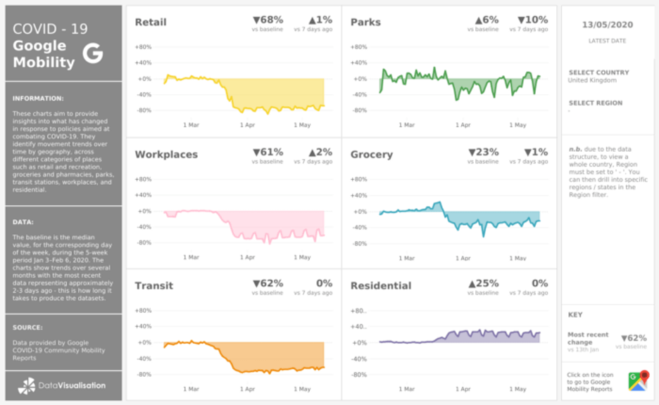
Google mobility data provides indicators on retail, parks, workplaces, grocery, transit, and residential changes. Insights in these reports are created with aggregated, anonymized sets of data from users who have turned on the Location History setting in their Google applications, which is turned off by default.

Google mobility tracker stats for the UK
Apple mobility data provides us with transit, walking, and driving trends at both country and regional levels. Reports are published daily and reflect users' requests for directions in Apple Maps.

Apple mobility data for the UK
We faced some issues initially as the schema of the data was changing constantly, so it took a little while for data to settle into a structure. Since April, however, we have been able to use this data to generate alerts as changes happen within each country. Tableau alerts came very handy; the following graphic shows an example of the alerts we recently received.

Example of an alert indicator on restrictions lifted/imposed
Our team created these visualizations to monitor the impact of COVID-19 and market recovery indicators, but we have seen a positive impact on various teams around Expedia Group, who use this data to enrich their COVID-19 analyses. We will continue to monitor this data for the foreseeable future as the world recovers from the pandemic. Thank you for reading!
Read more leadership stories and explore resources on how to empower your people in crisis.
相关故事
Subscribe to our blog
在您的收件箱中获取最新的 Tableau 更新。


