DataFam Roundup: January 24 - 28, 2022
Welcome! Dig into the first DataFam Roundup (of 2022!!)—a weekly blog that brings together community content all in one post. As always, we invite you to send us your content—and the DataFam content from your peers that have inspired you! Find the content submission form here.
DataFam content
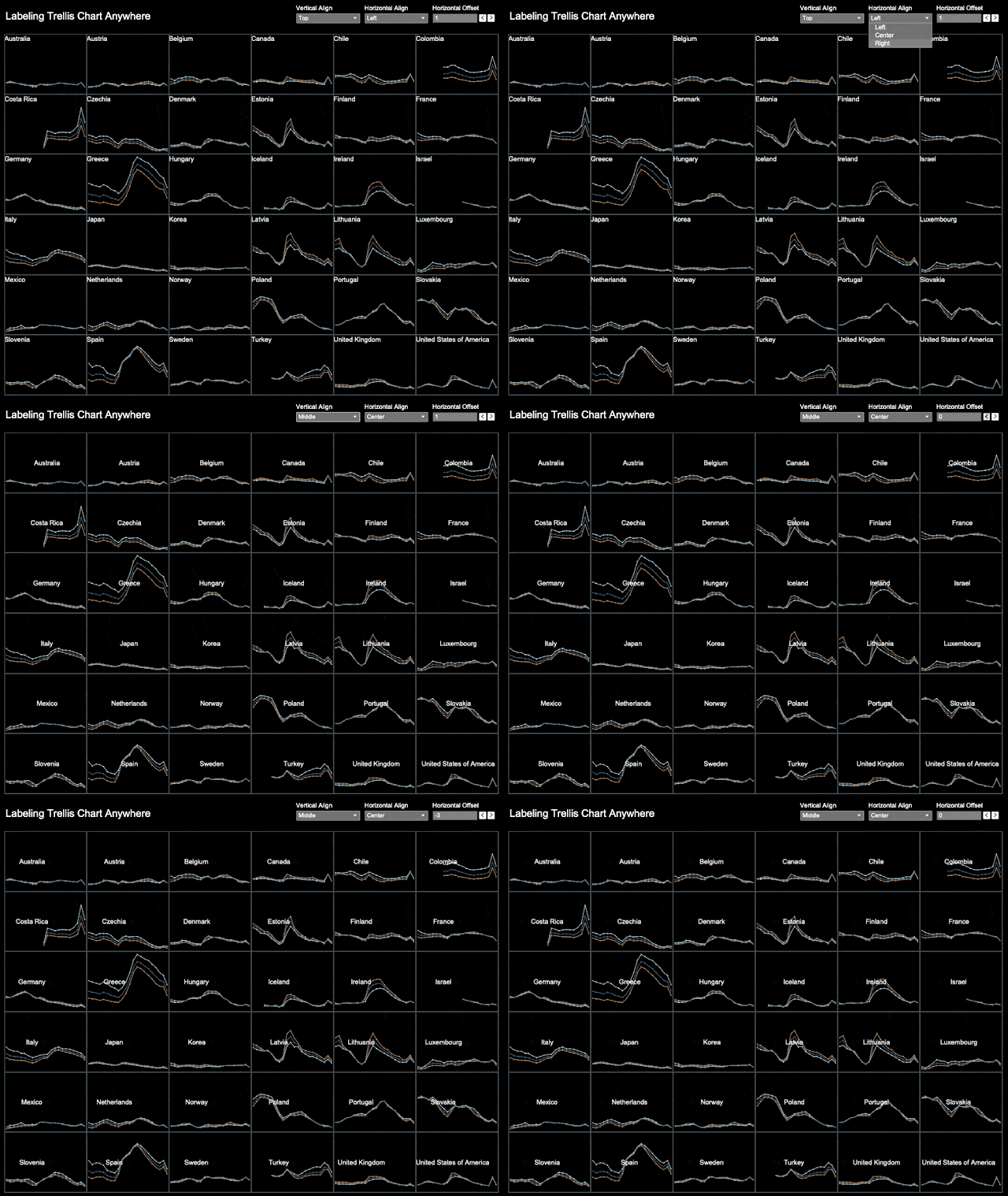
Alexander Mou, Vizdiff: Labeling Trellis Chart "Anywhere"
Dive into content created by the Tableau Community:
- Toan Hoang: Tableau QT: Histogram with Normal Curve
- Michael Dunphy: Two Tableau Visuals a Week for an Entire Year. What did I Learn?
- Sarah Bartlett, Sarah Loves Data:
- Adam Mico, Salesforce Ben: 5 Things Salesforce Admins Should Know About Tableau
- Donabel Santos, sqlbelle:
- Amy Wu and Nicole Klassen: Datasets for #Eduvizzers
- Tim Ngwena, Tableau Tim: How to learn Tableau in 2022: Full platform guide for all roles.
- Ivett Kovács: Usability Testing in BI- you need to know your weaknesses and fix them
- Alexander Mou, Vizdiff: Labeling Trellis Chart "Anywhere"
- Nathan Yau, Flowing Data: How Much Americans Make
- Vani Agarwal, Tableau Tips and Tricks: Parameters and it's use cases
- Richard Speigal, databoy: Lexis diagrams with Tableau
- Marc Bradbourne, Just 5 Minutes: Am I Experiencing Loss?
- Tanya Shapiro and the DataFam: A Twitter thread on the best recommendations on tutorials
Upcoming events and community participation
- Iron Viz 2022 Qualifiers: Let your data skills shine on the global stage. The Iron Viz qualifier contest runs from January 10 through February 7 and the top three entries will go on to compete in the championship at Tableau Conference 2022. Find a data set that aligns with this year's theme, Visualizing the Arts, and submit your entry on Tableau Public. At stake are bragging rights - and thousands of dollars in prizes.
- Get your Tableau CRM questions answered on the Forums.
- Stay up to date with the latest and greatest from the Tableau Community. We'll help you along in your Tableau journey, bring your data skills to the next level, and nurture powerful connections.
- The Feedback Loop Sign-Up Form: January 2022 This data vizzing workshop was started by Joshua Smith and is based on creative art workshops. He put it best: "The idea of the Feedback Loop, and of creative arts workshops in general, is meant to test the subjective and aesthetic elements against peers. It's meant to provide diversity of perspectives, because what works for one person may not work for another. And, what I've learned now, it can create an incredible community of people devoted to helping one another grow as artists."
- Sign up to be a panelist for the 3charts@3 Live: A Mystery Chart Show featuring topics like personal finance, energy, healthcare and more!
Vizzes
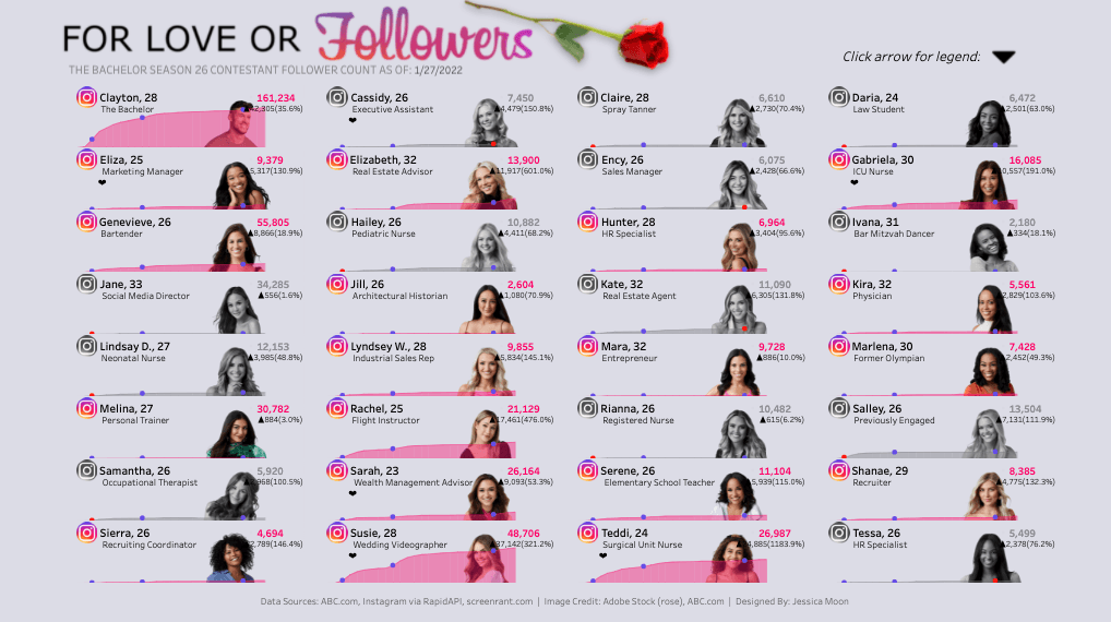
Jessica Moon: The Bachelor 2022
Catch this week’s Viz of the Days here and subscribe to get them emailed directly to your inbox.
Check out some inspirational vizzes created by the community:
- Agata Krawczyk: A little less conversation, a little more visualisation, please!
- Adedamola (Damola) Ladipo: Agricultural Land Use
- Jessica Moon: The Bachelor 2022
Community Projects
Back 2 Viz Basics *NEW!
A bi-weekly project helping those who are newer in the community and just starting out with Tableau. Not limited just to newbies!
Web: Back 2 Viz Basics
Twitter: #B2VB
Week 2: Dates & Line Charts
Data Plus Music *NEW!
A monthly project visualizeing the data behind the music we love!
Web: Data Plus Music
Twitter: #DataPlusMusic
January 2022: The Grammys
Games Night Viz *NEW!
A monthly project focusing on using data from your favorite games.
Web: Games Nights Viz
Twitter: #GamesNightViz
January 2022: Level 1: Hello World
Workout Wednesday
Build your skills with a weekly challenge to re-create an interactive data visualization.
Web: Workout Wednesday
Twitter: #WOW2021
Week 04: How have successful products performed?
Preppin' Data
A weekly challenge to help you learn to prepare data and use Tableau Prep.
Web: Preppin’ Data
Twitter: #PreppinData
Week 52: Departmental Decemeber - Operations
Iron Quest
Practice data sourcing, preparation, and visualization skills in a themed monthly challenge.
Web: Iron Quest
Twitter: #IronQuest
Storytelling with Data
Practice data visualization and storytelling skills by participating in monthly challenges and exercises.
Web: Storytelling with Data
Twitter: #SWDChallenge
January 2022: visualizing cycles
Project Health Viz
Uncover new stories by visualizing healthcare data sets provided each month.
Web: Project Health Viz
Twitter: #ProjectHealthViz
January 2022: One Year of Sleep
Diversity in Data
An initiative centered around diversity, equity & awareness by visualizing provided datasets each month.
Web: Diversity in Data
Twitter: #DiversityinData
November - December 2021: The countdown to Christmas and New Year!
SDG Viz Project
Visualize data about Sustainable Development Goals provided by the World Health Organization.
Web: SDG Viz Project
Twitter: #TheSDGVizProject
Sports Viz Sunday
Create and share data visualizations using rich, sports-themed data sets in a monthly challenge.
Web: Sports Viz Sunday
Twitter: #SportsVizSunday
January 2021: BBC Sports Personality of the Year
Viz for Social Good
Volunteer to design data visualizations that help nonprofits harness the power of data for social change.
Web: Viz for Social Good
Twitter: #VizforSocialGood
Jan 9, 2022 - Feb 6, 2022: Build up Nepal
Real World Fake Data
Create business dashboards using provided data sets for various industries and departments.
Web: Real World Fake Data
Twitter: #RWFD
Viz 2 Educate
Each month, create vizzes on global education syllabus topics as resources for teachers worldwide.
Web: Viz 2 Educate
Twitter: #Viz2educate
Makeover Monday
Join the community every Monday to work with a given data set and create better, more effective visualizations.
Web: Makeover Monday
Twitter: #MakeoverMonday
相关故事
Subscribe to our blog
在您的收件箱中获取最新的 Tableau 更新。


