Data Dialogues: The Design of Everyday Visualizations

Note: Data Dialogues is an occasional series that looks at what works well—and what doesn't work so well—in the world of data visualization. The series aims to foster a positive and constructive discussion.
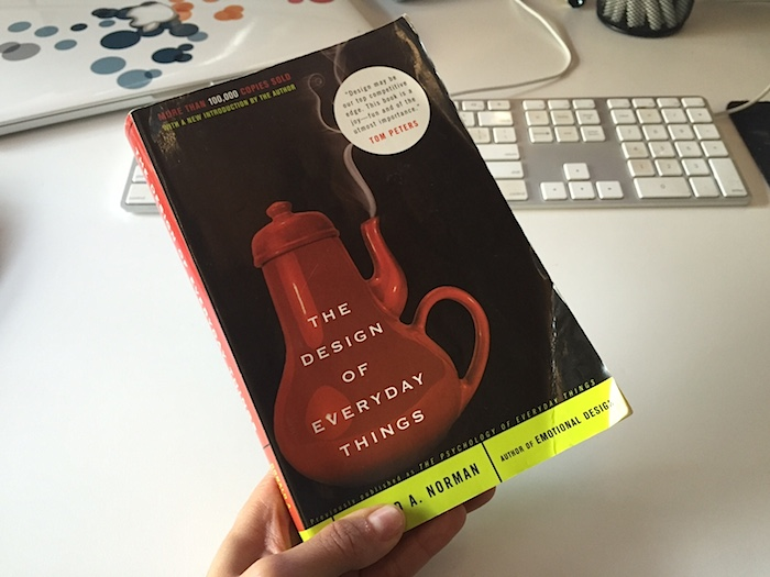
I’ve been educated and inspired recently by the best-selling design classic The Design of Everyday Things by UX guru Don Norman.
You really have to read the entire book, which applies to all types of objects that people design, from chairs to doors, to software, to organizational structures. It provides thoughtful and practical principles that guide designers to design all of those things well. And by “well” he means “products that fit the needs and capabilities of people” (p.218).
As I read it, it occurred to me that data visualizations—even richly interactive ones viewed on tablets and phones—are “everyday things” now, too. That has only become the case in the past half-decade or so.
Yes, examples can be traced back to the early days of the internet, but the recent explosion of data, software tools, and programming libraries has caused their proliferation.
And I found that point after point, principle after principle in Don’s book applied directly to data visualization. I’d like to call out five points that struck me as particularly relevant to recent discussions in the field of data visualization.
1. Good Visualizations Are Discoverable and Understandable
Don starts his book by describing two important characteristics of all designed products:
- Discoverability: Is it possible to even figure out what actions are possible and where and how to perform them?
- Understanding: What does it all mean? How is the product supposed to be used? What do all the different controls and settings mean?
He talks about common things that are often anything but discoverable and understandable, such as faucets, doors, and stovetops. One of my favorite quotes in the book is about faucets:
"If you want the faucet to be pushed, make it look as if it should be pushed."
Regarding doors, Vox published a great video on a particularly poorly-designed door on the 10th floor of the Vox Media office. The video references and even includes interview footage with Don Norman himself. And it’s funny. You should watch it.
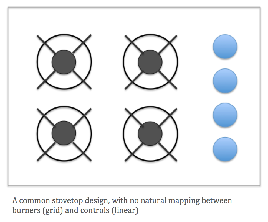
It occurred to me that the typical stovetop design snafu has a direct translation into the world of data visualization. To explain, let’s start with the problem with stovetops. Ever turn on the wrong burner? Why? Because you’re stupid? No, because there are often poor mappings between the controls and the burners. The burners are often arranged in a two-by-two grid and the controls are often in a straight line, like this:

What does that have to do with data visualization? We often use similar controls—radio buttons, combo boxes, sliders, etc.—to filter and highlight the marks in the view. When there are multiple views in a visualization (a dashboard), there is a similar opportunity to provide clear, or natural, mappings.
Don gives the following advice for mappings:
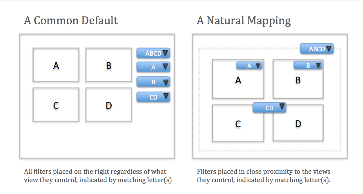
- Best mapping: Controls are mounted directly on the item to be controlled.
- Second-best mapping: Controls are as close as possible to the object to be controlled.
- Third-best mapping: Controls are arranged in the same spatial configuration as the objects to be controlled.
Often the software default places the controls on the right-hand side. Here’s my attempt to show these options on a generic data dashboard, where the four different views are labeled A, B, C, and D, and the controls that change them are labeled according to the views they modify:

This is a relatively straightforward example, and the job of the designer of a more complex visualization is to make it similarly clear what can be done and how to do it. Designers use things like affordances, signifiers, constraints, and mappings to make it obvious. Note that it takes a lot of effort to make the complex obvious.
2. Don’t Blame People for Getting Confused or Making Errors
A fundamental principle that Don drives home a number of times in the book is that human error usually isn’t the fault of humans, but rather of poorly-designed systems. Here are two great quotes on the topic:
"It is not possible to eliminate human error if it is thought of as a personal failure rather than as a sign of poor design of procedures or equipment."
And again on the same page:
"If the system lets you make the error, it is badly designed. And if the system induces you to make the error, it is really badly designed. When I turn on the wrong stove burner, it is not due to my lack of knowledge: it is due to poor mapping between controls and burners."
Don differentiates between two types of errors: slips and mistakes.
- Slips are when you mean to do one thing, but you do another.
- Mistakes are when you come up with the wrong goal or plan and then carry it out.
Both types of errors happen when people interact with data visualizations. In the world of mobile, slips are so common. Maybe I meant to tap that small icon at the edge of my phone screen, but the phone and app recognized a tap of an adjacent icon instead.
Mistakes are also common. Maybe it made sense to me to filter to a subset of the data to get my answer, but in reality I was misleading myself by introducing a selection bias that wasn’t appropriate at all. If someone makes the wrong decision based on misinformation they took from your visualization, that’s your problem at least as much as it is theirs, if not more so.
How to make sure your readers avoid slips and mistakes? Build and test. Iterate. Watch people interact with your visualization. When they screw up, don’t blame them or step in and explain what they did wrong and why they should’ve known better. Write it down and go back to the drawing board.
If the person who agreed to test your visualization made that error, don’t you think many more likely will? And you won’t be there to tell them all what they did wrong. Your only chance to fix the error is to prevent it.
3. Designing for Pleasure and Emotion Is Important
I’m a big believer in this principle. Don states that “great designers make pleasurable experiences”:
"Experience is critical for it determines how fondly people remember their interactions. Was the overall experience positive, or was it frustrating and confusing? "
How can an experience with a data visualization be pleasurable? In lots of ways. It can make it easy to understand something interesting or important about our world. It can employ good design techniques and artistic elements. It can surprise us with a clever or funny metaphor, or some combination of these and more.
What about emotion—the “e word” to which the analytical folks in our midst are allergic? Cognition gets a lot of play in the world of data visualization, but emotion does not. But these two horses of the chariot that is the human spirit are actually inextricably yoked:
"Cognition and emotion cannot be separated. Cognitive thoughts lead to emotions: emotions drive cognitive thoughts."
I also love the following quote:
"Cognition attempts to make sense of the world: emotion assigns value … cognition provides understanding: emotion provides value judgments."
So let’s embrace emotions. Some data visualizations piss us off. Some crack us up. Some are just delightful to interact with. These elements of the experience should be part of the discourse in our field, and not ignored just because they don’t match the left-brained predisposition of the bulk of the so-called experts. If we take them into consideration, we’ll probably design better stuff.
4. Complexity Is Good. Confusion Is Bad
There’s a trend in our field to move away from the big, complex dashboards of 2010 and toward “lightweight” and uber-simple individual graphs, even GIFs.
Why? A big part of the reason is that they work better on mobile. It’s true, and what we’ve learned in the past few years is that the complexity of those big dashboards isn’t always necessary.
This is a great development, and I’m all for it, but let’s just remember that there was often a great value to the rich interaction that is still possible on a larger screen.
Instead of abandoning rich interactivity altogether, I believe we should be looking for new and innovative ways to give these advanced capabilities to readers on smaller devices. When those capabilities will help us achieve some goal, we’ll be good to go. We’re not there yet.
After all, it’s not the complexity of the detailed, filterable dashboard that’s the problem on the phone. It’s that we haven’t figured out how to give these capabilities to a reader using a phone yet, and the experience is confusing. Does this make sense to you?
I actually see this as a good thing. Our generation has the chance to figure this out for the generations to come. The growth of the numerical literacy of our population will be well worth the effort.
5. Absolute Precision Isn’t Always Necessary
I have to be honest. This one is my hot button.
There’s a school of thought that says that the visualization type that gives the reader the ability to guess the true proportions of the thing visualized with the greatest accuracy is the only one that can be used. Some go so far as to declare it immoral to choose a visualization type that introduces any greater error than another (they all have some error).
I found this great visualization about visualizations in Tamara Munzner’s book, Visualization Analysis and Design:

The problem with this line of reasoning is that absolute precision isn’t always necessary for the task at hand.
Don uses the example of converting temperature from Celcius to Farenheit. If all you need to do is figure out if you need to wear a sweater when you go outside, a shortcut approximate-conversion equation is GOOD ENOUGH. It doesn’t matter whether it’s 52, 55, 55.8, or 55.806. In all four cases, you’re wearing a light sweater.
And let me repeat the point: There are errors associated with every visualization type. We aren’t machines and perfect decoders of pixels or ink. Sometimes it’s okay that a general understanding is achieved.
And for goodness sake, if absolute precision is required, then use labels, or just show a table of exact values.
Data Viz: The Catch-All Discipline
I hope this was helpful for you! I love doing this kind of thing—pulling lessons from other amazing writings and seeing how they apply to data visualization, which I see as the “catch-all” discipline.
It’s part numeric, part editorial, part graphic. To do it well, we need to embrace the principles of good design. I’ve tried to outline a few here from a true expert who we should all be familiar with. If you do read Don Norman’s book, you’ll find that there are many more.
What do you think? Do you agree with my points—that absolute precision isn't always necessary, that designing for emotions is an important part of visualizing data? Share your thoughts in the comments below.
Read Other Posts in the Data Dialogues Series
相关故事
Subscribe to our blog
在您的收件箱中获取最新的 Tableau 更新。


