Struggling to keep New Year’s fitness resolutions? Here’s how Strava’s new web data connector helps you visualize results
This guest blog post is written by Yvan Fornes, Business Analytics Senior Consultant at Amadeus and Tableau Zen Master. Check out his Tableau Public profile or connect with him on Twitter.
Last year, I got a Garmin watch for Christmas to track my workouts. I had previously used Strava, an app and network for fitness enthusiasts, to track basic GPS data with just my phone. But with my watch, I have been able to track my heartbeat, precise altitude, and cadence. Naturally, the first thing that I wanted to do with all this new data was to analyze and visualize it in Tableau!
With the Strava Web Data Connector (WDC), I was already able to retrieve my workout data in Tableau. The old WDC could not retrieve heart rate, altitude, and cadence, so I decided to contact Geraldine Zanolli, Tableau Product Consultant and WDC specialist, who had written a blog about WDCs.
Geraldine informed me that a group of sports-crazy Tableau developers (yes, they exist!) was working on an advanced Strava WDC. Geraldine was kind enough to introduce me to them, and a few weeks after I was testing an alpha version of the connector.
Three Great Features in the New Strava Web Data Connector
Thanks to Jac Fitzgerald, Kate Hotler, Robert Kosara, Sid Wray, and Drew Loika, the developers behind these three new features!
- You get all the data available in Strava! It comes in four tables, but three tables are most relevant for your personal workout tracking:
- My Activities: 1 row for each activity, including activity type, distance, and elapsed time.
- My GPS Streams: 1 row for each activity second, including the latitude, the longitude, and heart rate (we will see below how to filter this table that can be big).
- My Photos: 1 row by photo, including the Photo URL, latitude, and longitude.
- Common Calculations have been done already. The incredible Strava WDC development team was kind enough to pre-calculate the measures that we use most— all in different units!
- Distance in m, km, mile.
- Time in s, min, hours.
- Speed in km/h, miles/h, m/s.
- Incremental data refresh, which allows you to refresh your data much faster than with a full refresh (note that refresh is not available in Tableau Public).
How to Connect to your Strava Data
You’ll be ready to explore your Strava Data in just three steps!
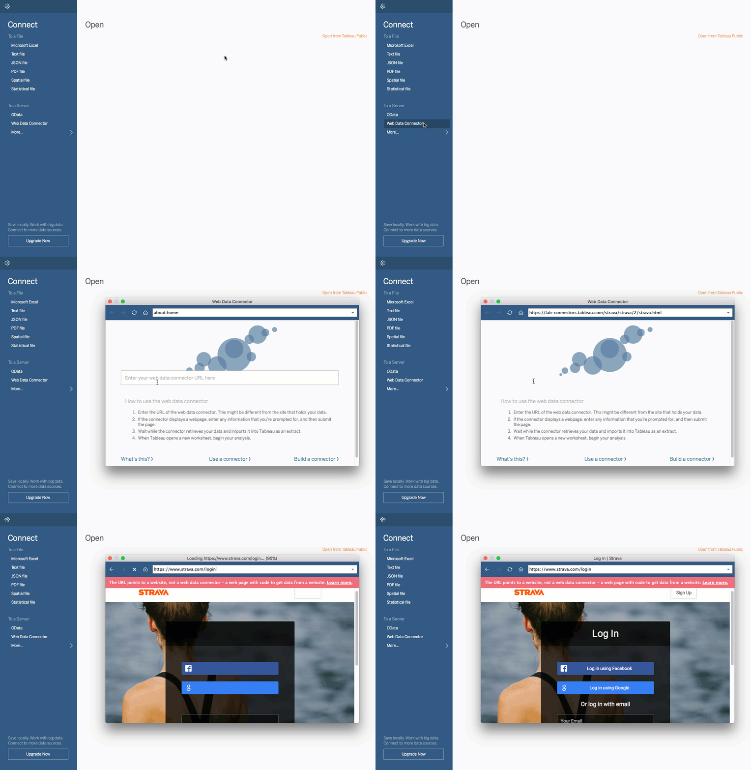
- From your Tableau Desktop app, navigate to and open a “Web Data Connector.”
- In the pop-up window, enter the Strava WDC URL: https://lab-connectors.tableau.com/strava/strava/2/strava.html
- Log in with your Strava credentials and start vizzing!

TIPS AND TRICKS
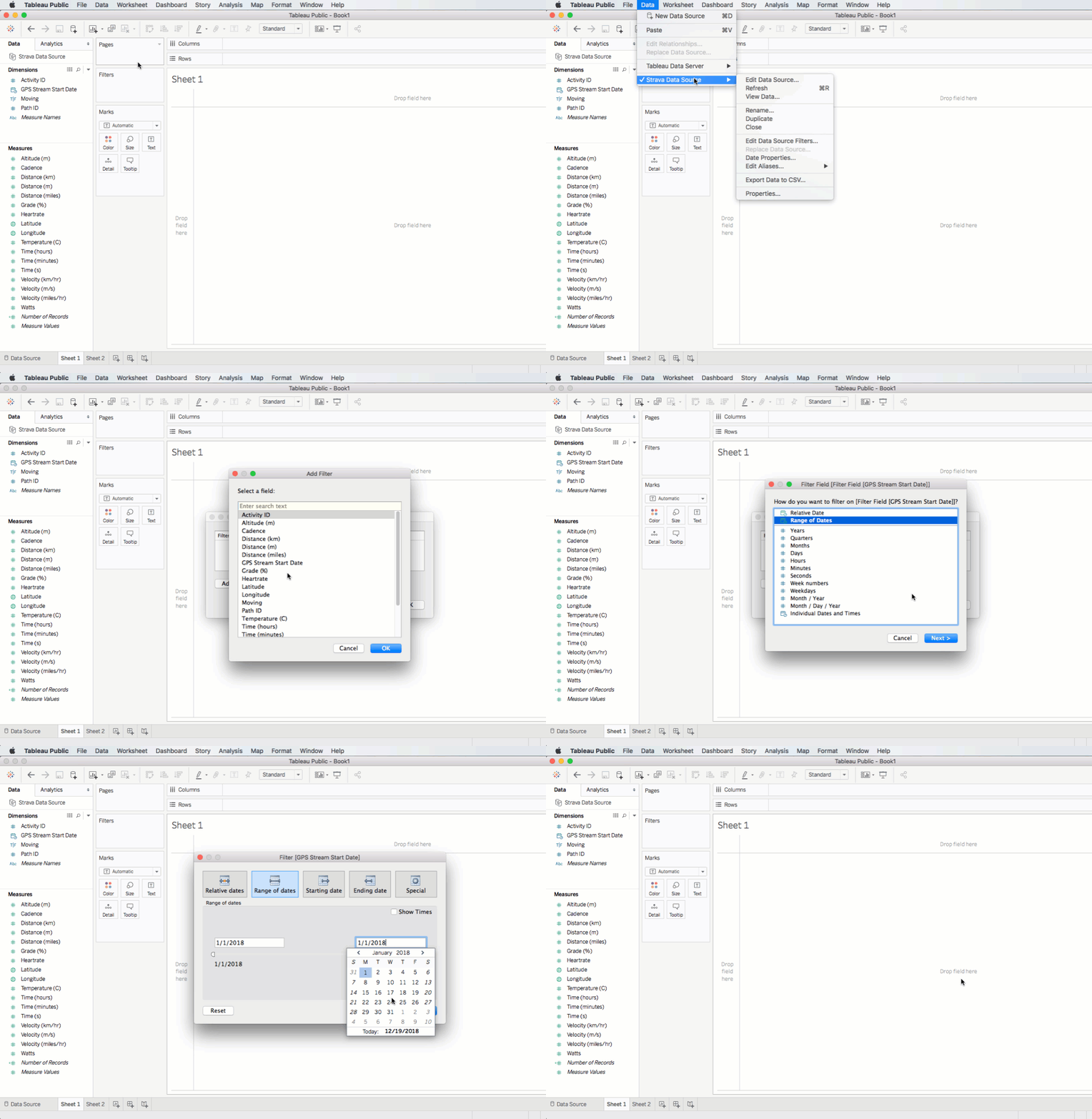
Filtering the data source. The My GPS Streams table can be quite big! But with a WDC, you cannot set your data source filter from the data window (you’ll notice that the the option is grayed out). I recommend filtering the data source, which you’ll need to do after you’ve fully imported the data (the menu path is as follows: Data > “Data Source Name” > Edit Data Source Filters).

Incremental data refresh. In the data pane, right click on the data source you want to refresh. Then navigate to Extract > Refresh (Incremental).
Visualize Your Fitness Resolutions
Last year, my new watch inspired two New Year’s fitness resolutions:
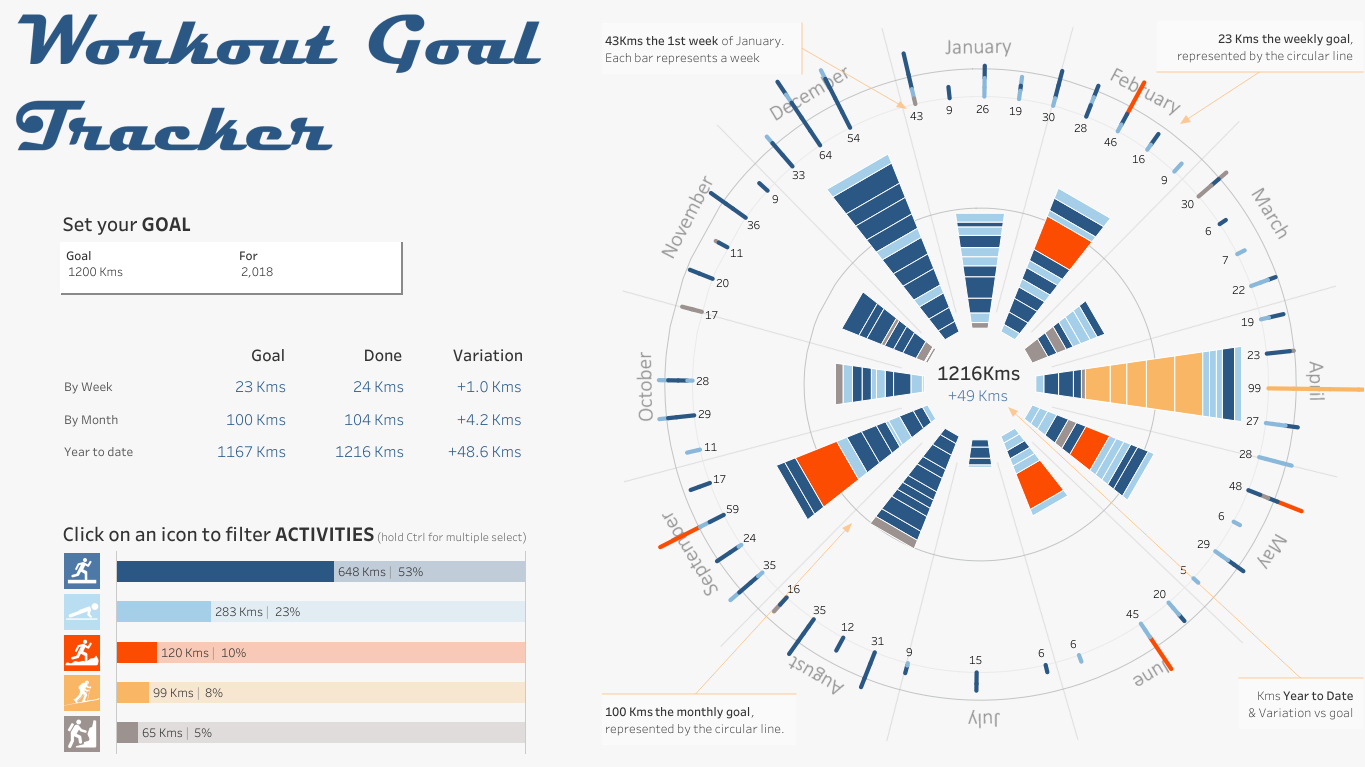
- Reach 1000 kms in running, walking or ski touring.
- Better analyze my heart rate to properly set my training intensity.
There are many ways to visualize your workout data. You can get creative in how you track your progress, as I’ve done in my most recent viz.

You can also choose a more traditional dashboard layout to track your progress. This viz has a dashboard that tracks my yearly goal of 1,000 kms, a dashboard on heart rate zones I used to synthesize workout intensity, and a Viz in Tooltip feature that displays all the details of a specific session.
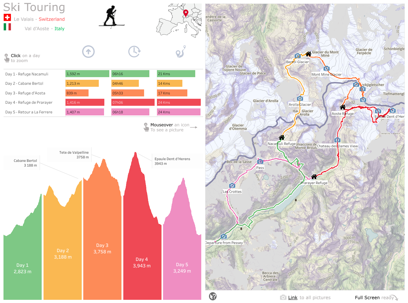
The WDC opens new possibilities. You may choose to track one specific event rather than an entire year’s worth of data. I find it very powerful to help show off your adventures.

Mixing sport and data can be very motivating. I never ran so much as I did in 2018, and I opened up new data visualizations possibilities for me. So go ahead— open up a fresh workbook and start playing with your personal data in Tableau! I bet you'll have as much fun as I did!
เรื่องราวที่เกี่ยวข้อง
Subscribe to our blog
รับอัปเดต Tableau ล่าสุดในกล่องข้อความ


