Splash achieves impact with a data-driven approach

Photo by Gavin Gough
Splash is a global nonprofit organization that's bringing safe water, sanitation, and hygiene (WASH) programs to over 425,000 children living in urban poverty across Asia and Africa. Our vision is clean water, clean hands and clean toilets for all children, no matter where they are born.
In 2011, Splash became one of the first non-profits to offer WASH implementation data online to the general public. Donors, partners, curious grad students, and anyone else, could click through to an incredible level of detail. Everything from water quality test results to handwashing station photos were accessible on Splash’s ProvingIt site, a custom-developed website with list and map-based views of every Splash project.
While we were proud of this sector-leading innovation for data transparency, we learned over time that a better solution was needed. We designed ProvingIt’s admin user interface for user-friendly data entry, but even the most basic data analysis and reporting required cumbersome, manual data manipulation. Although external audiences loved it, ProvingIt did not meet our internal data needs. We began documenting requirements for a new technology solution to store, manage, analyze and visualize our data for both internal and external stakeholders.
Guided by our core value of Mistakes (make them, don’t repeat them) our data strategy has evolved based on these three principles:
- Balance between proving and improving.
- Trust in our data is critical to building an internal culture around the use of that data.
- Simplicity is key.
Donors and partners need to see evidence of Splash’s impact. But our investments in data and technology must also serve our internal planning and learning needs.
Every missing or inaccurate piece of data, every report that doesn’t make sense, every spreadsheet covertly maintained on someone’s laptop, erodes the trust in our master source of data. We must invest in processes, training, and change management to get it right
A system designed for native English speakers with high-speed Internet connections will not work for local field teams who spend most of their time at project sites with limited or no connectivity.
Based on these principles, Splash’s project data is now entered and stored in Salesforce, supplemented by mobile data collection tools that enable offline use. The Splash impact page has replaced ProvingIt for external audiences, but leverages the same source data in Salesforce that we use for our own planning and impact evaluation. We are now able to do much more with our data, using Tableau, including creating detailed Tableau visualizations to guide our own internal planning, implementation, analysis, and learning.
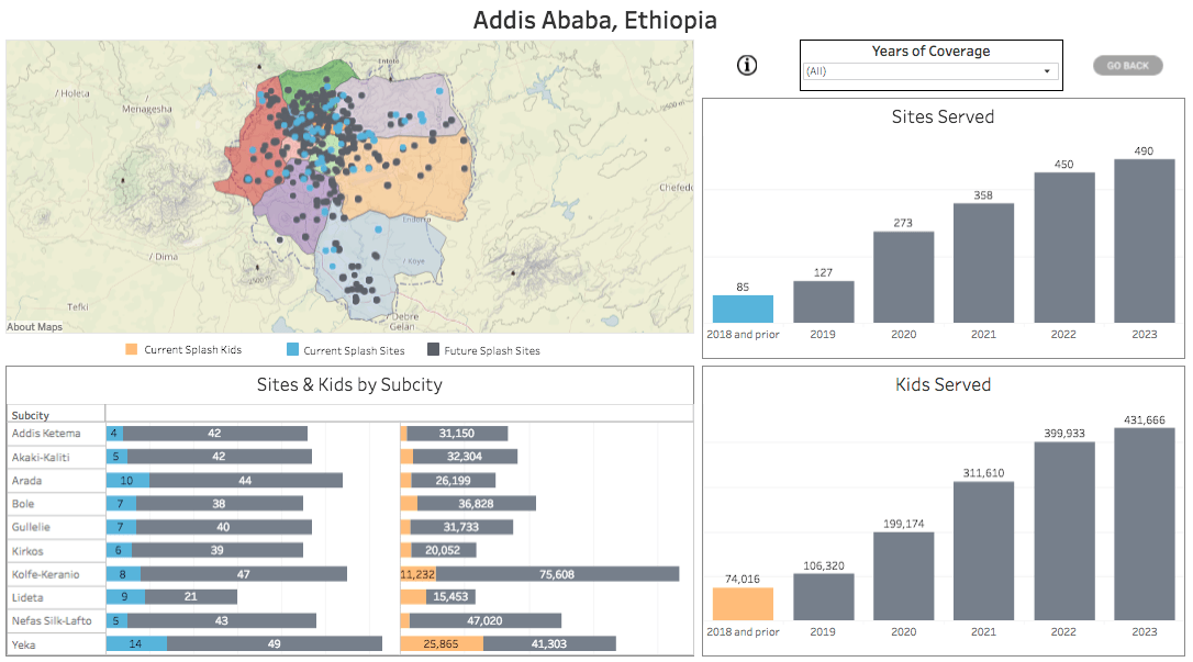
Most recently, we developed Tableau visualizations to map out our 5-year implementation plan to reach every government school in Addis Ababa, Ethiopia and Kolkata, India with clean water, clean hands, and clean toilets. These visualizations have been important tools for joint planning meetings with government stakeholders, for grant proposals to major donors, and for our internal logistics and planning efforts across multiple country teams.

As we work towards our goal of reaching 1 million kids in Ethiopia and India by the end of 2023, this data-driven approach will be increasingly critical to our success. Whether we’re refining our infrastructure standards, expanding our behavior change program, or launching new markets for our social enterprise, our data structures, tools, and practices will evolve and our principles of balance, trust, and simplicity will continue to guide our data strategy. We look forward to the challenges, as well as the triumphs—and to creating some amazing Tableau visualizations to guide us along the way.
Learn more about the Tableau Foundation and how it supports the impactful work of Splash and other organizations.


