Learn the Basics of Well-Structured Data
We define Data Literacy as the range of capabilities that describe someone’s ability to explore, understand, and communicate with data. These days, when we have questions, there’s plenty of data around for us to find the answers, and having some data literacy will make that possible. Unfortunately, it’s not always structured in a way that makes it easy to use, which is why we’ll spend time exploring the different characteristics of data, the ways it can be structured, and why. Lastly, we’ll touch on how to restructure the data to make it work better for your needs.
Know what to look for in data
There are lots of words that are used to describe the details of an item: traits, characteristics, specifications, descriptions. All of them help us find the information we need to determine if something is a good fit for what we’re doing. Recently, I needed to replace a broken part on my bike. For the bike to work right, the replacement I bought had to match the specifications of the original and the only way to be sure of that was to read the descriptions of the parts I was considering buying. It’s similar when looking at data: for us to get the answers we need, the data has to have the traits that make finding our answer possible, and the only way to be sure it does is to know what qualities it needs to be a good fit.
The first trait is High Volume. More (relevant) data gives us a much more reliable result. If one person tells you a restaurant is good, you might believe them. However, if 100 people tell you a restaurant is good, it’d be hard to believe otherwise. The same goes for our professional data - more records telling us something is good or bad, gives us higher confidence in our results.
The second trait is Historical. If I visited Seattle for the first time and it was sunny the first day of my visit, it would be naive of me to say that it’s always sunny in Seattle. I’d need data stretching back quite a while to feel confident in making a statement like this and it’s no different for your analysis. The more historical data you have, the more likely you are to accurately anticipate what’s to come in the future.
Third we have Detail. Recently, the water pressure in my kitchen sink dropped significantly, forcing me to troubleshoot the situation. First I checked the water supply, then the valves under the sink, then the line going to the faucet, and finally the faucet itself getting more detailed with each dead end. I finally discovered that it was debris in the faucet blocking the water flow. It’s no different than exploring our data to understand why something is happening in our business or lives. The more detail we have in our data, the more depth and accuracy we can get in our answers and insight which we can confidently use to make the best decisions
Lastly is Consistency and Standardization. Think about the last time you were in a conversation with a friend and you were using the same words but had different understandings of what they meant. You end up with miscommunications that potentially cause issues down the road. Similarly, a lack of consistency in your data: field names, date formats, number formats, and a lack of standardization in how data is recorded results in numbers that aren’t an accurate representation of what actually happened. Imagine that you work at a cell phone store and you return five iPhones. When typing in what they were you type: iPHONE5, I phone5, iphone 5, I Phone 5, and Iphone Five. You then try to report on how many iPhone 5’s you returned and instead of your system showing five iPhone 5’s it shows one return of five different iPhones because it’s impossible for your system to know they are the same thing. Standardizing on a naming convention, or date format, or currency prevents situations like this and provides the consistency needed to get an accurate picture of your data.
Know what well-structured data looks like
It’s bound to happen. At some point you’ll come up against data that just feels difficult to work with. You may not know why, but I’d bet that it comes down to the data not being well-structured. It’s a bit of a loaded statement as the meaning of “well-structured” can differ based on the use case, and the systems/applications you’re using, however there are some basic data structure principles that should improve your experience when working with data.
First, you need to figure out how it’ll be used. Are you going to use software to visualize the data? Or are you presenting the data in a spreadsheet? Or are you preparing the data for someone else? Each method will change the way the data needs to be structured. There are exceptions to every rule, but once you know the way it’ll be used, these tips are a good rule of thumb to get you started:
Columns and rows make up the core of our structure. Just like columns in buildings, columns in data are the vertical sections of our data structure stretching up and down the page. In the example below, “Date” would be a column of information along with 7 other columns. Rows on the other hand are the horizontal sections of our data structure spanning left to right across the page. In the example below there are 12 rows of data.
If you are using software like Tableau to visualize your data, each row should be an instance or an event, and each column should represent a detail about that instance or event. In the image below, the first row (or event) is a commute. The details (columns) are the date, the time of day, the temperature, the precipitation type etc…Each row after the first row is an additional event where we collect the same types of details that we did in the row (event) above:

This allows the software to easily search through your data when trying to retrieve the answers to your questions. The downside to this format is that it’s hard for humans to consume which is why it’s not uncommon see data structured like this when people don’t have access to data visualization software:

The format above is human readable but requires you to manually calculate totals and aggregations, and manipulate structure. This structure will also continue to grow wider over time as new data is added, making it much harder to visually analyze without lots of scrolling. Lastly, having individual columns for each date or having multiple types of values within a single column makes it almost impossible for an application to help you analyze your data.
Want to learn more about well-structured data? Check out this Trailhead module today!
What to do if your data is not well-structured
Rather than let these issues prevent us from getting answers, there are a few simple things we can do to solve a good amount of our data problems.
Go back to the source. Restructuring your data can help your immediate problem but doesn’t solve the larger issue of how it got that way in the first place. It also creates additional data sources that may not align to your corporate standards which can be a problem when comparing results across your business. It’s always the best decision to start with your data team to see what’s possible. Remember, for them to make the right changes, they’ll need plenty of context so come prepared to explain what you are hoping to get from the data.
Make the change. In a perfect world your data team would help you fix poorly structured data, but that isn’t always possible, and not everyone has a data team. When it’s not, there are a couple of common structure issues that you can address on your own.
Split ‘em Up! The first issue is when fields that should be separate appear as a single line of information. For example if the fields [Name] and [Customer ID] showed up together as:
“SamPriddy CN1357WA” and needed to be separate fields instead, you’d perform what’s called a “Split”. A split gives the user the ability to choose which “delimiter” gets used to decide where to break the field apart. A delimiter is just the name for the character in the line of information that the user chooses to use as the breaking point. So in the Case of the example above where the field says: “SamPriddy CN1357WA” we could use the “Space” character as our breaking point, or our delimiter, since we wanted to split the name apart from the customer ID. This functionality is built right into Tableau Desktop and Tableau Prep with no coding required. Want to learn how? Check out this help article for more information.
Pivot, Pivot. The second issue relates back to the commute data example above. In its human readable form the data is wide, having a column for each date, with a mix of different types of values filling in the column below. You’d use a “Pivot” to change the data from being wide to being long instead.
This is by no means the only way to do a pivot but an example of the concept and what it means. Here’s a simplified example to illustrate the process:
The data below is formatted for human consumption. We want to use this in Tableau though and this format won’t work. We’ll need to do a pivot to get it into the appropriate structure.

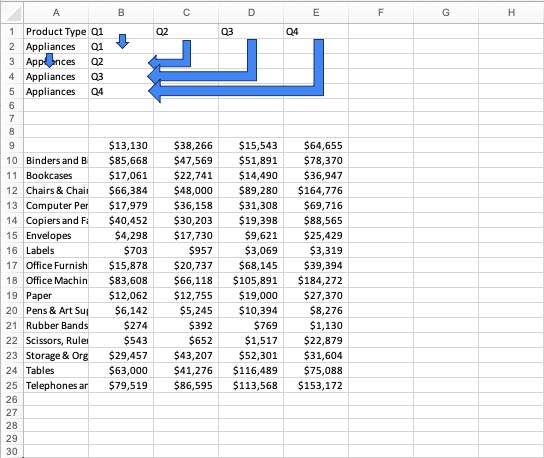
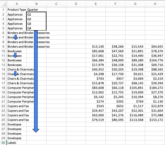
First we’ll make space by shifting our data out of the way. We’ll then make a column header for our fields that would be more appropriate as a category. In the example below we’ll copy/paste the “Product Type” fields down column A for the amount of values that showed up across their row. Because “Appliances” had four values (1 for each quarter) we’ll copy/paste “Appliances” until we have four rows of this product type. Similarly, we’ll pivot the individual quarters down and to the left, with Column B being our pivot point, changing the data from being horizontal, to vertical. We’ll then rename the column “Quarter” as it now contains all quarters, not just one specific quarter.

Next, we continue the process until we have all of our product types duplicated for the amount of records they originally showed (4 each in this example). This is what we mean when we say the data gets “longer”. We haven’t added any data, just changed the layout. We’ll also continue copy/pasting the quarters down our “Quarter” column until each product type has a specific quarter next to it.

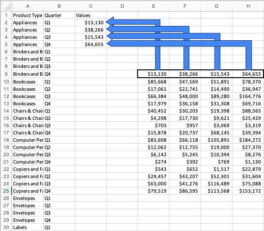
Once that’s done, all that’s left to do is to fill in our values. Remember that originally Q1-Q4 were horizontal so we’ll move our values into the empty column next to the quarter they belong with. We’ll repeat this process until all of our values are where they belong in their new column which we’ll name “Values.” Depending on your data, the name should fit whatever best fits the values.

After the final column is populated we’re ready to connect to this data to answer some questions.

This example is shown to illustrate the concept, however it’s more likely that you’ll do a pivot in a tool like Tableau Desktop, or a data preparation tool like Tableau Prep. In those cases, the tools have functionality that eliminates the manual work shown in the example above, but ultimately gives you the same results. Want to learn how to do pivots in Tableau? Check out this help article for in-depth instructions.
What next?
Be a sponge, and practice, practice, practice! The best thing you can do is continue to learn, and get hands on as much as possible. Check out our Data Skills homepage for access to tons of Data Literacy resources. Visit Tableau Public to download and use Tableau Desktop for free as well as free learning and sample data sets! If you prefer webinars, check out the Datafam Discovery Kit for more resources and updates on upcoming live webinars.
เรื่องราวที่เกี่ยวข้อง
Subscribe to our blog
รับอัปเดต Tableau ล่าสุดในกล่องข้อความ


