How to get people to remember your visualization
Editor’s note: This is the sixth post in a series about visual design with data. Read the first here, second here, third here, fourth here, and fifth here.
Oh, internet. For all the things you’ve given us, you’ve also taken a lot away. One of the things you’ve done for the worse, in my belief, is to diminish our individual capacities to remember things. Sure, as we age, our memories decline and we all start to become afflicted with what my late grandfather used to call CRS disease (as in, “can’t remember s--t”).
But it seems worse now than it did before. Nicky Case, who makes outstanding explorables and interactive visualizations, recently gave a lightning talk at the Game Developers Convention about retention and chunking. It used to be that we could generally remember 7 things at once, plus or minus 2; but now it's more like 4 things, plus or minus 1. Either we were wrong before, or we've so easily adapted to our connected way of life that we no longer maintain the same neural pathways for memory.
Since our brains aren’t remembering things as they once did, it’s yet another challenge to us, as visual creators, to make our works memorable even against this gradient of forgetfulness, this necessity of filtering out vast rivers of content from our consciousness lest we find ourselves overwhelmed, flooded, and washed away.
What is memorable?
What does it mean to make something memorable? I can recognize the style of a chart and internalize the branding of a chart, but the data within, the meaning, and the takeaway? I’m less likely to recall that information.
Making your style or your particular brand recognizable is one thing; making the actual message in your products memorable is something else entirely.
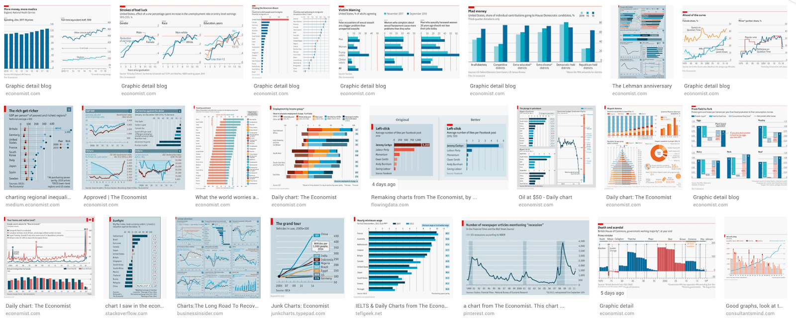
For example: The Economist has a very distinct brand for its charts. There’s a red rectangle in the top left corner, and a thin red line that goes across the page. The background is a light gray or blue. The predominant color of the chart data will be blue.

Because the style of each Economist chart is so similar, it’s easy to recognize any specific graph as being from this specific magazine. But, also because of that similarity, it’s hard to remember if you’ve seen any one individual Economist chart before, or what that chart specifically had to say.
Much of today’s LinkedIn-ish advice is about building a personal brand; making sure that you are recognized, and that your work is easily associated with you. But if you are emphasizing uniformity across all of the things you create--in color, in form, in style--then you are by definition not emphasizing the specific needs of the audience for the individual pieces of work you create. And if you don’t focus on the audience in your work, then you are lessening the chances that your messages will be received, internalized, retained, or recalled.
What makes an information product memorable?
One of the four goals that we set for every piece we create is retention—to have your work easily recalled by an audience. It’s perhaps the hardest to measure, at least holistically. By definition you can’t get a lot of instant feedback on how well people remember what you created. Nevertheless, we do know a little bit about what elements make a visualization memorable, thanks to researchers like Michelle Borkin, whose work in data viz research provides some guidance on how this looks in practice.
Best practices vs. real-world research
What do people remember about data visualizations, anyway? Unfortunately for people in the data viz punditry world, things that make a data viz *memorable* at a glance also happen to be the things we consistently decry as inconsistent with “best practices.”
Human beings are predisposed to recognize, react to, and understand elements of the natural world. The natural world is full of color, light, images, faces, soft edges, movement—and yet we as data visualizers are constantly preaching the gospel of “eliminate chart junk” and “have a high data-to-ink ratio” and “use as few colors as possible.”
In one experiment, Michelle Borkin, a leading researcher on this topic, found that it did not matter whether our sources were scientific publications, infographics, news organizations, or governmental publications—the number one thing that made a visualization memorable at a glance was whether it had “photographs, cartoons, or other pictograms of human recognizable objects.”
The effect was so strong that she and her research team had to separate out the tranche of visualizations that had pictogram elements and measure that group separately from the rest of the data visualizations. But within the pictogram and no-pictogram groups, certain similar qualities of memorability emerged:
- Chart Types: Grid/matrix charts, followed by tree/network charts and diagrams are the most memorable chart types. Line, bar, point, and bubble charts, along with tables, were the least memorable.
- Color: The most memorable charts had seven or more distinct colors. The least memorable had a single color.
- Visual Density: Charts with a high “visual density” (with lots of visual elements, regardless of whether they were encoding data) were the most memorable.
- Style: Charts with a low data-to-ink ratio (that is, the ones where a lot of the elements on the page were not specifically encoding data) were the most memorable. Minimalist, Tufte-style charts were the least memorable.
- Sources: All other things being equal, infographic sources provided the most memorable charts, government sources were the least, and science/news media fell roughly in the middle.
Words and pictures: What Is the exchange rate, anyway?
In a subsequent experiment using eye-tracking software, Dr. Borkin and her research team discovered that, for the most part, the “visualizations that were memorable “at-a-glance” (after only 1 second of encoding) are often the same ones that are memorable after “prolonged exposure” (10 seconds of encoding).”
However, a small group of visualizations became more memorable after prolonged exposure. In these visualizations, viewers were not able to make instantaneous visual associations (for instance, the data vizzes lack strong pictogram-like elements), but upon prolonged exposure were able to make semantic associations.
As a matter of fact, they found that it was a work’s title that people spent the most time fixating their vision on, when trying to make associations with a viz; even more than they did on human-recognizable elements.
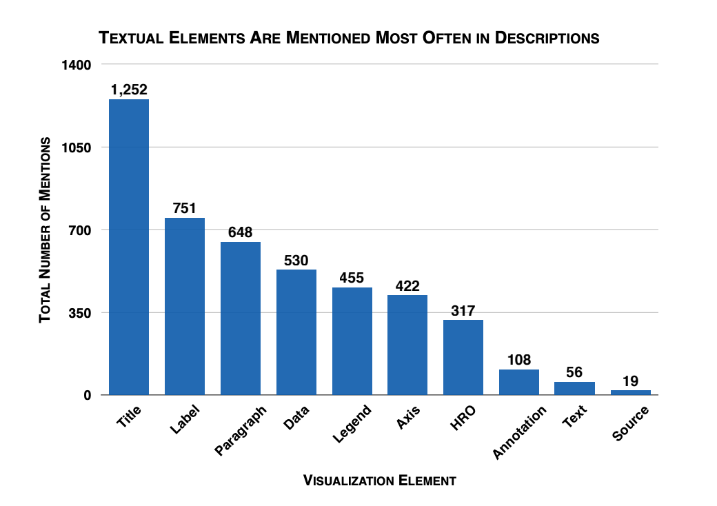
Given this, it should come as no surprise to you to hear that when participants were asked what, specifically, they remembered in their recalled visualizations, the element mentioned most often was the title.

The total number of mentions of specific visualization elements in the participant-generated recall text descriptions.
The experiment also found, reassuringly, that pictograms were not distracting elements to participants; viewers did not fixate on the pictograms when seeing the viz initially, but having seen a pictogram actually helped viewers to provide a better description of the viz later on (or, at the very least, did not hinder them). Now, this was only true when the pictogram had something to do with the data being shown, but I’m going to go ahead and assume that you are not going to include random images with your bar charts just to try to increase their memorability.
Double-encoding: Not just for cryptography
Lastly, the experiment found that redundancy was helpful in improving visualization recall and in improving viewers’ understanding of the data being presented. This was true whether it was data redundancy (like labeling your bar chart values, or dual-encoding data) or message redundancy (including the same message in a title, an annotation, a label, a pictogram, etc.).
If your goal is to be memorable, who cares if it’s “good”?
The good news is that it’s relatively simple to create things that people retain—but it challenges us to look beyond. some of our preconceived ideas about what makes a data viz “good.” That’s not to say that these principles aren’t valuable, but it’s worthwhile to explore how they help with retention.
Explore ideas like:
- Use images that go along with the data.
- Don’t be afraid to encode your data in multiple ways.
- Bar charts are...ok. But people don’t remember them. You’ll probably need more than just a bar chart.
- YOUR TITLE IS SUPER IMPORTANT. It’s the thing people look at for the longest, the thing they build the strongest association with, and the thing they’re most likely to remember. Don’t be obtuse with your title.
- Repeat and reiterate information in multiple ways.
- Don’t fear the color wheel. But, you know, learn a little bit about how colors work together.
Even though we are data-driven people, humans of science, it’s hard to set aside some of the beliefs we’ve long held as truisms—like less ink is better, don’t double-encode your data, stop cluttering up your work with text. Experimentation proves that they can sometimes be counterproductive for information retention.
And yet, in hindsight, it’s simple to see, given these experimental findings, how they make sense in a human world. We like pictures (they’re worth 1000 words, after all). We like repetition. We are drawn to color. We remember faces, sounds, extremely complex things. We expand our knowledge of the universe through the use of association, metaphor, and memory. We see how this new thing A is like this known thing B, and use metaphor C to bridge that gap.
We need to meet our audience on a human level with our data. We, the creators of these information experiences should know—just from the very act of living life as a human being in the world—that it’s these innate ways of connecting with anything outside of ourselves that allow an audience to hear, internalize, retain, and recall. And this doesn’t just apply to data products.
We hope you’ve enjoyed this series on creating successful information experiences for your audience. For those of you who want to experience these lessons live, delivered by the authors, Tableau Conference 2019 in Las Vegas is an excellent opportunity. That’s where we will be presenting “Beyond Design,” a one-hour talk based on many of the principles and techniques discussed here.
Resources
M. A. Borkin et al., "What Makes a Visualization Memorable?," in IEEE Transactions on Visualization and Computer Graphics, vol. 19, no. 12, pp. 2306-2315, Dec. 2013.
doi: 10.1109/TVCG.2013.234 https://ieeexplore.ieee.org/document/6634103
M. A. Borkin et al., "Beyond Memorability: Visualization Recognition and Recall," in IEEE Transactions on Visualization and Computer Graphics, vol. 22, no. 1, pp. 519-528, 31 Jan. 2016.
doi: 10.1109/TVCG.2015.2467732 https://ieeexplore.ieee.org/document/7192646
เรื่องราวที่เกี่ยวข้อง
Subscribe to our blog
รับอัปเดต Tableau ล่าสุดในกล่องข้อความ


