DataFam Roundup: August 30 - September 3, 2021
Dig into the latest DataFam Roundup—a weekly blog that brings together community content all in one post. As always, we invite you to send us your content—and the DataFam content from your peers that have inspired you! Find the content submission form here.
DataFam content
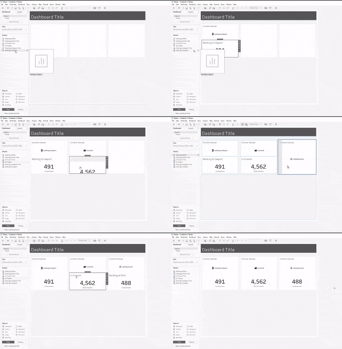
Spencer Baucke, Tessellation: 3 Fun Tips for Containers in Tableau
Dive into content created by the Tableau Community:
- Dinushki De Livera and Jennifer Dawes, Her Data: Lisa Trescott
- Lindsay Betzendahl, Viz Zen Data: *New Viz* The Cost of Data: One sheet, two chart
- Andy Kriebel, VizWiz: How to Compare to the Average with a Bar Chart
- Jim Dehner: 5 Ways to do YoY and YTD
- Sagar Kapoor and Will Perkins, VizConnect: Dashboard Requirements The Guide to Becoming a Concierge
- Donna Coles, Donna + DataViz: How many consecutive starts?
- Owen Comstock: A Twitter thread on data visualization and data science books
- Dawn Michelle, Tech Tips Girl: Create a Custom Color Palette
- Marleen Meier: Mastering Tableau 2021: How to handle Null Values
- Zach Bowders, Data+Love: Simon Beaumont
- Spencer Baucke, Tessellation: 3 Fun Tips for Containers in Tableau
Upcoming events and community participation
- Tableau Buddy is a firsthand beginner's den for those who are really serious about making a career in Data visualization specifically using Tableau. Connect with Tableau APJ Speaker Bureau Member Prasann Prem and book a session.
- September 17th, 10 AM CT – 11.00 AM CT: Join the third session of the Cup of Data series to expand on your Tableau CRM skills. The product team will demo their latest and greatest in a 'Release Jam'. Register for the event.
- Come Join Team #SportsVizSunday! If you are someone that loves sports, loves data, and loves the chance to selflessly showcase others then we invite you to put your name forward! Learn more.
- Black Cinema Viz Challenge: Black Cinema Data Sets 2000-2021, instructions and links are provided upon registration
- Are you a visualization and storytelling expert? Enter the Data Viz Competition to showcase your data-driven artistic skills while competing for top prizes!
- Data Visualization: State of the Industry 2021: The purpose of this survey is to help the Data Visualization Society and the broader data visualization community understand the state of data visualization, the people who make it, the challenges they face, what can help practitioners, and where the field is headed.
Vizzes
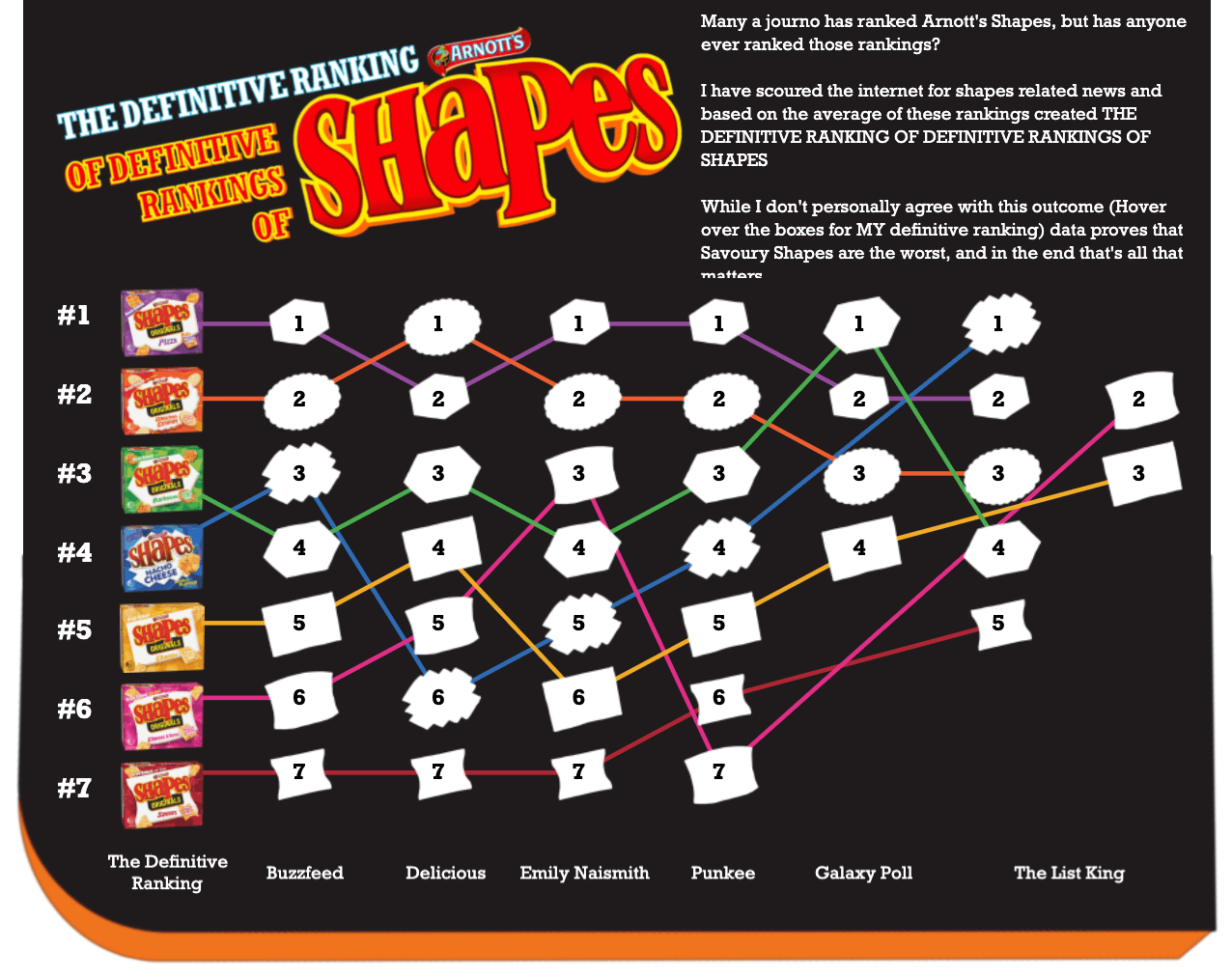
Caitlyn McIntyre: The Definitive Ranking of Definitive Rankings of Shapes
Catch this week’s Viz of the Days here and subscribe to get them emailed directly to your inbox.
Check out some inspirational vizzes created by the community:
-
Annapurani Vaidyanathan: The Entry Level
-
Naveen Mithare: International Tourism
-
Revolt BI - Czech & Slovak Tableau Partner: Tokyo 2020 Paralympic Games
-
Caitlyn McIntyre: The Definitive Ranking of Definitive Rankings of Shapes
-
Arshad Ejaz: Media Bias Ratings | USA | Allsides
-
David C. Velleca: Friends Random Episode Selector
-
Kevin Flerlage: Closest Parking Space
Community Projects
Makeover Monday
Join the community every Monday to work with a given data set and create better, more effective visualizations.
Web: Makeover Monday
Twitter: #MakeoverMonday
Week 35: Estimation of Country-Specific and Global Prevalence of Male Circumcision
Workout Wednesday
Build your skills with a weekly challenge to re-create an interactive data visualization.
Web: Workout Wednesday
Twitter: #WOW2021
Week 35: How Much Change Has Occurred?
Sports Viz Sunday
Create and share data visualizations using rich, sports-themed data sets in a monthly challenge.
Web: Sports Viz Sunday
Twitter: #SportsVizSunday
August 2021: UFC
Iron Quest
Practice data sourcing, preparation, and visualization skills in a themed monthly challenge.
Web: Iron Quest
Twitter: #IronQuest
August 2021: Travel & Vacations
Storytelling with Data
Practice data visualization and storytelling skills by participating in monthly challenges and exercises.
Web: Storytelling with Data
Twitter: #SWDChallenge
September 2021: envision education
Project Health Viz
Uncover new stories by visualizing healthcare data sets provided each month.
Web: Project Health Viz
Twitter: #ProjectHealthViz
September 2021: Biggest Healthcare Data Breaches
SDG Viz Project
Visualize data about Sustainable Development Goals provided by the World Health Organization.
Web: SDG Viz Project
Twitter: #TheSDGVizProject
Goal 17: Partnerships for the Goals
Preppin' Data
A weekly challenge to help you learn to prepare data and use Tableau Prep.
Web: Preppin’ Data
Twitter: #PreppinData
Week 33: Excelling at adding one more row
Real World Fake Data
Create business dashboards using provided data sets for various industries and departments.
Web: Real World Fake Data
Twitter: #RWFD
Dataset #12: Hospitality
Viz 2 Educate
Each month, create vizzes on global education syllabus topics as resources for teachers worldwide.
Web: Viz 2 Educate
Twitter: #Viz2educate
Topic: Microbiology
Diversity in Data
An initiative centered around diversity, equity & awareness by visualizing provided datasets each month.
Web: Diversity in Data
Twitter: #DiversityinData
August 2021: Refugee Data
Viz for Social Good
Volunteer to design data visualizations that help nonprofits harness the power of data for social change.
Web: Viz for Social Good
Twitter: #VizforSocialGood
เรื่องราวที่เกี่ยวข้อง
Subscribe to our blog
รับอัปเดต Tableau ล่าสุดในกล่องข้อความ


