Why I Ditched My Fitbit and What This Means for Analytics

Note: This is the first installment of a series on the quantified self. A version of this piece first appeared in ComputerWorld.
When I first got a Fitbit, it was amazing.
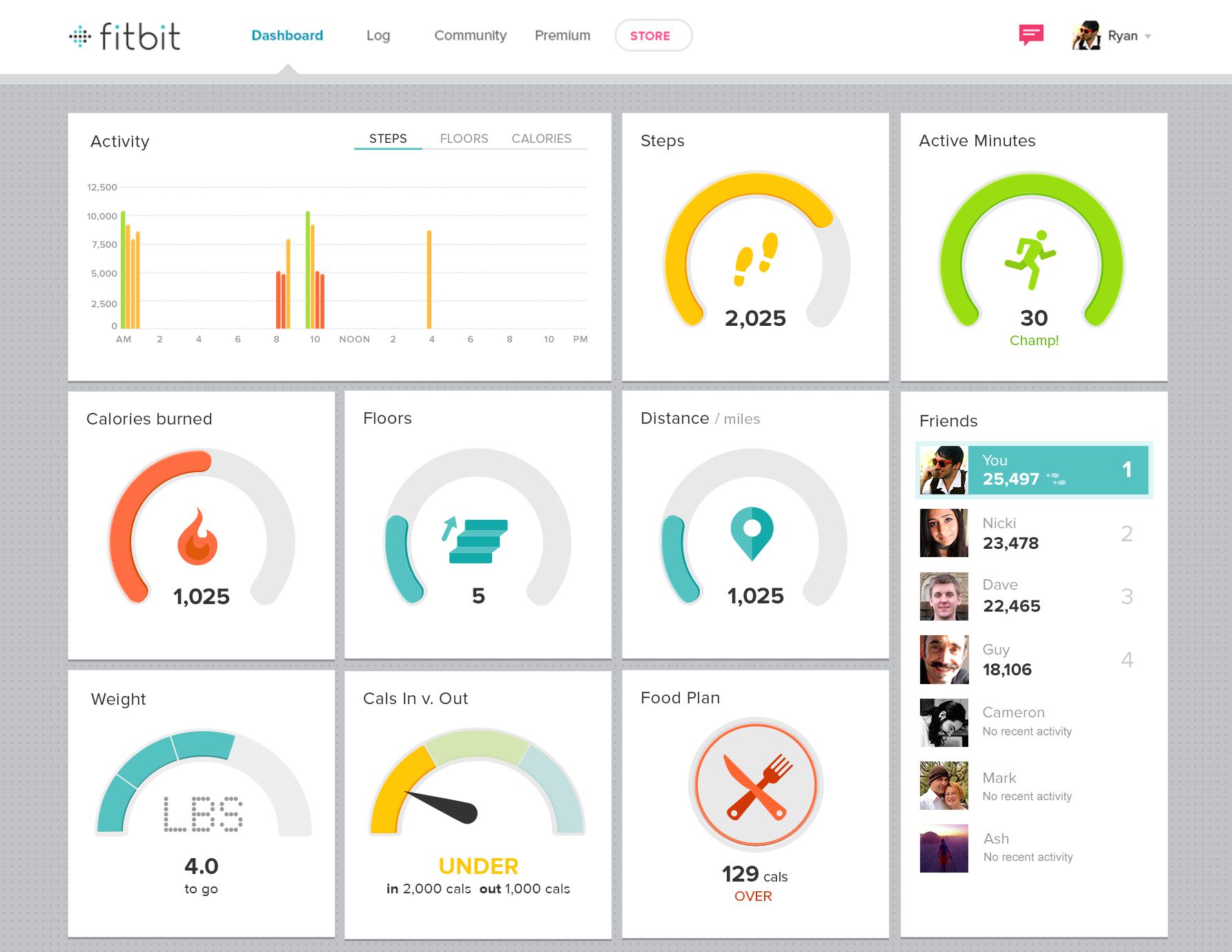
My daily dashboard, focusing mostly on a 10,000-step target, was incredibly motivating. Was I hitting the target? Answer: sometimes. Connecting with friends added great gamification. I began making different choices in my daily routine to take more steps. When I lost my first tracker, Fitbit sent me a free replacement. Wow! What more could I ask from this dream company?
Over time, however, I stopped going back to the dashboard as often.
After a year, my Fitbit strap broke. I decided not to buy a replacement. Why? Because Fitbit’s analytics was a dead-end dashboard.
After using a Fitbit for 12 months, I knew what the dashboard would show me each day. I’d learned to be able to sense the approximate step count each day. I no longer need the exact count, and yet I was still making healthy choices to walk more. The dashboard ceased to reveal anything new to me. Having successfully analyzed my steps, I wanted to move on and ask new questions about my daily activity.
For example, I’m more interested now in how much of each day I spend sitting down. Sitting down all day is not healthy; I use a standing desk at work as often as I can. What I want to do is measure how much of each day I spend standing. Fitbit records active minutes but doesn’t display them in a way that meets my new needs. My Fitbit couldn’t adjust to my new data requirements, and thus our happy relationship came to an end. Until I can tweak and adapt the Fitbit dashboard, it is no longer useful.
The Fitbit story is relevant to all visual analytics. Dashboards that don’t evolve don’t get used. Too often, a completed dashboard is seen as a finishing line, not a starting point. All this does is lead to dead-end dashboards. They litter company portals, unloved and unseen. Whether it’s Fitbit data or the finances of a Fortune 500 company, you must consider dashboards as living, evolving things that are responsive to people's changing questions.
Could Fitbit win me back? It could, if it adopts some of the approaches to dashboards any business needs to apply to deliver successful self-service analytics to its employees. Here are three:
1. Empower People to Dive in and Ask Ad Hoc Questions on Your Dashboards
Even the perfect dashboard will only answer the questions you designed it to answer. What happens if someone is looking at the dashboard and finds it needs a small tweak to the dashboard, such as adding a field, in order to answer the user's question? Can the user tweak the dashboard there and then, or must he or she wait for some unknown period of time? Empower users to edit and enhance the views themselves for ad hoc visual analysis. This is more than filtering; people need to be able to manipulate and adapt the component charts themselves.
2. Provide Access to Data Sources, Not Finished Dashboards
Let’s face it: It’s not possible to build one dashboard that fits everyone’s needs. Why not focus instead on tightly-governed data sources? Provide people with some dashboards and encourage them to build then save their own. Imagine if I could tweak Fitbit’s dashboard to focus on the activities that I want, just the way I want? Incidentally, Fitbit doesn’t allow you access to your own data unless you’re a premium customer. This doubles down on the problem: People aren’t engaged or empowered when data is inaccessible.
3. Change the Data Being Collected as Requirements Change
I’m done with counting steps. Thanks to Fitbit, I know exactly what a typical day looks like. Next I need a tracker to measure standing/sitting patterns. I accept that this is hard for Fitbit to do, but even if the dashboard could evolve, there’s also a data problem. Customer needs don’t stand still for Fitbit, and they don’t stand for still other businesses, either. The data you collect needs to evolve with your business or your customers.
When businesses adopt these approaches, they see success. Matt Francis, who is responsible for analytics at the Wellcome Trust Sanger Institute, says, “Low dashboard usage typically signals a need for change. Sometimes they are for projects that are wound up. Other times requirements have changed so we work with people to refresh them. This way we ensure dashboards on our systems are giving users answers they need.”
I can’t evolve my Fitbit dashboards. I can’t get at the underlying data in order to explore it myself. I’m stuck with what Fitbit created: a dead-end dashboard. Don’t let the people in your organization feel the same way about your dashboards they use in your business. Whether you’re analyzing wearables or widgets, steps or sales, you need flexibility and freedom in order to keep the dashboards alive and useful.
Got an interesting quantified-self story of your own? Email us at ideas@tableau.com and let us know.
Relaterade berättelser
Subscribe to our blog
Få de senaste Tableau-uppdateringarna i din inbox.


