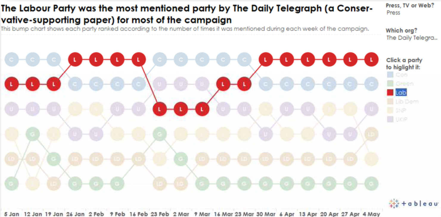
Vizzing the UK Election: Showing Ranks over Time

Note: This is the second post in a series highlighting the media's use of Twitter to cover the UK general election. Check out our election site for full details, and read the first post on rethinking stacked bars with ghost marks.
The bump chart above was an attempt to focus on the ranking of the parties during the recent UK election. Often the raw values are not as important as the actual ranks. This is true in sports, politics, and any instance where final positioning is more important than the actual values.
As with all chart types, showing the data in one way means a compromise. A bump chart hides the underlying raw values. As you can see below, a regular line chart makes this easier to see, but makes the ranking a little less obvious:

To make the bump chart more distinct and highlight each party more clearly, I used a dual axis chart in Tableau. One measure was a line, and the other a circle.
Bump charts aren’t the most common chart type, but they are easy to understand. Here are a couple more great examples. The first looks at the rankings of teams in the English Premier League in the 2012-2013 league:

Sticking with football, this is about the densest bump chart I’ve ever seen. It’s by Tableau’s own Mac Bryla. Click on the viz to explore team rankings over time.
Finally, do you know why it’s called a bump chart? It was originally created to show how college boats changed their positions during the bumps races!

Learn about making dual axis charts for similar ends on my blog, Gravy Anecdote. We also have a tutorial on creating bump charts in Tableau. And find out more about chart choice in our visual analysis guidebook.
Relaterade berättelser
Subscribe to our blog
Få de senaste Tableau-uppdateringarna i din inbox.


