Vizzing the UK Election: Comparing Values over Two Time Periods
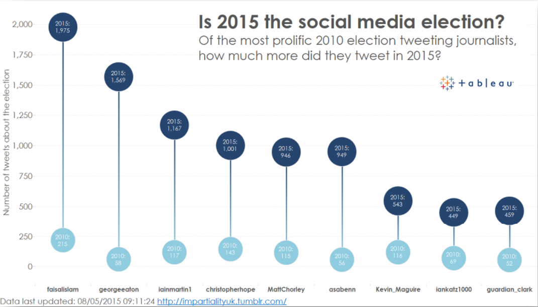
This is the final post in my series based on vizzing the UK general election. In this post, I’ll explore the best way to compare two categories over time. This lesson came from looking at how journalists’ time on Twitter has changed since the previous election. The chart below compares tweet counts for key journalists in 2010 (in light blue) and 2015 (in dark blue).

I used a vertical line to compare the volumes of tweets in 2010 and in 2015.
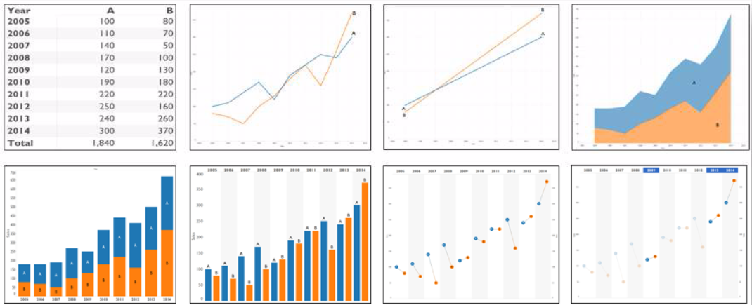
In this instance, I chose to use a vertical line to compare the two elections. There are many many other ways to show a dataset like this. I wrote about this on my GravyAnecdote blog recently, in a post titled “Killing the Paired Bar Chart.” The image below shows the many ways a simple dataset like this could be displayed:

Here are eight ways to compare simple data.
What if you could see all of those views in a matter of minutes? Each one is valid and each provides a different perspective on the data. The video at the top of this post shows how flowing with data is the best way to understand it. Discovery isn’t about knowing what view you want before you explore your data; it’s about finding the way organically.
In the end, I chose a vertical line for my election post. You might choose a different way. The point, as always, is to focus on the key question your chart is trying to answer. Iterate through several options and ask others for their opinions on which best suits your data.
Find out more about chart choice in our visual analysis guidebook.
For full details on our election project, visit our election site. And catch up on our previous series posts on rethinking stacked bars with ghost marks, and showing ranks over time.
Histórias relacionadas
Subscribe to our blog
Receba em sua caixa de entrada as atualizações mais recentes do Tableau.


