How To Spot Misleading Charts: Review the Message


Charts exist everywhere. Viewing a chart instead of a table of numbers helps us quickly understand data, see patterns, and make better decisions. In today’s world, swift decision-making with data is crucial. When viewing and creating charts, it’s vital that we discern the integrity of the information and conclusions presented in charts.
Many people don't realize that charts are as flexible and malleable as the written word. In the same way that words can deceive, so can charts. In a world of increasing misinformation, it is vital everyone has the skills to spot the tricks used by some. It's also possible to accidentally create misleading charts if one has gaps in their data literacy: these pitfalls outline ways to ensure our own charts fit to high standards.
To aid your thoughtful review of charts, we created a handy 4 part checklist with an easy to remember acronym, SCAM. SCAM stands for Source, Chart, Axes, and Message. Be aware of the SCAM! This blog will cover the fourth part of the checklist—reviewing the message. Read on to learn how to spot misleading charts with confidence and continue your learning with the rest of the checklist:
- How to Spot Misleading Charts: Know the Source
- How to Spot Misleading Charts: Check the Chart Design
- How to Spot Misleading Charts: Check the Axes
Review the Message
Even charts created with accurate source data and appropriate design choices are subject to misinterpretation. The key is to think critically and take time to evaluate the interpretations of data portrayed in charts.
What types of comparisons are made in the interpretation?
Data Visualization expert and author Kathy Rowell says that we should always ask “Compared to What?” Charts help us make informed comparisons that lead to good decisions. It’s important to consider the context of the chart and understand the comparisons made. Even if a chart’s data is trustworthy, you might jump to incorrect conclusions if you don’t pause to make sure the chart is addressing the right questions first.
Ask if the entire context is being presented. For example, in How Charts Lie: Getting Smarter about Visual Information, Alberto Cairo discusses the following bar chart. The suggested takeaway is that the unemployment rate is increasing.
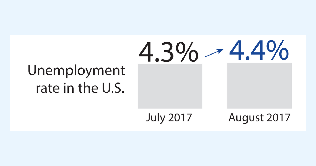
Bar graph showing unemployment increasing from July to August of 2017. Image from How Charts Lie by Alberto Cairo.
However, if you look at these two data points in the context of the entire year or even across multiple years, a different pattern emerges. Although the unemployment rate did increase between July 2017 and August 2017, the rate is actually going down over time with fluctuations occurring between months. Including this context tells a very different story.
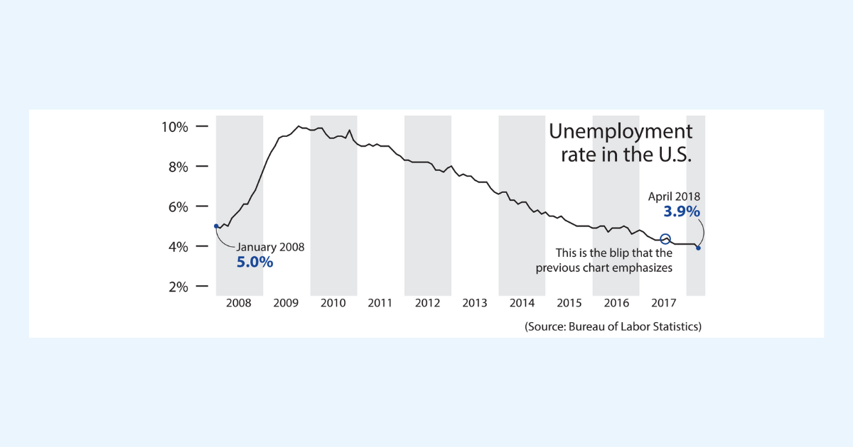
Unemployment rate shown over multiple years, showing a downward overall trend from 2009 to 2018. Image from How Charts Lie by Alberto Cairo.
Is the interpretation appropriate for the data analysis shown?
Sometimes an appropriate chart and analysis can be misinterpreted. For example, you might encounter correlation being interpreted as causation.
Correlation only shows how strongly variables are related. It doesn’t explain the how or why.
For example, ice cream sales correlate with the number of sunglasses sold. Are people buying ice cream because they bought sunglasses, or vice versa? No. The cause of both purchases is clearly something else. In this case, the cause may be the hot weather.
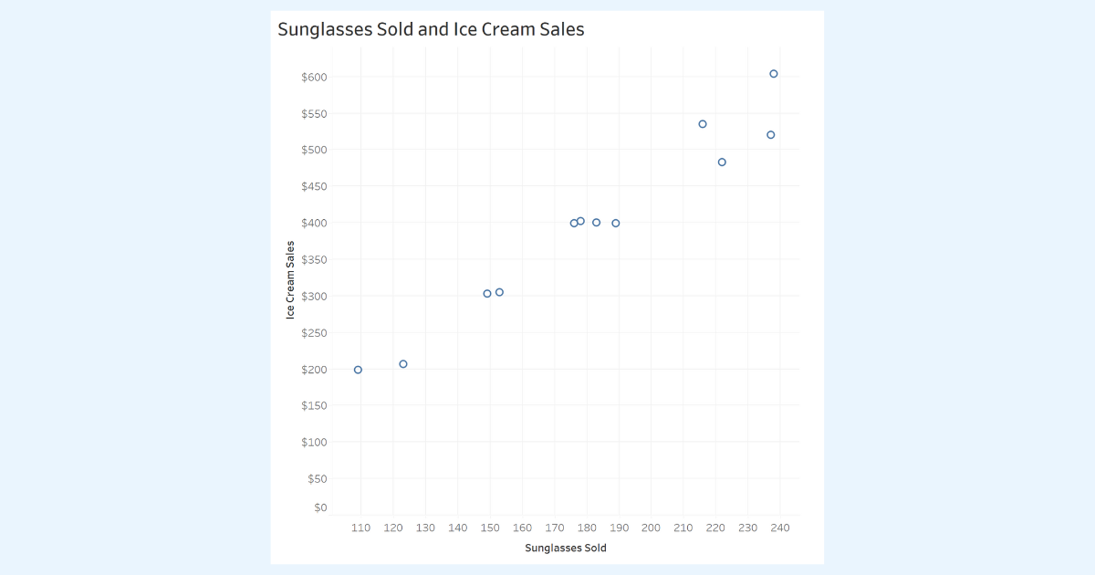
Scatterplot showing a correlation between Sunglasses Sold and Ice Cream Sales.
Consider Uncertainty
In the Know the Source post, we discussed the importance of watching for insufficient data. We used survey data to explore the Margin of Error or MOE. The MOE tells us how much uncertainty there is in our estimates. When the MOEs of two estimates overlap, we don't have enough evidence to show that the estimates are different.
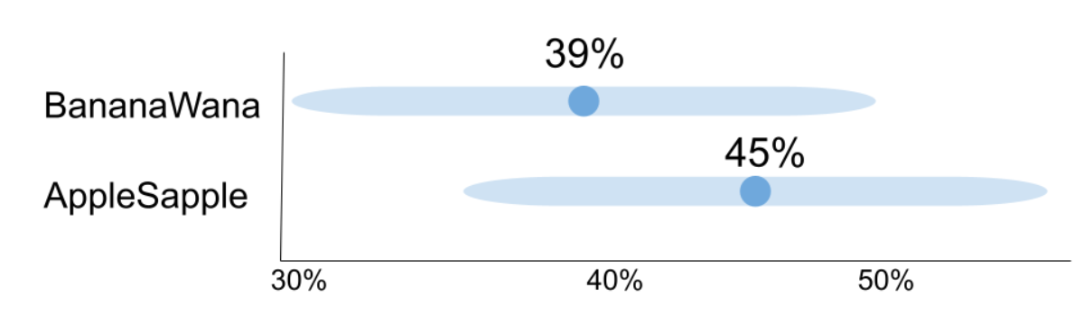
Graph showing the +/- 9 percentage points margin of error (MOE) for the survey results from a total sample size of 300 (135 preferred AppleSapple and 117 preferred BananaWana). While the results show that 45% prefer AppleSapple and 39% prefer BananaWana, the MOEs for the two values overlap. (Note: Not showing the 16% (48) who responded with no preference)
When interpreting comparisons, we need to consider the uncertainty in our results. Data isn’t perfect! You might be surprised by the results of elections when the polls showed the non-winning candidate ahead. When we report the margin of error, we aren't describing “mistakes” in the study, rather we’re showing how much uncertainty there is in our estimate. When interpreting and presenting comparisons, be mindful of the uncertainty in our results.
To learn more about uncertainty, sample size, and understanding populations, check out the Trailhead module on Variation for Data Comparisons.
Language Matters
Pay attention to the words used to describe a chart. Do the title and subtitles properly describe the chart? Do labels use inclusive language that avoids stereotyping when describing data about people? Are words emotionally laden in a way that might influence the perception of the data? Be aware of how language can influence our perception of the conclusions being presented. And finally, consider whether the visualization was created with an inclusive and equitable lens. Consider the possibility of bias in the analysis and presentation of the data.
For example, the graph below refers to incarcerated people as “inmates” when showing the rate of mental health diagnoses they receive. While inmates might seem neutral and objective, it dehumanizes people by labeling them by their punishments. The term “inmates” in this context also ignores the role racism and discrimination play in how likely incarcerated people are to receive a mental illness diagnosis.
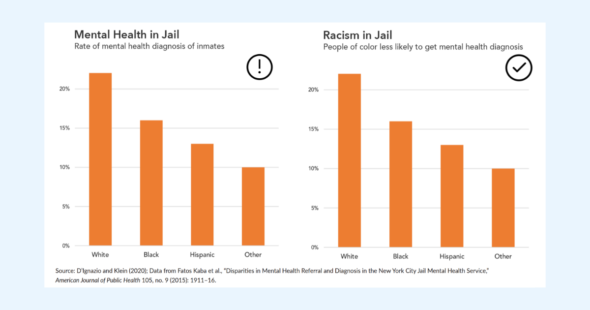
Two identical graphs use different language to describe them. Describing racism shifts the focus to unfair advantages of the dominant group. Image from the Do No Harm Guide: Applying Equity Awareness to Data Visualization by Jonathan Schwabish and Alice Feng.
A more accurate description of the findings of this study could be that people of color are less likely to get a mental health diagnosis. The focus shifts from what people of color lack to the unfair advantages of the dominant group and racial disparities in the jail system, and references people rather than inmates.
To learn more about how to present data through a more diverse, equitable, and inclusive lens, check out the Equity and Inclusion Guidelines for Data Visualization Trailhead.
Keep asking questions
When you read a chart and an author’s interpretations or visual representations of data, always ask questions. If you see something that doesn’t add up, ask why and investigate. You’ll be amazed by what you can learn and how you can help those around you. Stay curious and ask questions.
Practice and be confident
Interpreting charts can be challenging work. You can all help improve how decisions are made every time you accurately read charts or call out misleading charts that you encounter. It’s important to practice. Follow the SCAM checklist every time you see a chart in your daily life.
Share and help the community
While it’s important to think critically and ask yourself smart questions, it can be extremely helpful to analyze data with others. Discuss your interpretations and chart critiques with your peers and friends. You’ll find that you can help improve the decision-making within your organization and help stop misinformation in our communities.
Want more data resources?
Data Skills Resources: Whether you’re a seasoned data veteran, or totally new to the world of data, we have the resources to fill in the gaps, or build a solid foundation to launch from.
Tableau Academic Resources: Want to use this information in your academic classroom? Visit the Tableau Academic Curriculum website to request access to this information and more.
Trailhead Module: Guidelines to Recognize Misleading Charts: A five unit badge that will help you accurately read and present chart data and avoid misleading chart designs. A perfect follow-on after reading this blog!
Trailhead Module: Communication with Charts: A five unit badge that will help you apply best practices for designing and reading charts to tell the story of your data.
Trailhead Trail: Build Your Data Literacy: Seven badges that will help you explore, understand, and communicate effectively with data. The trail covers topics such as the basics of data literacy, aggregation and granularity, well-structured data, distributions, understanding variation, and correlation and regression.
Trailhead Module: Equity and Inclusion Guidelines for Data Visualization: A five unit badge that will help you present data through a more diverse, equitable, and inclusive lens.
Book: Alberto Cairo (2020), How Charts Lie: Getting Smarter About Visual Information,W.W. Norton & Company: In-depth guide on how charts can mislead us. Helps you be a critical consumer of data visualizations.
Report: Jonathan Schwabish and Alice Feng (2021), Do No Harm Guide, Applying Equity Awareness in Data Visualization: In-depth guide from the Urban Institute to help data practitioners to work through a lens of diversity, equity, and inclusion.
Book: Katherine Rowell, Lindsay Betzendahyl, and Cambria Brown (2020) Visualizing Health and Healthcare Data: With a focus on health and healthcare, a manual that will help you learn visualization best practices and create beautiful and useful visualizations for the user.
Histórias relacionadas

Transforming Ideas into Features: Tableau's Commitment to Community-Driven Innovation
 12 Abril, 2025

DataFam Roundup: April 7-11, 2025

Meet 2025 Iron Viz Finalist Bo McCready
 8 Abril, 2025
Subscribe to our blog
Receba em sua caixa de entrada as atualizações mais recentes do Tableau.