How To Spot Misleading Charts: Know the Source


Charts are all around us. When communicating with data, viewing a chart instead of a table of numbers can help us very quickly understand our data, make comparisons, see patterns or trends, and use that information to make better decisions. In today’s world, the ability to swiftly make decisions and act on data is crucial. When viewing and creating charts, it’s vital that we gain the ability to critically explore and discern the integrity of the information and conclusions shown in charts. Doing this important work helps us make informed decisions.
Many people don't realize that charts are as flexible and malleable as the written word. In the same way that words can deceive, so can charts. In a world of increasing misinformation, it is vital everyone has the skills to spot the tricks used by some. It's also possible to accidentally create misleading charts if one has gaps in their data literacy: these pitfalls outline ways to ensure our own charts fit to high standards.
To aid your thoughtful review of charts, we created a handy 4 part checklist with an easy to remember acronym, SCAM. SCAM stands for Source, Chart, Axes, and Message. Don’t be SCAM’d! This blog will cover the first part of the checklist—know the source. Read on to learn how to spot misleading charts with confidence and continue your learning with the rest of the checklist:
- How to Spot Misleading Charts: Check the Chart Design
- How to Spot Misleading Charts: Check the Axes
- How To Spot Misleading Charts: Review the Message
Know the Source
Whether you are reading a social post, news article or business report, it’s important to know and evaluate the source of the data and charts that you view. Investigate the source by asking questions that help you get to the heart of who, what, where, when, and why the chart was created. Here are some suggestions to help you get started:
Topic to investigate: Who
- Who is responsible for the data, analyses, and resulting presentations?
- Who collected and analyzed or created the data?
- Was the author(s) paid to collect, analyze, and present the data? If so, are there any potential conflicts of interest?
Topic to investigate: What
- What methods were used in collecting and preparing the data? How were summarization values calculated?
- What types of data does the author(s) present?
- What types of measurements were taken and how accurate are those measurements?
- What was the sample size of the data? Does the sample properly represent the population?
- How many people were surveyed in a poll and what was the demographic breakdown of those surveyed?
Topic to investigate: Where
- Was the data collected from a particular region, state, or country?
- Is the data available on a credible source’s website or other means?
Topic to investigate: When
- Is the data current?
- Does the data track back in time? If so, how long?
- Was the data collected yearly, monthly, daily, or even by the minute or second?
Topic to investigate: Why
- Did the authors have a particular motive behind gathering the data and doing the analysis?
- Was a company paying researchers to test new products?
- Was it a government study sponsored by the community?
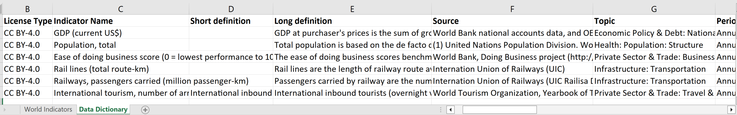
Spreadsheet showing Data Dictionary tab giving detailed information about each field in the World Indicators dataset.
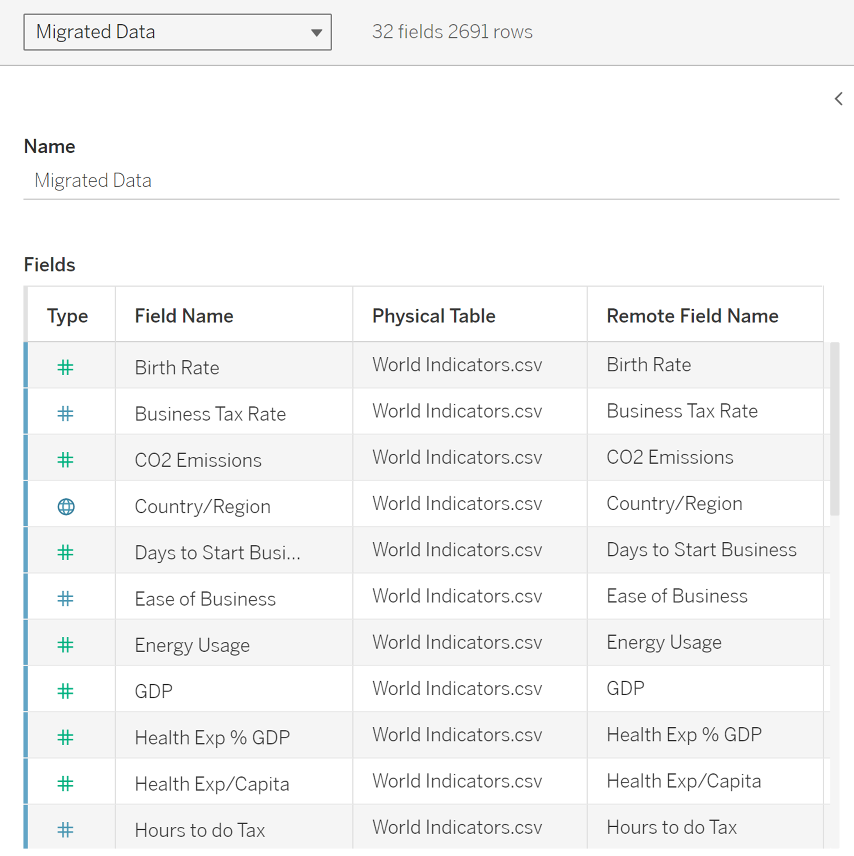
The Metadata grid in the Tableau Data Source page. In this example you can see that the data source has 32 fields and 2691 rows of data. Details about each field are shown by rows in the grid.
To help you question the data, be sure to study the metadata, which is the data about the data. Read any accompanying documentation to gather useful insights from the metadata, such as when, how, and why the data was collected. For example, many organizations that share data with the public will provide documentation describing characteristics, ownership, formatting, suggested use, and many other details about the data. When viewing spreadsheets, oftentimes, there are ‘readme’ or Data Dictionary tabs that share those details.
When Making Summaries and Comparisons
Another question to ask is “What summarizations were made to the data?” When viewing summary numbers, evaluate if the summary number is appropriate. For example, a common pitfall can happen when summarizing skewed data such as salary data. When using the average instead of the median, we may be misled into believing a higher value represents the typical or middle value for the data. The middle value is better represented as the median.
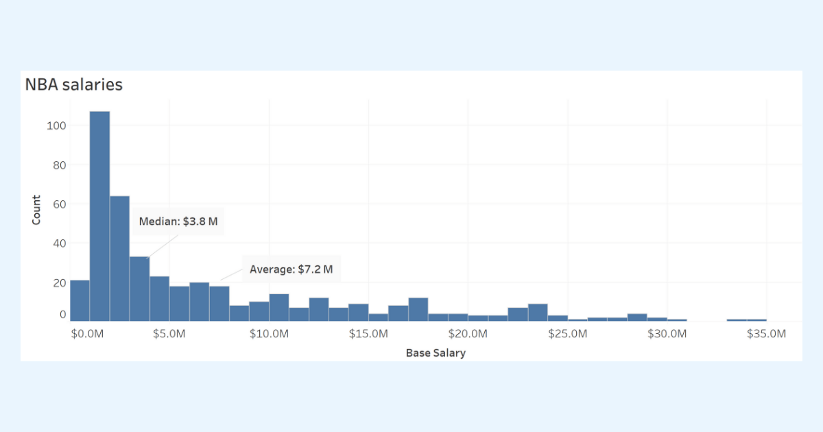
This histogram shows the distribution of base NBA salaries that shows the data grouped into ranges (or bins). The median value of $3.8 million is the better summary value for showing a ‘typical’ or middle value for NBA salaries. The average is much higher at $7.2 million.
To learn more about distributions, check out the Data Distributions badge on Trailhead.
Rates and Percentages
Rates and percentages measure a relationship between values. For example, you may observe three out of every five attendees of a presentation sign up for a newsletter. You say ⅗ or 0.60 or 60% of attendees signed up for the newsletter.
Be mindful when comparing counts on maps or when comparing locations. Counts are often dependent on the population. For example, you may have higher sales in a region because of a higher population in that area. Comparing percentages or rates will be more informative.
Watch for Insufficient Data
I think all of us have a responsibility to interrogate the data thoroughly before publishing visualizations that make assertions.
A common pitfall is making inaccurate comparisons when you don’t have enough data.
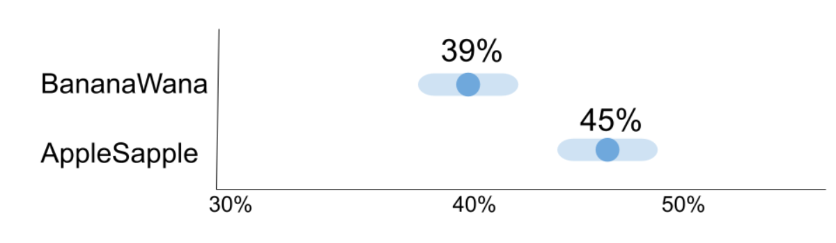
For example, let’s say you ran a survey comparing the preference of two products, AppleSapple and BananaWana fruit snacks.. Your results show 45% prefer AppleSapple and 39% prefer BananaWana (16% didn’t have any preference). You create a report recommending to move forward with the AppleSapple product and leave BananaWana on the shelf.
But wait, how confident are you in the result? How many people did you survey? The number of people that you surveyed, or the sample size, will affect the margin of error (MOE). The margin of error tells us how much uncertainty there is in our estimate. When statisticians describe margin of error, they will say at a particular confidence level or level of uncertainty. If we use the 95% confidence level, statistics allow you to be confident that if you ran the study (or survey in this example) many times with the same methods, 95% of the time your estimate would fall within the margin of error.
In our example of a survey sample size of 300 participants (135 (45%) preferred AppleSapple and 117 (39%) preferred BananaWana), we get a margin of error of +/- 9 percentage points. To describe your results you would say, “Given our methods of collecting and measuring, we are 95% confident that the value that we’re trying to estimate (% of population that prefers AppleSapple) is between 36 and 54 percent, or 9 percentage points larger or smaller than 45.”
When you visualize the margin of error around the values for BananaWana and AppleSapple, you see that there isn’t enough evidence to support that AppleSapple is the preferred product over BanaWana. What if you had conducted a larger survey?
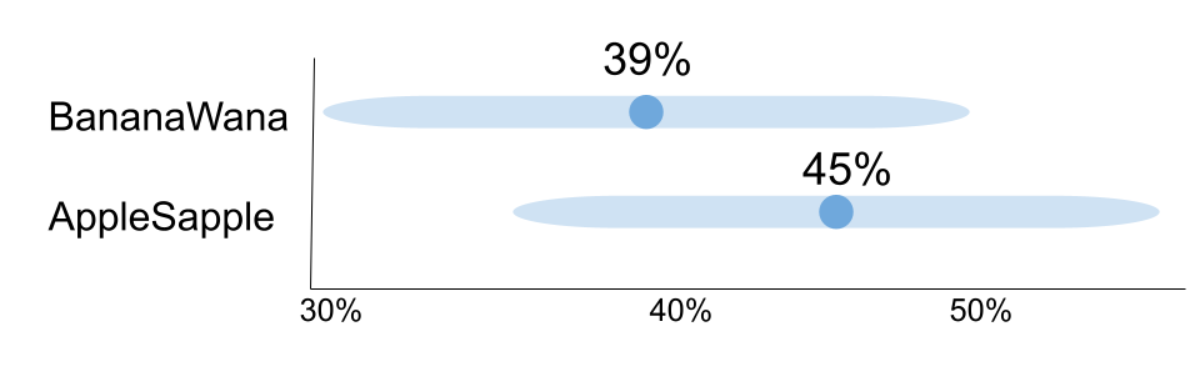
Graph showing the +/- 9 percentage points margin of error (MOE) for the survey results from a total sample size of 300 (135 preferred AppleSapple and 117 preferred BananaWana). While the results show that 45% prefer AppleSapple and 39% prefer BananaWana, the MOEs for the two values overlap. (Note: not showing 16% who responded no preference)
Let’s imagine that instead of 300 participants, you had 3000 participants. With 3000 total participants, the margin of error is +/- 2.8 percentage points. If you had conducted the larger survey, you would be more confident about moving forward with AppleSapple.
Graph showing the +/- 2.8 percentage points margin of error (MOE) for the survey results from a total sample size of 3000 (1350 preferred AppleSapple and 1170 preferred BananaWana). The results show that 45% prefer AppleSapple and 39% prefer BananaWana with non-overlapping MOEs. (Note: not showing the 16% (480) who responded no preference)
You can see how to calculate the Margin of Error at Good Calculators and explore more on showing uncertainty in survey data from Steve Wexler’s Data Revelations website.
To learn more about uncertainty, sample size, and understanding populations check out the Trailhead module on Variation for Data Comparisons.
Practice and be confident
Interpreting charts can be challenging work. You can all help improve how decisions are made every time you accurately read charts or call out misleading charts that you encounter. It’s important to practice. Follow the SCAM checklist every time you see a chart in your daily life.
Share and help the community
While it’s important to think critically and ask yourself smart questions, it can be extremely helpful to analyze data with others. Discuss your interpretations and chart critiques with your peers and friends. You’ll find that you can help improve the decision-making within your organization and help stop misinformation in our communities.
Want more data resources?
Data Skills Resources: Whether you’re a seasoned data veteran, or totally new to the world of data, we have the resources to fill in the gaps, or build a solid foundation to launch from.
Tableau Community Resources: Just getting started, expanding your network, or growing your skills? We’ve got personalized resources and recommendations at the ready to help you reach your goals.
Tableau Academic Resources: Want to use this information in your academic classroom? Visit the Tableau Academic Curriculum website to request access to this information and more.
Guidelines to Recognize Misleading Charts: A five unit badge that will help you accurately read and present chart data and avoid misleading chart designs. A perfect follow-on after reading this blog!
Communication with Charts: A five unit badge that will help you apply best practices for designing and reading charts to tell the story of your data.
Build Your Data Literacy: Seven badges that will help you explore, interpret, and communicate effectively with data. The trail covers topics such as the basics of data literacy, aggregation and granularity, well-structured data, distributions, understanding variation, and correlation and regression.
Alberto Cairo (2020): How Charts Lie: Getting Smarter About Visual Information,W.W. Norton & Company: In-depth guide on how charts can mislead us. Helps you be a critical consumer of data visualizations.
Histórias relacionadas

DataFam Roundup: April 28-May 2, 2025

DataFam Roundup: April 21-25, 2025

Transforming Ideas into Features: Tableau's Commitment to Community-Driven Innovation
 12 Abril, 2025
Subscribe to our blog
Receba em sua caixa de entrada as atualizações mais recentes do Tableau.