Overcoming ambiguity in natural language: The research behind Ask Data
As with any natural language system, questions typed into Tableau’s recent natural language capability, Ask Data, are often simple, yet ambiguous and underspecified. People often ask questions about their data without explicitly specifying the attributes they are interested in seeing in the visualization response. Concepts used in these questions can also be vague and the system needs to interpret the questions sensibly with reasonable defaults.
To fully support a useful analytical experience, the system needs to process these utterances and turn them into specifications so that a sophisticated visual analytics platform can show the user an appropriate visualization response. While follow-up repair utterances can help resolve ambiguities, the system is often constrained by the domain of the knowledge base or the context of the interaction (e.g. “inexpensive” home has a different meaning than “inexpensive” wine). By finding relevant missing data attributes and appropriate visualizations, Ask Data attempts to satisfy people’s intent in these natural language utterances. Let’s walk through some examples to give a flavor of the various ways we infer missing information in Ask Data.
Consider a question like, “What's my profit over time?” While it is apparent that the user is expecting some form of a time-series visualization to perhaps see how their profit margins are doing, they haven't specified any time attribute to associate with profit. Ask Data resolves an abstract concept such as ‘time’ to an appropriate time attribute in the user’s data such as ‘Order Date’ as seen below:
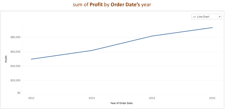
Now, you might ask, if there is more than one time attribute in the data source, how does Ask Data know which one to pick? To help infer missing information, the feature relies on additional metadata derived directly from the data source. This metadata includes information about the data types (e.g., text, dates, places, boolean, numbers), statistical values such as data distribution, cardinality as well as popularity scores that reflect how often the data attribute is used in visualizations generated from the data source.
Filling the holes and connecting the dots
Ask Data supports five different analytical expressions based on the basic database operations found in Tableau:
- Aggregation expressions: The values of multiple rows are grouped together to form a single value based on a mathematical function. For example, “Sum of Sales,” or “Count of Customers.”
- Group expressions: Expressions that partition the data into categories shown in a data visualization, like “by Region” or “by Sales.”
- Sort expressions: Expressions that arrange data rows in an order, like ascending, descending, or alphabetical. For example, “sort Products in ascending order by sum of Profit” or “sort Customer Name in alphabetical order.”
- Filter expressions: Expressions that return a subset of the field’s domain. They can be numerical filters like “sum of Sales at least $2,000” or categorical filters like “Customer Name starts with John” or “Category contains Manufacturing.”
- Limit expressions: Expressions akin to Filters that return a subset of the field’s domain, restricting up to a subset of rows. For example, “top 5 Wineries by sum of Sales” or “bottom Category by average Profit.”
Similar to grammar for a language, there is a known syntax for each of these expression types in Ask Data. However, just like people use language colloquially, we can’t expect these utterances to be grammatically correct and precise all the time; Humans are innately imprecise and ambiguous. In that spirit, here are some examples of how Ask Data handles underspecified or ambiguous analytical expressions by inferring missing information.
Example 1: Inferring missing information for filtering data
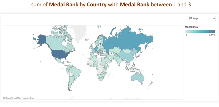
A person types “countries with rank 1 3.” They have specified a range of numbers without mentioning the type of filter. Ask Data infers the filter operation “between” that accepts a range of numbers as input, with the tokens “countries” and “rank” mapping to the attributes “Country” and “Medal Rank” respectively. Inferring this missing information helps generate the visualization response below:
Example 2: Inferring information to generate a valid Tableau visualization
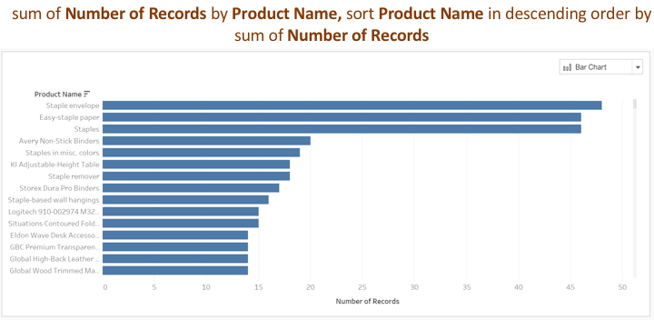
While handling missing information in natural language utterances is fairly common, the system also needs to deal with another form of missing information to satisfy Tableau’s underlying query language, VizQL. As per the declarative syntax of VizQL, in order to construct a visualization, there must be a dimension to group the data or a measure to aggregate the data. However, people often ask a question with an intent to filter or sort the data without necessarily specifying a group or an aggregation expression. Say someone types “sort products from the biggest.” VizQL requires the dimension used in the sort expression (i.e. “Product Name”) to also be used to group the data in the visualization. Ask Data infers “by Product Name” and also “sum of Number of Records” to generate a sorted bar chart of products based on the number of records in the underlying data source seen here:
Example 3: Inferring information to enhance the usefulness of Ask Data’s response
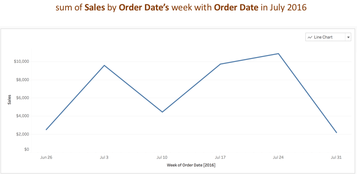
To support a conversational experience with a user, the system also infers additional information that can help improve the analytical usefulness of the visualization response to their utterance. When they ask to see “sales throughout July 2016”, Ask Data infers a date field, “Order Date” and creates a group expression “by Order Date’s week”, which is one level lower than the month level (i.e. July 2016) in the time filter expression. This group expression helps generate an analytically useful time series chart as shown below:
Inferring missing information to generate a specific chart type
During visual analysis, people may explicitly express their intent for a specific chart type, such as a line chart to perform temporal analysis or a map to see their data by location. The inferencing logic for deducing sensible attributes to satisfy valid visualizations relies on Tableau’s Show Me feature. Show Me adopts best practices from graphics design and information visualization when ranking analytically useful visualizations based on the type of attributes utilized in the analysis workflow.
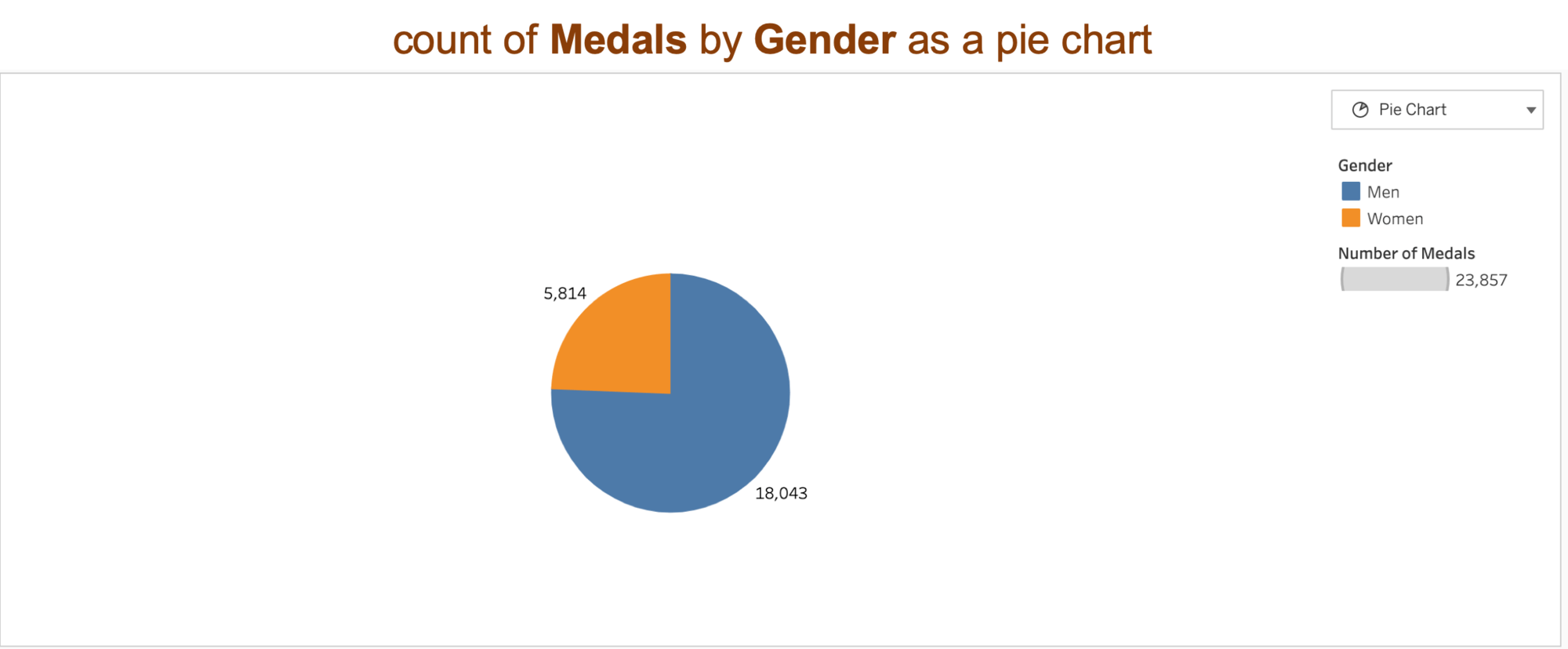
People have different ways of specifying their preferences. Some know exactly what they want when they order at a restaurant for example, while others prefer the chef to choose for them. Ask Data can handle types of people (but no, we haven’t gotten the system to cook for us). Consider a data source on Olympics medal information. A specific request for a visualization type like, “Show me number of medals as a pie chart” will infer a low cardinality categorical data attribute “Gender” from the data source, for example, to generate this:
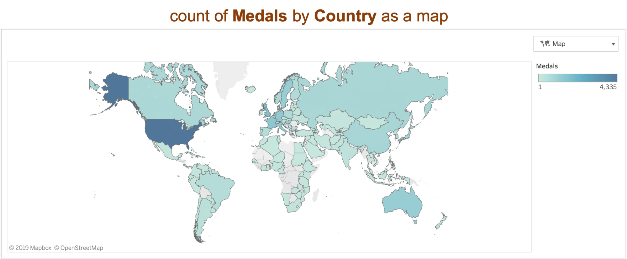
A less direct request “medals by location” will infer a geographic field “Country” to display a map.
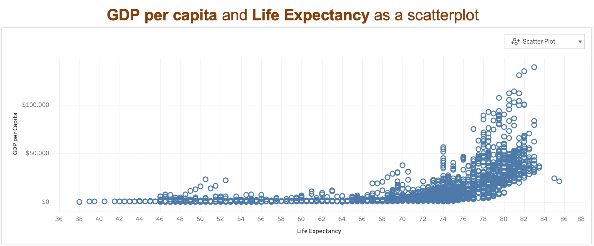
A more indirect request is an utterance “what’s the correlation of gdp?” for a data source on World Indicators. In this case, a scatter plot is a useful way of observing correlation of the numerical attribute “GDP per Capita” along with another numerical attribute. Ask Data infers a top-ranked numerical attribute based on usage popularity information to generate a scatter plot.
Mapping fuzziness to something more concrete
Ambiguity is common, even manifesting in the way people use certain words in conversation with Ask Data, such as ‘low’, ‘high’, ‘good’, and ‘near.' These vague concepts typically have blurred definitions that are often subjective. To solve for this, the system uses metadata provided with the underlying data source, so it can support various vague concepts and infer a reasonable default to align with the user’s expectations.
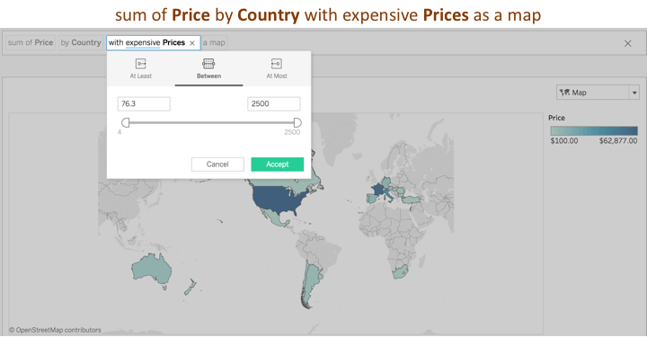
For the question, “Where are the expensive wines?” the system infers a currency-type attribute. The filter type is a numerical range filter between and the value is inferred to range from the average to 1 standard deviation from the maximum values for the currency attribute ‘Price.’ However, different people have different models and interpretations of what they mean by these qualifier words. Similar to how people will clarify their point of view in a human conversation, Ask Data exposes these system assumptions as interactive widgets where a user can override or repair this default numerical range in the user interface.
To wrap up, ambiguity is the bane of any communication, and as humans we are naturally good at filling in the missing pieces either by direct dialog and clarification, or through sensing the environment around us. In the spirit of enabling a natural language interaction between a human and Tableau, we engineered a set of inferencing techniques in our feature, Ask Data. Based on constraints of the underlying analytics platform and imbibing best practices from information visualization literature, Ask Data supports four types of inferencing:
- Handling underspecification within the analytical expressions
- Handling underspecification between the analytical expressions
- Inferring attributes given an explicit intent for a visualization type
- Inferring reasonable defaults for vague underspecified concepts
A detailed explanation of these various techniques along with how we iteratively refined the heuristics based on user feedback, can be found in our recently published research paper. We believe that our work paves the way for a promising area of interdisciplinary research and engineering, drawing inspiration from web search, visual analytics, and user interaction, one analytical conversation at a time.
Subscribe to our blog
받은 편지함에서 최신 Tableau 업데이트를 받으십시오.


