How I found inspiration in the data behind my favorite music
Music is equally personal as it is connective. It brings people together and it helps us understand a bit more about ourselves. If I were to ask a group of ten people, “What’s your favorite song?” I wouldn’t be surprised if I got ten different responses. However, if my question was “Describe how your favorite song makes you feel?” the answers would all be fairly similar.
This shows that regardless of our music taste, there is an underlying emotional quality that we can all relate to. And those in the Tableau community are very familiar with the connecting power of an engaging data visualization. When the two come together, the result is some of the most engaging and interesting visualizations; which is why I’m so excited that Tableau is highlighting Data + Music this summer.
My first introduction to music data and how it changed my vizzing style
This topic is near and dear to me because my first-ever Tableau Public visualization was on the topic of music. The Guardian’s list of the “Top 1000 songs to Listen to Before you Die” to be exact. A very simple dataset of 1000 rows and just a handful of columns that I found on Socrata’s data repository. I was inspired to make this viz for a couple reasons. The first reason being that there were several songs in the list that I was unfamiliar with and secondly, I was inspired to make this viz through all the encouragement from the #DataFam after Tableau Conference in 2015. To my humble surprise, it was a hit when it was released. It was given #VizoftheWeek status and garnered several thousand views on Reddit. To this day, it still remains my second highest viewed viz on my profile. To say the least, I was hooked and was inspired to do more.
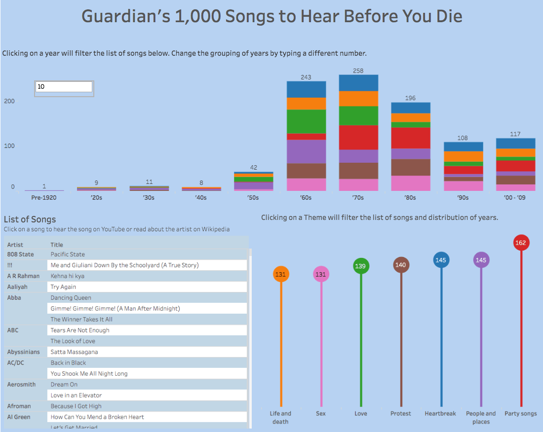
My first music visualization showcasing The Guardian’s list of the “Top 1000 songs to Listen to Before you Die.” See the interactive version here.
Tracking the data behind my own music habits
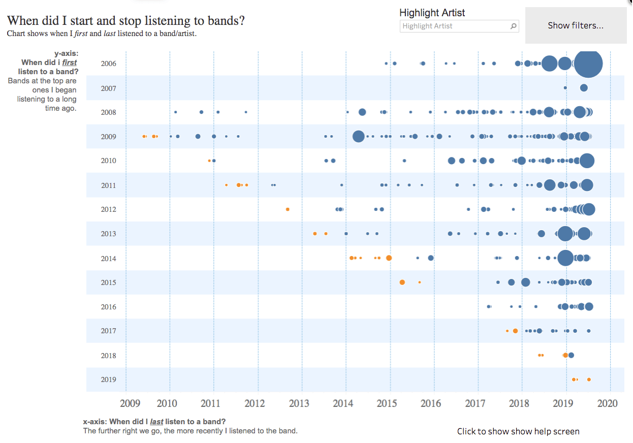
Riding the wave of my 1000 Songs visualization, I started looking for more angles to do music analysis. I came across some of Andy Cotgreave’s visualizations about his listening habits. I was blown away when I saw that there's an automated way to track your listening trends for every song. This is still one of my favorite visualizations to explore.
This inspired me to start tracking my listening history and eventually made a viz in that same spirit...
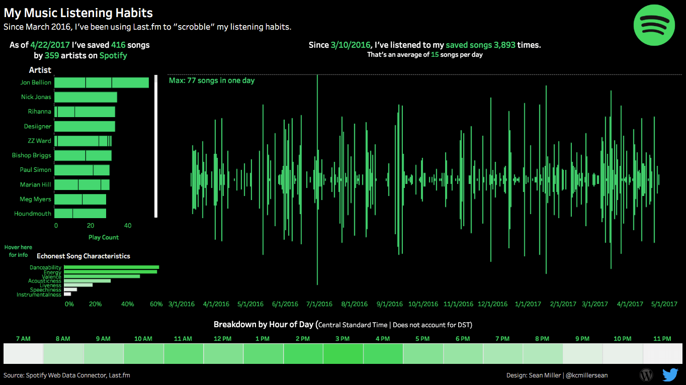
My own listening habits, inspired by Andy Cotgreave's viz (shown above). See the interactive version here.
Data + Music inspiration from the Tableau community
There are so many other great examples of music and data analysis in the Tableau community. Here are some of my favorites.
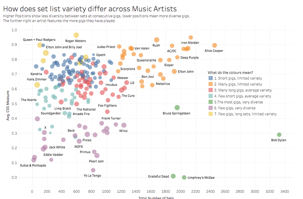
“Set List Diversity” by Rob Radburn and Chris Love
Tableau Zen Masters Rob Radburn and Chris Love partnered on a couple of different music-focused analyses. In this one, they analyze the live performance setlists of several prominent performing artists to see if they are “trotting out the same old setlists gig after gig.” This visualization really had me reminiscing about all of the concerts I’ve attended over the years.
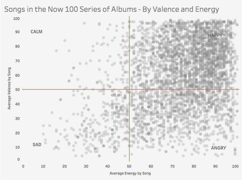
“Songs in the Now 100 Series of Albums by Valence and Energy” by Rob Radburn and Chris Love
This is another fun visualization by Rob and Chris. They analyze the composition of 100 records of “Now! That’s What I call Music” to see how it has changed through the years. I don’t know about you but I love a good compilation record! And Now! is the gold standard to which all others aspire to. Some really cool analysis in this one.
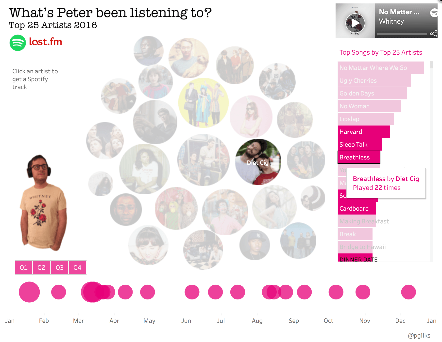
“What’s Peter been listening to?” by Peter Gilk
Peter Gilk put together this quirky, insightful quantified self viz on his listening habits. I love the artist bubbles and commentary on his listening habits. I really enjoy hovering on an artist and seeing if Peter’s been listening to this artist for a while or if this is a newly discovered performer. Also, being able to see if he listens to particular songs on repeat or if his habits are more diverse. Lastly, I enjoyed seeing how diverse his listening habits are. Going from Miles Davis to Mos Def is quite the leap.
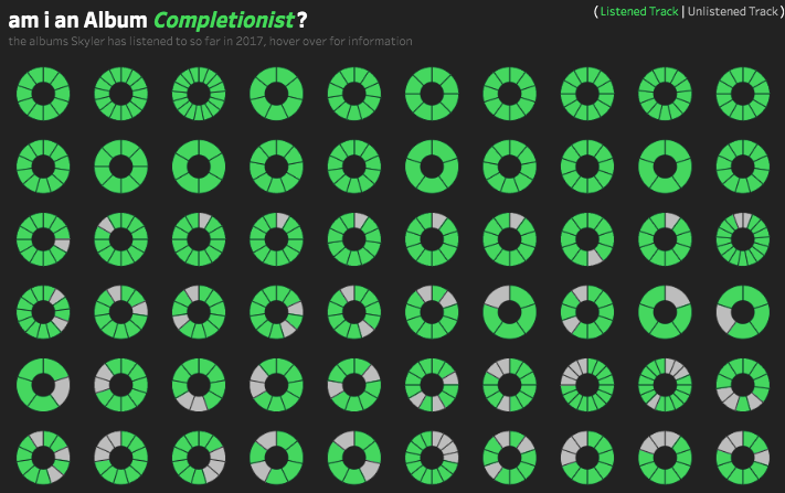
“Album Completionist?” by Skyler Johnson
I grew up during a time when there weren’t any streaming services so I saved my money to buy physical CDs. I spent a lot of time at Best Buy, Camelot Music, and Sam Goody amassing up to 350+ CDs at my peak. And back then, I forced myself to listen to the full album regardless of how many songs I actually liked. Fast forward 15-20 years when Skyler published this viz, I was immediately sent back to that time and thought about my own listening habits and how they’ve changed. Check out this webinar to learn how to connect to your own Spotify data.
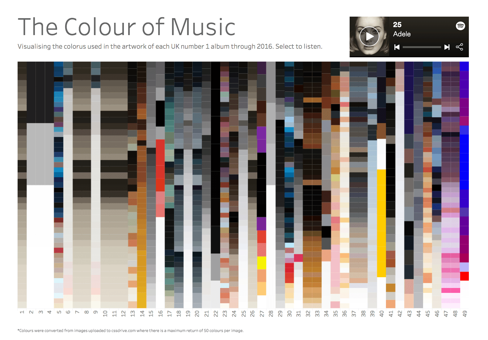
“The Colour of Music” by Ben Moss
Ben looked at the album cover art of 50 of the most popular music albums. This viz does a great job of leaving you asking more questions as you go through the mosaic. I found it very interesting that the majority of albums use darker colors (like grays and blacks) and just a handful of albums have colors on the brighter end of the spectrum. I can’t help but wonder what the connection is between color and emotion in context of popularity.
More inspiration from across the web
Spotify’s “This Is” playlists: the ultimate song analysis for 50 mainstream artists by James Le
Unsurprisingly, the Tableau community is not the only analytics community interested in music data. The Medium channel Towards Data Science currently has well over 150 different articles regarding music and analytics. This article by James Le dives into an analysis using the Spotify API. James analyzed song attributes for several mainstream performers to see how they compare to each other. I like how he used clustering to group these performers into groups and then analyzed each group.
The Data Science of K-Pop: Understanding BTS through data and A.I. by Haebichan Jung
The author here goes through analysis of popular K-Pop group, BTS to evaluate song attribute characteristics of their music and uses it to do some machine learning in an attempt to have a computer determine if a particular song was a K-Pop song and further, a BTS song.
Rhapsody in Grey: Using Brain Wave Data to Convert a Seizure to Song by DataDrivenDJ
For those of you who are ready to take several leaps forward, there are programmers like Brian Foo who writes at DataDrivenDJ, where he combines music, algorithms and borrowed sounds to explore and experiment with the concept of data sonification. He makes music out of data. I highly encourage you to check out his website and explore some of his projects. I particularly enjoyed how he used EEG brain waves of an epileptic person during a seizure to make music.
As you can see, the only limit to what you can visualize with music data is your imagination. All summer, Tableau will be highlighting and showcasing the connection between music and data. Check out all the amazing vizzes Data + Music gallery on Tableau Public. I encourage you to create a music viz or share your favorite music viz with #DataPlusMusic.
관련 스토리
Subscribe to our blog
받은 편지함에서 최신 Tableau 업데이트를 받으십시오.


