Visualizing COVID-19: A discussion on the “flatten the curve” visualization and responsible data use
Editor’s note: Since published, we’ve updated the data source to make sure everyone has uninterrupted access to the latest data. Learn more about the latest data source.
Each month, Steve Wexler, Jeff Shaffer, Amanda Makulec and I get together to discuss the latest ups and downs of data visualization in Chart Chat.
This month, we focused solely on the role of data in tackling COVID-19 including:
- The history of the highly-publicized “flatten the curve” visualization
- How the data might ebb and flow in the coming weeks and months
- How to take a responsible approach to data and analytics during this time
In this post, we’ll cover these three topics, along with links for further reading. Watch the full Chart Chat to learn more.
The history of “flatten the curve”

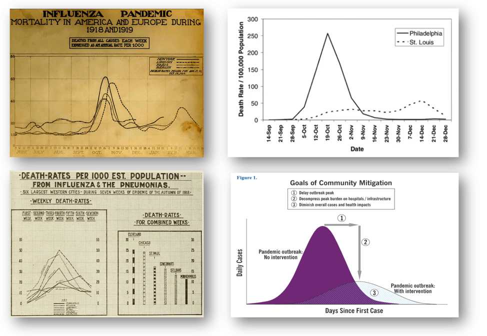
(Image: courtesy of the National Museum of Health and Medicine)
Jeff looked back at the 1918 Influenza Outbreak for parallels in how data informed and controlled that pandemic. The charts from 100 years ago largely looked the same as today’s charts—the noticeable difference being that they were being hand-drawn on graph paper.
Jeff also dug into the history of the “flatten the curve” chart, the visualization that has become the poster child visualization of this pandemic. The chart’s history goes back to around 2007. A paper from Proceedings of the National Academy of Sciences used a curve chart to show how municipal responses from St. Louis and Philadelphia had radically different effects on the spread of the virus. In the same year, the CDC published a paper on pandemic strategy planning that contained what was possibly the original “flatten the curve” chart.
Here are links to the charts and articles that Jeff shared in the chat:
- Death rates from influenza Sept. to Nov. 1918. Monthly Bulletin of the Department of Health, December 1918, NYC Municipal Library.
- Excess Mortality in U.S. Cities During Influenza Epidemic, 1918-19. National Museum of Health Otis Historical Archives via the Center for Disease Control.
- Pandemic Influenza: The Inside Story. February 2006.
- Public health interventions and epidemic intensity during the 1918 influenza pandemic. February 2007.
- Interim Pre-pandemic Planning Guidance: Community Strategy for Pandemic Influenza Mitigation in the United States. February 2007.
- Community Mitigation Guidelines to Prevent Pandemic Influenza. CDC Mitigation Guidelines. February 2017.
What “flattening the curve” will really look like

Amanda then discussed what the curve will really look like as countries adapt their testing and mitigation strategies. She described how the curve chart is helping bridge the gap between those people who work with data every data and those with little to no data knowledge.
One amazing example is the animated model of “simulitis” by Harry Stevens on The Washington Post. This is the most viewed article on WaPo’s online site, ever. It’s marriage of animation, text, and charts is an effective way to explain a complex concept to lay people.
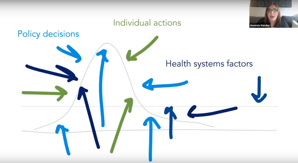
Amanda used George Box’s quote “all models are wrong, but some are useful” to describe how we all need to understand that the curve is likely to move in ways we may not be able to predict. The reality of the coming weeks and months will not be as smooth. Social distancing will push the peak further out. More testing will reveal more cases and push the curve upwards. The curve won’t even be smooth. There may well be multiple waves.
Here are the links Amanda that shared:
Worthwhile background reading and watching:
- Find the explainer video on case fatality rate and R0 for COVID-19 on the CFR Wikipedia page
- Ten Considerations before you Create another Chart about COVID-19 (Tableau link)
- A Data Designer’s Responsibility during a Global Crisis (DESK Magazine)
Modeling COVID-19:
- Modeling COVID-19 Spread vs Health Care Capacity (RShiny app from Dr. Alison Hill)
- Impact of Non-pharmaceutical interventions (NPIs) to reduce COVID-19 mortality and healthcare demand (Imperial College, with US and UK outcomes)
- New: Modeling from IHME on COVID-19 and Health Care Capacity by US State
Visualizations we discussed:
- Daily Coronavirus Updates, including the daily charts of cases and deaths on a log scale from John Burn-Murdoch (Financial Times)
- Why outbreaks like coronavirus spread exponentially and how to “flatten the curve” (Washington Post)
- The Korean Clusters (Reuters)
- Severe Outcomes Among Patients with Coronavirus Disease 2019 (COVID-19) – United States, February 12-March 16, 2020 (CDC)
How a chart becomes a story

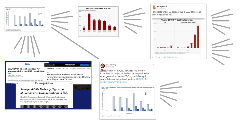
In my section, I looked at how a chart itself can become a virus: starting in an academic setting, in this case with the CDC’s March 18th report on the outcomes of 4,226 COVID-19 cases in the US, and evolving into a variety of angles from news sources, and then onto social media.
I showed how unequal age bands and a large amount of missing data were easy traps and might confuse people reading quickly and looking for something to share on social media. These traps don’t make this a bad chart: the CDC was visualizing the data that they have available. My takeaway? In normal times, we always warn people to take extra care to understand the underlying data and to read a chart before sharing. In these times of crisis, it is even more important to take extreme care when making any conclusion from a chart you see.
Here are the links we discussed:
- See the original chart in these reports from the CDC
- Younger Adults Make Up Big Portion of Coronavirus Hospitalizations in U.S., New York Times
- Younger adults are large percentage of coronavirus hospitalizations in United States, according to new CDC data, The Washington Post
To help further understanding of the rapidly evolving COVID-19 situation, Tableau has developed a free data resource hub with connections to data from Johns Hopkins and jump-start visualizations to support analysis. Access the hub here.
관련 스토리
Subscribe to our blog
받은 편지함에서 최신 Tableau 업데이트를 받으십시오.


