Hospital Charge Data: More Than Meets the Eye
This is a guest post by Kathy Rowell at HealthDataViz. Kathy and her team of healthcare experts help organizations align systems, design reports, and develop staff to communicate healthcare data clearly.
I have watched with great interest as the U.S. Center for Medicare and Medicaid Services (CMS) has made hospital charge data available to the public, and different groups have begun reporting on it. I imagine that many of you share my core feeling about this topic (one that I have long held, and that the publication of this data changed not at all): hospital charges do not reflect the true cost of delivering care. Displaying what these institutions charge without adequate explanation and context is therefore deeply misleading.
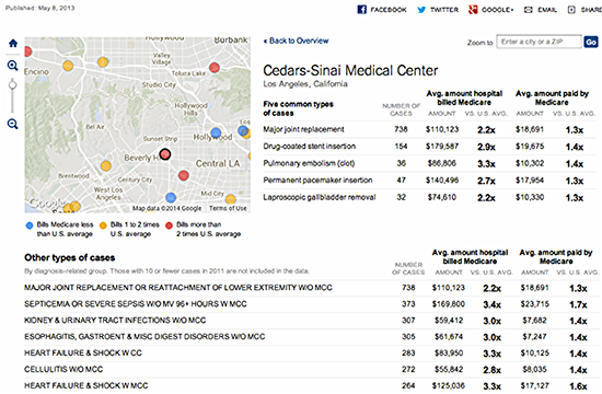
Here is one display of the data from a New York Times visualization that made me- and many hospital CEOs and CFOs- very uncomfortable: "
"
Click image to explore this visualization
This graphic showing only Medicare charge and reimbursement data for US hospitals displays the following information:
• The five most common types of procedures performed by a particular hospital
• What the hospital charges for these procedures
• How those charges in each case compare to the average of all other US hospitals for the same procedure
• How much Medicare reimburses the hospital for the types of procedures selected
• How that payment compares to those to other U.S. hospitals
Data displays like this one have elicited comments and re-design suggestions, such as comparing teaching hospitals only to other teaching hospitals, since their charge and reimbursement structure includes the cost of training physicians.
Additionally, there are factors crucial to correctly interpreting Medicare charges and payments: geographic location of respondents (urban v. rural), for example; and patient acuity, among others. These factors can and should be explained more fully in the displays—as should an even more central piece of information often left out: the hospital’s payor mix. Aside from Medicare, who is paying the bills and how much is being spent?
Here’s what I’m getting at: most of us who work in the system often dismiss hospital charges as a false construct, one that isn't based in any way on what it really costs to deliver care. We view these charges through the lens of cost-shifting – the process by which hospitals inflate their charges in order to capture higher reimbursement from private payors to make up for the reimbursement shortfalls in public ones, such as Medicare and Medicaid.
The Hospital Executive’s Complex View of All Payor Data

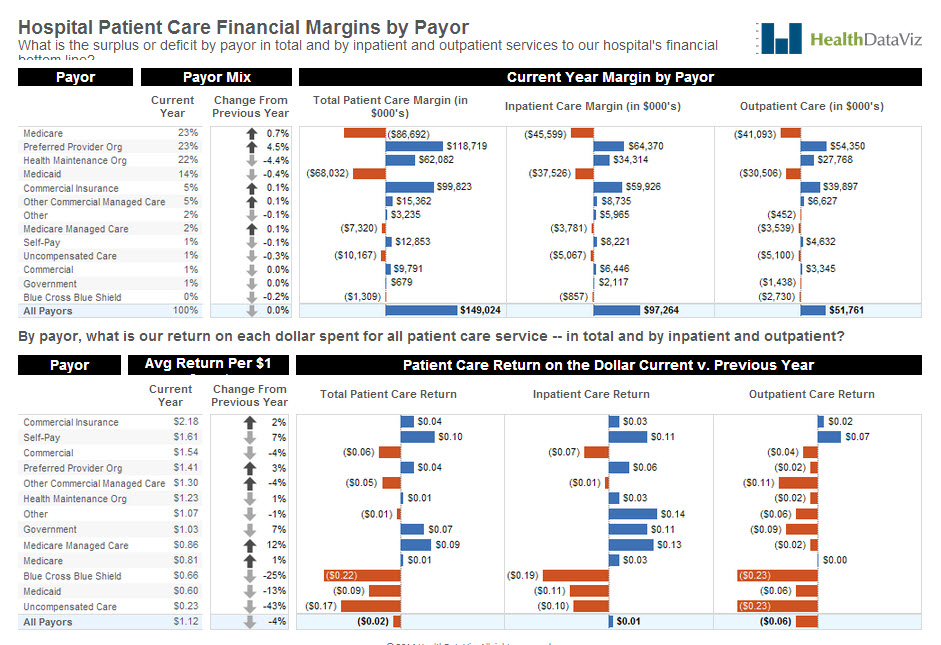
Click image to explore this visualization
On the top half of the page, we have displayed our example hospital’s payor mix (the variety of institutions and organizations that pay for services), followed by a figure representing how much each payor type’s percentage of the total has increased or decreased from the previous year.
We used shades of gray on the arrow icons instead of brighter colors like red and green, which would label the change as good or bad (an increase in Medicare, Medicaid, or uncompensated care, for example, is not an encouraging trend for a hospital).
Next we used a series of three deviation graphs to show revenue after expenses by payor for our example hospital, in total and by inpatient and outpatient care. We used orange to display a loss, blue a gain. In the second graph, we used the same layout, but broke the data down to show the return the hospital realized for each dollar spent on delivering care by payor. As you can see, there is a lot of orange, where the expenses are greater than the revenue in these graphs — especially for Medicare, Medicaid, and uncompensated care.
The Future of Charge and Payment Data Displays for the Average Consumer
Now, our display is all well and good for a hospital executive or policy wonk trying to understand how his margins are by payor, but it is not of much help to average consumers(especially those with large insurance deductibles) trying to figure out what they might be paying to receive care. Enter PricingHealthcare.com and the Healthcare Bluebook.
Check out the following two displays from these groups:

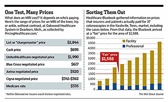
The table on the left by PricingHealthcare.com lays it out pretty clearly: here is what is what the hospital charges for an MRI of the knee, hip, or ankle without contrast; here’s the list of negotiated fees by payor, and the cash price (for patients paying out of pocket). What concerns me, though, is hidden in a footnote (keep an eye on that fine print!) that says that neither Oakwood nor insurers would disclose negotiated rates. (You don’t say!).
A quick review of the site leads me to believe that some, if not all, of the private payor data is
reported by consumers: “we've made it easy for patients to enter data from their medical bills,
anonymously and securely, while helping them track and analyze their bills as part of their
personal health record.”
An interesting idea, but given the extensive number of contracts and the different types of
care that patients require I am cautious (okay, downright skeptical) about the reliability of this
information. All the same, the idea certainly has merit.
The Healthcare Bluebook graph on the right shows the data in a different way, displaying the
facility and professional (doctor’s) fees paid by patients and insurers for 37 colonoscopies in or
around Nashville, TN. They display the “Fair” price for the service—one based on Healthcare
Bluebook's recommended price for a service based on the typical fee that providers in the area
accept as payment from insurance companies. I can also see from a quick look at its site that it
captures private insurance information in the same manner as PricingHealthcare.com–directly
from patients.
Okay, so here is the bottom line – we need to make healthcare data transparent and available
to all of the stakeholders in the system. And while it is true that the payment system is complex,
and not all of the data is easy to find, understand, grasp, or respond to, the day of reckoning is
finally here and change can no longer be postponed. I for one am looking forward to the
challenge of guiding this evolution in accurate, effective data display.
Subscribe to our blog
Tableau の最新情報をメールでお知らせします


