Tips on Using the New Device Designer in Tableau Public 10
My, how fast technology has moved. We’ve gone from mobile-optimized to mobile-first. With Tableau Public 10, we’re bringing our data as our +1 to the mobile party.
So how do you make the best data visualizations for any device? Let me introduce you to device designer. With this feature, you can create specific, curated experiences for each device. Here’s how to use device designer to make your viz shine on any device.
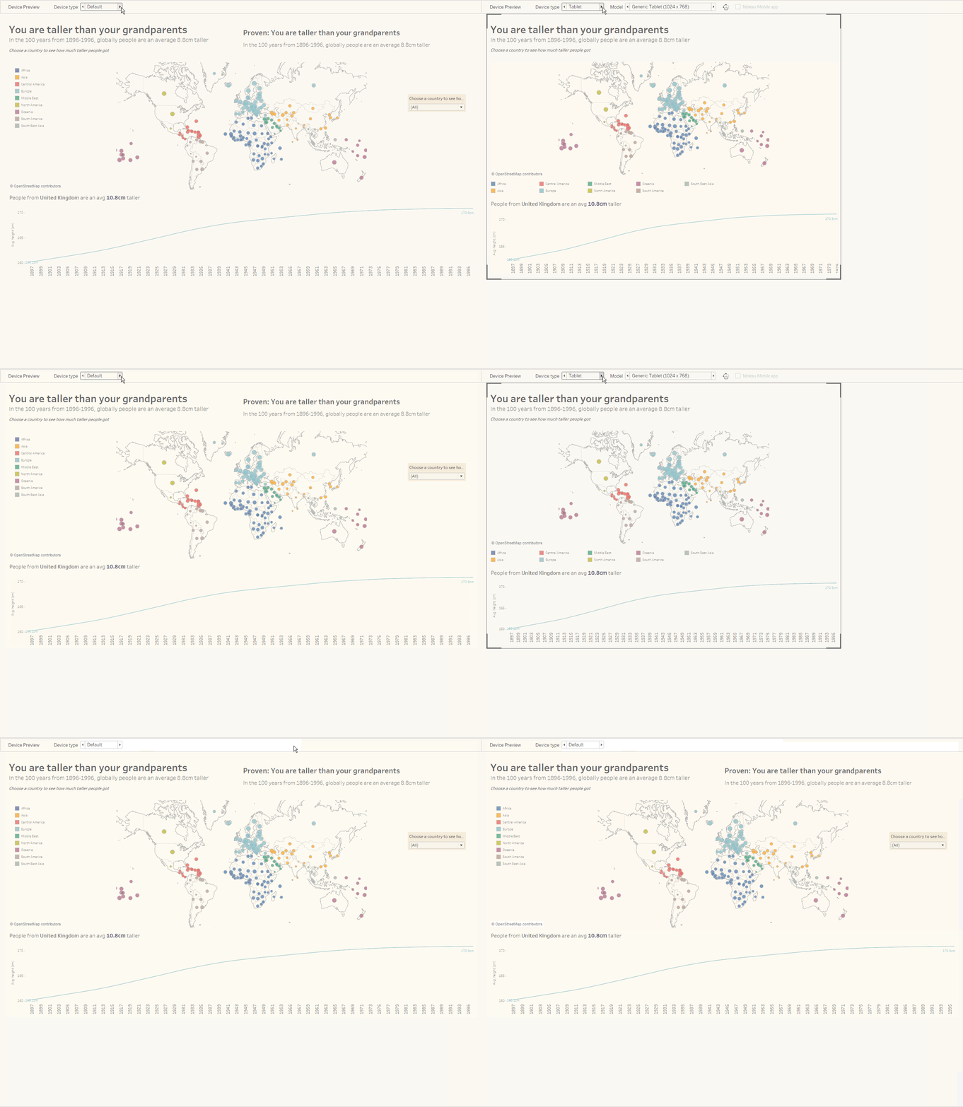
Device Designer: letting you build different views for different devices
Using Device Designer
Device Preview
So you’ve made your viz, but you want to know how it will look like across various devices. You can check out all views without leaving Tableau Desktop with the new “show preview” button.
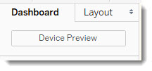
use 'Preview' to open up the device preview pane
Once you click, you’ll see a black outline. It represents what a user will see on any given device, given the size you picked for your dashboard. Use the options at the top to toggle between desktop, tablet, phone, and various examples of each device. You can even swap the screen orientation for mobile devices.
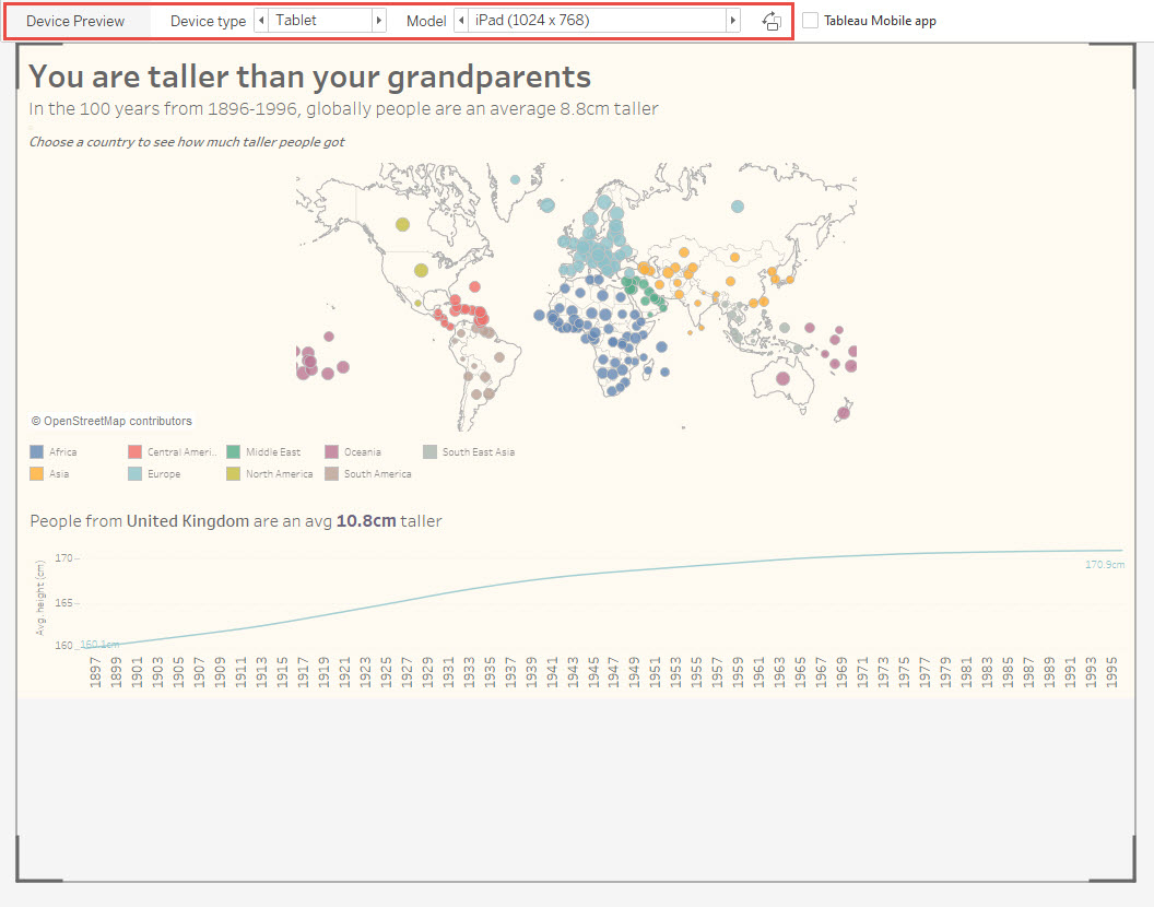
You can preview different device types, and different device models in the Preview pane
If you’re using “auto” or “range” sizing, you’ll see your viz shrinks to fit on a smaller screen size.
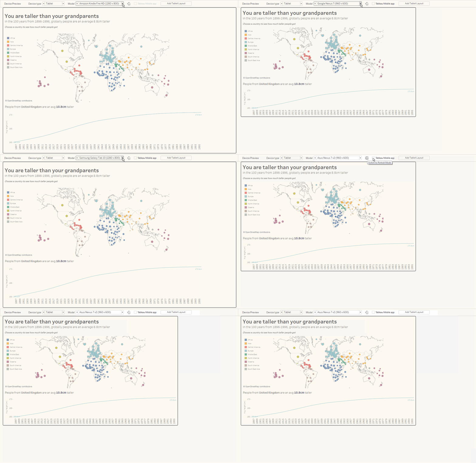
Range sizing lets your viz 'shrink' and 'expand' within a size range
If you’re using a fixed dashboard size, you’ll see if only a portion of your viz will show on a smaller screen.
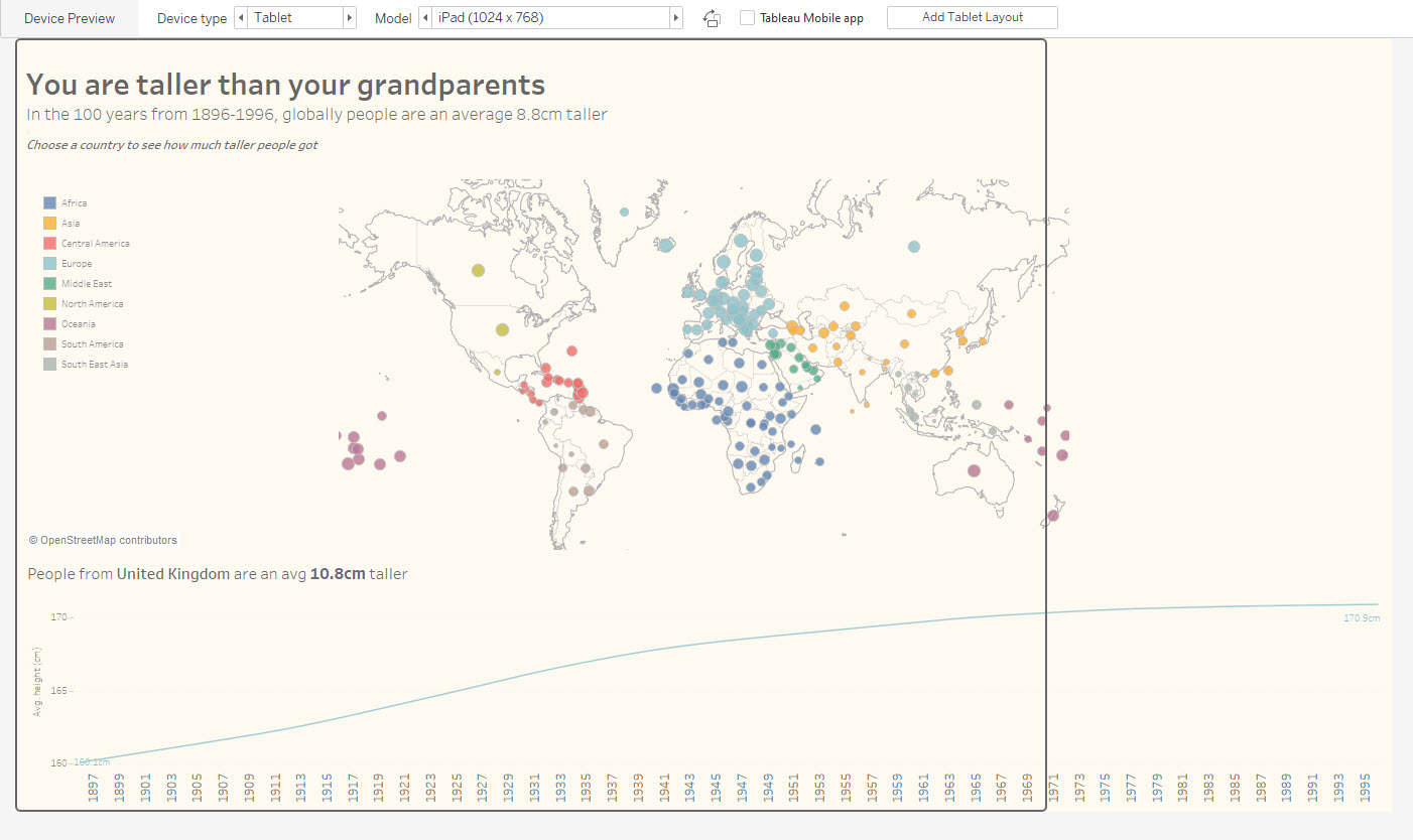
You can only see part of this 'Fixed' size dashboard on an iPad
So what do we do with this viz? If we make it ranged or automatic, it’s not going to look very good on a phone; all the text and charts will be very scrunched up. That’s where the next part comes in.
Default Dashboard
The default-dashboard layout is like a master dashboard. It’s your original, and it does not change even if you start making other device layouts. Don’t forget this.
If you haven’t made a device-specific view for a particular device, people using that device will see the default dashboard. For example, say only you create a phone view of your viz. If someone views your viz on a tablet or desktop, that person will see the default dashboard.
There are two ways you can use your default dashboard:
1. As Your Desktop/Tablet View
If you only want to create a separate phone view, then your default dashboard will be seen on desktops and tablets. This means you’ll want to design your default dashboard to look great on desktop and tablet views.
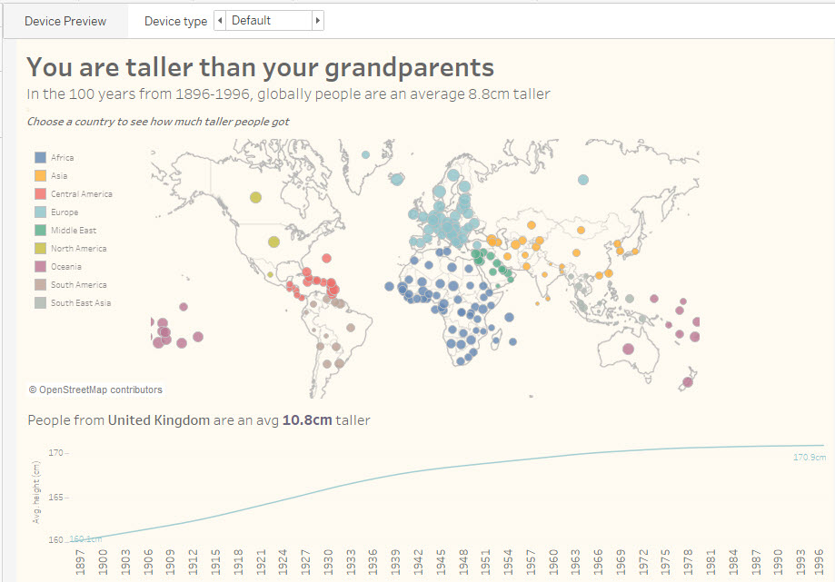
This Default Dashboard designed at 900x600px looks great on Tablet and Desktop
2. As a Holding Station
If you want to create very different layouts for mobile, tablet, and desktop, then you can use the default dashboard as a place to hold all the different elements that you want on each of these different views. You can see in the default dashboard below that there are two different titles (one for the desktop and tablet views, and one for the mobile view), and also a filter that will only appear in the phone view. This makes for a messy-looking default dashboard, so I need to make sure I build versions for all three available device views.
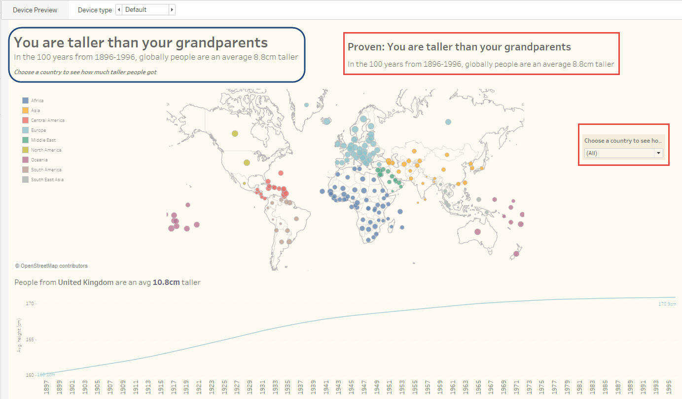
This Default Dashboard is a 'holding' place for all the different elements I want to use on each device
Adding Views
First, click “show preview.” While you’re in this preview mode, a new button shows up on the upper right: “add layout.” Clicking it will add a new dashboard layout for the device you are currently previewing (e.g. the tablet preview will create a tablet layout, and a phone preview will create a phone layout).
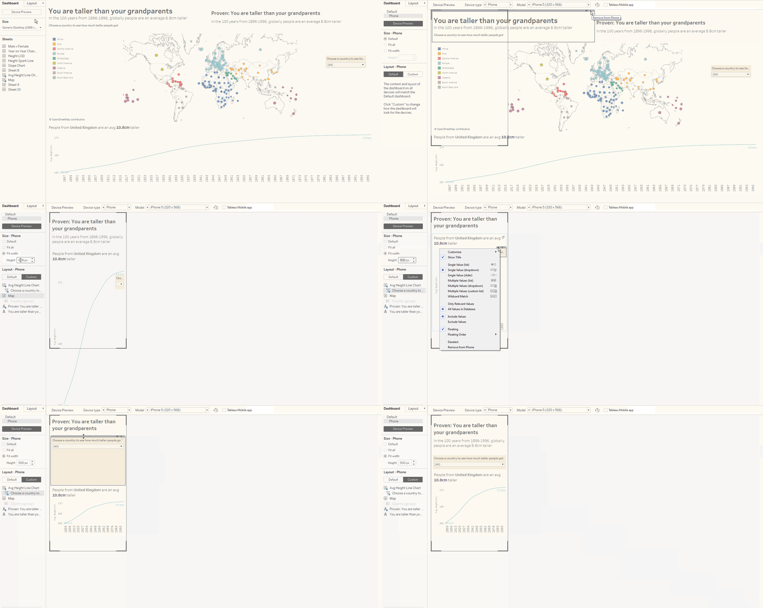
Add a device layout, and then make it look good!
It’s important to note that nothing about the dashboard has changed yet; the phone layout sits underneath the default dashboard.
You can create up to three separate device layouts: desktop, tablet, and phone. These are in addition to the default dashboard.
Default, Fit All, or Fit Width?
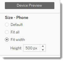
Device designer includes three sizing options: default, fit all, and fit width.
What fit size should you use?
- Default fit applies the same sizing rules as the default dashboard. Using default fit will ignore any fit/sizing changes you have on your tablet/phone layout
- Fit all automatically fits dashboard objects to the height and width of the device. While this sounds great, mobile devices come in many sizes, and using the fit-all option means you have less control over how your viz will look across them all
- Fit width is our preferred option. It automatically fits your viz to the device width and a set height. This means you have maximum control over how your viz will look on any-sized mobile device. With fit width, you need to set a height. If a viewer is looking at your viz on a screen that’s smaller than the one you used to design it, the viewer will be able to scroll vertically down your dashboard.
You’ll see in the gif above that I used the fit width option and set the height at 500 pixels.
Mobile Design Tips
Designing for mobile devices can be challenging, so here are some of our top mobile design tips.
- Design mobile-first: It’s much easier to avoid object overload (a cluttered dashboard) if you first design the phone view of your viz. You can then add extra context to larger tablet and desktop views.
- Design phone views for vertical scrolls:
- People hold their phone’s vertically over 95% of the time, so design your viz to look good vertically.
- If you are designing for tablets (which people rotate vertical/horizontal a lot more), then check that your viz looks ok in both planes.
- If you viz is taller than the screen size, add a little “peek” (of the next part of your viz), that disappears off the bottom of your dashboard. This lets people know they need to scroll.
- Don’t expect people to click for tooltips on mobile: Phone screens are small and people are unlikely to click on data points to see important information in the tooltips. If the information is important, use annotations or the title to call it out.
- Don’t forget about padding: Remember that the preview pane is just that—a preview. Different devices and browsers add a little “padding” to screens to give you a good viewing experience. This means you might have to give elements of your viz a little more room than you see in the device-preview panes.
To learn more about using device designer, watch the device-designer training video (it's #17), or catch a live training session. And check out our list of resources.
Have a mobile design tip of your own? Tweet it to us @tableaupublic using #TableauMobileTips to be in the drawing for some Tableau swag!
Thanks to Dan Hom, one of our brilliant Tableau Public product managers, for help with this post.
関連ストーリー
Subscribe to our blog
Tableau の最新情報をメールでお知らせします


