How to add context to Marimekko charts in Tableau
Note: The following is the last installment of a three-part series on the Marimekko chart by Tableau Zen Master Jonathan Drummey. Tableau 10 gives you precise control over the width of your bars, enabling this new chart type. If you haven't yet, first check out parts 1 and 2.
Throughout this series, we've been exploring admission rates at the University of California in Berkeley. In 1973, the overall graduate-school admission rates for men and women appeared to be biased toward men. But when looked at in more detail, the trend shifted the other direction. In four of the six largest departments, there were proportionately more women admitted than men:
Highlighting data in Marimekko charts to tell the whole story
However, the above dashboard doesn’t tell that whole story. It’s got the department breakdown, but not the overall male/female proportions. To add that, we can add a third worksheet to the dashboard that only has the male/female proportions.
In this case, I chose to place it to the right since the main point here is the department-level view. And I simply used a duplicate of the formatted Marimekko worksheet with the Department dimension removed. This broke the # of Applicants table calculation (turning the pill red) because it was addressing on the Department dimension. All I needed to do was to click that off, and this small Marimekko now works:
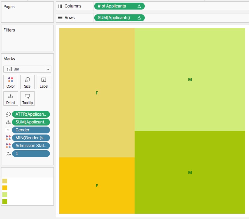
Adding that to the dashboard then becomes an exercise in adjusting everything so it’s properly placed, and adding a highlight action to link the charts. Here’s the completed dashboard:
One thing you might notice as you are interacting with the above dashboard is that when hovering over marks, Tableau surrounds them with a black border that doesn’t fit the colors of the viz. Unfortunately, we can’t control that.

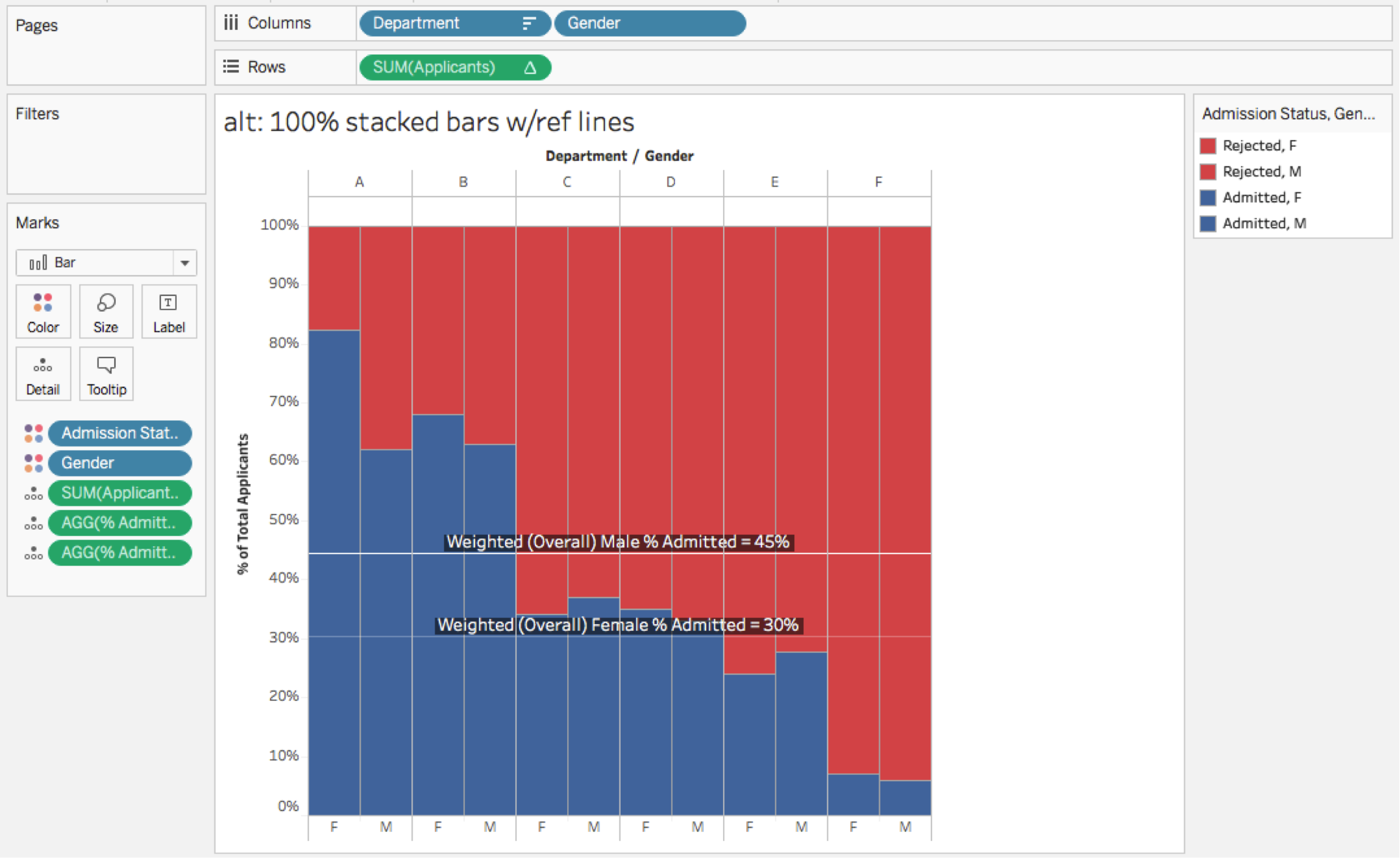
For a somewhat simpler option, you could add reference lines instead:
Reference line calculations
There are two calculations for each gender used to build the reference lines. Female Applicants has the formula:
IF [Gender] = 'Female' THEN [Applicants] END
Then % of Female Applicants has the formula:
SUM(IF [Admission Status] = 'Admitted' THEN [Female Applicants] END)/SUM([Female Applicants])
% of Female Applicants is added to the Level of Detail shelf. The calculation won’t work at the viz LOD that includes the Gender (everything will return; however, when added as a reference line with the aggregation set to total, it works because it is then computed across all the data):
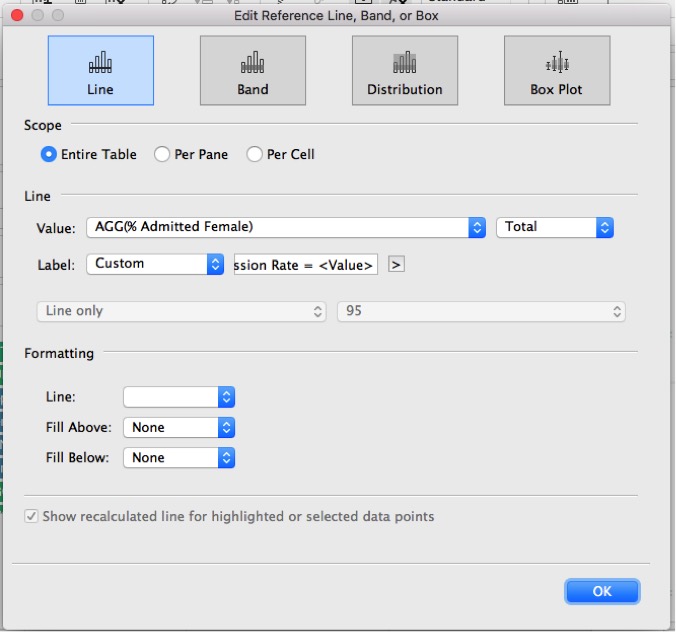
Then the process is repeated for the male reference line.
Note that if you need to edit the reference line, you can’t do it by hovering over the reference line in a full Marimekko. That's because there’s no space between any of the marks. Instead, you’ll need to access the reference line from the vertical axis or remove the pill from the Size shelf in order to create space.
Marimekko alternatives
Now, before you try to fit all your data into Marimekko charts, do read up on some valid criticism out there (here, here, here, and here). This quote from Stephen Few is particularly apt:
"In addition to realizing that it isn’t necessary to force everything into a single graph, it’s also important to realize that no single view of data will ever answer every question. This is an underappreciated fact of visual analysis."
In that light, here are some alternatives:
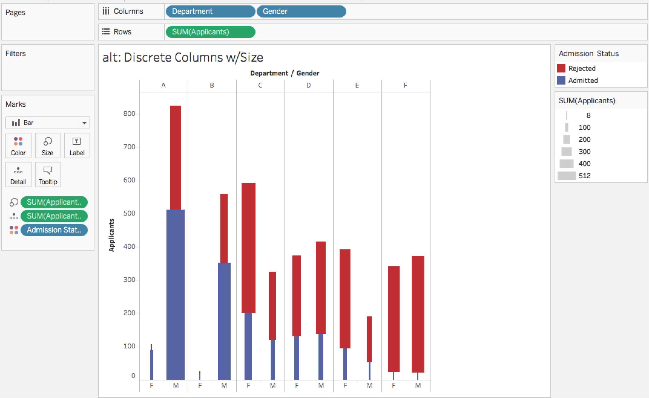
Don’t try to create a continuous x-axis and build out a full Marimekko. Instead, use discrete headers and the measure on Size. This can be a good starting place before building a Marimekko because this is entirely created via drag-and-drop:
Or make the bars 100% stacked bars in a couple more clicks using a quick table calculation (this is described in Tableau’s original Marimekko KB article):
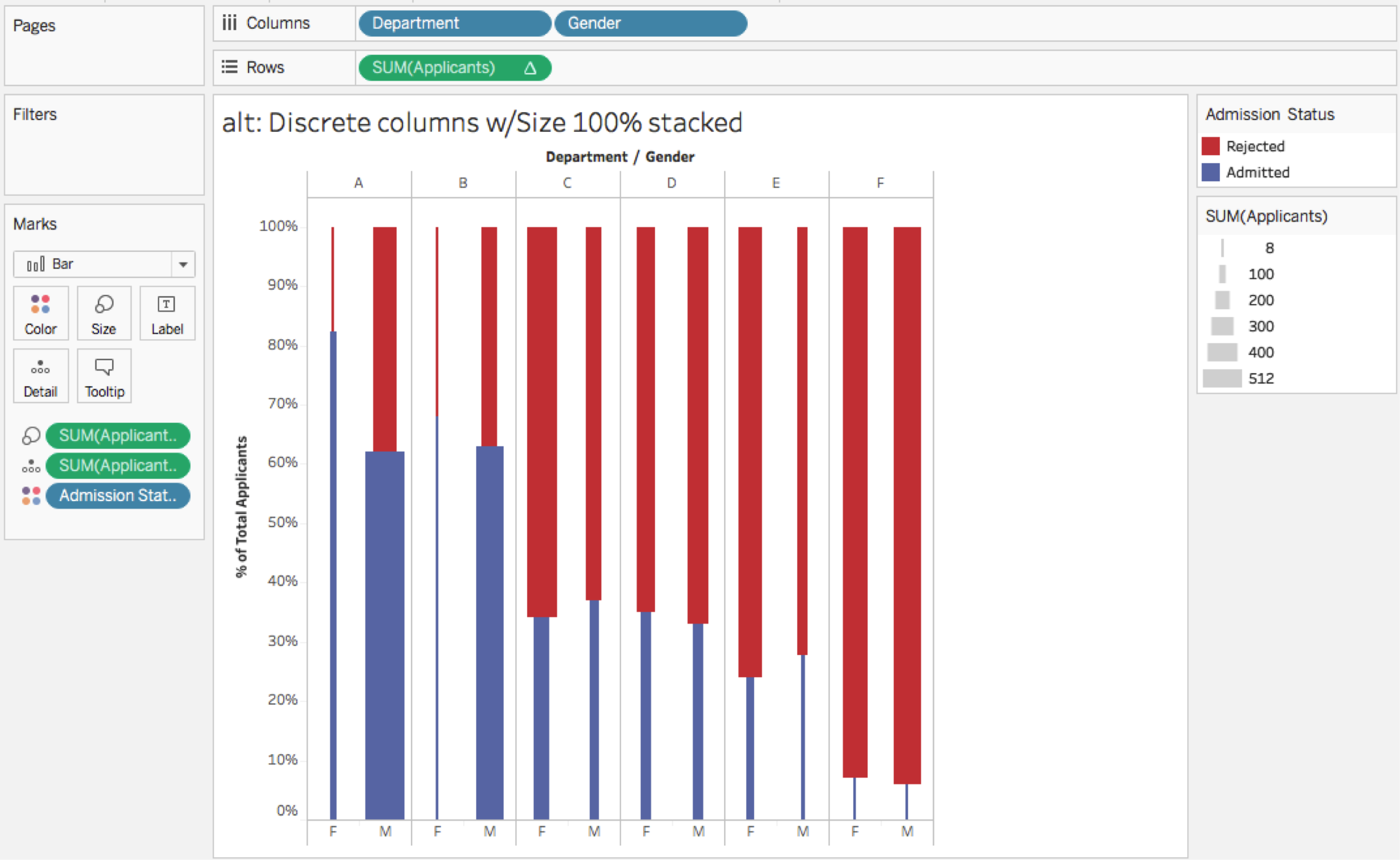
Both of the above views are very busy with the number of Applicants on the Size shelf. Another alternative that shows the effect of that variable is to avoid using the Size shelf and add properly-weighted reference lines using the calculations described above for adding reference lines to the Marimekko:
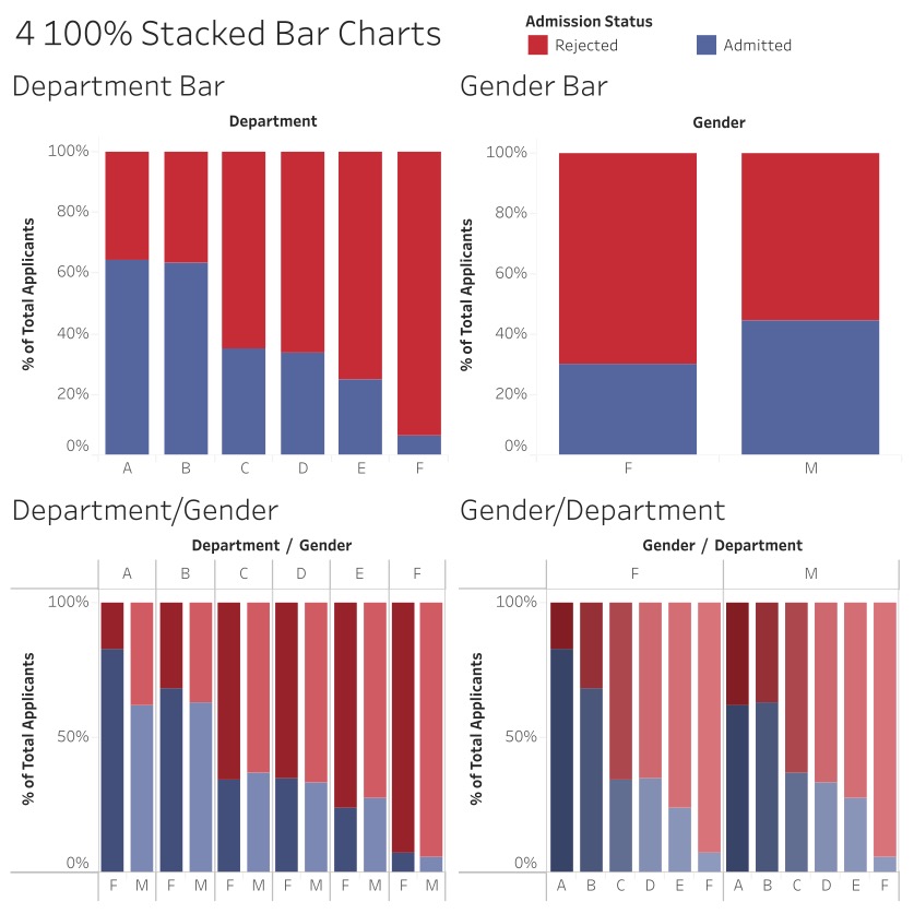
Here’s another couple of views using the four-sets-of-bars idea suggested by Stephen Few. I don’t think either quite gives the sense of proportion that the Marimekko or the above views do since this data set has the additional Admission Status dimension. But given how fast they are to build, they are certainly worth checking out:
One question that remains is: What was going on back in 1973 that made for such large differences between genders in the number of applicants per department and created Simpson’s Paradox for acceptance rates? To answer that, here’s an extended quote from the concluding summary of the original paper:
If the data are properly pooled, taking into account the autonomy of departmental decision making, thus correcting for the tendency of women to apply to graduate departments that are more difficult for applicants of either sex to enter, there is a small but statistically significant bias in favor of women. The graduate departments that are easier to enter tend to be those that require more mathematics in the undergraduate preparatory curriculum.
The bias in the aggregated data stems not from any part of discrimination on the part of admissions committees, which seem quite fair on the whole, but apparently from prior screening at earlier levels of the educational system. Women are shunted by their socialization and education toward fields of graduate study that are generally more crowded, less productive of completed degrees, and less well funded, and that frequently offer poorer professional employment prospects.
Drawing more complete conclusions
So back in 1973, women applying to UC Berkeley Graduate School tended to apply to departments that had lower acceptance rates such as in the liberal arts. Men, on the other hand, tended to apply to departments that had higher acceptance rates such as engineering and sciences that also required more mathematics.
The authors of the paper identified that bias existed in the socialization and education of the time, and as a parent of a young girl who likes mathematics, my question 43 years later is: How much have those factors truly changed?
Thanks for reading! And thanks to Bora Beran, Anya A’Hearn, and especially the Tableau dev team for the new mark-sizing and table-calculation features! Last but not least, thanks to the Marimekko company for the design inspiration.
If you’d like to build a Marimekko/mosaic plot yourself, all of the screenshots above are views in the workbook and the raw data is available as well (UCBAdmissions, UCBAdmissions by Department).
When he’s not writing Tableau tutorials, Jonathan Drummey offers Tableau consulting and training at DataBlick. He is also a Tableau Zen Master and authors the @helpmedatablick Tableau tip of the day.
Storie correlate
Subscribe to our blog
Ricevi via e-mail gli aggiornamenti di Tableau.


