Data, Diversity, and Pride: Honoring the LGBTQ+ Community on Tableau Public


At Tableau, we believe in the power of data to tell compelling stories and drive positive change. This Pride Month, we are excited to shine a spotlight on the incredible ways data visualization can celebrate diversity, promote inclusion, and amplify the voices of the LGBTQ+ community.
The Power of Data in Telling LGBTQ+ Stories
Data is more than numbers; it's a reflection of our world and our experiences. Data visualization can break down complex issues, uncover hidden stories, and foster understanding. Tableau Public provides a platform for creators to explore LGBTQ+ topics, from historical milestones to current challenges and triumphs. Explore Data Pride vizzes on Tableau Public.
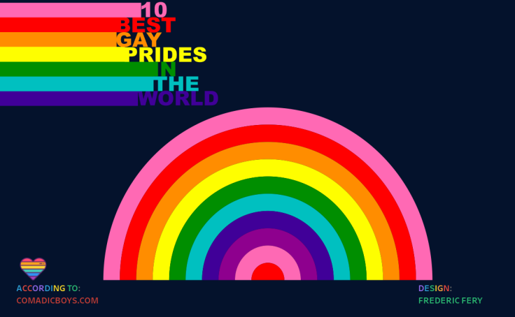
10 Best Gay Prides in the world
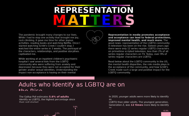
Representation Matters
Highlighting Historical Milestones
Understanding the history of the LGBTQ+ movement is crucial to appreciating the progress made and recognizing the work yet to be done. Tableau Public is home to numerous visualizations that map out pivotal moments in LGBTQ+ history. From the Stonewall Riots of 1969 to the landmark Supreme Court ruling on marriage equality in 2015, these visualizations are powerful reminders of the resilience and courage of the LGBTQ+ community.
Showcasing Diversity and Representation
Representation matters. Visualizations on Tableau Public celebrate the diversity within the LGBTQ+ community, highlighting the unique experiences of different groups. Whether examining the intersectionality of race, gender, and sexual orientation or showcasing the stories of LGBTQ+ individuals across various professions and industries, these visualizations help broaden our understanding and appreciation of the community's rich tapestry.
Addressing Contemporary Issues
Pride Month is also a time to address ongoing challenges faced by the LGBTQ+ community. Tableau Public visualizations delve into critical issues such as healthcare disparities, mental health, discrimination, and legal protections. By leveraging data to assist in the telling of these stories, we can foster informed discussions and advocate for meaningful change.
Visualizing Pride
The creativity and passion of the Tableau community continually inspires us. Here are a few standout visualizations that honor Pride Month and the LGBTQ+ community:

1. Mapping the Global State of LGBTQ+ Rights
This interactive map provides a comprehensive overview of LGBTQ+ rights around the world, highlighting countries where progress has been made and areas where advocacy is still needed.
View the viz
2. Celebrating LGBTQ+ Icons
An engaging visual tribute to notable Drag Race contestants that asks the question, “How have lip syncs changed over the seasons?”
View the viz
3. Exploring LGBTQ+ Representation in Media
This visualization examines the portrayal of LGBTQ+ characters in film, tracking trends over time and highlighting key moments of visibility.
View the viz
4. The Unequal Impact of COVID-19 on LGBTQ+ Communities of Color
While the pandemic disrupted everyone’s life, its impacts have been more severe for members of marginalized and vulnerable communities.
View the vizJoin the Conversation
We invite you to explore these visualizations and more on Tableau Public. Whether you're a data enthusiast, a member of the LGBTQ+ community, or an ally, there are countless ways to engage with and contribute to the celebration of Pride Month.
Get Involved:
- Create Your Own Visualizations: Use Tableau Public to amplify stories about the LGBTQ+ community. Share your work with the hashtag #DataPride.
- Attend the Data Pride TUG: Join this virtual Tableau User Group focused on highlighting, elevating, and bringing together the LGBTQ+ community in data & its allies.
- Support LGBTQ+ Organizations: Consider using your data skills to volunteer for LGBTQ+ nonprofits, helping them visualize their impact and reach wider audiences.
- Join a Pride-focused Tableau Community Project: Visualize You Are Loved Billboards or the Gay Games with Back 2 Viz Basics, Pride Flags and Pride Parades or LGBTQ+ Representation in Film with Diversity in Data, or LGBT Identification in the U.S. with Makeover Monday.
Be a Data Pride Ally
Pride Month is a time to celebrate love, diversity, and the ongoing fight for equality. At Tableau, we're proud to support the LGBTQ+ community and amplify its stories through the power of data visualization. Together, let's create a world where everyone can see themselves reflected in the data and feel empowered to make a difference.
Happy Pride today and every day from all of us at Tableau! 🌈
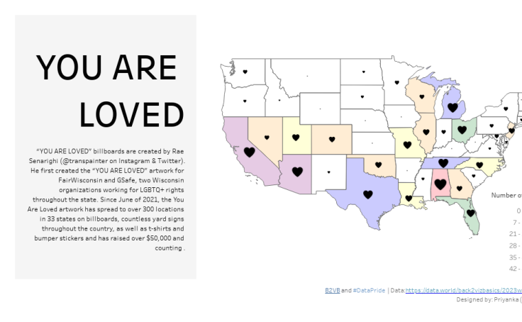
You Are Loved
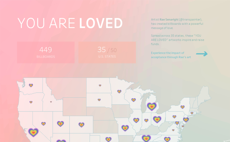
You Are Loved | #DataPride - Back 2 Viz Basics
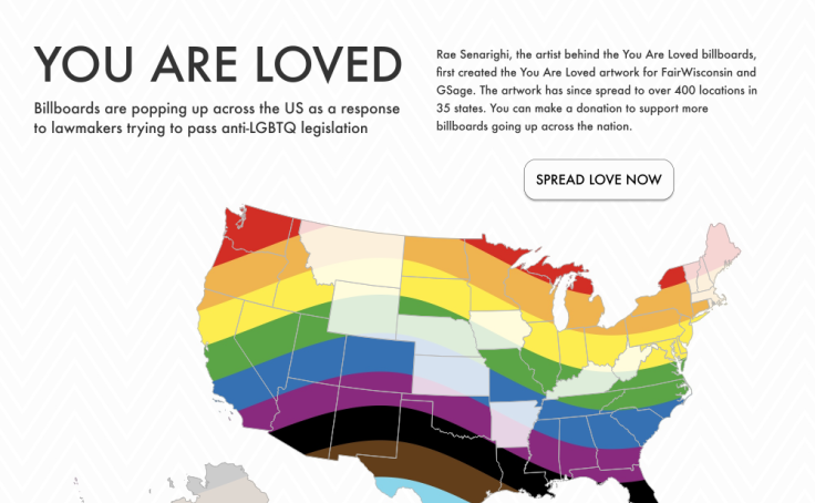
You Are Loved #B2VB 2023.11
Storie correlate

DataFam Roundup: March 24-28, 2025

DataFam Roundup: March 10-14, 2025

Iron Viz: Student Edition 2025 Top 3 Visualizations
 14 Marzo, 2025
Subscribe to our blog
Ricevi via e-mail gli aggiornamenti di Tableau.