How to successfully deploy self‑service analytics and drive results
5 best practices for a successful retail data strategy
Leading retailers are blazing a path toward better insights with a new, modern approach to data — self-service analytics. This approach allows business people to ask and answer their own day-to-day questions, and find faster avenues to bring new ideas to the market. This new methodology, where IT manages data governance, ultimately frees IT from the antiquated reporting queue and simultaneously allows them to focus on other mission-critical projects.
In the report Growth Strategies: Chasing the Consumer With Technology, Retail Systems Research found that retail "winners" are more likely to utilize data visualization for both structured and unstructured analytics: "A majority of winners also seek to operationalize predictive analytics with [a] visual presentation of data, apparently in a bid to make the results of predictive analytics available to operators in the selling environment."
Finding success in self-service analytics requires overcoming the data silos and the entrenched, static reporting practices that plague most retailers. The fact is, businesses can no longer thrive while working with different siloed data sets that don't translate effectively between departments including Marketing, Merchandising, Supply Chain, Supply Chain, Store Operations and e-Commerce.
Analytics teams must develop new skills to drive business engagement, such as storytelling, scenario building and rapid prototyping.
Gartner sees similar obstacles: “In numerous client interactions, Gartner found that analytics and BI teams struggle to engage with their business end users who, in turn, are frustrated by not getting their desired levels of service and engagement. The analytics department must develop new skills to drive business engagement such as storytelling, scenario building and rapid prototyping to communicate the business relevance of their insights,” according to Analytics and Business Intelligence Modernization Primer for 2017.
Building a self-service environment
To remain competitive, retailers must create a road map toward an analytics approach that enables line-of-business managers to quickly grasp trends that drive the business forward. To achieve that goal, it's important that retailers embrace the five key components of a successful self-service analytics strategy.
Click to expand and view each section below
1. Launch prototypes to drive a quick test-and-learn culture
Speed to market matters. To achieve a dynamic self-service analytics culture, retailers need to quickly place useful tools into the hands of every employee. But building those tools has traditionally been a lengthy, and not always successful, process.
The traditional approach to reporting, where IT and business leaders meet to define requirements and then translate the many data feeds into a process or platform, is painful and time consuming.
IT often can spend six or more months trying to transform the business needs into a usable report. Only then do business users get a chance to use and understand how the analysis works — and inevitably will discover additional needs and gaps. The reality is, people often can't articulate what they want until they see it, or they are conditioned to ask only for things they think IT can deliver.
Rapid prototyping avoids those pitfalls. In addition to IT and business users, this faster process also includes analysts, who add knowledge and business context to the conversation about tool capabilities and underlying data models. Instead of attempting a complete list of requirements, the group members start with the business problem; then they collaborate to develop a prototype of data visualization on the spot, test it in a sandboxed environment, and immediately discover what works and what needs tweaking.
Rapid prototyping includes analytics, as well as IT and business users, who add knowledge and business context to the conversation about improving business outcomes.
This is called the Cycle of Visual Analysis. At any point, the group may skip steps, back up, seek additional data or even start over. IT, retailers and analysts are free to be creative, iterating on what they develop. The result is a product that solves the real business problem, constructed in the way the business wants to use it. The discussion is far richer, and the end result — a purpose built visual analysis that solves business problems — has far fewer defects.
Rapid prototyping is a critical part of a self-service analytics culture, because it ensures tools are user-ready and focused on delivering real business value. According to Gartner's Analytics and Business Intelligence Modernization Primer for 2017 report, “By focusing on business value, analytics leaders can prioritize actions and investments that facilitate moving analytics into key business domains.”
2. Create a unified data language around training, security, and data preparation
Another key component of a self-service analytics strategy is a unified data language that's more than just master data management. It means the organization has come together to establish consistency across definitions, format and governance, and reach consensus on the value and importance of data.
Too often, departments in a data project are brought in only when their skills are needed, without a chance to see the big picture. Those tasked with data security, for example, often are consulted only at the end to bless or deny data use in a specific application. When these security analysts are provided with the broader business context up front, they have far more opportunities to act proactively instead of retroactively. For example, if customers are having difficulty logging into an app, their issues could be resolved quickly and more effectively if the app is able to better authenticate the user with personally identifiable data. With that customer experience information in hand, a security analyst can more easily make the correct decision to allow or deny the use of personally identifiable information.
Establishing a unified data language gets everyone in the organization on the same page so collaboration can focus on advancement, not resolving discrepancies.
Retailers also need to establish consistent metrics and definitions. This means resolving differences across systems and parts of the greater organization — such as a new acquisition — so there is a universal definition of what data is needed, and how it is labeled and used. For example, how do we report sales – gross sales, net sales, sales less refunds?
Establishing a unified data language gets everyone in the organization on the same page so collaboration can focus on advancement, not resolving discrepancies. This language also must be a part of training for existing and new users, so everyone can get up to speed quicker.
3. Use data blending to achieve a unified brand message
Most retailers run a tangle of siloed legacy systems that were implemented for various disjointed projects. As a result, many retailers face challenges in bringing data together to support decision-making. Unfortunately, unifying data has not been a high priority simply because the value proposition isn't clear to retail leaders.
Too often, retailers ignore data and reporting until the end of a project. They create something specific to the new application, but fail to see the value in connecting that data to other systems. For example, they may not see e-Commerce as linked to store operations. But in a unified commerce world, store associates directly impact e-Commerce sales, and this role must be measured, studied and rewarded so retailers can understand and drive this revenue opportunity.
Promotional analysis is another area of intense focus for retailers, and multiple areas of the organization need to be on the same page from merchandisers, marketers, supply chain, e-Commerce teams, and store operations if brick and mortar. In the visual analysis below, one can quickly see the category, subcategory, or brand of promoted items and instantly see the promotion impact. Users can also see the corresponding products. We can also see the sales volume changes, price points pre-promotion and during the promotion, current inventory levels and trends and a measure of availability. This is a great visualization to ensure multiple departments and multiple data sources are utilized to maximize the impact of the promotion period.
By connecting data sources via visual analytics, a large retailer increased YOY revenue by $100 million.
In one instance, a large retailer was maintaining real-time pricing data in one database and market basket (product affinity) data in another. By connecting these data sources via visual analytics, the retailer discovered that the wrong products were being promoted or discounted—because the data showed that the customer would have purchased at full price and the retailer was not being price competitive with online retailers. This insight motivated a new promotion strategy that resulted in a $100 million year-over-year revenue increase during the critical holiday quarter. Prior to self-service analytics, these insights were hidden in a database, and the data integration project was still left unfunded.
By considering up front how every new project adds new data streams, retailers open up new possibilities. Google began offering its 411 information service to collect consumer voice data without an intended use case; years later it became the foundation for voice activation testing for the Android operating system. Retailers need to adopt a similar data-first mindset.
The Pitfalls of Maintaining the Same Old Analytics Strategy
Savvy companies are learning to transform their big data into visual analytics that quickly reveal trends and insights. According to Retail Systems Research's Growth Strategies: Chasing the Consumer With Technology, 58% of successful retailers call predictive analytics and visual presentation of data very important, compared with 39% of others. So while brands without this capability are pouring time and resources into producing static reports, their competitors are leapfrogging right into meaningful insights they can act on:


Retailers without a cohesive self-service analytics strategy miss out on the ability to bring new ideas to market quickly.
4. Insert experience into data analysis to drive collaborative learning
Many industry executives believe making data actionable means producing accurate analysis and great-looking dashboards. But that is not the case. What's often missing is context — seeing the data in terms of the actions you would consider, depending on the results: shifting spending, increasing marketing or the rationalization of SKU allocation. Too often, analytics output is a prettier form of processed data, instead of a series of insights or events seen in context of a business problem — a visual story.
Consider two scenarios: In the first, a group is looking at a chart titled “Monthly change in sales;” and in the second, the title of the visual is “We will increase marketing in larger parts of the business that experienced declines in revenue and units." The first context is open-ended, leaving people to go searching in different directions. The second context is purposeful, specific, and actionable. This language aligns everyone into story-receive mode.
In the data story below, executives can walk through the multiple channels and products. The context of what they are looking for is set, and we know the action that we are going to take “increase marketing in relavent parts of the business where revenue and units are declining.” With this context, one can walk through the analysis jointly, and we arrive at the joint conclusion that Channel 1 has the majority of revenue and significant negative declines.
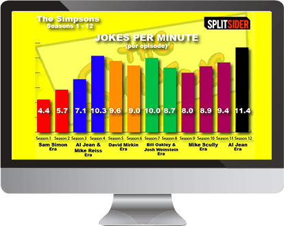
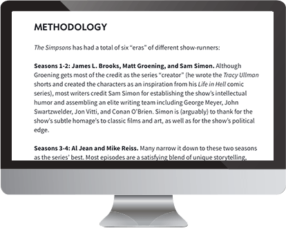
To further illustrate with a visual story, check out these two sites featuring data about The Simpsons. The first features some pretty but static charts about phases of the show's history. If you were a network executive looking to make some writing staff decisions, this might be somewhat helpful.


Now consider making that same decision with this level of insight:
When retailers use their intimate knowledge and experience to agree on what they would have to see in the data to consider taking action, their collaboration becomes much more effective. Instead of working toward a shared interpretation of the data, they are reaching consensus on what action to take as a result.
5. Incorporate visual analysis and storytelling to tap into the brain's strengths
Teams have been working with rows and columns of numbers since VisiCalc and Excel. This became the default way of working and remains entrenched. The problem is, it takes incredible effort to find patterns, trends or relationships in even a small grid of data — and it's easy to miss something. This is holding retailers back.
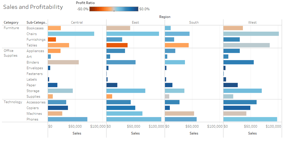
Take an example of the sample grid report below. Where are the problems? For many, this is probably a small report of number compared with what you use on a daily basis. Where are the issues? What about sales? Profitability? What region do I need to focus on for a given category? It is hard for us to make correlations of data with raw data alone.

Now take a look at the report below. This visual analysis is the exact same data, but with visualization techniques applied. The burnt-orange color for Profit Ratio makes it clear that the group needs to look to profitability issues for these items, particularly the Tables subcategory in the East. It's instantly obvious that the West is doing OK with Tables, so the team needs to investigate the differences to find the root cause.

Now look again at the grid report of data above. See how hard it is to make this correlation?
Visual analysis is a hands-down better alternative for finding meaning in data. That's because:


By tapping into both right- and left-brain processing, visual analytics frees retailers to work with data more naturally, and thus find more insights. It stimulates conversation, not presentation, so participants are interacting with data in many different ways, diving deep where needed, tapping their curiosity and feeding off one another's ideas.
Tableau has absolutely solved the technical work of authoring beautiful visualizations. Now we are helping self-service leaders communicate insights and action through analytic stories.
Great visualization goes hand in hand with storytelling, which brings data to life, allowing the viewer to make a personal connection to the information — that “a-ha” moment. Telling a story through visuals takes the user through exploration, analysis and finally a call to action from the story the data is telling.
According to Gartner's Analytics and Business Intelligence Modernization Primer for 2017. “Data science calls for a different attitude and a different skill set from traditional data analysis, anticipating and optimizing outcomes, behaviors and processes. It relies on sophisticated experimentation, failure, creativity and a driving sense of curiosity that traditional BI — with its predictable queries on predictable data and its emphasis on consistency and accuracy — would be unlikely to discover.”
The Modern Approach to Data Analysis
Self-service analytics deployments that incorporate rapid prototyping, a unified data language, connected data, visual analysis and storytelling will empower retailers to drive real business results with data. This modern approach frees the organization from the limits of traditional data management, and enables it to compete in an analytics-fueled marketplace. Gartner recommends businesses “embrace easier-to-use, more agile tools as greater responsibility for analytics shifts to lines of business,” according to the report Critical Capabilities for Business Intelligence and Analytics Platforms.See how retailers use Tableau
Learn more