New in 9.0: Formatting the Story Points Navigator
Y'all asked and our development team delivered! It's now easy to format the story points navigator to your liking.
I used this feature recently when revamping the very first viz I ever made before working at Tableau, a dashboard on mercury in seafood:
It was made prior to the introduction of story points, and with the ability to format story points available, now seemed like a good time to update it with some additional context and better views.
Previously, story points looked like this:

The default story points navigator formatting.
Although the formatting works alright, it'd be nicer with more contrast and the ability to see all the text without scrolling in the first story point.
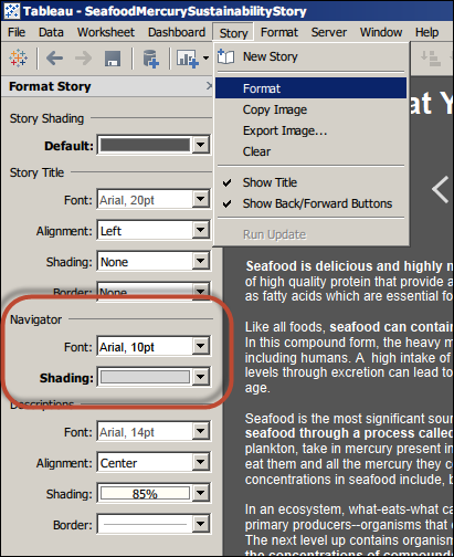
To change the default formatting, open the options using the Format entry in the Story menu:

Open the Format entry in the Story menu to change the navigator formatting.
And to change the size of the story points, simple click and drag the corners or edges of any story point.
With this simple change comes a big punch of contrast that draws the eye to the navigator and allows the user to read the whole story point caption without scrolling:
Now if you want your captions to match any background color--orange, purple, brown--you can! And you can write story points captions of any length and display them without scrolling (though we wouldn't recommend putting a comprehensive treatise in there).
Articles sur des sujets connexes
Abonnez-vous à notre blog
Obtenez les dernières nouvelles de Tableau dans votre boîte de réception.


