Tips on building dashboards for the smartphone
Note: The following is a guest post by Tableau Zen Master Kelly Martin.
I rarely get requests for Tableau dashboards on smartphones, probably because they are usually a secondary concern. That is, most business dashboards don’t automatically translate well to the phone format, so they are not high on the priority list. Here are a few things I’ve learned when making these wee dashboards that might be of help to you.
Determine the dashboard's focus and context
Because of the small canvas and the fact that the user is on a mobile device, it’s important to zero in on exactly what the user needs to see. Mobile dashboards tend to have a specific, limited function. For example:
“When I’m on the run, I might need to see [blank].”
“It would be handy, before I head into the office or to the client, to see if [blank] has increased or decreased.”
“I would have loved to have been able to announce that we exceeded target this month while I was in the VP meeting.”
Because of space, you can’t provide a lot of information or detail. It’s not as simple as squeezing down a dashboard that you’ve built to be utilized via PC, and it can be very difficult to provide enough context for specific numbers.
For example, the value of sales in the month of December is of limited value without a chart showing the trend for sales, or regional sales, or the number of orders contributing to those sales, or the variance over last month, etc., all of which can’t necessarily be represented on such a small canvas.
Interactivity: There’s an app for that
Let’s face it. Smartphones can be annoying. Squeezing and expanding things to get them to fit or read the way you want can be frustrating. Adding a lot of filters or interactivity to your dashboards may only further frustrate your users and may even cause the untimely death of an innocent smartphone. Fortunately, there’s an app for that. The Tableau Mobile app optimises filters for this medium, making them pop and easy to use. It also allows for logical scrolling, swiping, pinching, and zooming.
Unfortunately, my phone, an older model, won’t run the app. When the robot wars come, my phone will find itself impaled on a stick in front of my house as a warning to other robots, Vlad-style. For now, my phone is the best-worst case to use when building dashboards for this medium.
If you are in an organization with users with many different brands, sizes, and ages of phones, you will have to deal with trying to find a size and level of interactivity that meets the majority of your users’ phones as well. If everyone’s on a big, fat Galaxy Note, well, lucky you! Here’s a resource workbook with CSS dimensions for current mobile devices that might be helpful in deciding the size of your dashboards.
Utilize Story Points
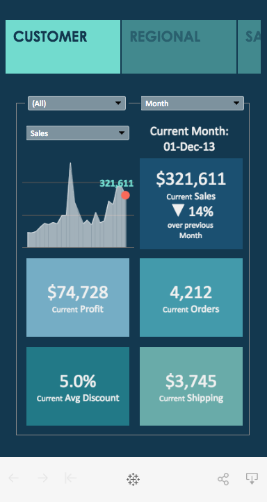
Story points work very smartly on a smartphone. This style is particularly great for a group of related dashboards, although they don’t necessarily have to have a story. This example has many dashboards with different focuses, allowing the user to swipe through the story points to find the specific measures they need.
For these dashboards, I chose a size of 350 x 600 for the story and 320 x 460 for the dashboards. On my phone (which has dimensions of 360 x 598), the top of the story points are cut off, but I can still tap them. And there is plenty of room for my chubby fingers to slide the view up and down. I added the text box with a border to the dashboard as a guide while placing the elements, but decided to leave it in the finished product as I did find it helpful as a guide when viewing.
With respect to interactivity, I kept the filters to a minimum—no more than three per dashboard and specific only to the charts within the dashboard (no global filters). This reduces confusion and helps with performance.
On the sales map dashboard, the map interacts quite smoothly and the tooltips behave nicely, appearing and disappearing when you want them intuitively. I don’t know how much smaller you’d want to go with a map, which limits the amount of information you can add. In this case, the tooltip would be a good spot to add additional fields and values.
The city sales dashboard (the last story point) is probably the most challenging in this bunch. There are two drop-down filters and two chart actions. The sales trend chart has skinny little bars which allow the user to filter on a time period. I don’t recommend using this chart if you like the people you’re building this for. I left it in as an example of the frustration you can experience. Try it out on your phone. The fat city bars are much easier to use as a filter.
Consider wide or long dashboards
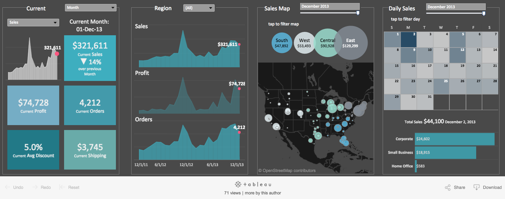
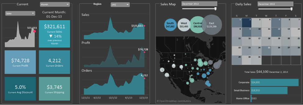
Another option is to lay out your charts on one dashboard horizontally or vertically. The horizontal example uses most of the same charts laid out on one dashboard 1320 pixels wide. The bordered text boxes break it into four screen views. Again, the filters and actions only apply to charts within these views.
This format is fairly easy to interact with, but I wouldn’t want to have too many more charts as the load time could slow down.
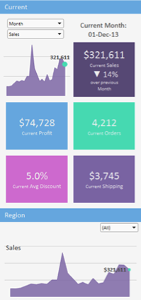
The vertical example (320 x 1860), seen below, is similar to the wide dashboard with a slightly different style. It’s on a light background, with a blue header bar delineating the screen views rather than a border. Personally, I find the dark background easier on my eyes, but I do prefer the vertical scrolling over horizontal.
I hope these examples help you with some of the decisions you’ll need to make next time you build a smartphone dashboard. But more than anything, I hope you’ll be inspired to get creative and not be afraid to tame and rule your smarty-pants phone.
Historias relacionadas
Suscribirse a nuestro blog
Obtenga las últimas actualizaciones de Tableau en su bandeja de entrada.


